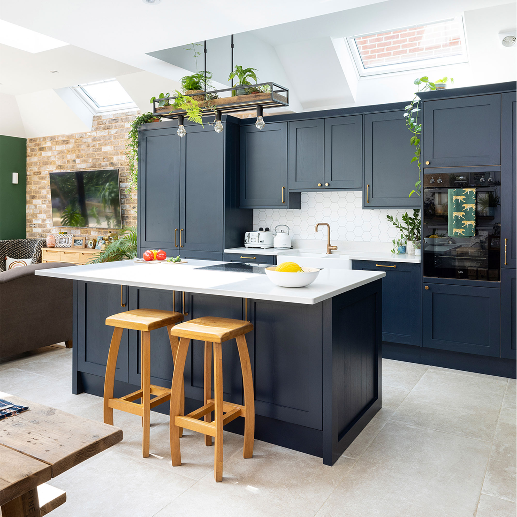
Faced with a small, poky kitchen, a mish-mash of rooms and a chaotic layout, a kitchen re-design was top of the list for this homeowner.
‘We bought this house six years ago, knowing that it had plenty of potential, but also that we were going to spend several years renovating it,’ she explains. ‘The downstairs was a real issue and it just didn’t suit us as a family with young children.’
Extended layout
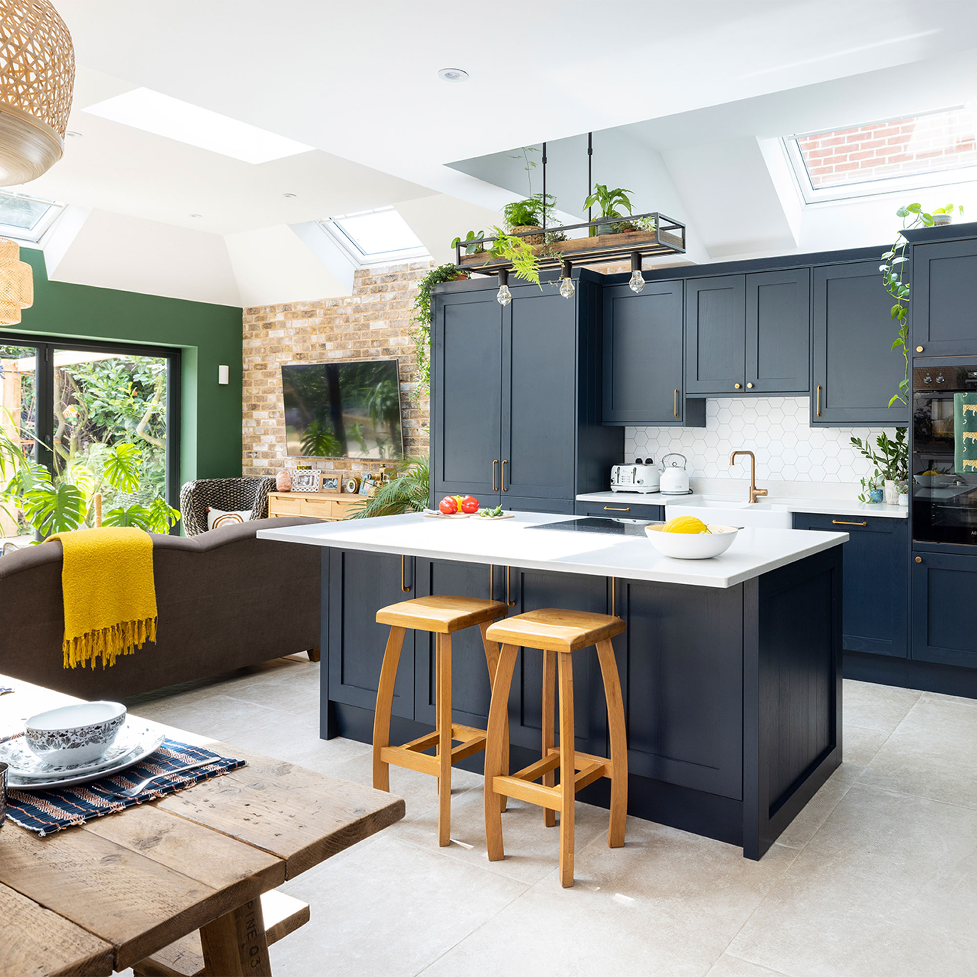
‘The living room just needed a bit of renovating, but the rest of the downstairs was a mess. There was a tiny, dated kitchen, a lean-to and a strange dining room that didn’t serve any real purpose.
‘The obvious thing to do was rip it all out, take the back off of the house and extend the kitchen into the large garden, but it was such a major project that we put it off and slowly worked our way through the rest of the house, installing a new bathroom and shower room and decorating each bedroom.’
Co-ordinated colourscheme
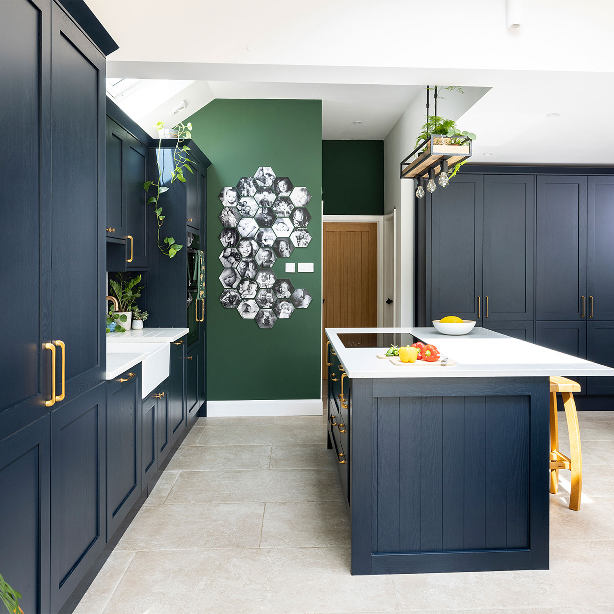
‘The idea was to make everything open plan and put in bi-folds across the back and side so that we could bring the outside in and blur the line between in and out. We applied for planning, which was a long and complicated process as we were more than doubling the size of the space.’
The kitchen before
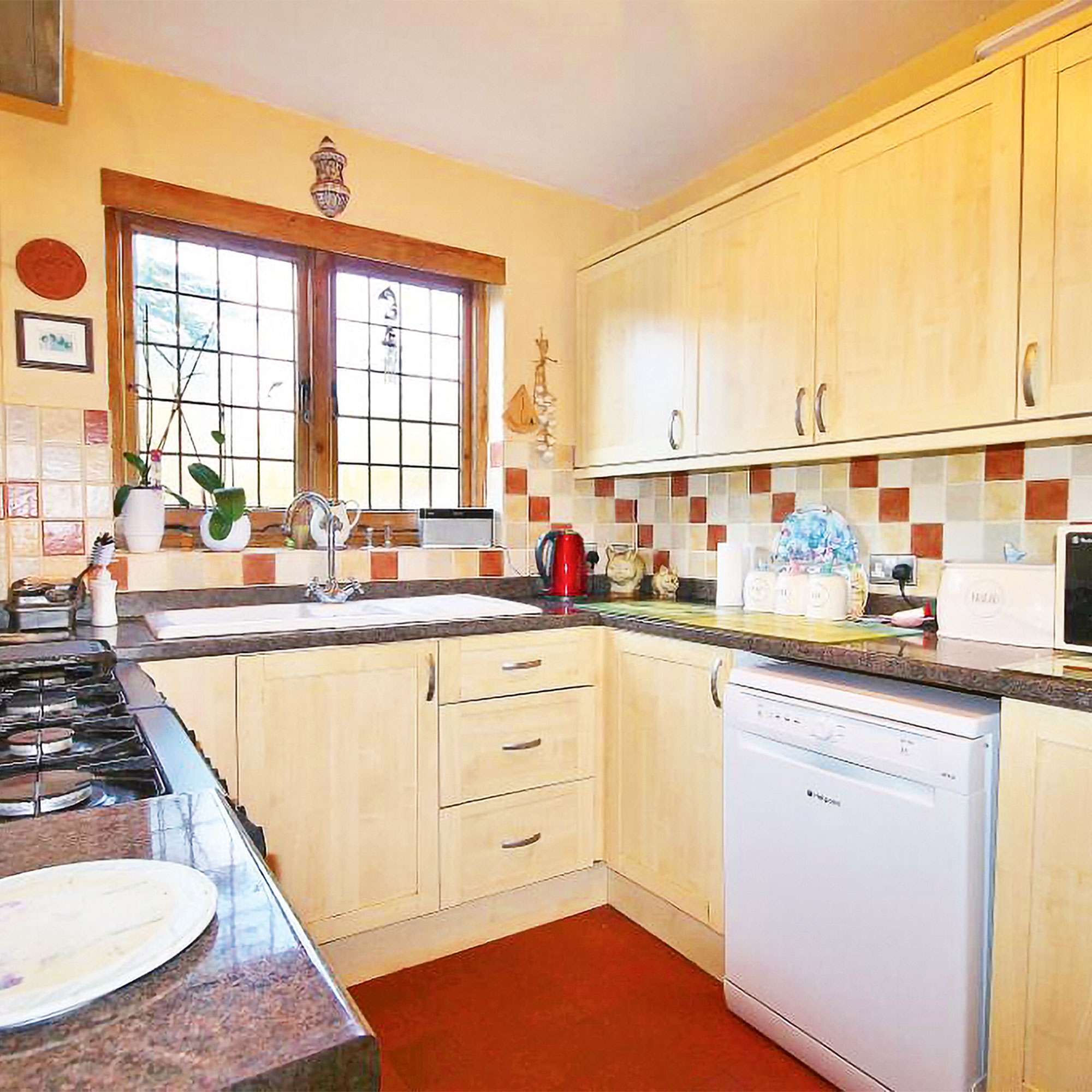
‘We got a start date of August 2019, but then Covid intervened – plus there were major problems with the roof, which had to be raised and replaced, so we didn’t get to start the kitchen until February 2021. The whole thing was finally finished last summer, taking three years in total, and there were points along the way where we almost gave up, but we’re so pleased we didn’t.’
Velux windows
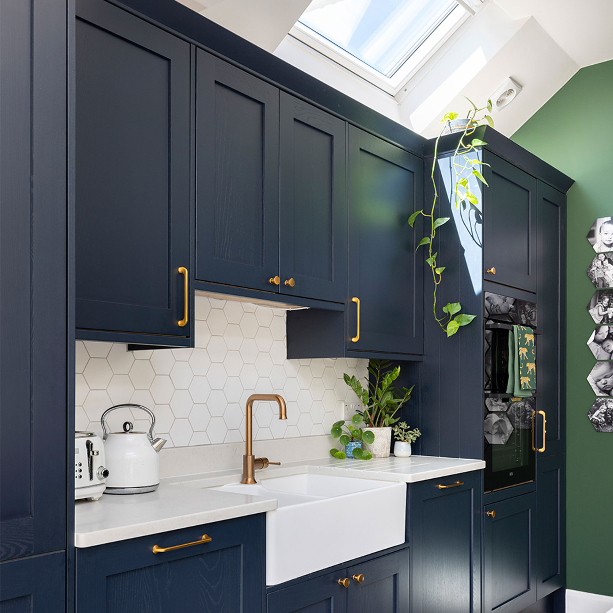
‘High ceilings and plenty of light were the main two essentials for the structure. As well as the bi-folds, we factored in five Velux windows, which I was worried was too many, but it makes it lovely and light. It’s such a big space, but it has no windows on one side, so it was important to bring that daylight into the kitchen extension somehow.’
‘We’re big fans of natural materials, so wood, glass and stone were always high up on the list. We were left with a very large rectangular room, which we split into cooking, eating and relaxing zones and focused on making it not feel like a cavernous space.’
Tiled splashback
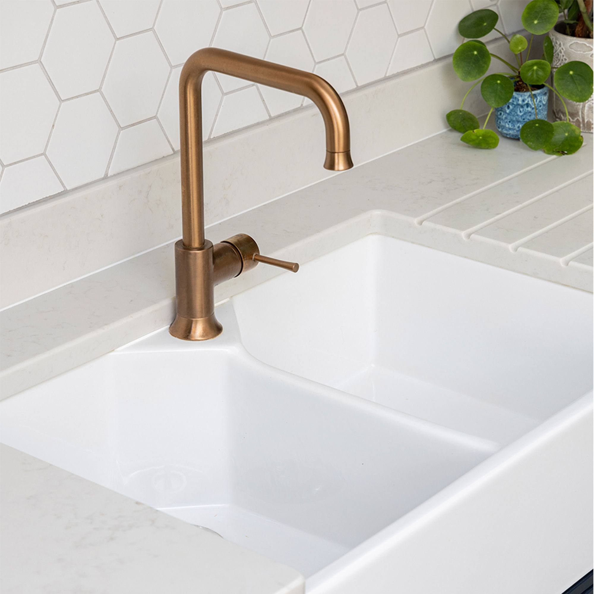
‘We’re very big on keeping things if they’re working well, buying items secondhand wherever possible and using reclaimed products. The wooden stools were from Facebook Marketplace, along with the hexagonal tiled splashback, which was a job lot from someone getting rid of it for £30 – a total bargain!
‘We kept our existing ovens and hob as we’d had to replace them recently anyway, along with our table and benches, which is made of reclaimed wood from a company called Stormwood Interiors, and our existing sofas.’
Tiled flooring
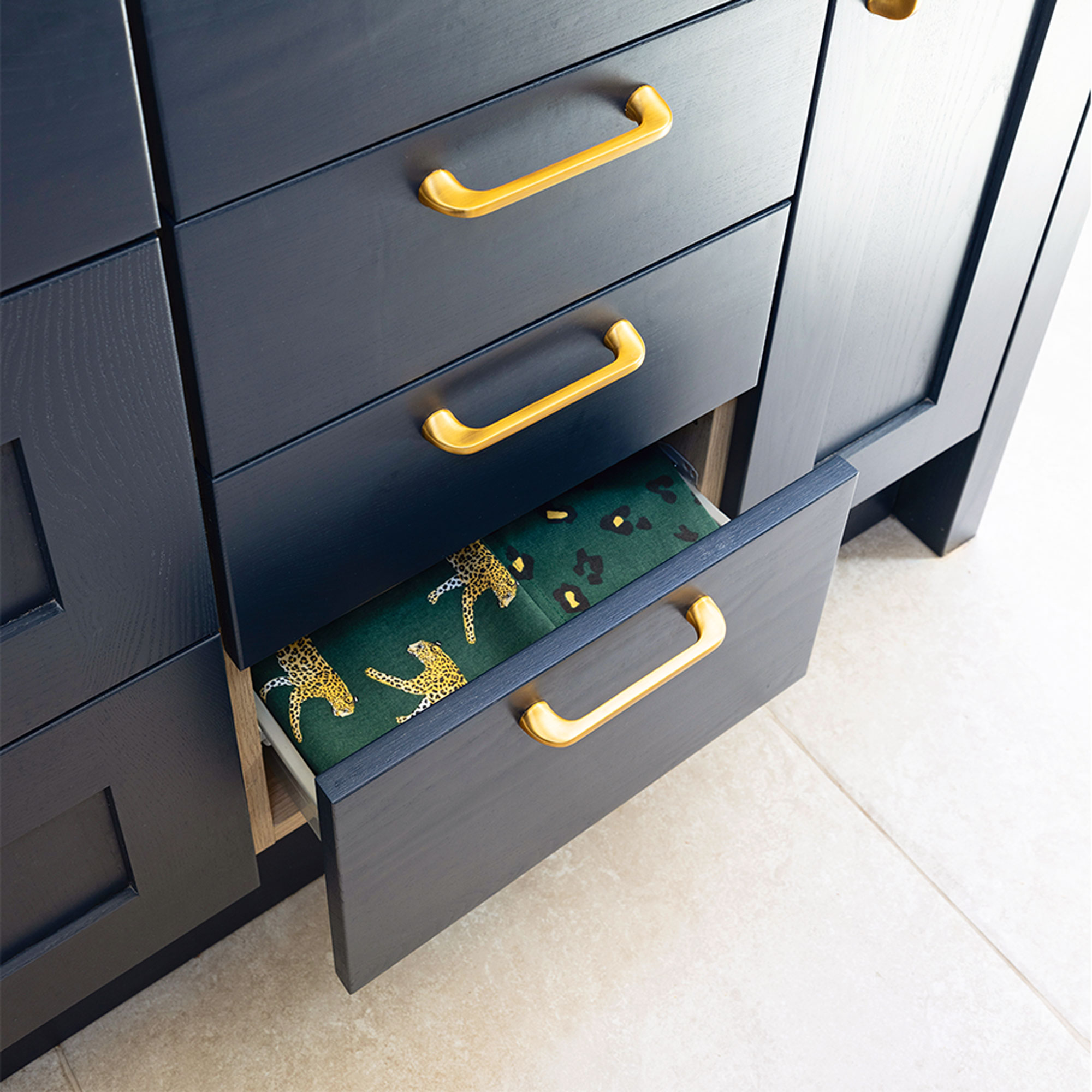
‘The flooring in the original rooms was a mishmash anyway and in a terrible state, plus we’d added a large extension, so we wanted something to tie everything together. It needed to be practical and hardwearing as it’s next to the garden, and everyone will be tramping through, including the dog.
‘Tiles seemed like the obvious choice, and we chose a tile that we could carry through to the outside as well.’
Feature wall
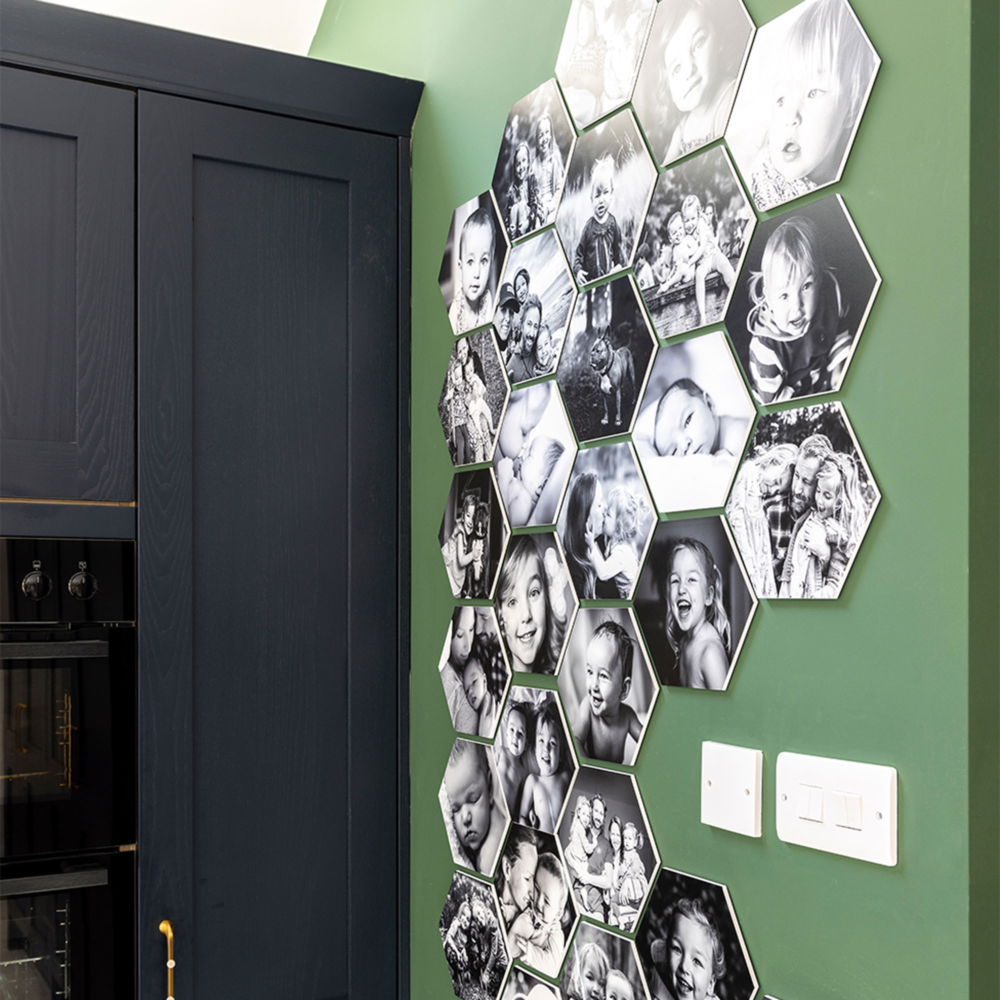
‘Having opted for dark blue kitchen units, which we felt the room could easily take as it’s so big, I wanted to bring in another colour as well. It had to be something strong, as a pale colour would have been overwhelmed by that blue. We didn’t want it on all the walls, just a couple, with plain white in between.’
‘Green made sense, as we were bringing the outside in, and we love plants. The most important thing was that the paint was non-toxic, and we’ve gone for two brands that really lead on that: Lick and Little Knights.’
Rustic brickwork
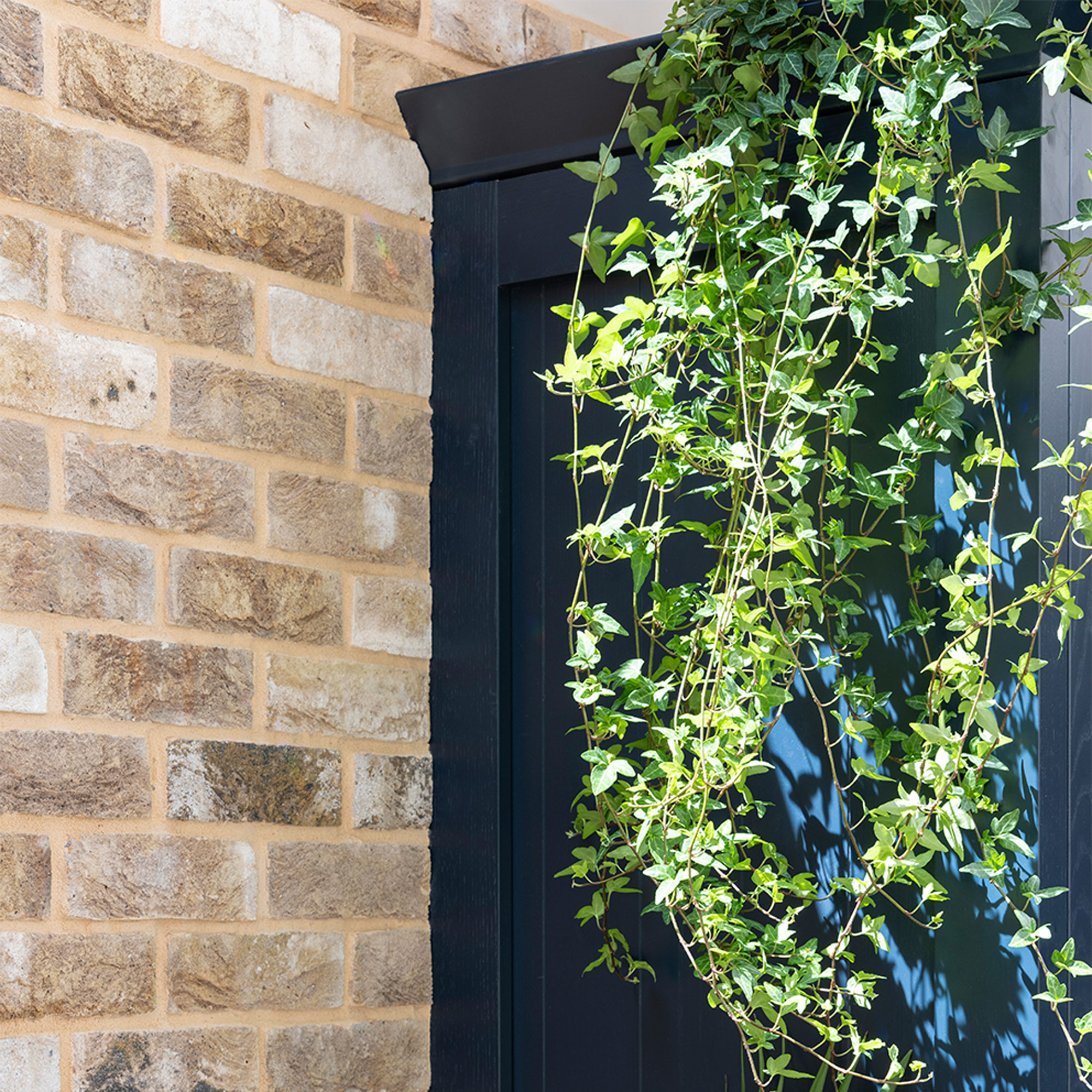
‘I love the look of exposed brick walls, which you obviously don’t get with a new-build extension, but we realised we could achieve a similar look with genuine old brick slips stuck onto the wall. It’s very effective and gives the kitchen an instant feeling of permanence.’
Stylish dining area
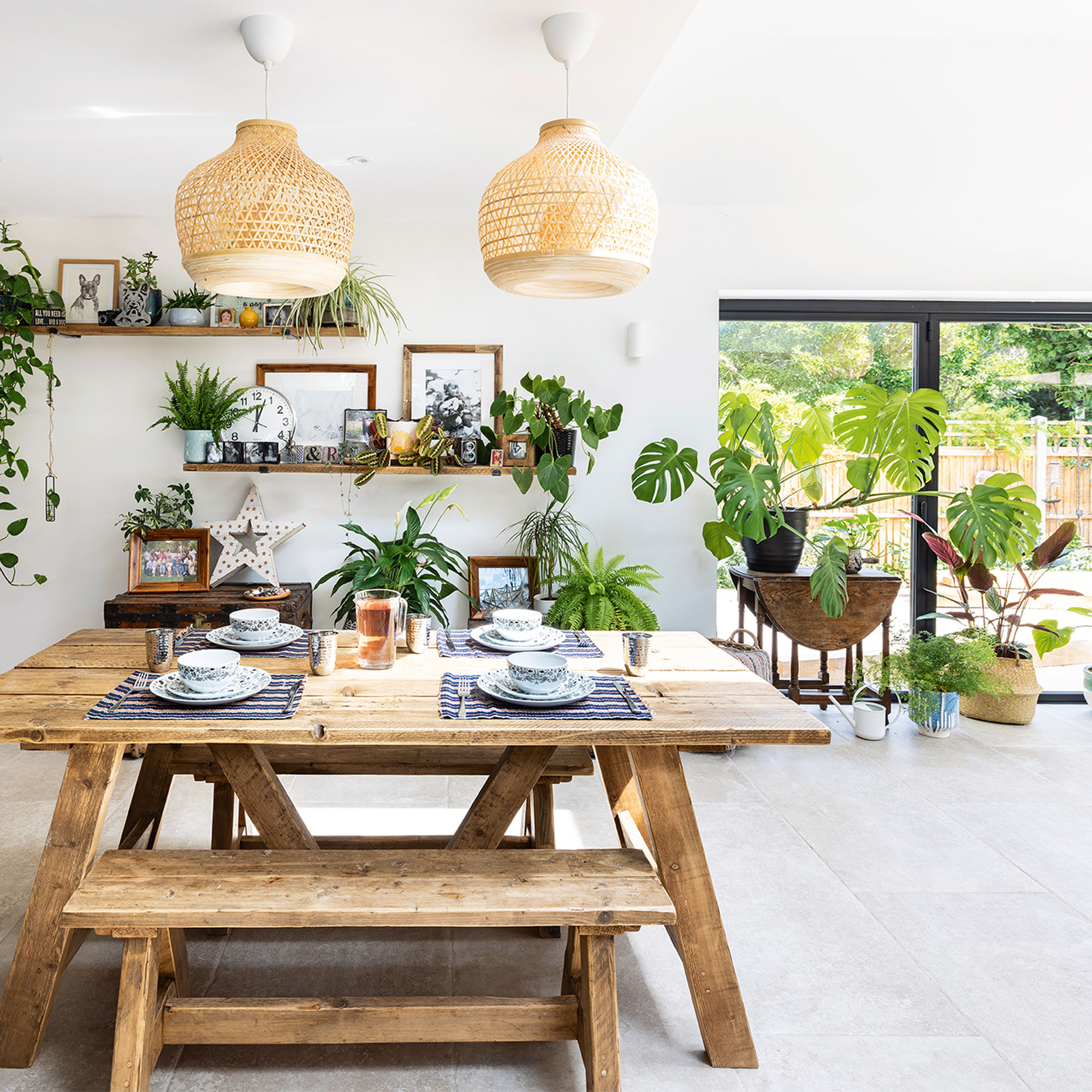
‘The idea that this dining set is made from reclaimed wood really attracted me, plus the fact that it’s nice and sturdy and it’s a great place for art and homework. The shelves match as well.’
Feature shelving
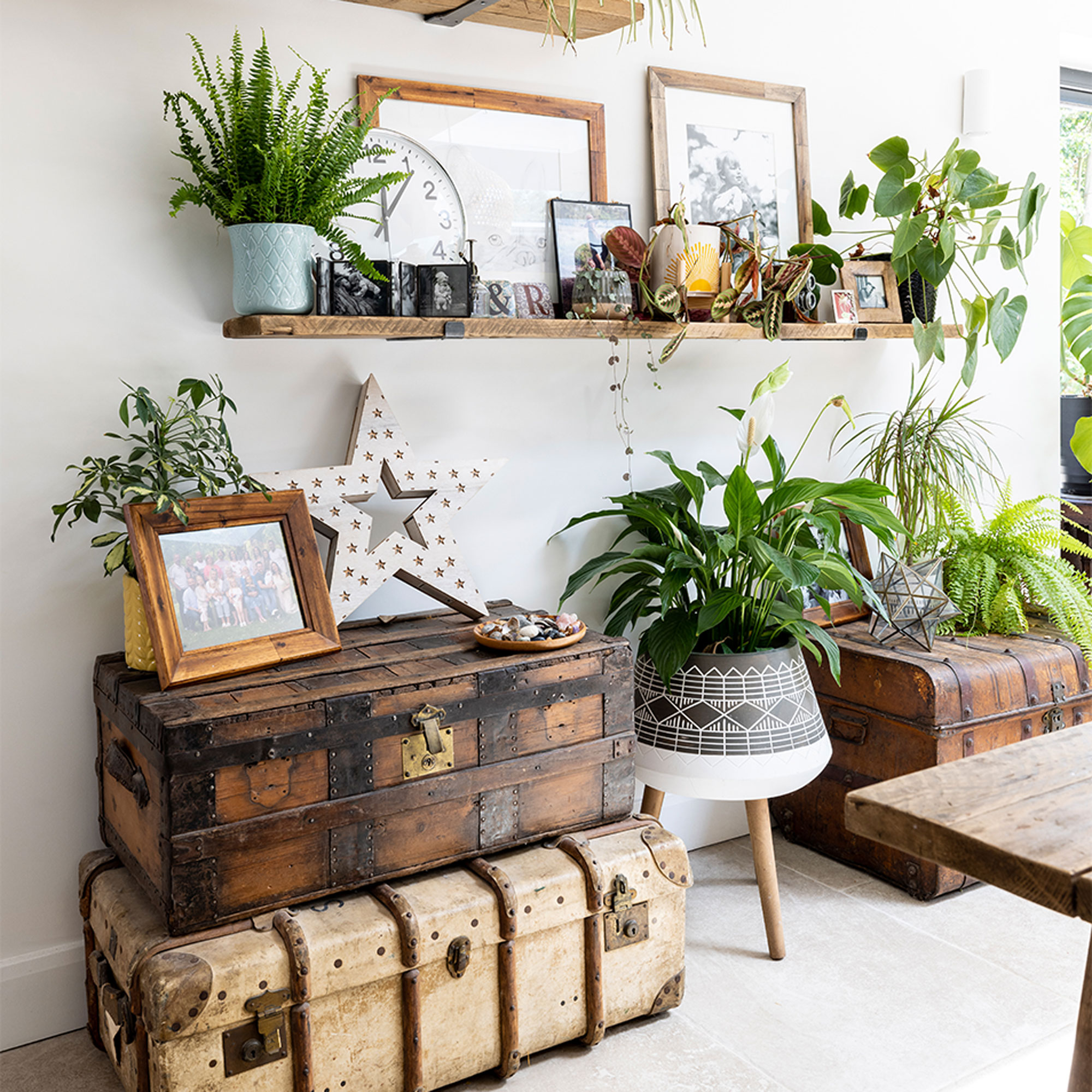
‘Old trunks are a great idea to display pictures and plants, and I’ve picked up several for a few pounds at charity shops. You can also store stuff you don’t want on show inside.’
Eye-catching lighting idea
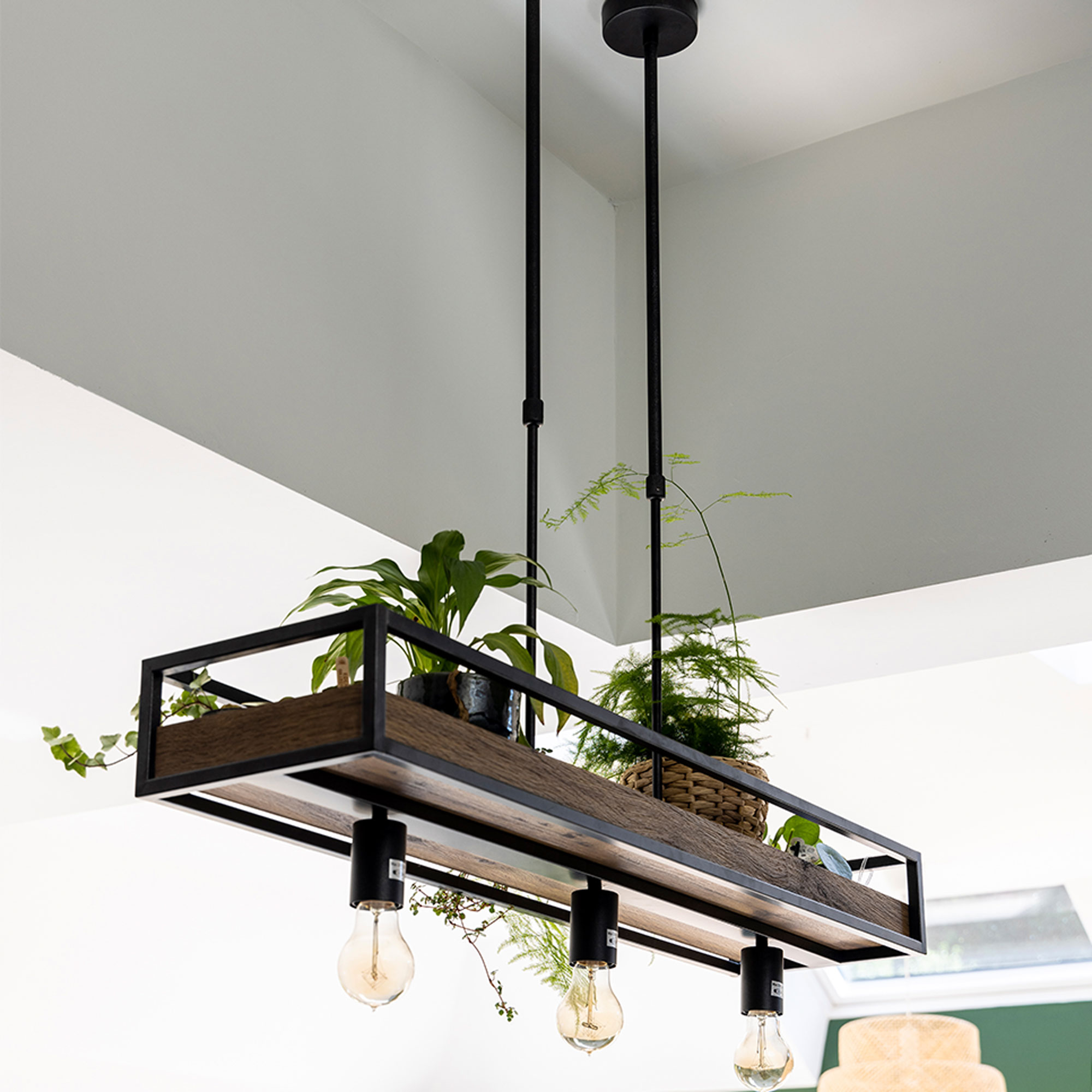
‘I loved the idea of this hanging light which you can also put plants on.’
‘Once I’d got all my favourite photos up, and brought in my plants, many of which I grow from cuttings, it felt like the kitchen had always been there. We spend all our time in here now.’


