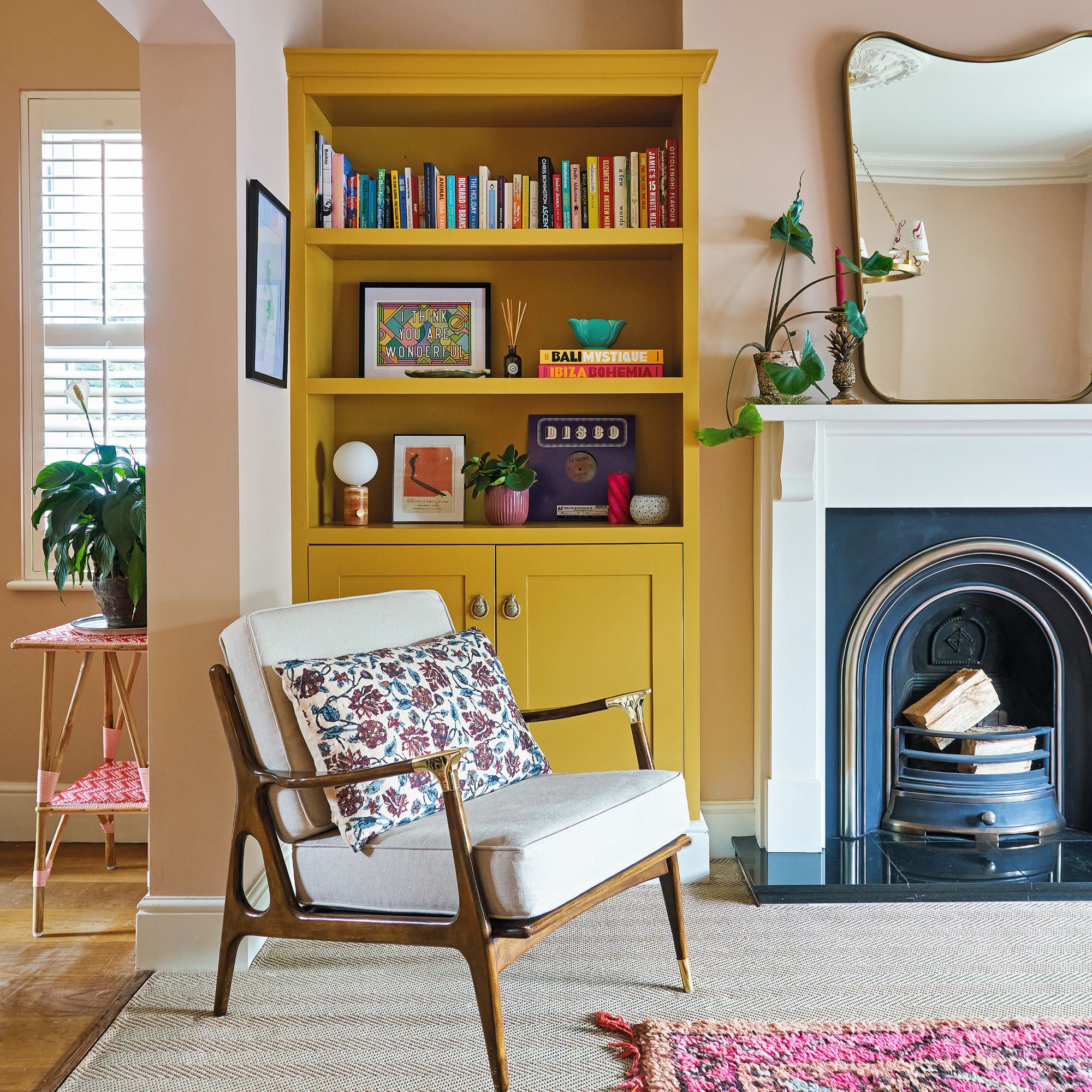
Colourful interiors are having a revival at the moment and this joyful home is the before example of how to work personality and colour into every corner of a home. The home's interiors are full of colour, and personal touches and have a laid-back, comfortable feel.
This Victorian terrace house in Cheshire belongs to Holly Lamont, founder of the interior design studio Holla Design, who lives there along with her husband Tommy, and their labrador, Juno.
Holly isn't afraid to go bold with her design choices, and though her style could be described as unique, it's also hard not to love. She showed us around her beautiful home and talked us through her styling process.

A happy, welcoming environment
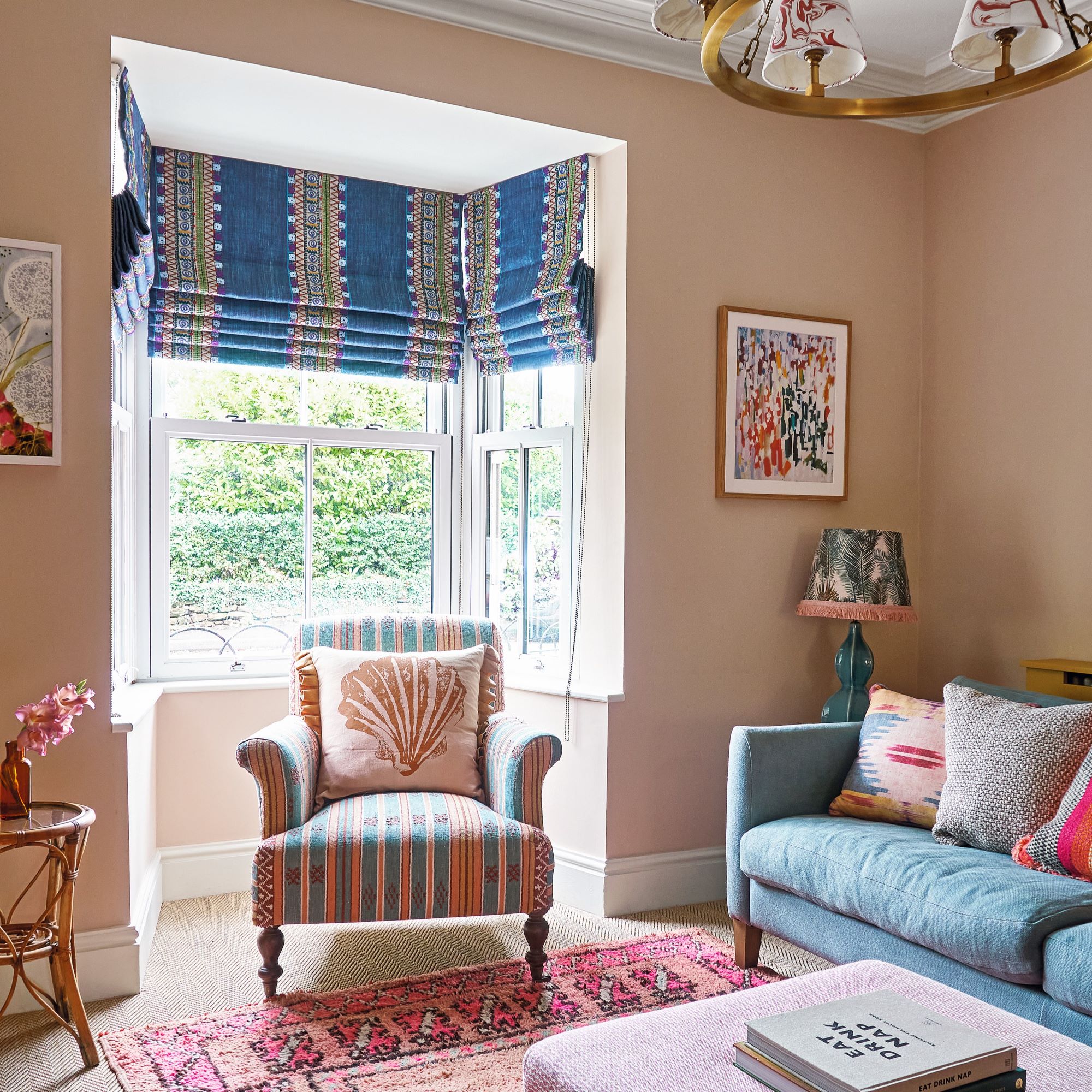
'There must be a comfy sofa and every room flows to the next,' Holly says. 'The dining room felt gloomy, so it made sense to knock through to the living room. The walls are painted in a pink tone to work with the existing flooring and kitchen worktop. It’s an easy colour to work with that’s also fun.’
Patterned blinds add interest and are also more cost-effective than curtains as less fabric is required.
An epic dining table
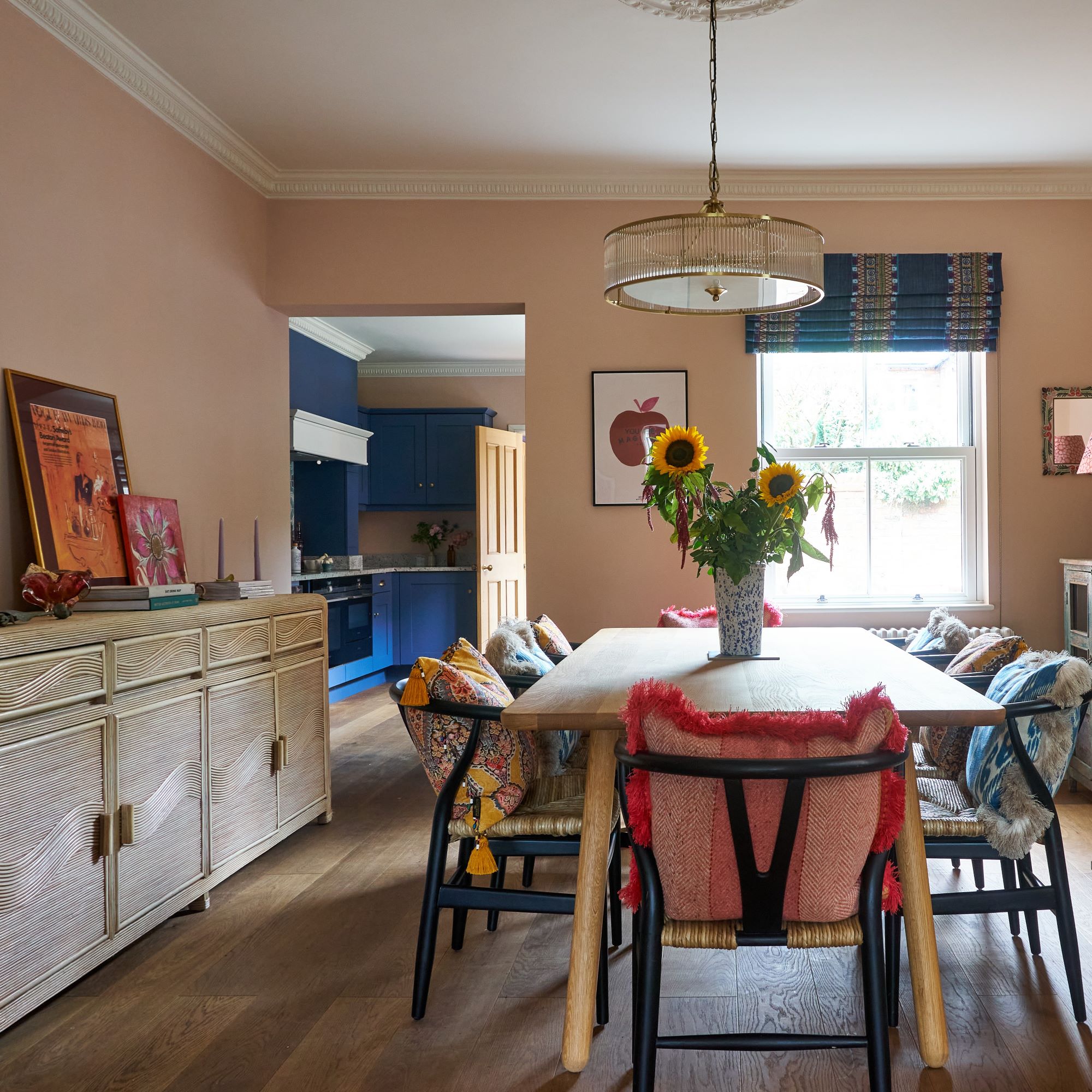
After living in flats for so long, Holly wanted to make the table a key focus in the dining room.
‘It is the central point downstairs. We wanted a table roomy enough to entertain 10 people and as it is so large, a simple design that was easy on the eye. The sideboard is also big but being pale, visually, it doesn’t overwhelm the room.’
Holly says she loves using fabrics with patterns to breathe life into a room.
Adding a personal touch
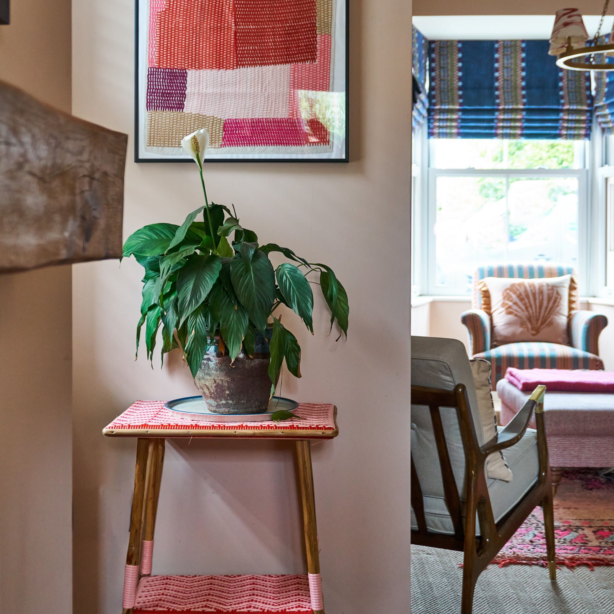
It was important to Holly that the interior of the home reflected her personal tastes. ‘I like to combine brands I love (mid-price to high-end) with eye-catching finds from artisanal suppliers and smaller, independent shops, either for sentimental reasons or to go with the scheme,' she explains. 'It’s these touches that make a home unique.’
An inspiring kitchen
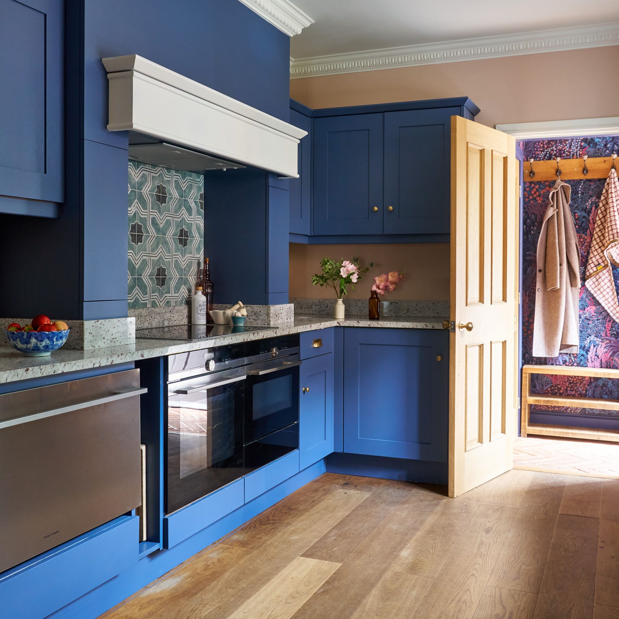
Holly is a firm believer in creating spaces that inspire her, and she especially wanted to do this with the kitchen. Rather than undertaking a full-scale kitchen renovation, she instead decided to elevate what was already there.
‘When we moved in, we didn’t want to invest in a new kitchen, so saved costs by updating existing cabinets with a new colour. The granite worktop was a lovely grey, so we chose the blue to co-ordinate. To achieve a good finish, I would always recommend getting the cabinets sprayed, rather than hand-painted.’
Brightening the hallway
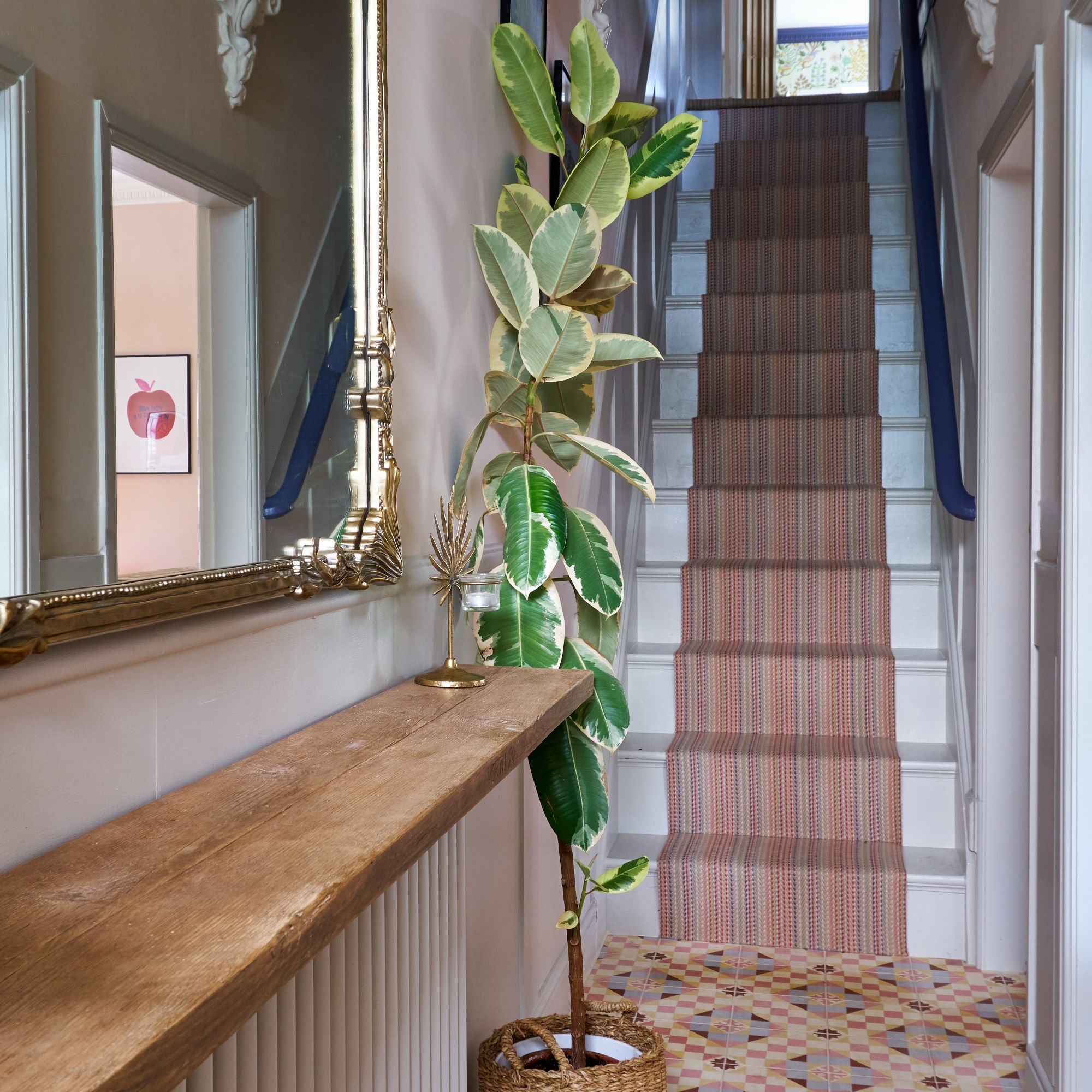
‘It was crucial to add as much light as possible to the hallway,' Holly explains. 'To do this, we added glass doors through to the living and dining room and chose pale-coloured tiles for the floor.'
Hallway mirror ideas add further light to the space, but the pièce de résistance is the Roger Oates stair runner. 'It was one of those bust-the-budget moments but it’s such good quality. The vision of sight is drawn upwards. There is pattern – but it’s not so intense.’
The home office
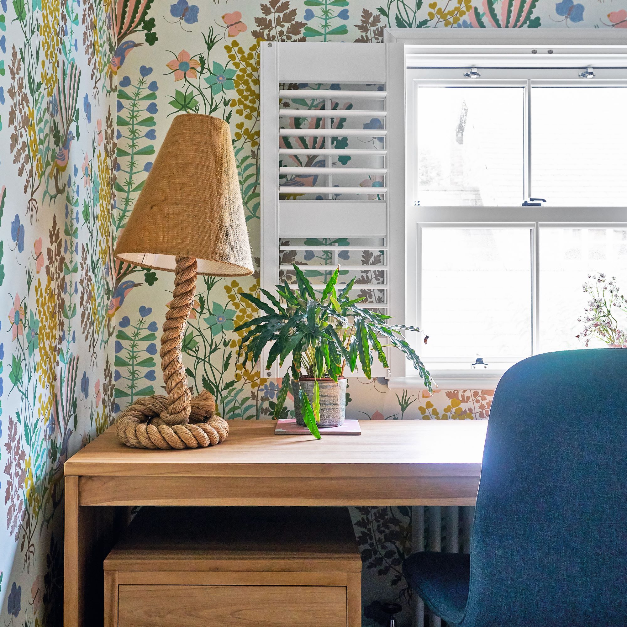
'In the office, I wanted something that reflects Holla Design and my interior style. It’s my creative den and the perfect-sized space to do something fun that doesn’t feel overwhelming.'
Holly adds, 'this wallpaper works with everything else in the house and I like how it contrasts with the dark woodwork. There is a blush pink in the pattern that has potential to feel twee, but the blue paint toughens it up.'
The flow of colours
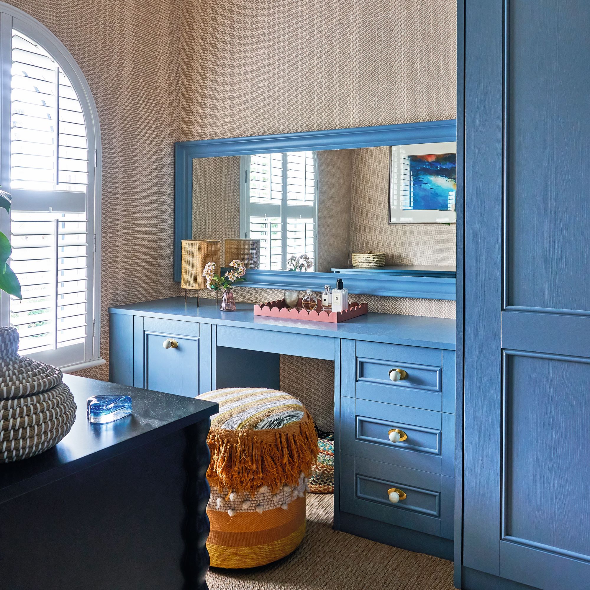
Holly's chosen colours flow throughout the house - they’re just used in different amounts or in a different style.
'For instance, downstairs, the kitchen is a statement in dark blue, which is picked up in the hallway with the doors. In the bedrooms, blues and ochre shades continue but they’re softer,' Holly says. 'We had just enough wallpaper leftover from the dressing room to use in the bedroom alcoves. This brings the two rooms together.’
An elegant bathroom
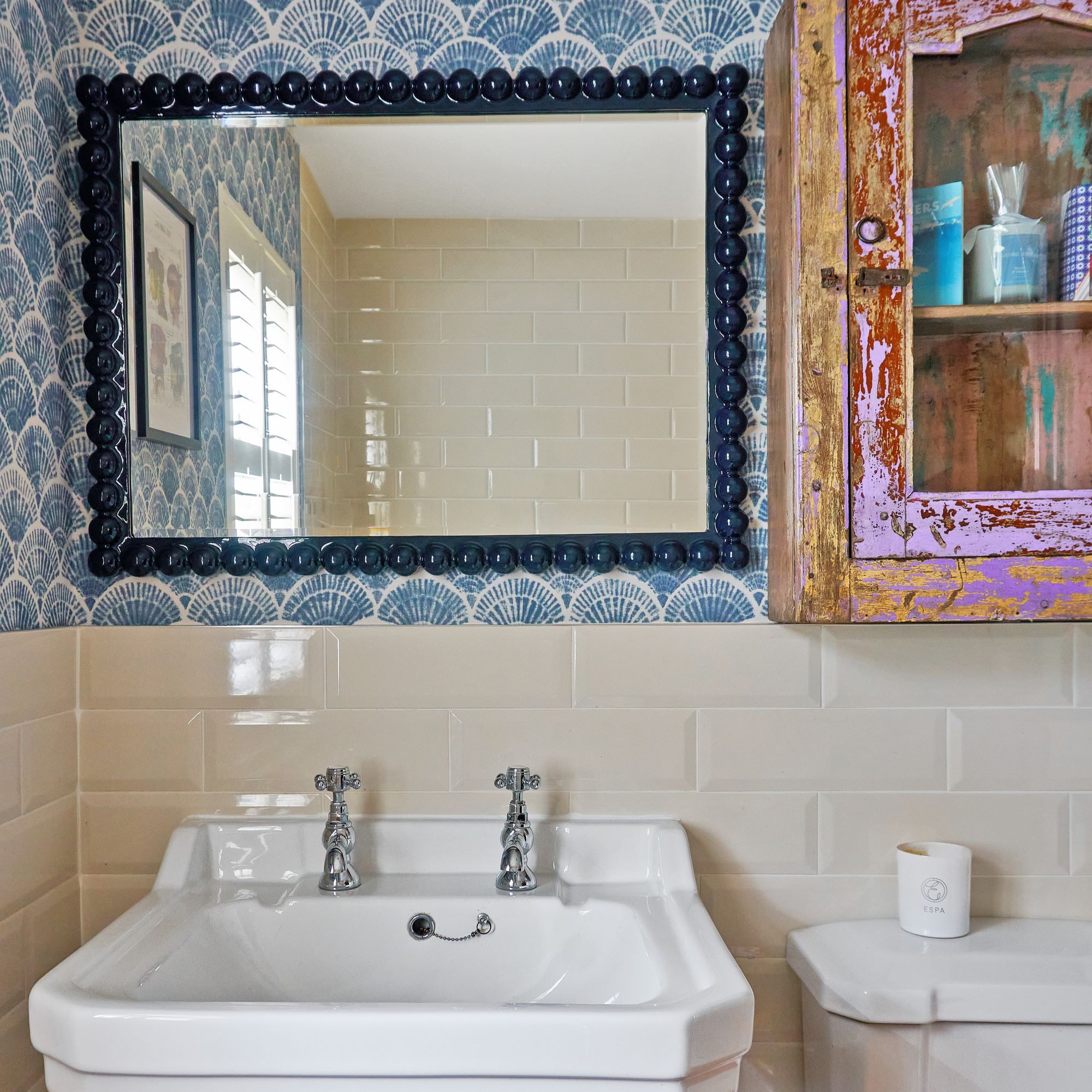
Similar to the kitchen, Holly wanted to avoid costly structural work in the bathroom. 'It was decent when we moved in, so we preferred not to do any building work, replacing wall tiles or installing new lights.'
Instead, they upgraded the wallpaper - chosen by Holly's husband Tommy - and added a painted wall cabinet they found at a reclamation yard, which adds character. There's also a rechargeable table lamp, which is handy for when you’re in the bath.
A stylish bedroom
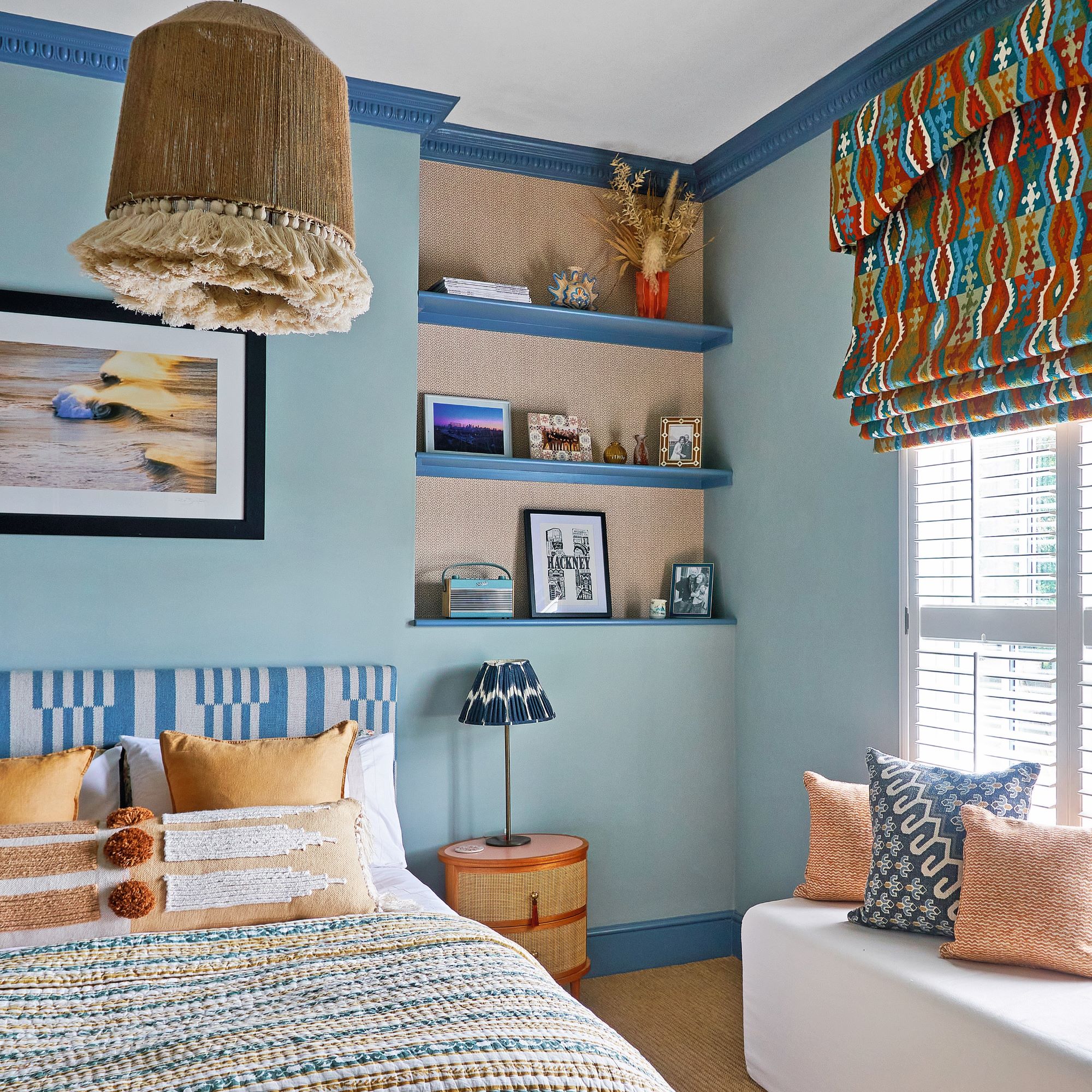
A focal point for the bedroom was the window treatments, which Holly likes to look at on a case-by-case basis.
‘Teamed with shutters, blinds are a practical option. In our bedroom, the window sits low, so by placing the pelmet high up on the wall, you wouldn’t know where the window finishes. It’s a good illusion.’
The stunning dressing table has good storage, and is positioned near plug sockets by the window, so it benefits from natural light.
A unique ceiling
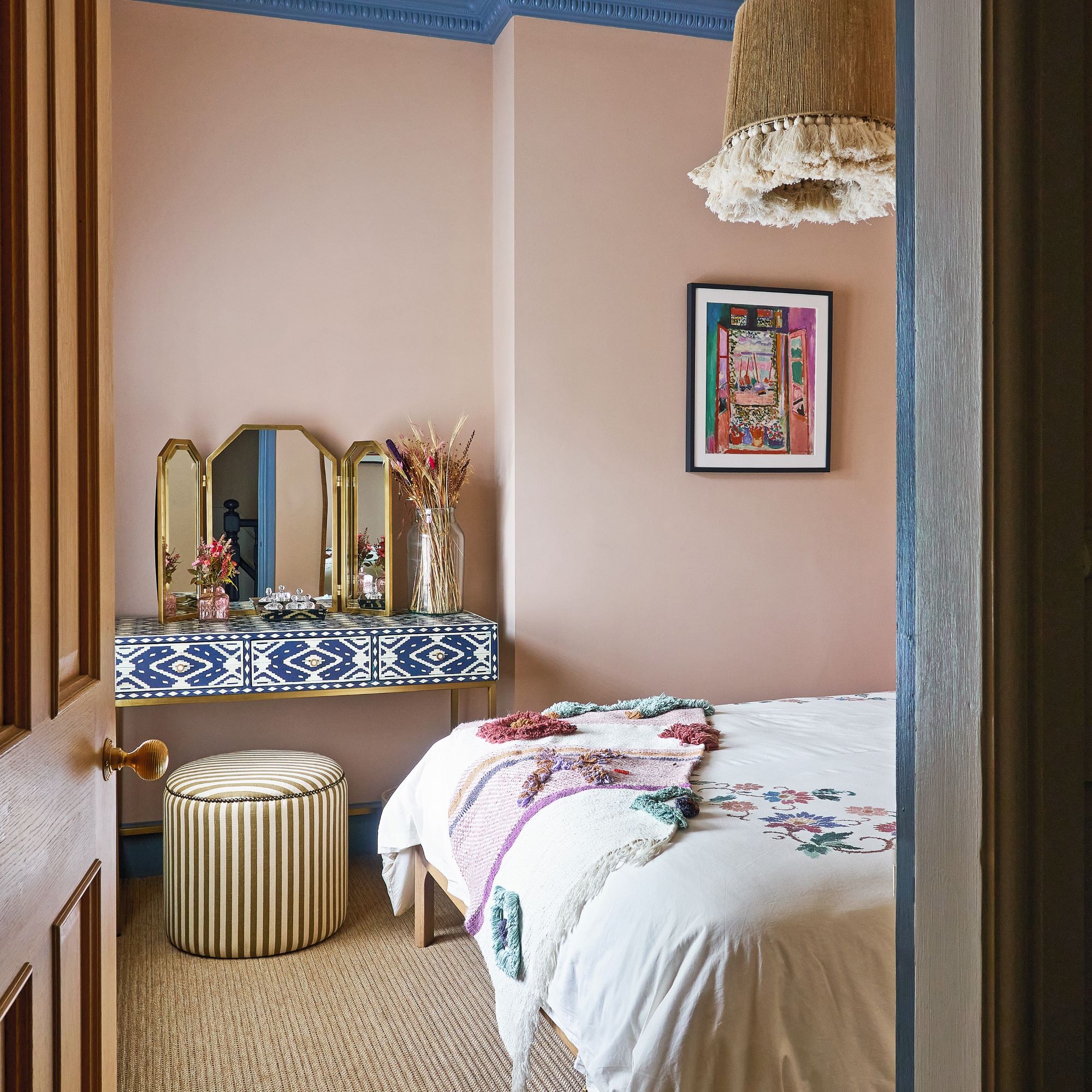
A lot of the original features of the house were kept, such as the cornicing and ceiling roses. Whether original or retro-fitted, cornices bring ornate character and ambience to a space. Holly and Tommy painted the cornices upstairs in a contrasting colour to add interest and accentuate.
'Throughout the house, there is a blend of natural, woven materials such as rattan paired with bold patterns and bright colours. This creates a balanced design, which feels modern yet is sympathetic to the period character of the property.'


