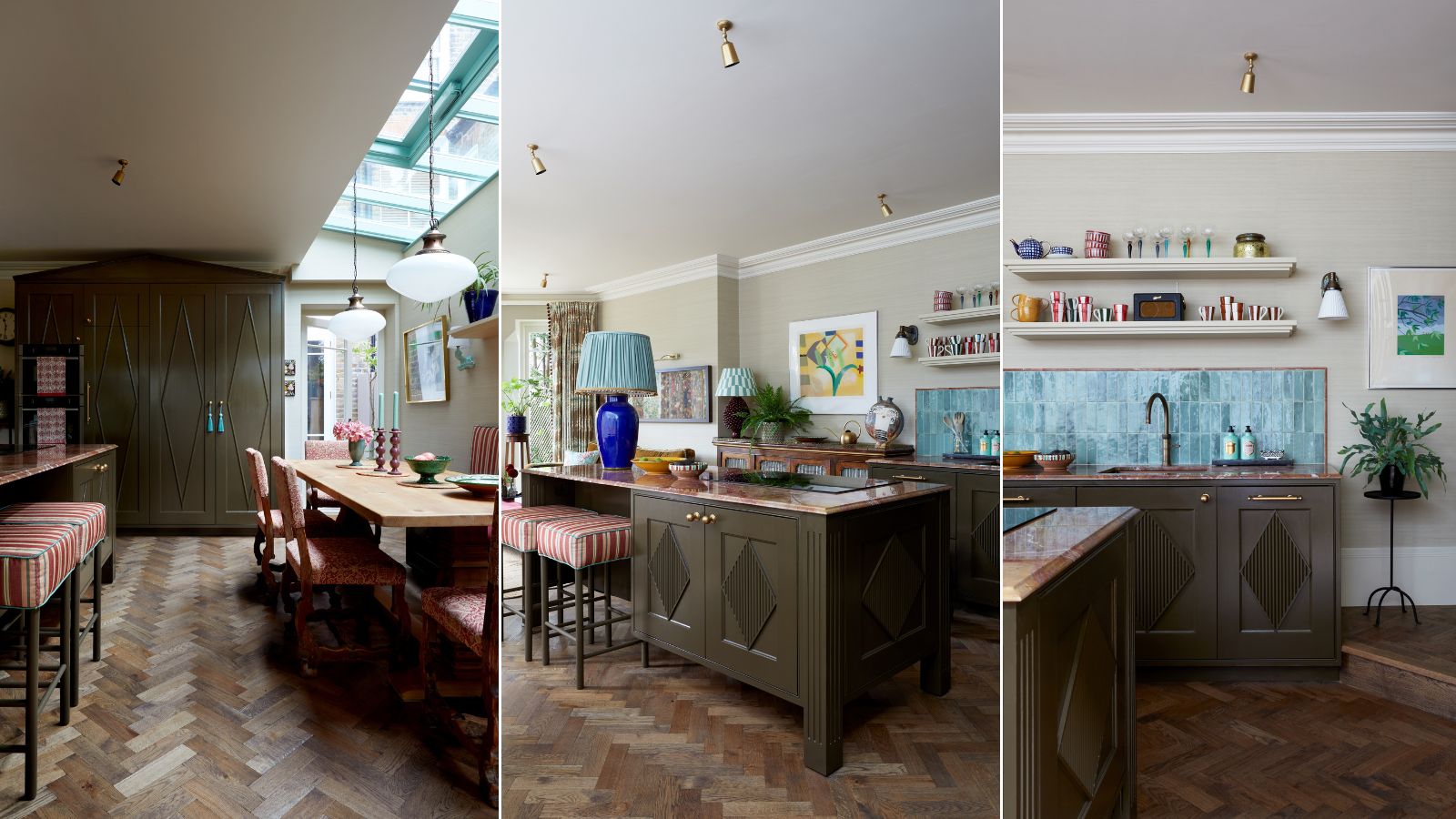
One of my favorite clients to date, the owner of this ground-floor flat in Highgate, London, is a remarkable woman. Recently widowed in her early 60s, the move was a major downsizing project. She wanted to preserve some of the grandeur and precious memories from her old family home, but keep it fun and playful. Her children and grandchildren often visit, so it had to cater for at least 12. Above all, she did not want an ‘old lady’ kitchen!
Along with the rest of my team at Laura Stephens Interior Design began by pushing out at the side and back to create a bigger footprint. With no other reception rooms, the kitchen had to cover relaxing and dining, which inspired the idea of a cozy kitchen that doesn’t feel like a kitchen at all.

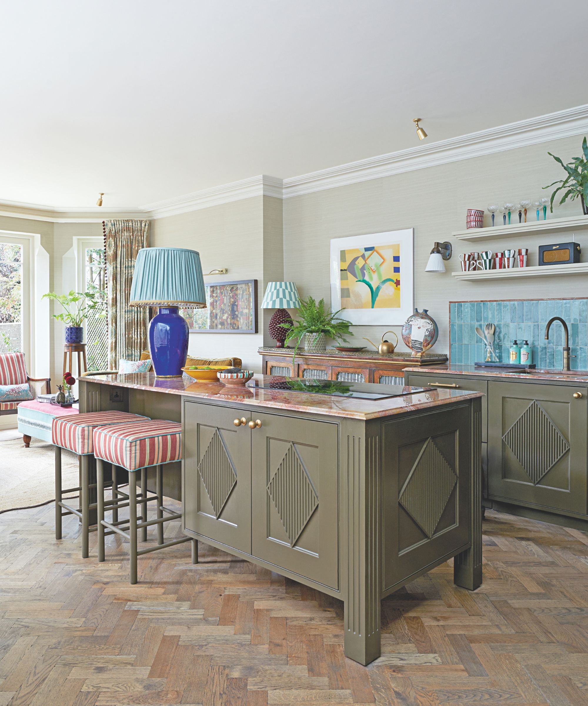
The kitchen island is styled as a beautiful piece of furniture – the red marble top with an ogee-edge profile is like something you’d expect on an antique sideboard. The lamp, converted from a favorite vase, was wired through the marble with no visible cables. It serves as a lovely full stop to the kitchen zone and further promotes that living room aesthetic.
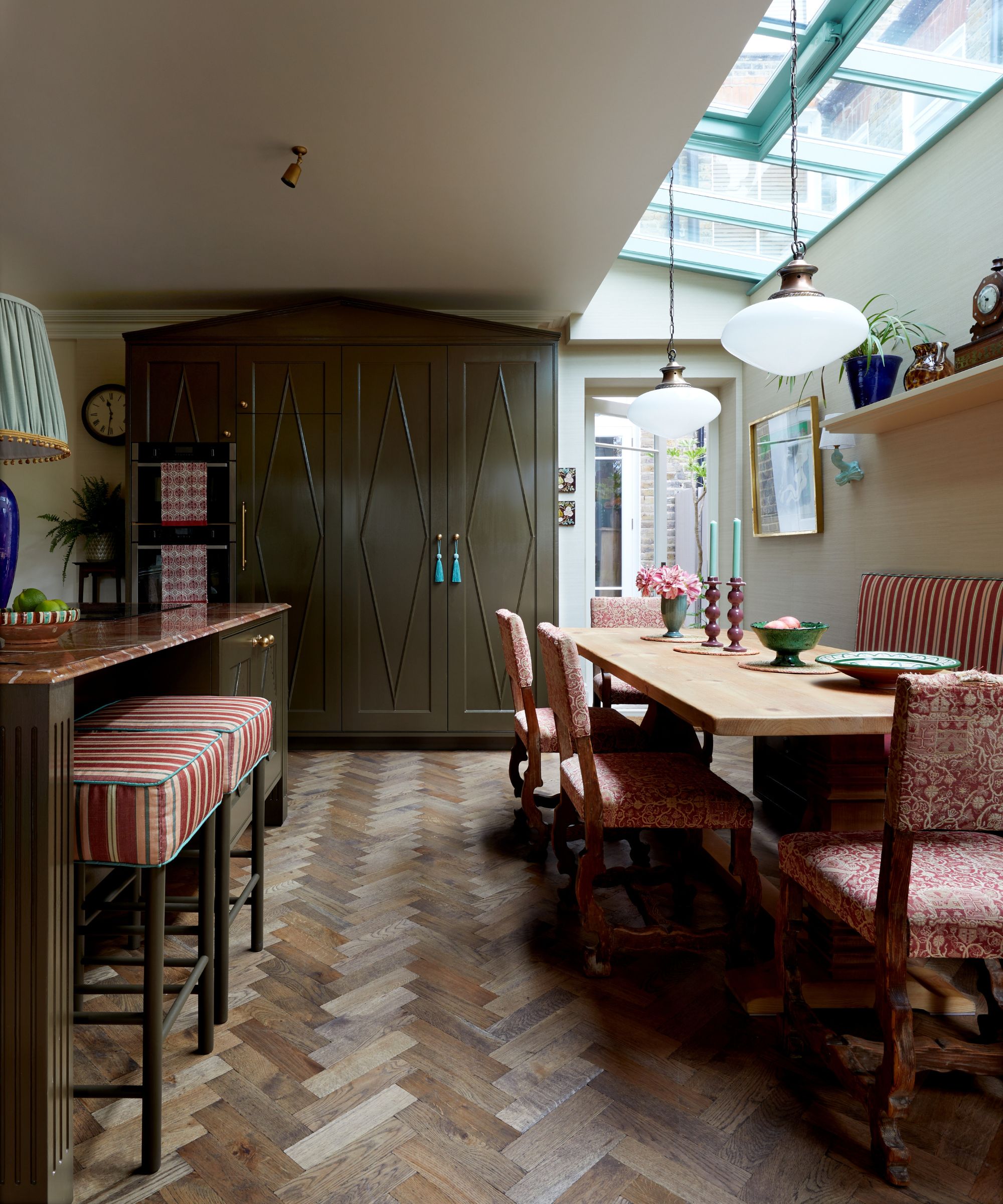
At the end, there’s a tall cabinet housing the pantry and ovens that resembles a large, elegant armoire. The kitchen color scheme was informed by the reds, greens, and browns in the framed antique tapestry that hangs in the seating area.

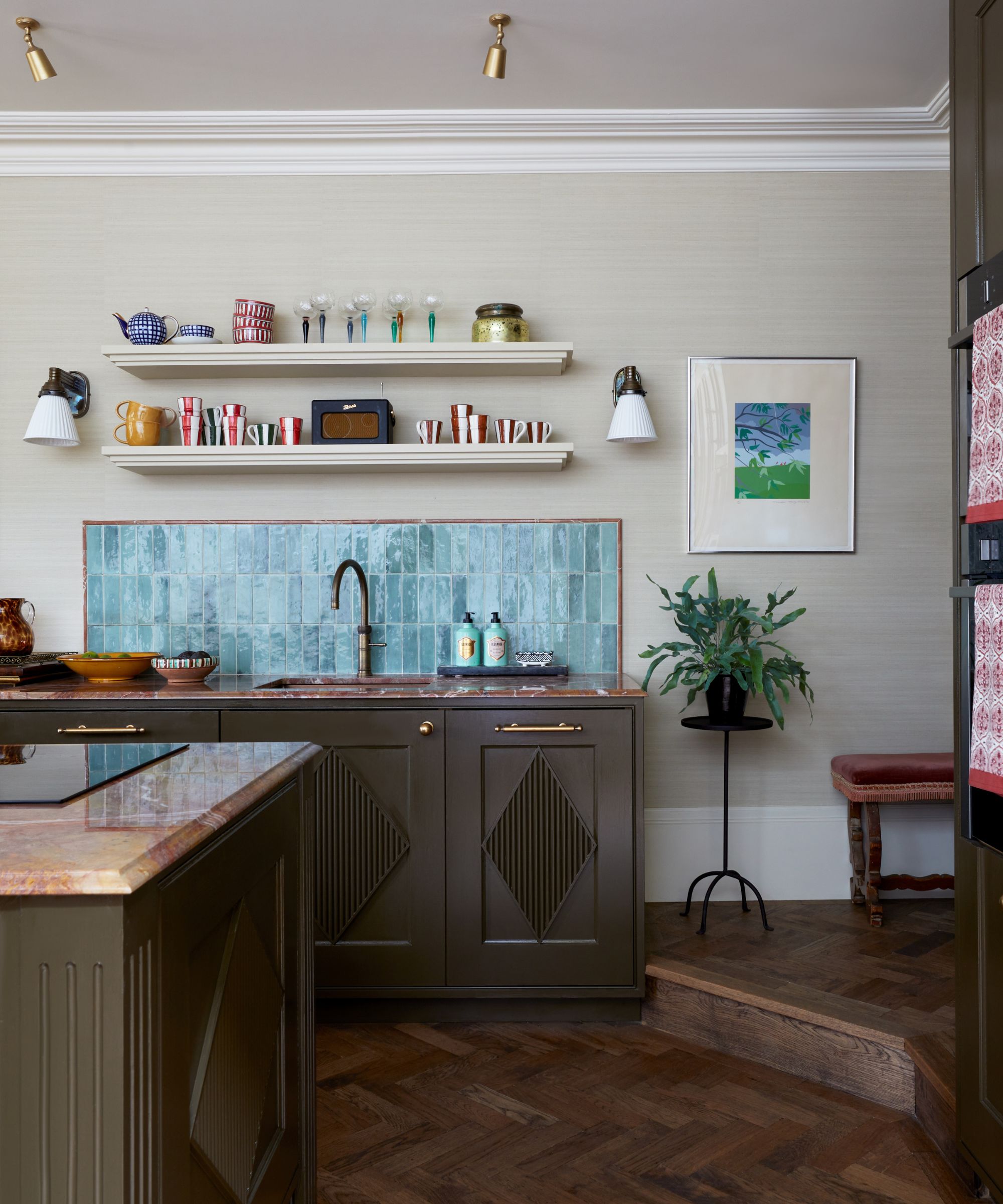
The kitchen cabinets are in Bronze by Paint & Paper Library, which is a lively brown with hints of green, and the blue-green tiles and red striped stools take things in a more contemporary direction that breaks up the grandness. The diamond motif on the doors was inspired by the wallpaper in the main bedroom and has a slight Gustavian/Swedish air that supports the free-standing furniture theme.

Getting everything in without compromising the flow was my biggest challenge – I must have measured up 5,000 times, but it’s probably the smaller details that make it a success. Like the splashback panel, which was framed with red marble beading strips, found on a late-night eBay trawl, that exactly match the worktops. The owner’s trust in me made everything much easier, though. She still sends photos when entertaining her family, excited with how well it all works, which is really rewarding.
Shop the look
To match the style of Laura Stephens' London kitchen, combine dark olive green furniture with blue gloss tiling, finishing with plenty of characterful wooden elements. Pale green painted walls will keep the scheme looking light and fresh, and to ensure the space feels cozy, try adding table lights and upholstered furniture.
Colorful glass and artwork are essential for keeping the look playful. If you don't have a marble countertop but want to introduce the sophisticated material, a side table is a hassle-free way.
These delightful colorful wine glasses designed by Sophie Lou Jacobsen are a great way to add charm. Store on open shelves or in a glass-fronted cabinet to make the most of the color pop.
Introducing a glazed ceramic tile in a vibrant color is a great way to introduce texture and color into a kitchen, as well as being a durable and practical solution.
Table lamps in a kitchen will make it feel more homely. Pooky have a wide range, like their classic Empire shade which is elegant and comes in a vast selection of prints.
This printed artwork by May Watson for Paper Collective is an affordable way to welcome a splash of color and interest into your kitchen.
This hand-painted solid pine cabinet is a great way to introduce a touch of heritage style to your kitchen whilst providing useful extra storage.
Introduce personality into your kitchen with these beautiful sponge-painted bowls.
An upholstered bar stool is a sophisticated addition to a breakfast bar. The simple style is made with a kiln-dried solid hardwood frame.


