Selecting a color scheme for a room is an art form. The process should involve balancing colors, giving a specific weighting to each, and not overwhelming the space with more than three strong hues. It's a tricky art to master, but one that has been perfected in this home in the Gowanus neighborhood of Brooklyn.
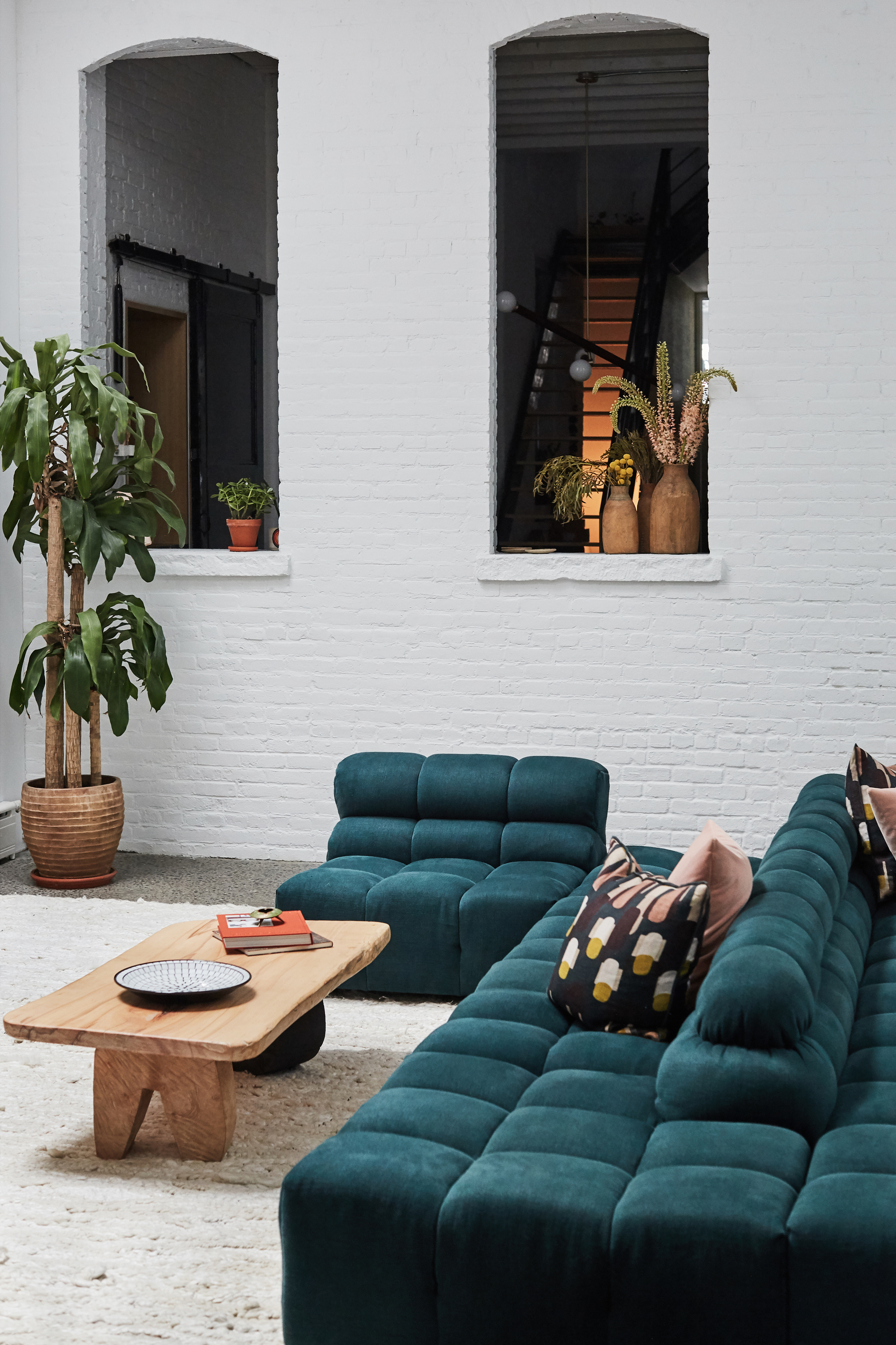
Under the leadership of Jenna Chused of Chused & Co, this three-story loft - once a thriving ink and print factory - has been turned into a beautiful modern home where white brick walls give both the furniture and decor a starring role in bringing a cohesive color palette together with burnt orange and green pops.
'The style the family wanted was a soft, colorful modern interior with unique pieces,' says Jenna. It got me thinking about how I use color in my living room, and the weighting of color that comes from big ticket items like the sofa, a rug and the walls. Looking at my living room through this lens helped me spot colors that didn't work and made me see clearly the main colors and how to complement them. We speak to the designer to find out how she achieved this in this home.
Selecting the colors

Interior designer Jenna Chused began the living room color process starting with the white walls as a blank canvas, then adding a darker saturated color and pulling in a complementary color. 'I started with a deep, dark saturated color because I like the contrast against the white,' says Jenna. 'Then I used complementary colors to develop the space and bring it to life.'
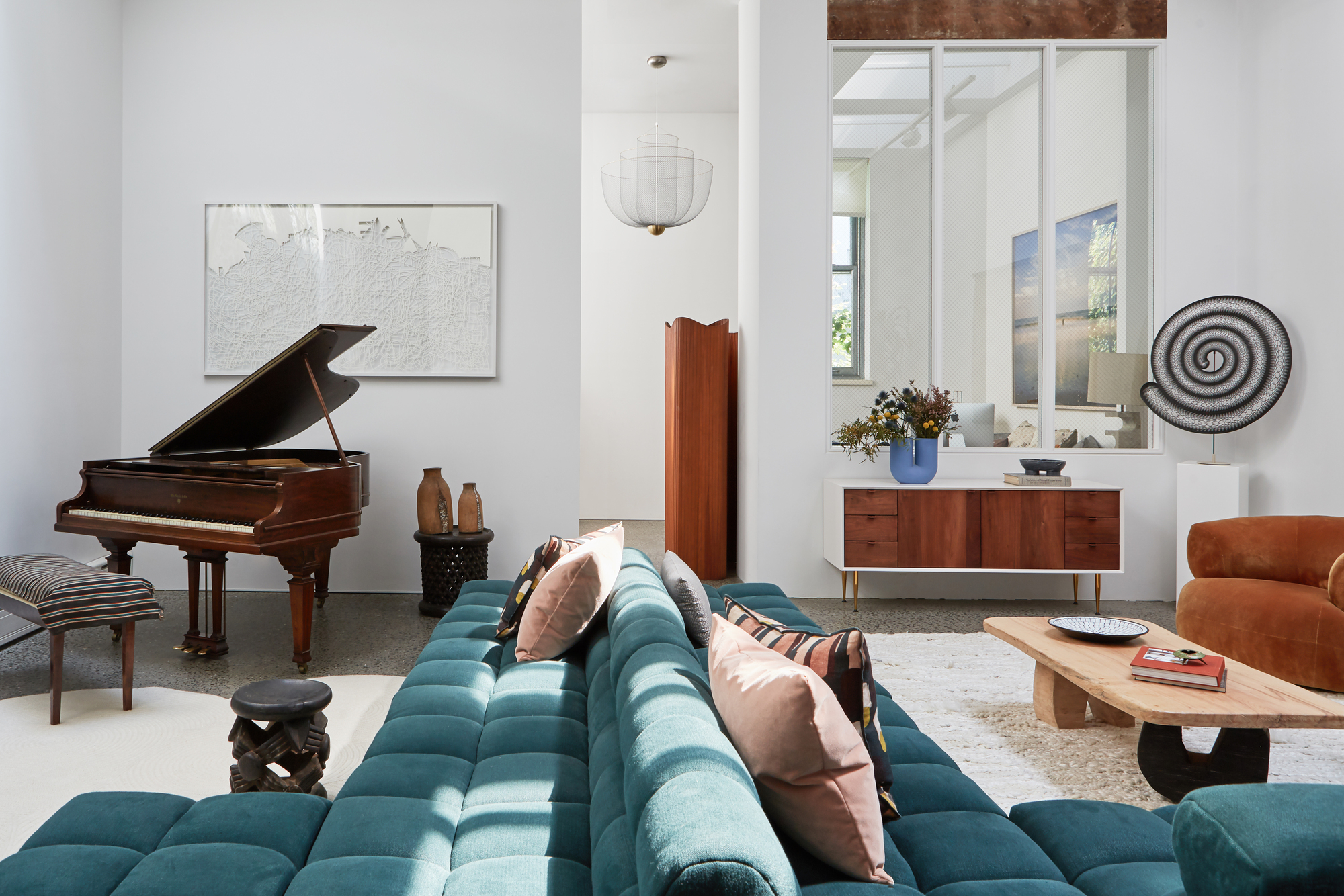
'It started with this amazing green woven fabric for the sofa by Rogers and Goffigon,' explains Jenna. 'I then found the deep copper velvet and loved it against the dark green so we put that on the Moving Mountain chairs.'
'Finally, I was at a trade show and saw the table that is between the chairs and it was in an almost verdigris finish but made out of concrete. I fell in love with it and took a chance to throw it in.
'I absolutely love the color mix it created in that room and the living room is my favorite room in the house.'
For Jenna, it's not a science and a rule she adheres to like the 60-30-10 rule, but about picking three shades and getting the balance right. 'The colors should blend harmoniously. When I use color, I don't want visitors to come in and think these interiors are so colorful - I would rather someone feel the warmth or the space and not notice the individual colors as much as the blend and harmony of them.'
The sofa as an anchor

In the living room, tall white walls and the square shape bring an industrial quality to the space. To create coziness, Jenna divided up the space by designing a snaking living room sofa that runs its way through the living room.
'The living room shape was a large square,' explains Jenna. 'It was too generous for one seating area, but not quite large enough for two.
A baby grand piano also needed to fit into the layout so I designed a couch that would sit in the center of the room and be open on either side, creating two separate seating areas.
This creates seating facing the piano and seating in a typical living room set up on the other side. 'The clients love to entertain so it works perfectly for the space.'
Bringing in color through textiles

For Jenna, it's texture and textiles that are the best vehicles to bring color. 'By using color in fabric versus walls, the feeling is not as domineering. I was a textile science major in college and then was in fashion for 10 years before falling into interiors.'
'Textiles are very important to my style. I am drawn to deep rich colors and then marrying those with more acidic colors. The main gold is using complementary colors in different saturations in a room.'

Aside from textile and fabric, decor is another pillar of the home that brings in color. 'Decor is always the best part for me because I'm constantly traveling to flea markets collecting interesting art and objects.
'At the end of the project, before the photoshoot, I go in for a couple of days and fill in the spaces. The clients love this stage too because it finishes the space.'
The dining room

Another place where color is harmoniously balanced is the dining room. 'They are big entertainers so it's important that all the spaces have multiple purposes,' says Jenna. 'The dining table's shape can be just as comfortable for a family dinner as it is for a dinner party of 12.'
The color scheme shifts slightly from the living room, where bolder, more saturated colors are replaced with earthier browns and oranges, with a jet black that creates a sophisticated look.
The black heavy-duty door has an industrial interior design feel, but actually conceals a secret bar.


