I am a compulsive rearranger. I love to faff about my home, moving things around and creating displays that I think give my rooms character and charm – stylish clutter if you will. And a change in season gives me all the more reason to give these displays a refresh.
Somewhere that gets a lot of my rearranging attention is the credenza in my living room. It's the perfect spot to get creative with books, ornaments, flowers and foliage, and it's an area that gets a lot of stage time, lots of people see that surface space so it's nice to change it about every now and then.
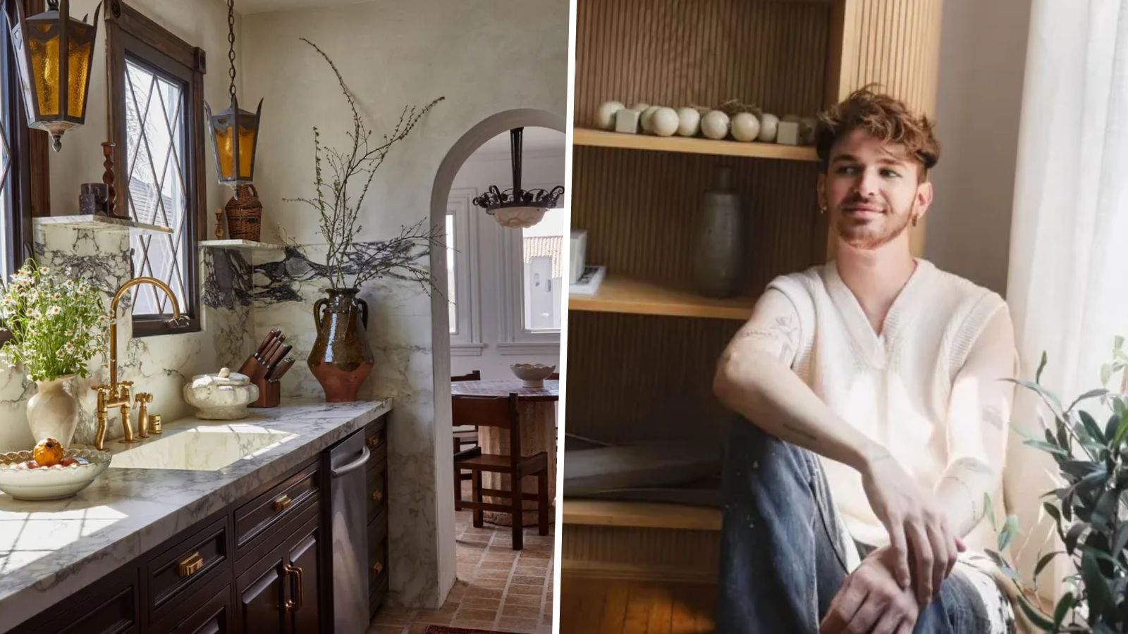
I was already feeling it was time to really lean into fall decor and change the display, but I just caught designer Drew Micheal Scott (a.k.a Lone Fox) doing exactly that in his own home. His video is filled with easy and impactful tips that I will definitely be using when I have a rearranging spree this weekend.
Drew kindly crammed a lot of styling tips into his 60-second video, so these are the lessons I am taking away to influence my own fall switch-ups. And these tips don't just apply to a credenza but are ones to bear in mind when switching out shelving, tables, kitchen islands, any surface you want to give an autumnal refresh.
Thrifted pieces are always better
We all knew this, but if you are looking for the easiest way to give your vignette character, no matter what the time of year, decorating with vintage is the way to go.
Drew starts his video by explaining, 'Today I want to share with you how I style my really large credenza in my living room for the fall time. The credenza itself is from Olive Ateliers, it's a vintage piece. And then the art, I actually found this at a flea market for $30, and then I framed it in some wood from the hardware store that I stained.'
Thrift stores and flea markets are perfect for finding small decor accents that are going to add interest and depth. The key to a good display is you don't want it to look too styled or too purposeful and characterful secondhand piece will always help with that.
Use foliage for texture
The first things to go on the credenza are the pots. Drew says 'The black I like. But I also really like this brown pot,' before choosing the latter. This here is a lesson in itself, brown is the new black. It's softer, less dominant but still grounds a display and adds those moody hues that are topping fall color trends right now.
Then it's onto the foliage. 'I actually saved these dried leaves from last year. They are real but I think they are dyed at the Flower District,' explains Drew. He then moves the foliage slightly to the right, stating 'I am going to put it a little more against the white.'
Such a simple styling tip – you want to create some contrast. Having the darker foliage sat against that darker artwork meant it just got lost, there was no definition. That simple move meant you can see the organic shapes of the foliage.
For my displays, I will likely go foraging outside as the leaves are looking so beautiful right now. But Drew actually has a whole fall foliage page on his Amazon storefront, filled with longer-lasting ways to create the same look.
Height and repetition are musts
'I really like repetition in decor,' says Drew as he places down two matching candlesticks. If you are after a way to ensure your displays always look cohesive, even if they are a bit chaotic, repetition is the way to do it.
Candlesticks are a good option as they also add height and a bit of structure too, somewhere for the eye to focus. Which is Drew's next piece of advice – height variation – always key to a good display.
Add pumpkins for an extra nod to fall
So we have the fall foliage, but we haven't got really seasonal just yet. Drew has an adorable wooden ghost ornament from Home Goods which he adds to the display, but for me, the perfect nod to fall comes in the form of pumpkins, as Drew points out they just finish off the look.
I like the un-uniform look of decorating with real pumpkins, but this year I have seen so many great faux options that are ideal to get out year after year. Again Drew has shared plenty of options on his storefront. Group different sizes and shapes together for more impact and then I like to dot a couple of really tiny pumpkins throughout the rest of the display to tie the look together.


