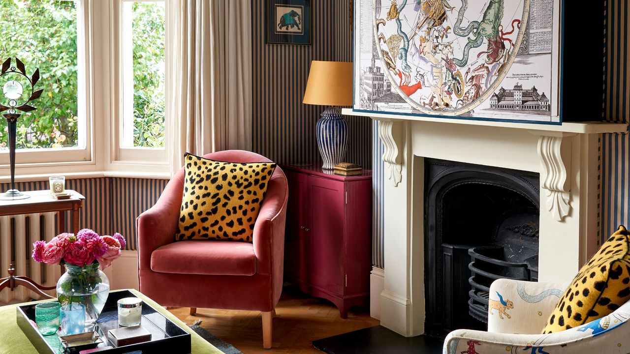
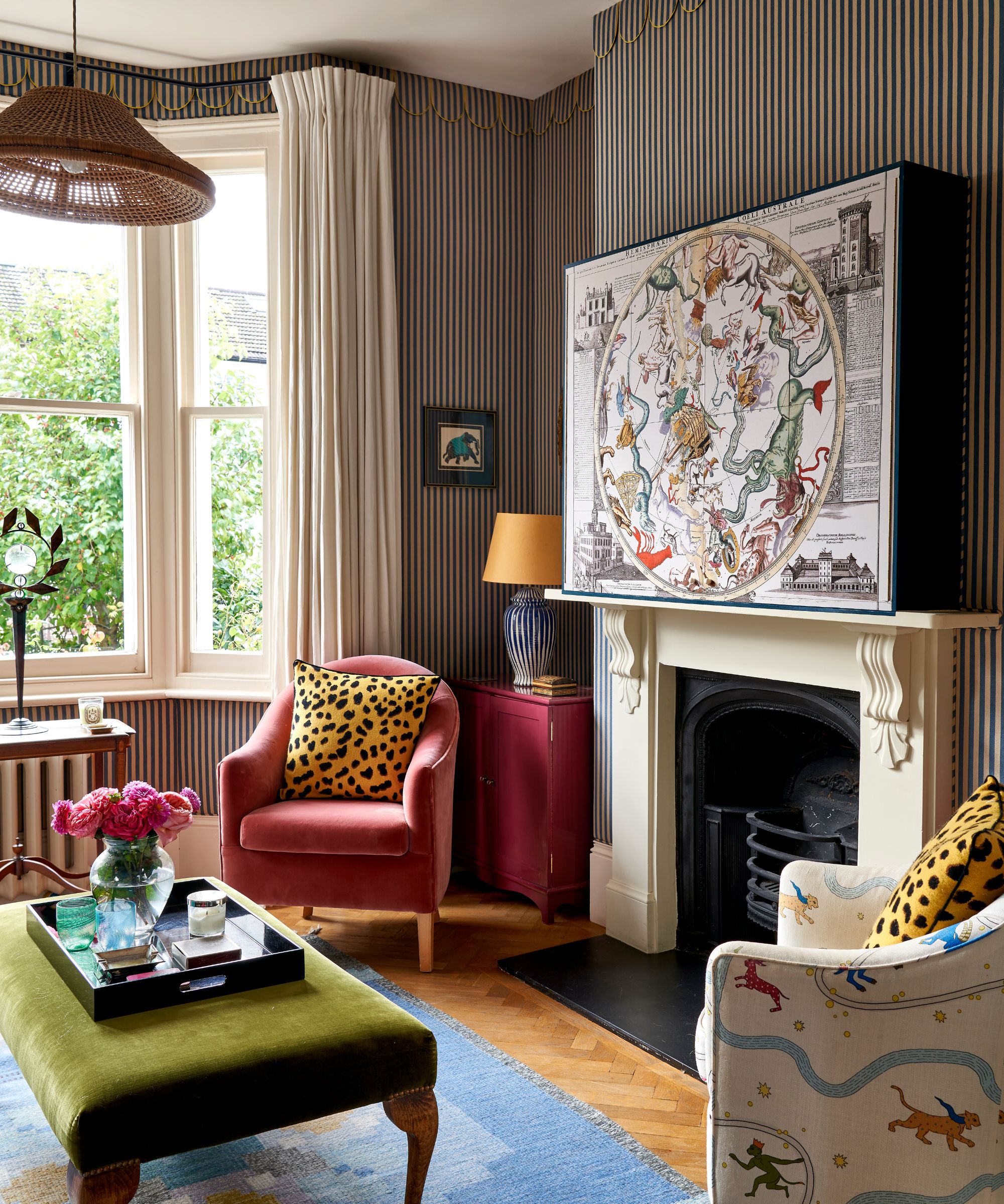
At first glance, this West London living room feels like a maximalist fever dream – stripes climbing the walls, layered prints, color at every turn. And yet, it manages to read as calm, cohesive, even restful.
Designed by Phoebe Hollond of Studio Hollond for her own home as a snug for both entertaining and everyday family life, it proves a small living room can absolutely take more, not less. As Phoebe puts it, 'I always want a space to feel joyful and lived-in rather than overly polished.'
From the anchoring sofa that everything orbits around, to the balanced mix of scale, color palette, and cleverly concealed tech, this is maximalism at its most livable. Here, Phoebe breaks down the design DNA behind it – and how to use the same secret sauce at home.
The Formula That Keeps It Cohesive
The mix of patterns here may feel spontaneous – stripes on the walls, bold upholstery, statement art, and scattered prints through cushions and accents. But look closer, and there’s a curation at play.
'I think it’s best not to shy away from color or pattern in a small room. Instead, make it feel layered and immersive, with lots of personality. This room is filled with pieces I’ve collected over the years, giving the room a sense of history and character,' says Phoebe.
'I rarely follow strict rules when it comes to mixing patterns, I think the most interesting combinations happen quite instinctively,' Phoebe explains. 'That said, it does help when colors repeat across different fabrics, and when the patterns vary in scale. Mixing large stripes with smaller prints keeps things feeling balanced rather than overwhelming.'
The room combines one dominant pattern (the sofa), one structured pattern (the vertical stripe), and a handful of smaller, more decorative prints layered on top. 'In this room, the striped walls and the sofa provide a framework, which means the smaller details like cushions, lamps, and artwork can introduce color without the space feeling chaotic,' she notes.
A Patterned Sofa Sets the Pace
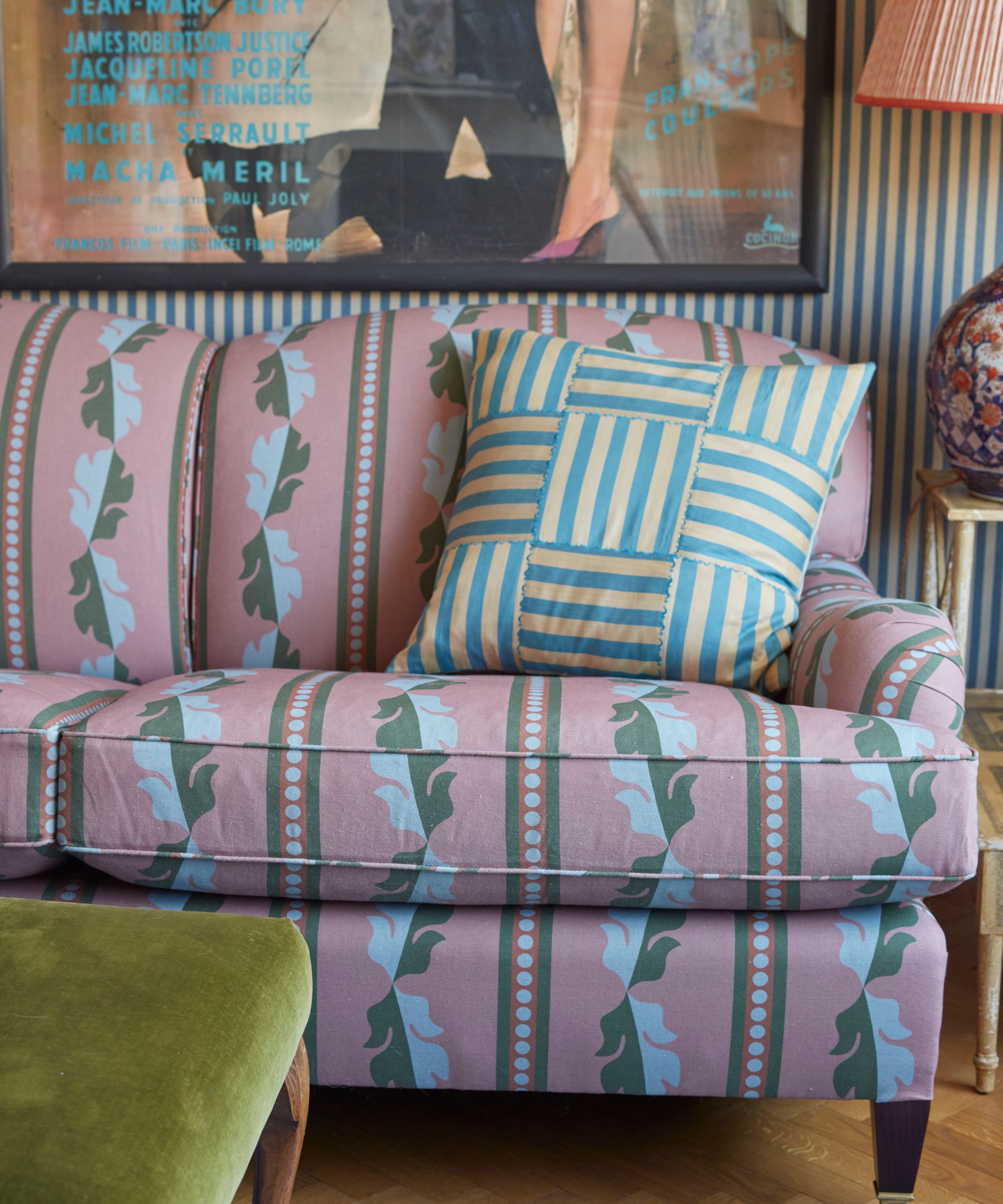
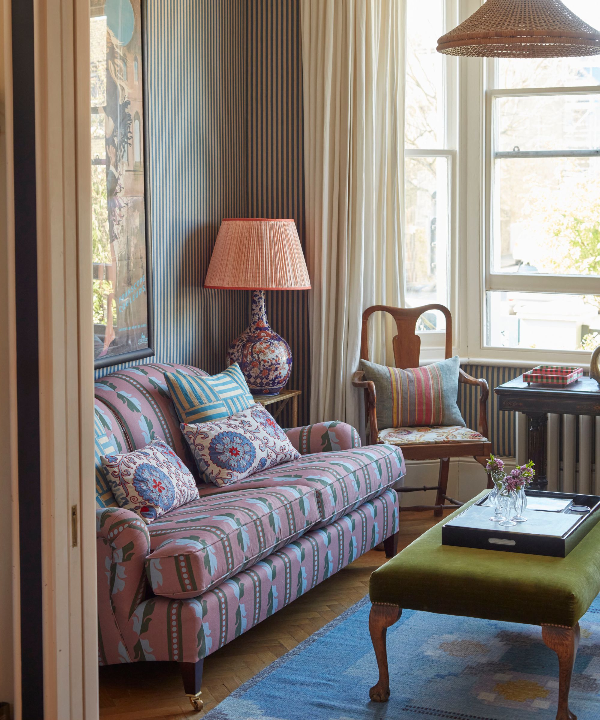
Every well-designed room has a focal point, and here, it’s the patterned sofa. A classic shape, it was reupholstered in Studio Hollond’s first fabric, Duchessina – a lively pink and green pattern that immediately draws the eye. 'Reupholstering it completely transformed the room. Once that fabric went on, the scheme really came to life.'
As Phoebe explains, 'Although the room is quite layered with pattern and color, the pink really draws your eye in. I love how everything in the room seems to orbit around it.'
'This is our main living room/snug, so I wanted it to feel super comfy, while still showcasing Studio Hollond’s eccentric flair,' she adds.'It has multiple functions: for entertaining friends or curling up with family- both were equally important.'
The takeaway? When designing a bold yet bijoux space, start with one dominant piece and let it lead. Whether it’s a patterned sofa, a rug, or even statement drapes, choose something that combines your key colors and sets the mood. Then, pull two or three shades from it and repeat them across the room.
Contrast in Scale is What Makes it Feel Spacious
The layout is what allows the room to breathe. Despite the snug footprint, nothing here feels crowded – and that comes down to a carefully judged mix of scale.
The generous, deep sofa is balanced by more petite armchairs and a leggy ottoman, creating a small living room layout composition that feels welcoming rather than heavy.
'The layout is everything,' says Phoebe. 'You need to establish early on how the room will function – in our case, it needed to work for entertaining as well as cosy movie nights with the family. In a smaller room, every piece of furniture has to earn its place, so scale becomes really important.'
'What works well in this snug is the contrast in scale,' she explains. 'The George Smith sofa is quite deep and generous, while the surrounding armchairs are much more petite. The ottoman and chairs all have visible legs, which allows you to see through them and keeps the room feeling lighter and less cluttered.'
To recreate the effect, avoid the common small-space pitfall of choosing furniture that’s all similarly bulky and consider furniture with exposed legs to keep sightlines open. Be disciplined about spacing, too; even a few inches between pieces can prevent the layout from feeling cramped.
Fabric-Wrapped Walls Softens the Scheme
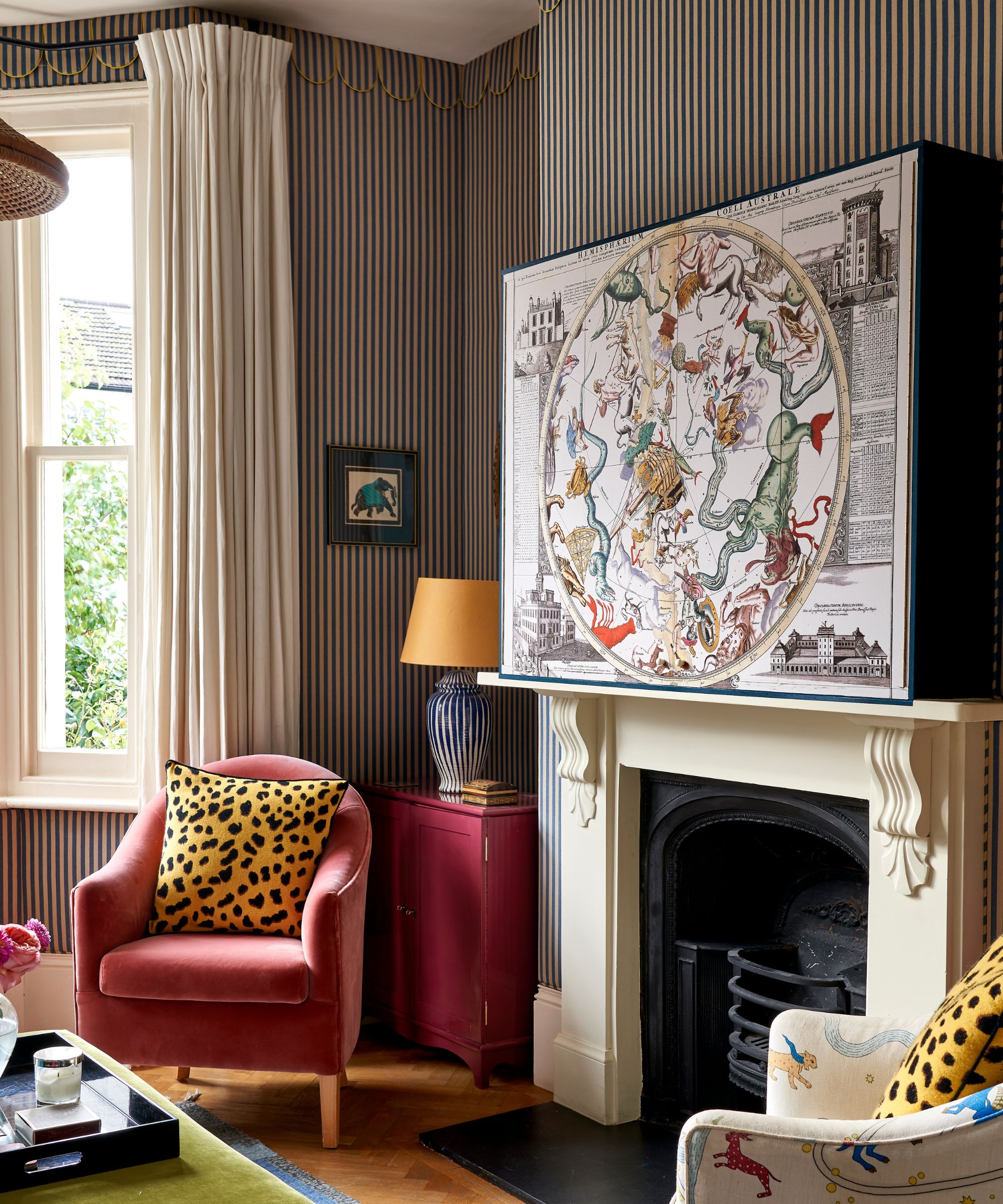
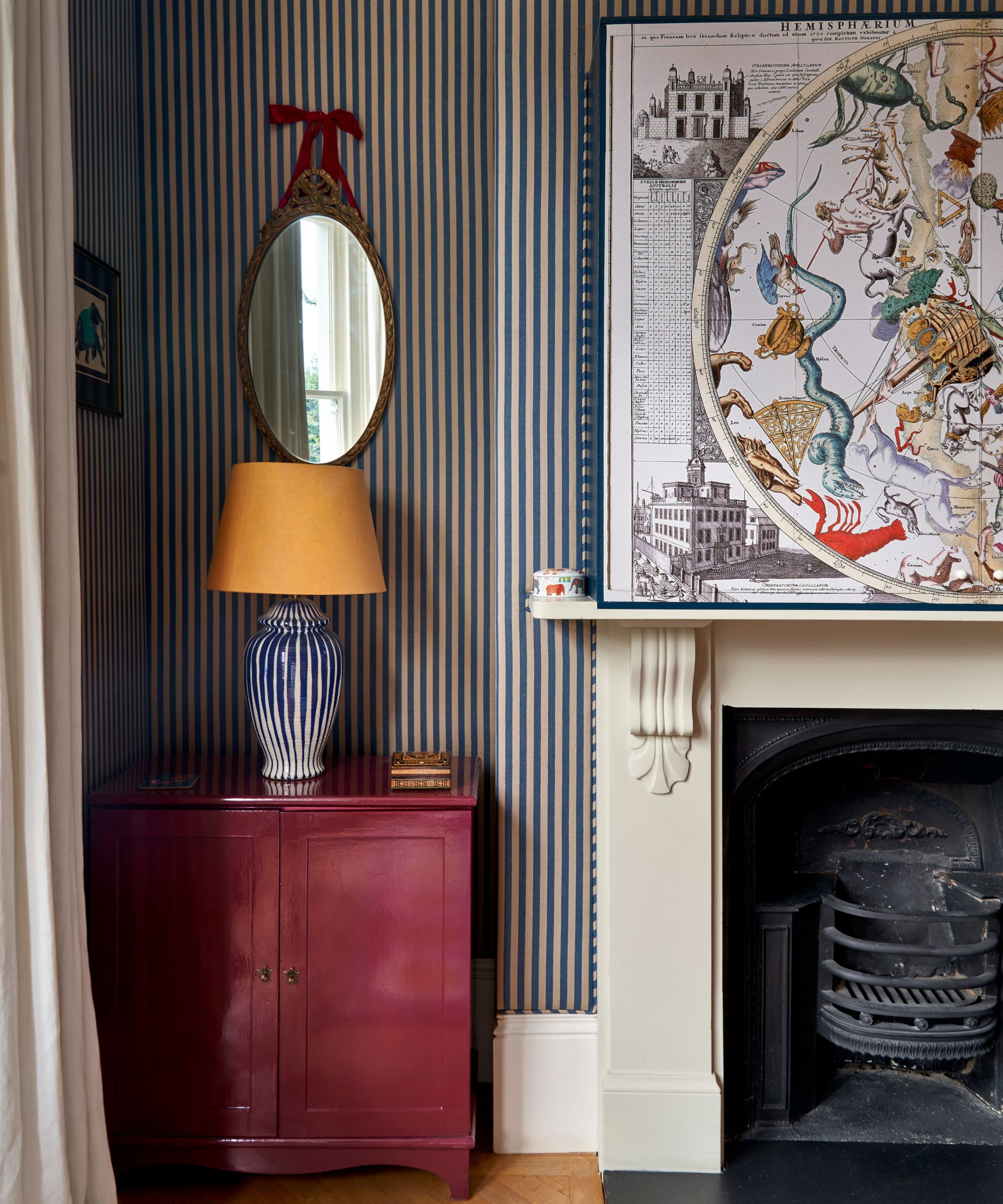
While it might look like wallpaper, the striped walls are actually fully upholstered to create an immediately cocooning feeling.
'The walls are actually upholstered in fabric from Claremont, installed traditionally with battens and wadding, so they’re wonderfully padded – almost like the walls of a cushion,' Phoebe describes.
'It gives the room a softness and intimacy that you don’t get with standard wallpaper,' she adds. 'The scalloped trim adds a playful finishing touch and helps frame the room, almost like a piece of theatre set design. Altogether, it makes the space feel very cozy and almost tent-like, with the circus inspo.'
'The room needed to illustrate my love of star signs and the circus, so the striped fabric walling with the scallop top detailing and the astrology TV box brings that to life,' Phoebe adds of the vision.
'The upholstered stripe on the walls helps ground everything – its scale and slightly muted tones give the room a calm foundation for the brighter colors layered on top,' she adds.
The Final Trick That Protects the Room’s Focal Point
In a room built on layering and atmosphere, a black screen can quickly undo the effect. If you're wondering how to hide your TV stylishly, take a leaf out of Phoebe's book.
Here, the television is hidden behind artwork above the mantel, allowing it to disappear entirely when not in use. 'I think technology should support how a room is used, but it shouldn’t dominate the visual story,' she explains. 'Whenever possible, I like to conceal it within joinery or artwork so it blends into the room rather than becoming the focal point.'
With the TV concealed, the fireplace remains the natural focal point, and the eye is free to take in the patterns, textures, and details without interruption.
'A TV can really interrupt the atmosphere of a room, even though we all use them. Hiding it behind artwork above the mantel means it disappears when it’s not needed,' she advises.
Ultimately, this is a room that’s designed to feel 'playful, layered and cocooning,' but never chaotic. Its success lies in feeling collected rather than overly contrived. As Phoebe says, 'the most interesting spaces are layered with antiques, fabrics, art, and unexpected details that all tell a story.'
The Edit
If you’re following Phoebe’s approach, this is your starting point. A statement fabric like this does the heavy lifting, combining color, scale, and personality in one move. Use it on a sofa, ottoman, or even cushions, then pull out two or three shades and repeat them across the room.
This is exactly the kind of piece that balances a more dominant sofa. Its compact proportions and exposed legs keep sightlines open, helping a small room feel lighter and introducing some contrast to the scheme.
A smaller-scale print like this leopard print pillow is key to making pattern mixing feel chic, not kitsch. Layer it alongside stripes, florals, or bold plains throughout the room. It’s an easy way to add personality without tipping the balance.
Inspired by Phoebe's astrology piece, artwork is where you can lean into storytelling. Choose pieces that feel personal or slightly unexpected, and use them to soften more practical elements – or perhaps help to hide an unsightly piece of tech.
A vertical stripe like the Kirby wallpaper from Lulu and Georgia helps structure a busy scheme, acting as a calm backdrop that grounds everything else. In a small living room, especially, wrapping the space in a cocooning wall treatment will make all items feel curated.
A leggy ottoman like this brings both function and lightness to the layout. It works as a coffee table, extra seating, or a place to rest your feet, while its visible legs prevent the room from feeling heavy. Style it with a tray for both practical and aesthetic purposes.
Design DNA is the Homes & Gardens series that breaks down beautiful rooms into their essential elements. Each installment dissects one interior and shows readers exactly what makes it work, from the anchor furniture and layout choices to color, lighting, and styling details.
Love beautiful design ideas, expert advice, and inspiring decor trends? Sign up for our newsletter and get the latest features delivered straight to your inbox.


.png?w=600)

