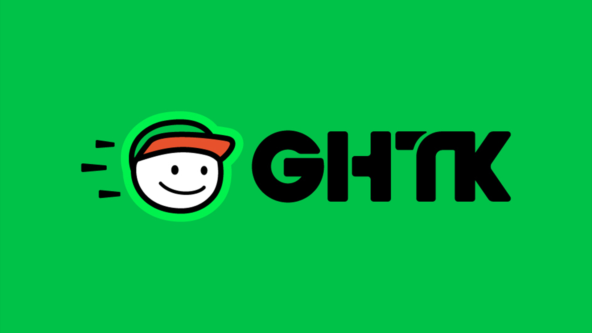
Delivery company GHTK has unveiled a delightfully playful rebrand to align with its ever-evolving position in the Vietnamese logistics sector. With a fresh brand strategy, new visual identity and an evolved customer experience, GHTK's rebrand isn't just an empty aesthetic makeover but a visualisation of the brand's innovative future.
As we've learnt from the best logos of all time, it takes a lot to stand out from the crowd, but GHTK's new identity is already a new classic. Expertly combining joyful imagery with modern design, it's a rebrand that propels GHTK into the future with a light and creative spirit.
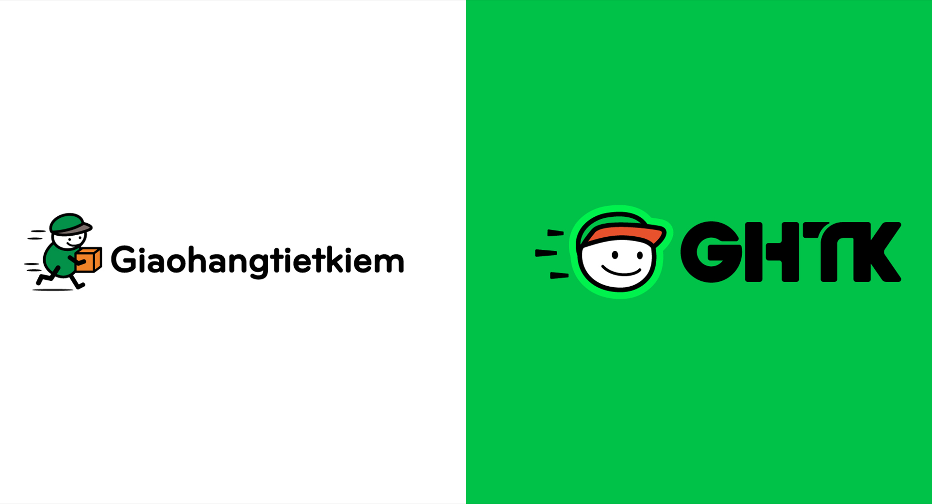
Partnering with branding studio M – N Associates, GHTK refined the key elements of its identity, beginning with the shortening of its name Giao Hàng Tiết Kiệm to GHTK. The snappier identity allowed the studio to experiment with logotypes, eventually settling on a sleek design inspired by a "motorcycle wheel, visual representations of narrow alleys on maps, and the rapidly evolving roadway transportation system," according to a press release.
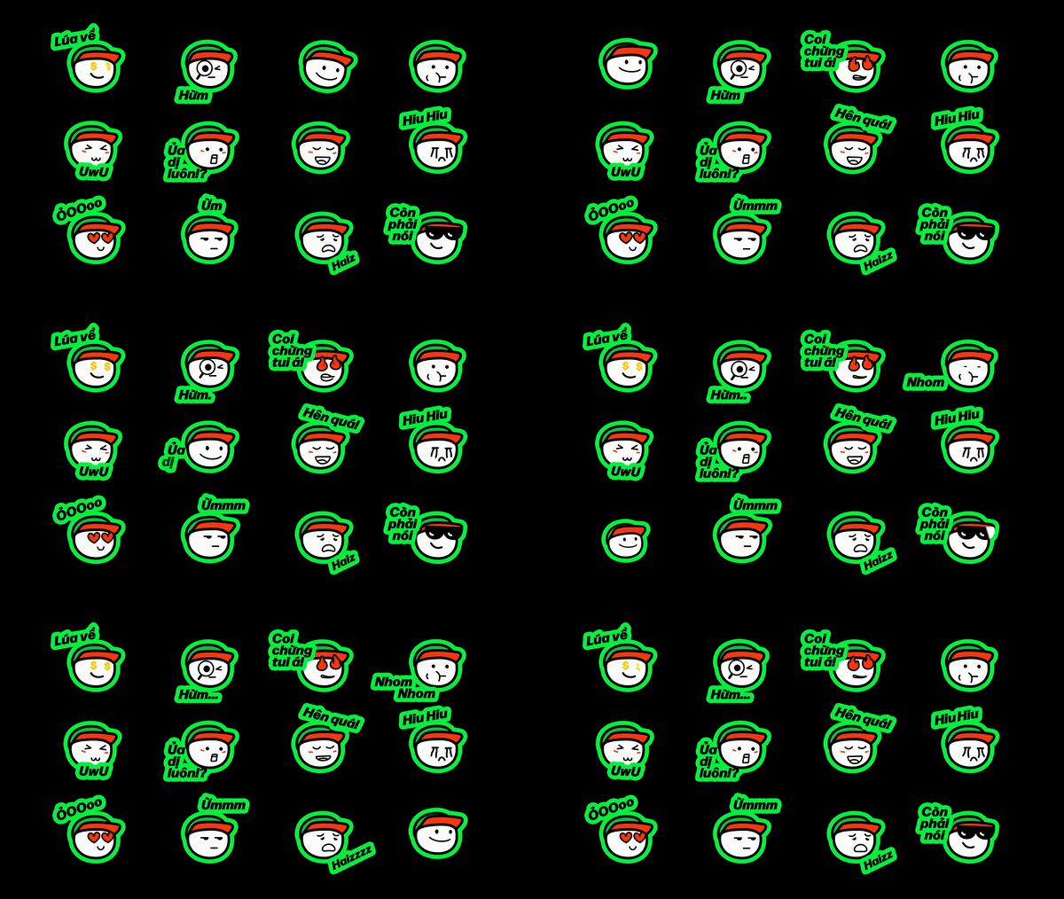
It's not all out with the old, as the rebrand preserves GHTK's beloved mascot, zooming in to capture its winning "Confident Smile". The new brand icon affirms the brand's trustworthy nature, creating a sense of joy and playfulness that transfers to the redesigned website and app. A host of custom animated emojis and a new user-centric interface give the rebrand a fun contemporary feel, revolutionising how customers interact with the brand.
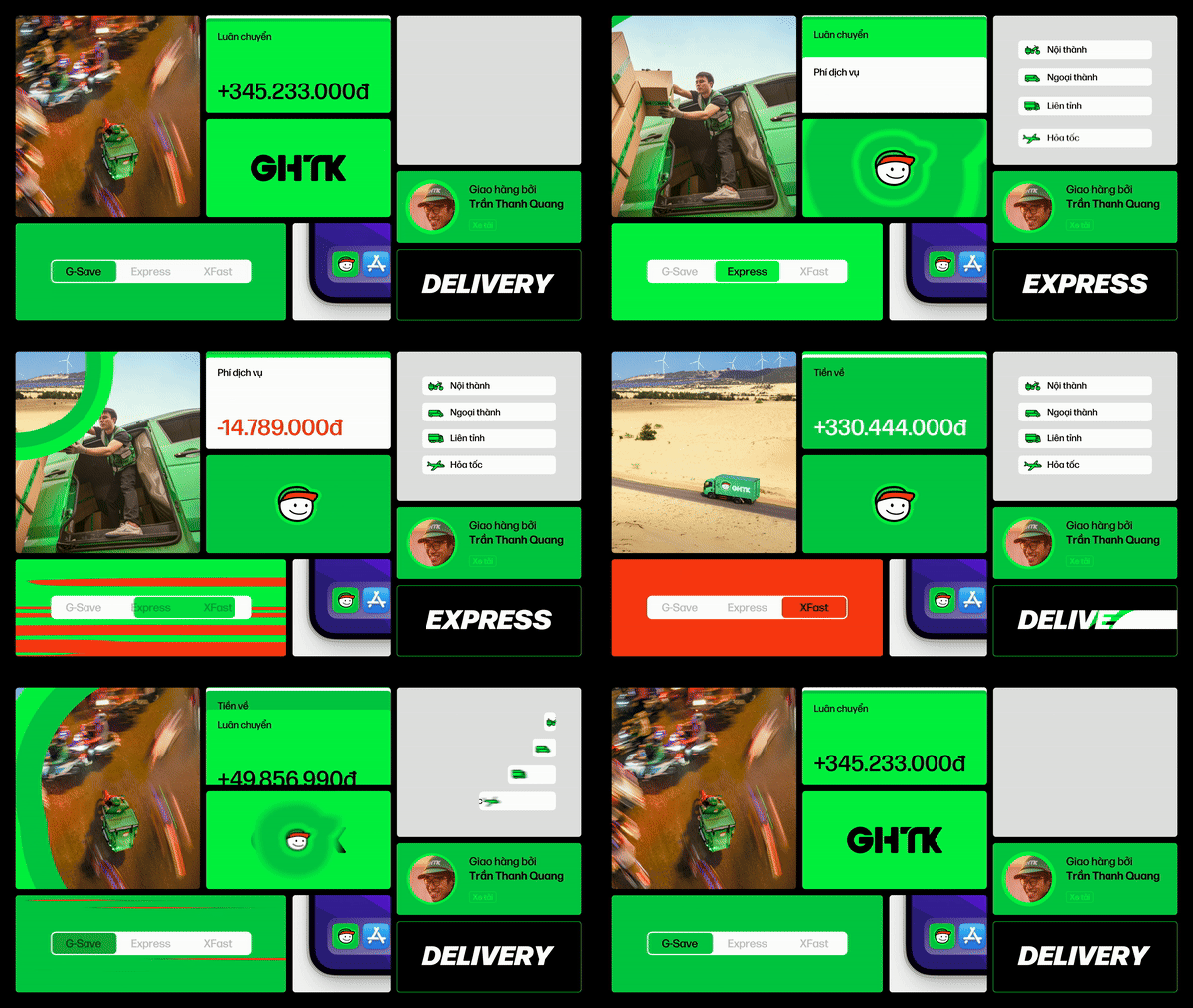

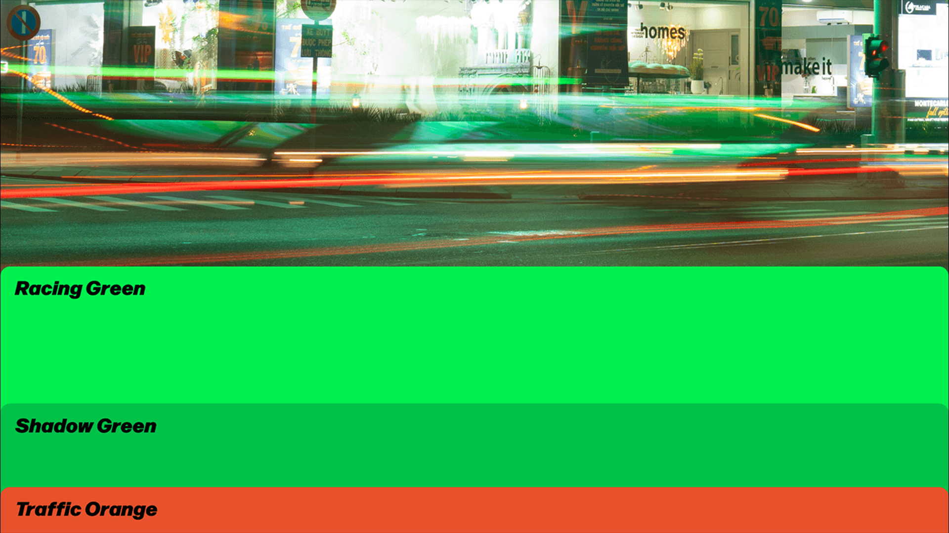
Central to the rebrand is a sense of motion, inspired by Vietnam's bustling traffic. Sound, speed and lighting form the key design principles of the new identity, which are reflected in the brand's new motion assets and colour scheme. "To showcase the beauty of Vietnam's lifestyle in an engaging and energetic manner," the typography motion animations give the rebrand an enriched liveliness and visual interactivity.
The new typeface is an italicised variant of DJR Forma font family. Its forward-slanted form gives the font a sense of momentum to represent GHTK's progression and innovation in the delivery sector. While "Racing Green" has always been the brand's key colour, the expanded palette integrates a deeper "Shadow Green" and introduces "Traffic Orange" – a fresh juxtaposition that commands attention in style.

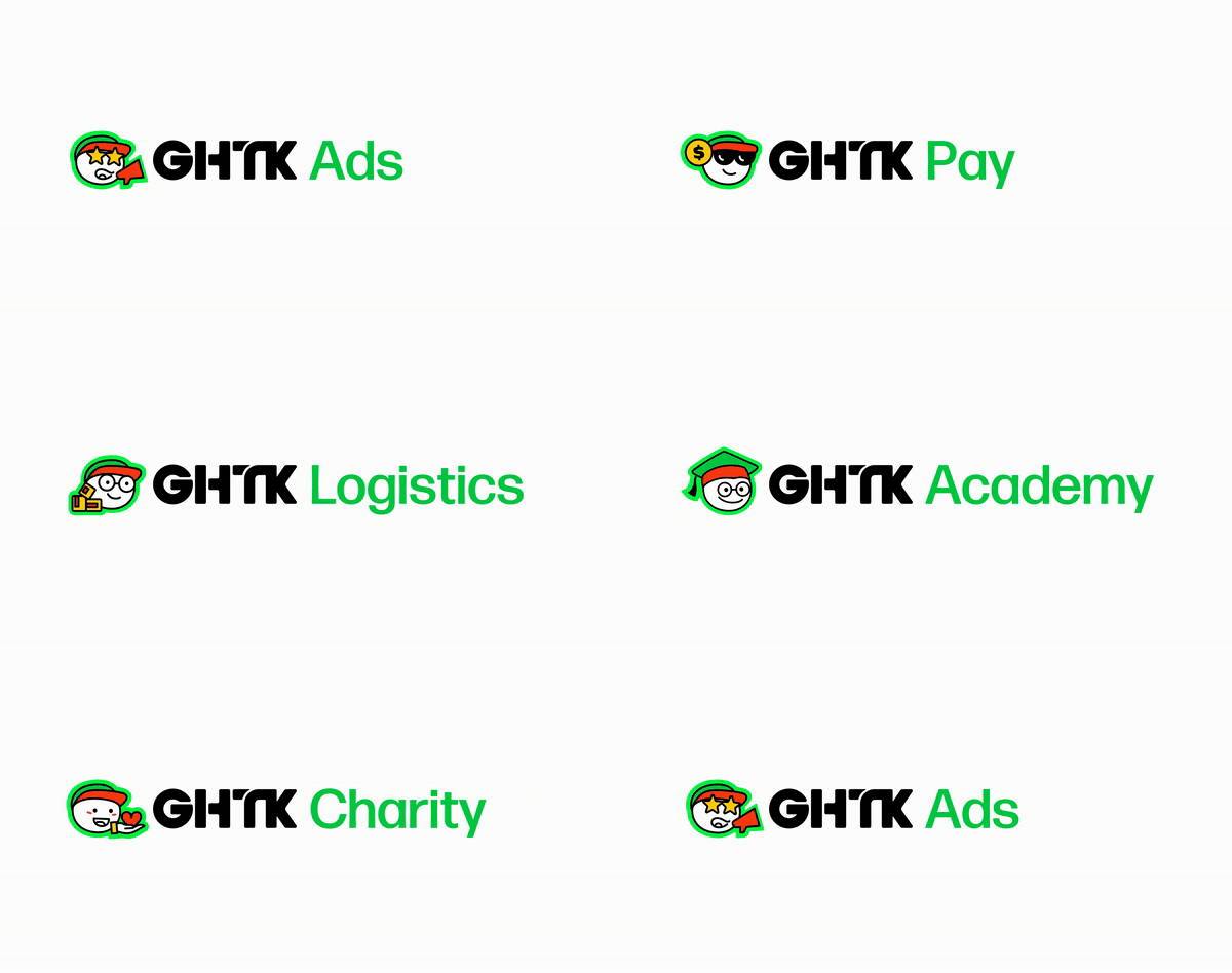
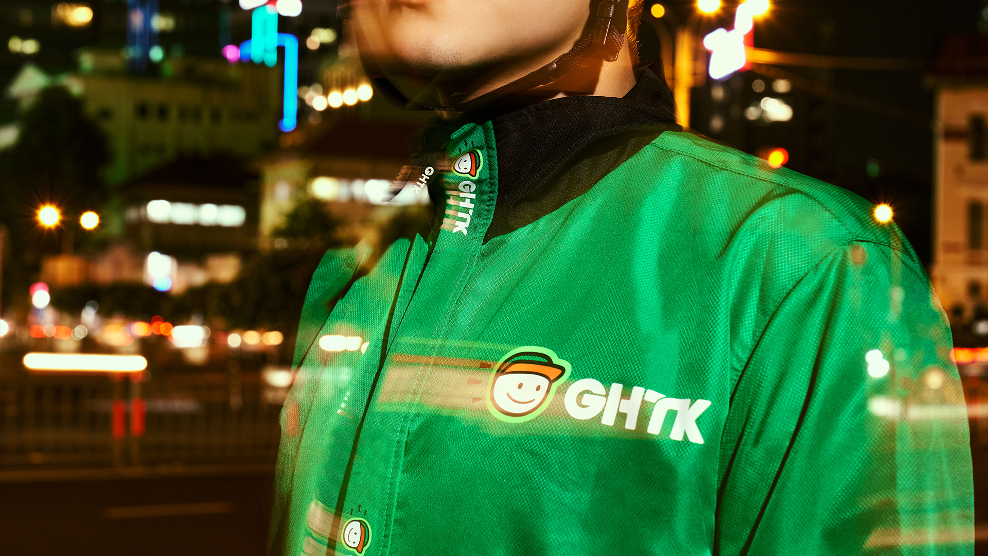
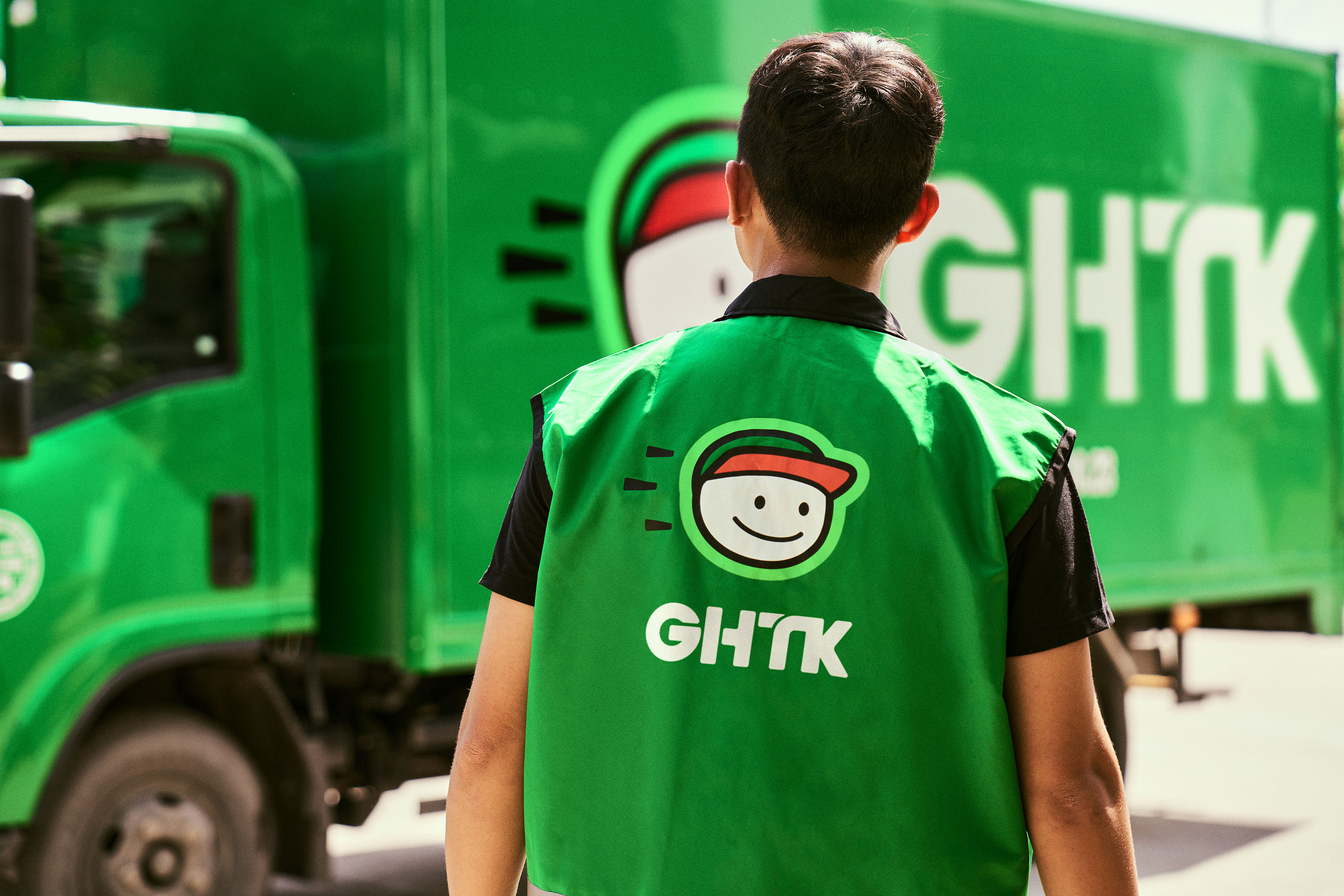
The stylish rebrand will be rolled out across GHTK's physical branding, from its delivery vehicles to its vivid new staff uniforms. While it's a fitting modern upgrade, the rebrand also leaves scope for the brand to expand, with the option to innovate and grow into other sectors under one strong and refined brand identity.
For more playful design, check out Go.Compare's mascot rebrand that gives Gio Compario a well-deserved makeover. If you're after some stunning design inspiration check out InnTravel's delightfully simple rebrand that gets back to nature.

