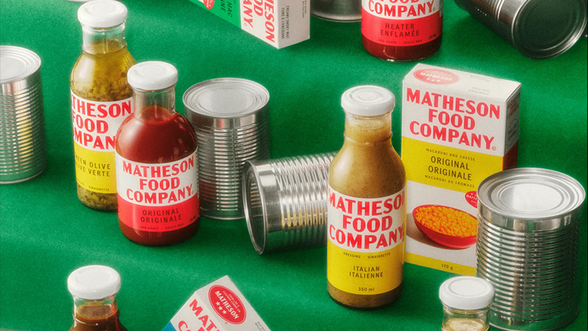
Legendary chef Matty Matheson is bringing a delightful dose of retro nostalgia to pantries across Canada, launching a host of new products from his brand Matheson Food Company. Inspired by the 1930s design aesthetic, Matty's stylish products are bringing a bold yet classy familiarity to the packaging world.
When we look back at adverts of the 1930s, there's a nostalgic appeal that's been somewhat disregarded in the sea of garishly bright design trends of recent times. While there are echoes of a retro revival in contemporary packaging design, Matheson Food Company embraces the aesthetic, bringing us simplicity, sophistication and effortless style.
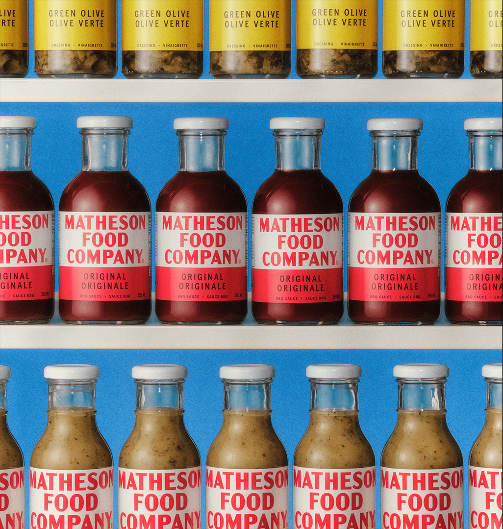
Working with design studio Wedge, Matty's vision was formed around the concept of "Bold. Punchy. Memorable. Flavor." According to Wedge, the initial inspiration for the packaging aesthetic came from Hereford Corned Beef, a timeless product Matty grew up eating.
Adopting a unique vintage aesthetic across his personal branding, the Matheson Food Company packaging design serves as an extension of Matty's identity. With bold primary colours, classic typography and a tasteful infusion of personality, the products are a delicious blend of classic design motifs and stripped-back style.
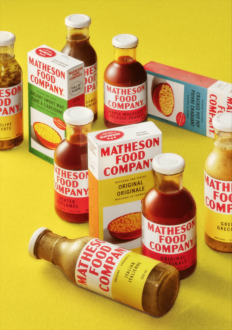
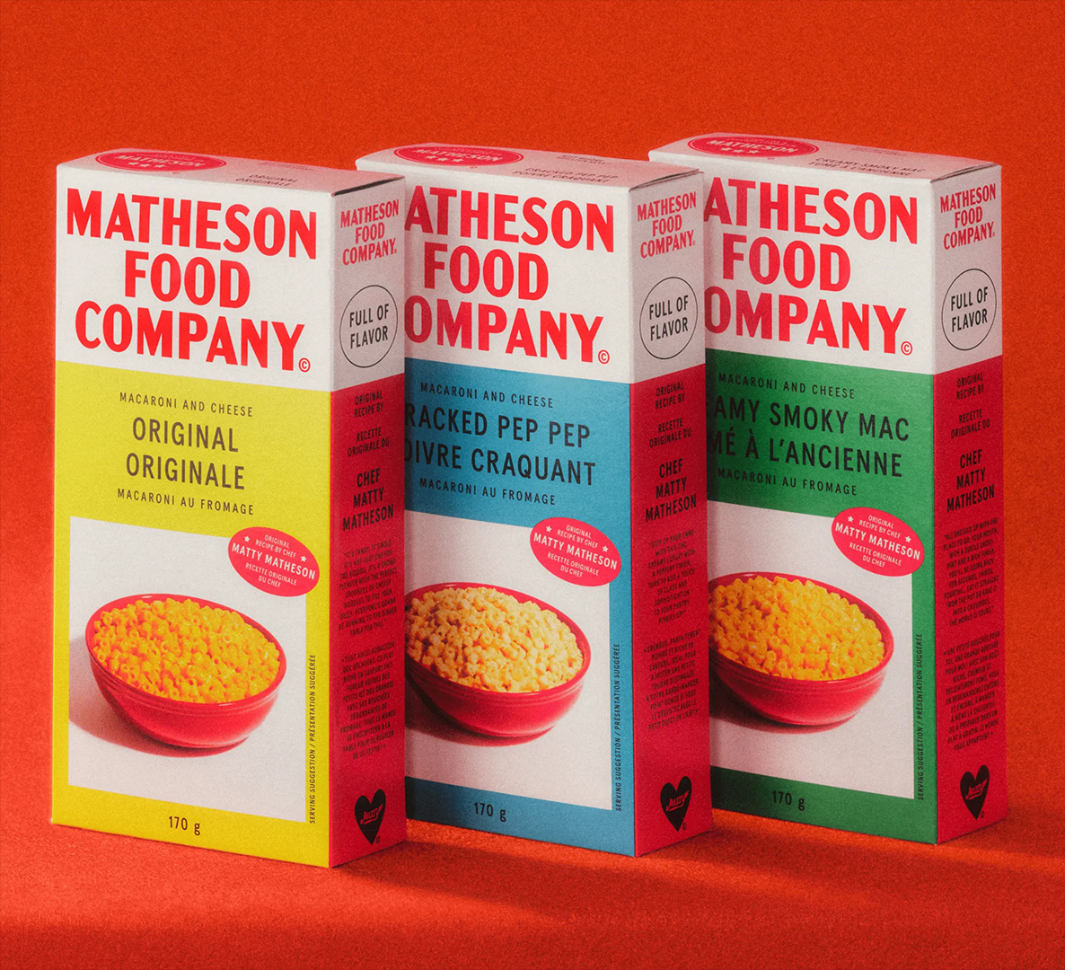

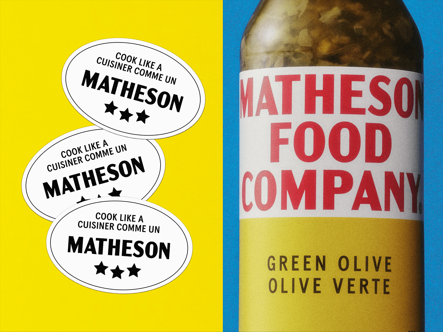
The new products include BBQ Sauces, Salad Dressings, and Mac n’ Cheese – food staples inspired by Matty's childhood memories. This sense of heritage and comforting personalisation gives the brand a wholesome appeal that effortlessly complements the packaging's retro aesthetic.
For more inspiration, check out our collection of the best standout packaging designs. If you missed it, take a look at Illustrator's new tool for packaging design that could be game-changing for designers.


.jpg?w=600)


