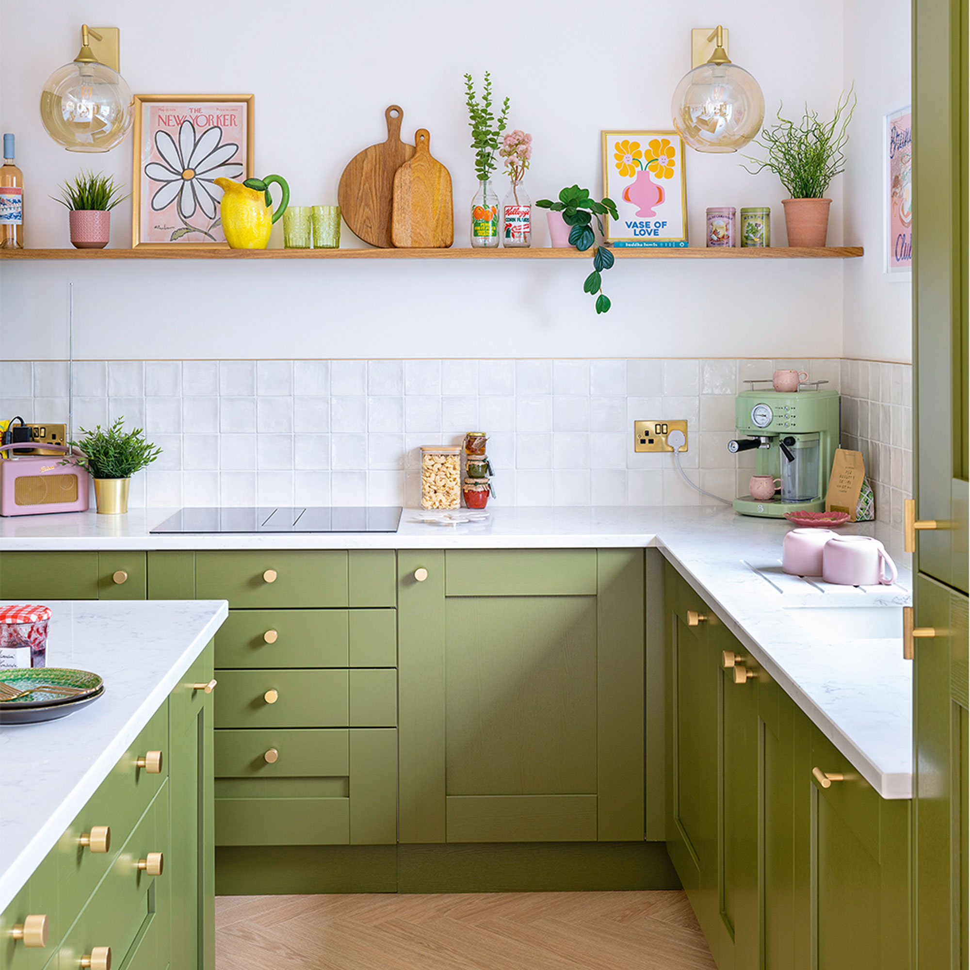
Moving into this three-bedroom detached 1960s bungalow on the outskirts of Brighton, these young homeowners were not at all impressed with the dilapidated and cramped kitchen, unused dining room and poky lean-to that was obstructing the view of the garden.
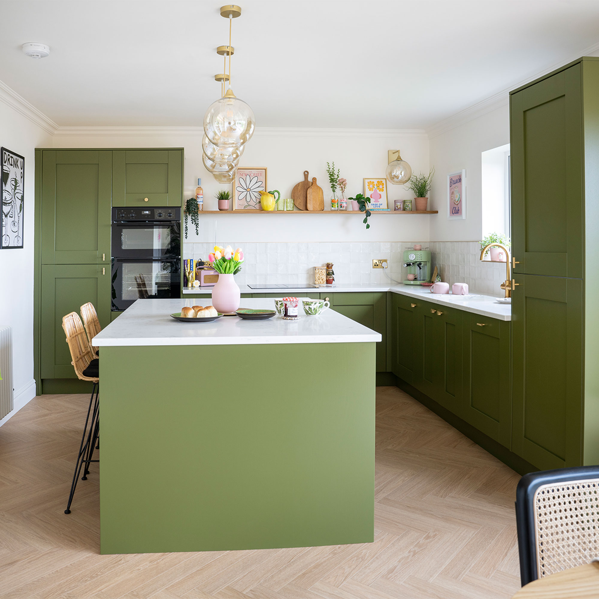
Reconfiguring the clunky kitchen layout was top of the list, with a plan to turn all three rooms into one large and spacious kitchen-diner, which would open onto the garden with its fabulous sea views.
The re-worked kitchen layout
‘We gave up a two-bedroom, finished flat to take on a tired bungalow where everything needed doing,’ says homeowner Ellie Rimmer, an NHS worker and content creator @sevenpalmtreehouse. ‘But we knew we’d have to go for a renovation job to get a bigger property.’
‘It ended up being an eight-month project in the end, where we removed most of the walls downstairs and converted the loft, but it was worth it. We couldn’t have lived there while the major work was going on but, luckily, we could stay with my nan round the corner and didn’t have to pay rent.’
The kitchen before
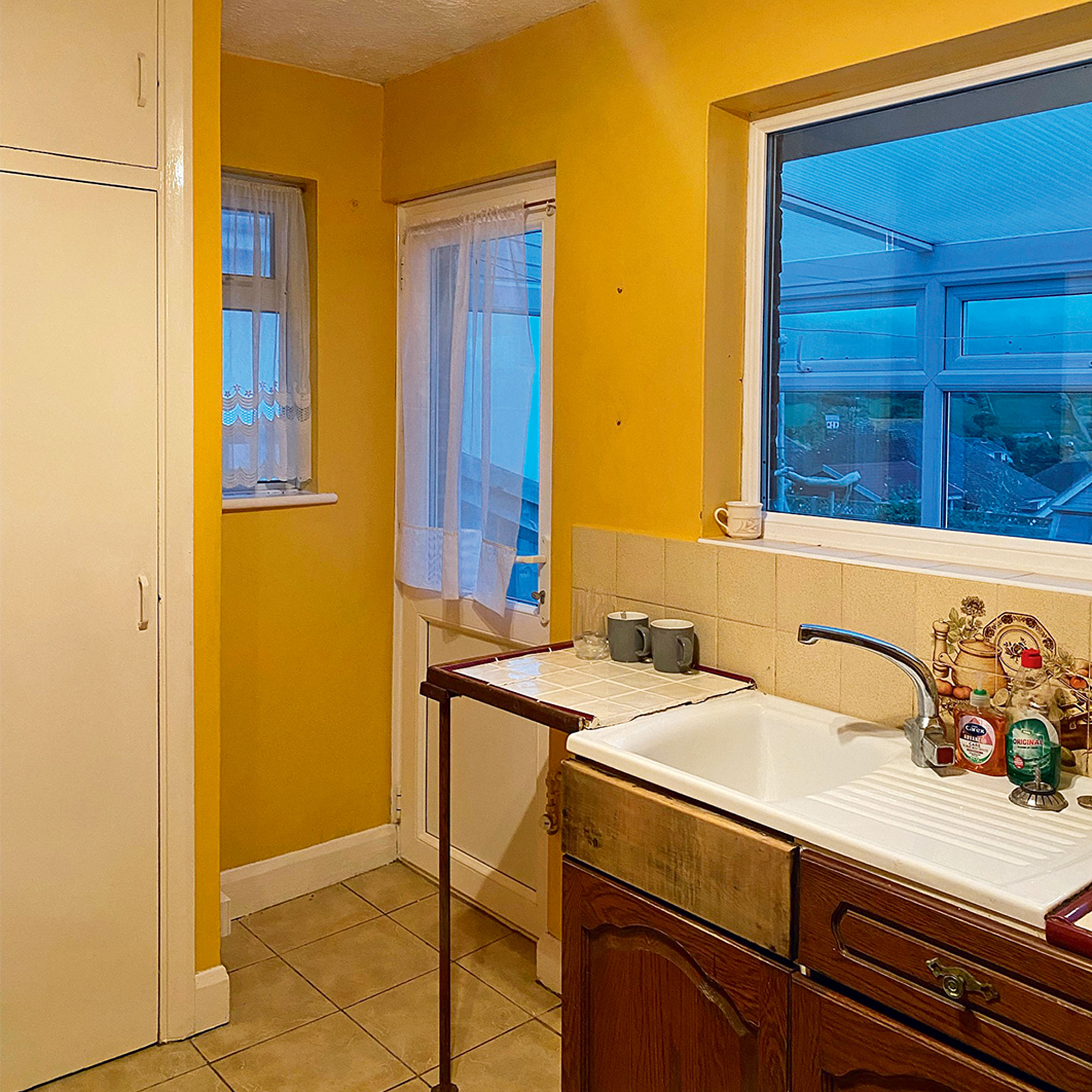
‘My partner James and I are a good team when it comes to a big project, as James is very handy at DIY and he trusts my judgement on décor and colour schemes. We both wanted a lovely big open-plan kitchen-diner as a top priority, where we could entertain people and still be able to see the sea.’
‘There was nothing worth keeping in the original kitchen and it was a tiny galley space, plus there was a horrible lean-to at the back, which had to go. It made sense to bring down some walls and incorporate the dining room as well, as this would give us enough room to have a proper kitchen and dining area where people weren’t squeezed in together.’
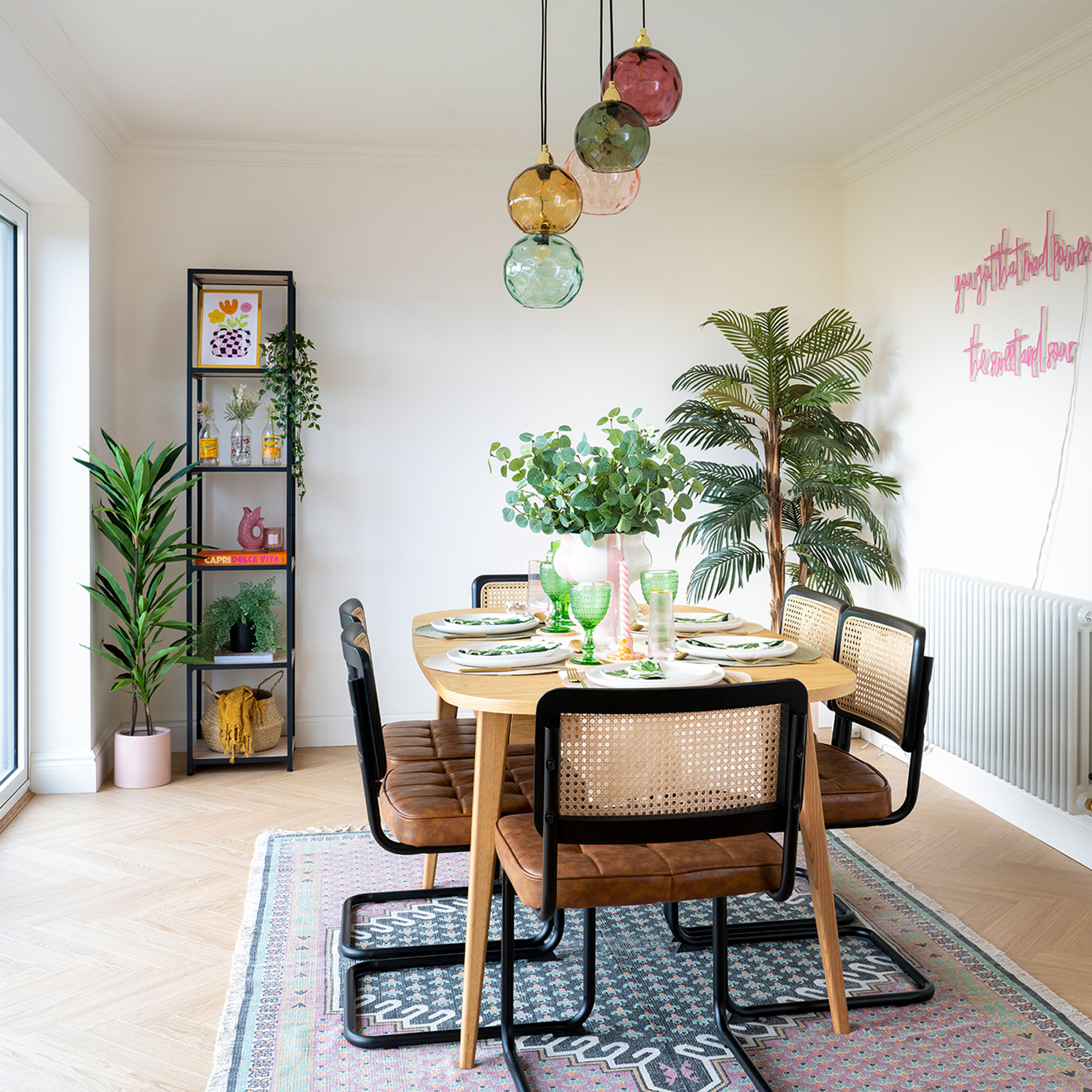
Dining area
‘The obvious shape for the room was a rectangle, which would allow us to make the most of the views and we’d already decided we wanted a green kitchen colour scheme with brass handles before we moved in. My favourite colours are green, pink and yellow and you’ll usually see some of all three in one of my schemes!’
‘Once we had our space all sorted and plastered, with the doors to the garden in, it made sense for the kitchen to be at the end with the window, and the dining space to be where we have the views of the sea and access to the garden.’
Smart green cabinets
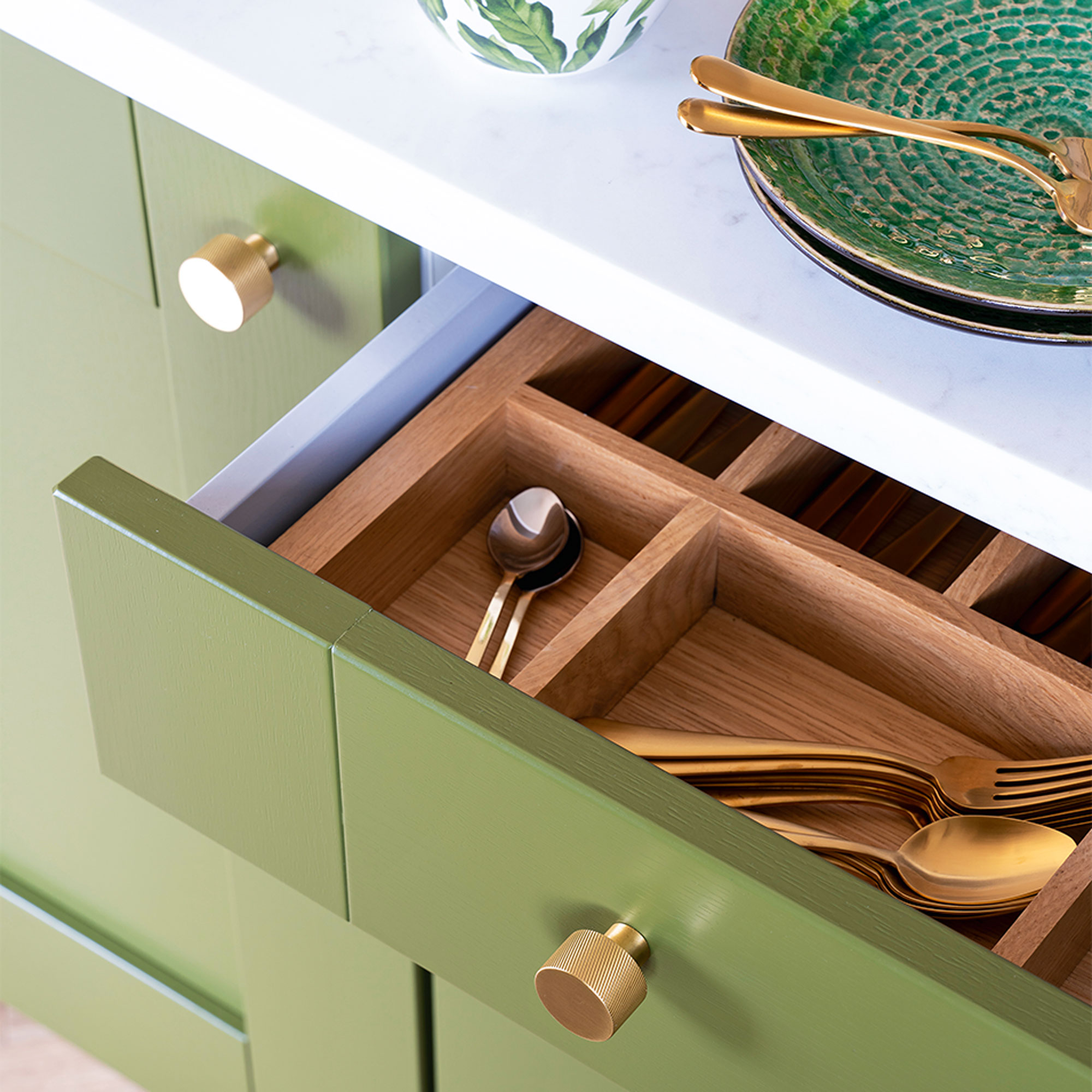
‘I was determined to go for a high-quality kitchen with an island at a low price, and I found online company DIY Kitchens. Their units are great quality, and they have a fantastic range of colours, but you have to do all the measurements yourself, which is a bit scary. I must have measured everything about a hundred times, but it all came together. I chose the brass knobs separately to give a luxury touch.’
Classic dining table and chairs
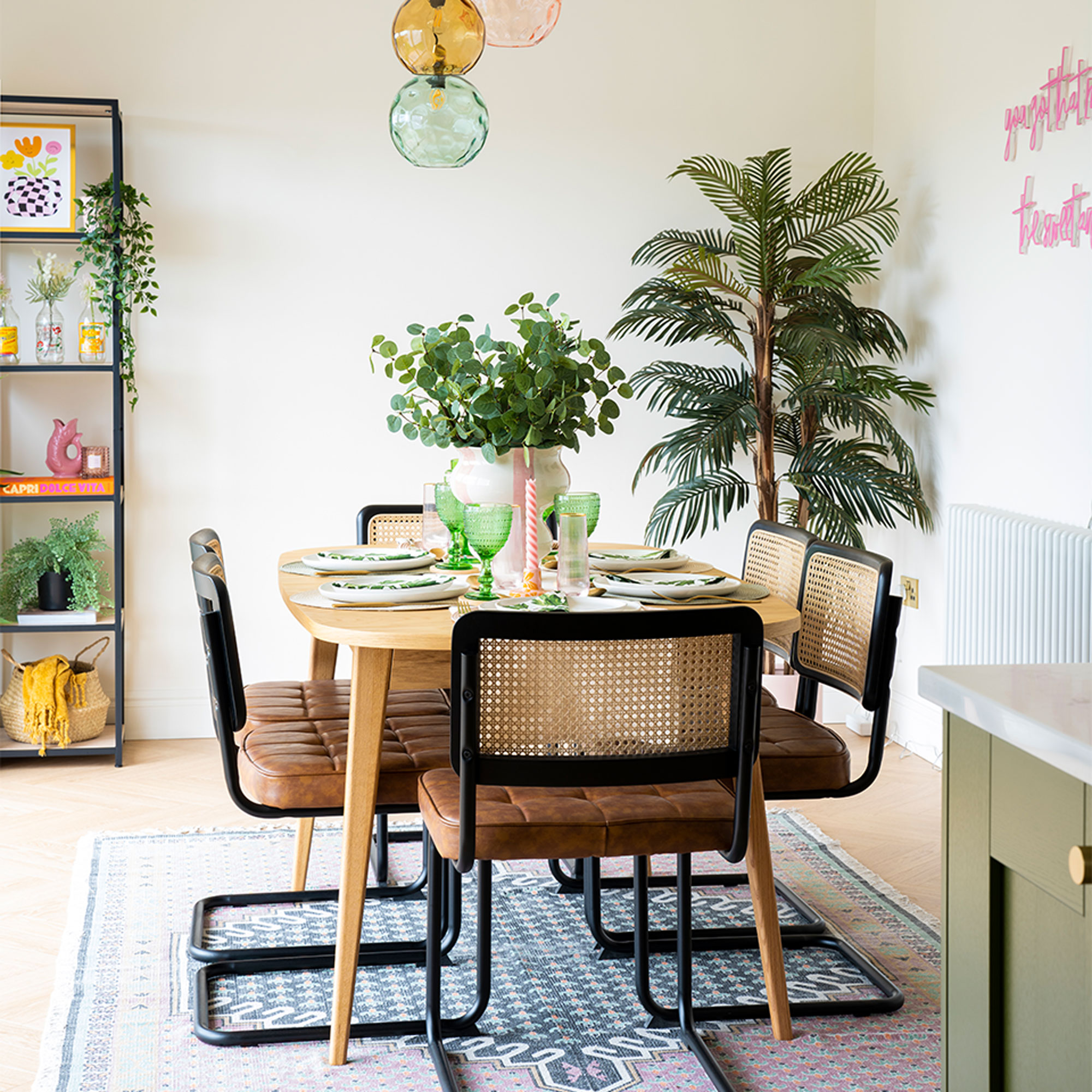
‘Because we were on a limited budget, we had to look at what we could reuse from the flat. The dining table and chairs were an obvious yes, as we’d chosen a classic design and we still really liked them, but we added a new rug. Our coloured lights that had always gone above the dining table, also came with us, carefully wrapped.’
‘We also brought our fridge freezer, as it was fairly new and could be hidden behind a door, plus my space-age Elica induction hob, which I didn’t want to leave behind. We made sure our new ovens were black to tie in. There’s nothing chrome in the kitchen, it’s all brass or black appliances.’
Pops of greenery
‘Having decided on green for the units, we spent a lot of time picking the right shade. I knew I didn’t want an olive green or a really dark forest green, but we kept looking until we spotted Farrow & Ball’s Bancha, which is the right combination of dramatic but not too dark. We wanted to bring the outside in, and I’ve deliberately put quite a few plants about the space, as well as some pictures of flowers, but kept everything else subtle.’
Oak-effect flooring
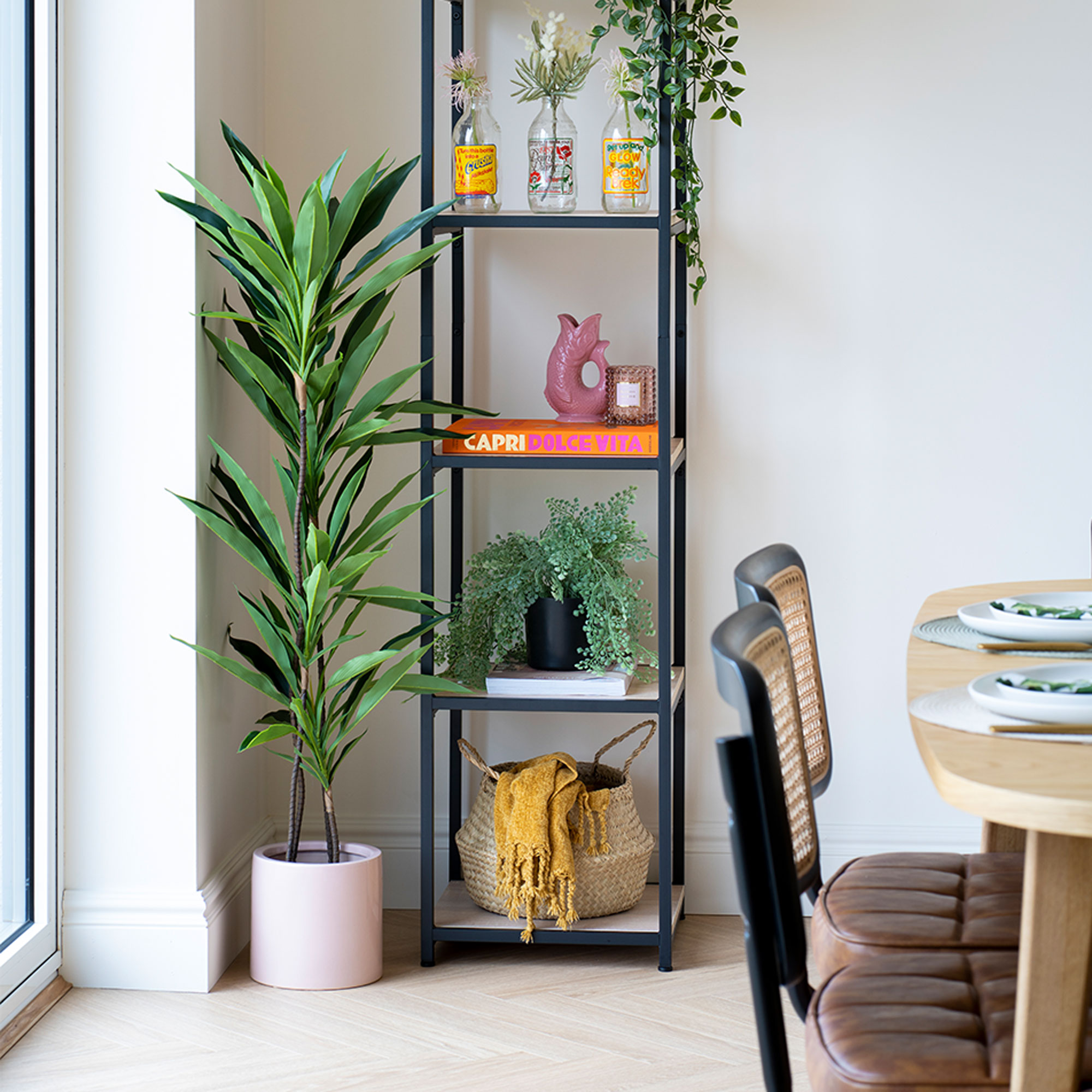
‘Because we were taking down walls and reconfiguring, we knew we’d have to look for new kitchen flooring for the whole space. I liked the idea of adding in a wooden element to the scheme and I’ve always liked herringbone flooring, which fits in well with the age of the house.’
‘However, to have it in solid oak would have been incredibly expensive, and I actually thought wood-effect laminate would be more practical anyway, as the kitchen is right next to the garden so you’re in and out all the time, plus we’ve got our cockapoo Barney. We were right – the laminate is much more hardwearing and you can’t really tell the difference!’
Finishing touches
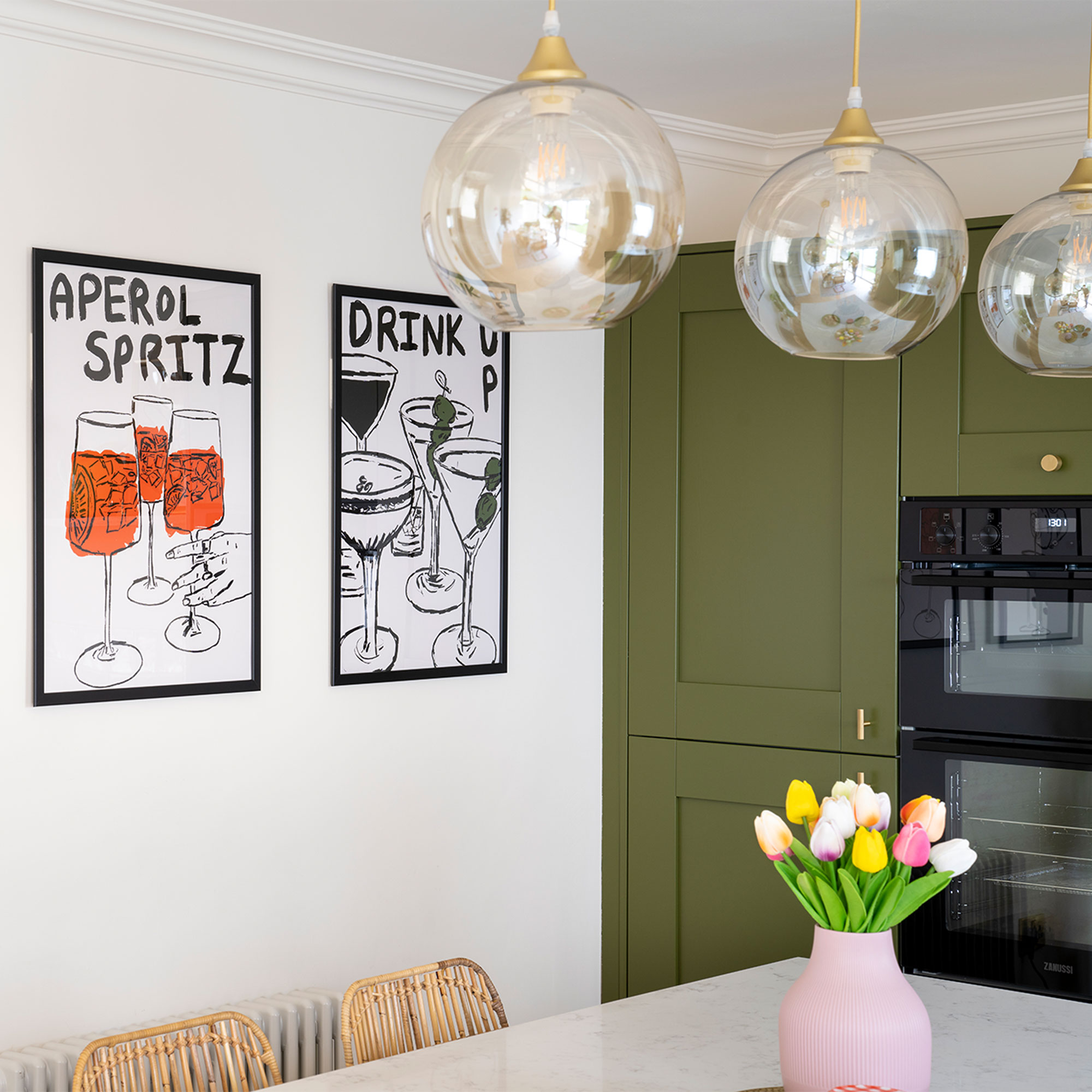
‘Vibrant green units and brass knobs create a luxurious feel, and I’ve deliberately kept the walls, tiles and accessories in neutral or paler colours so the kitchen can shine.’
‘These simple prints really called out to me, and they add a fun touch to the room. I framed them in black to match in with the unit at the other end.’
Brass fittings
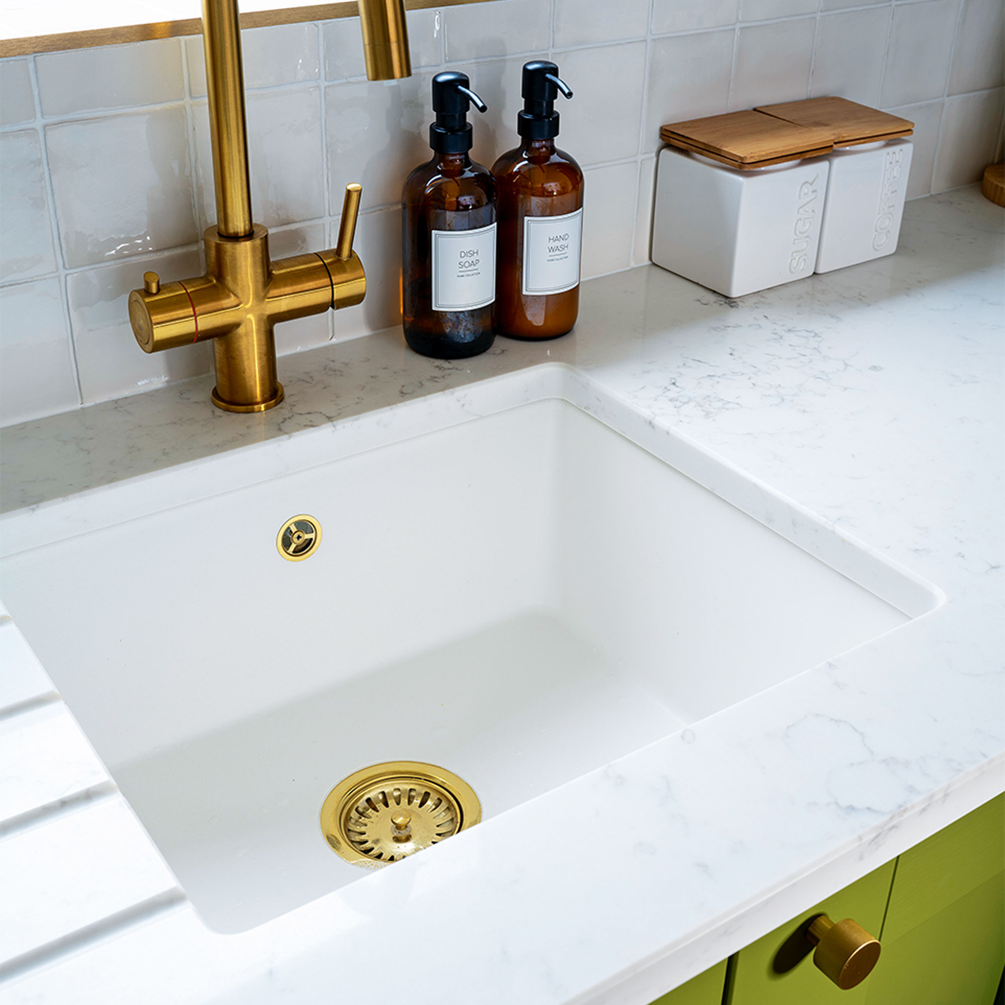
‘There are two different brass knobs, some circular and some T-bar, which adds visual interest, and I’ve made sure they’re nice and chunky.’
‘Having the best boiling water tap that boils water as well as providing the usual hot and cold was always my aim and I found a fantastic one in the sale.’
Sleek wooden shelving
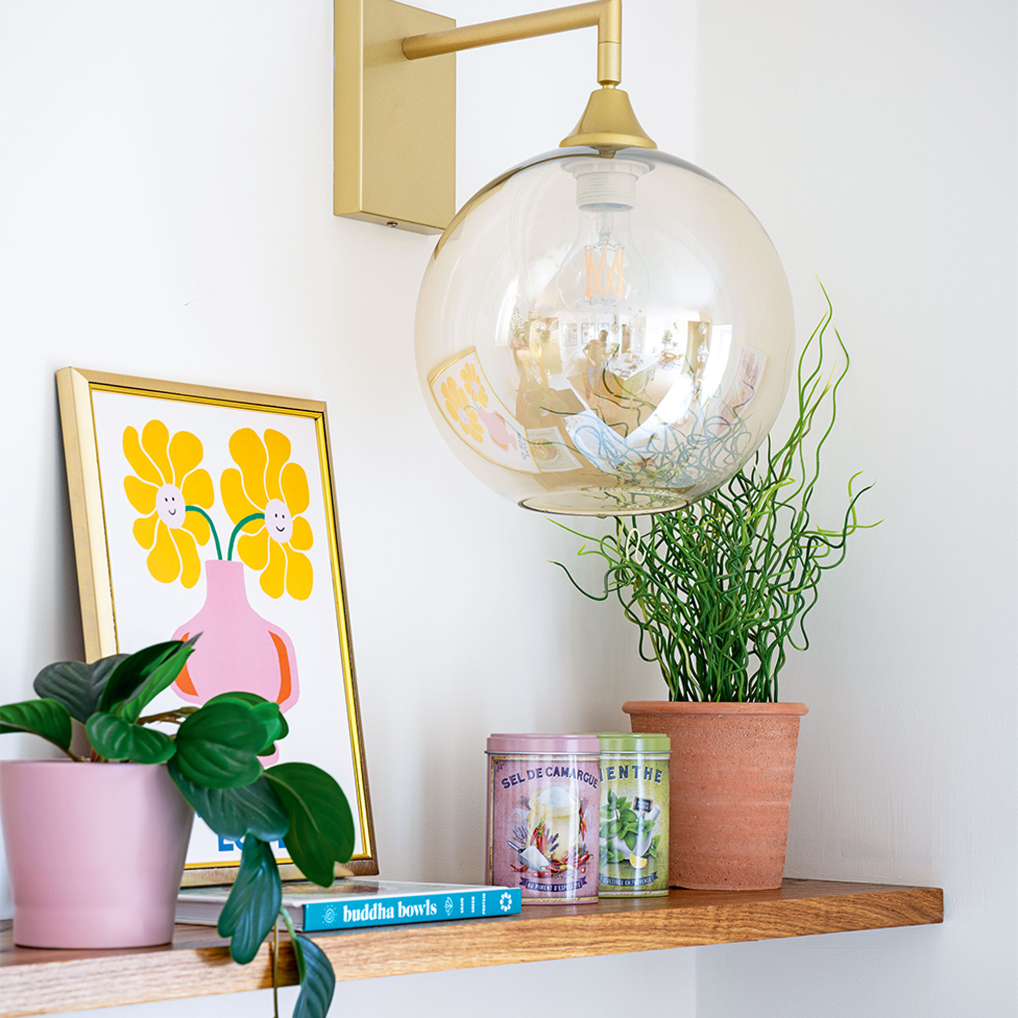
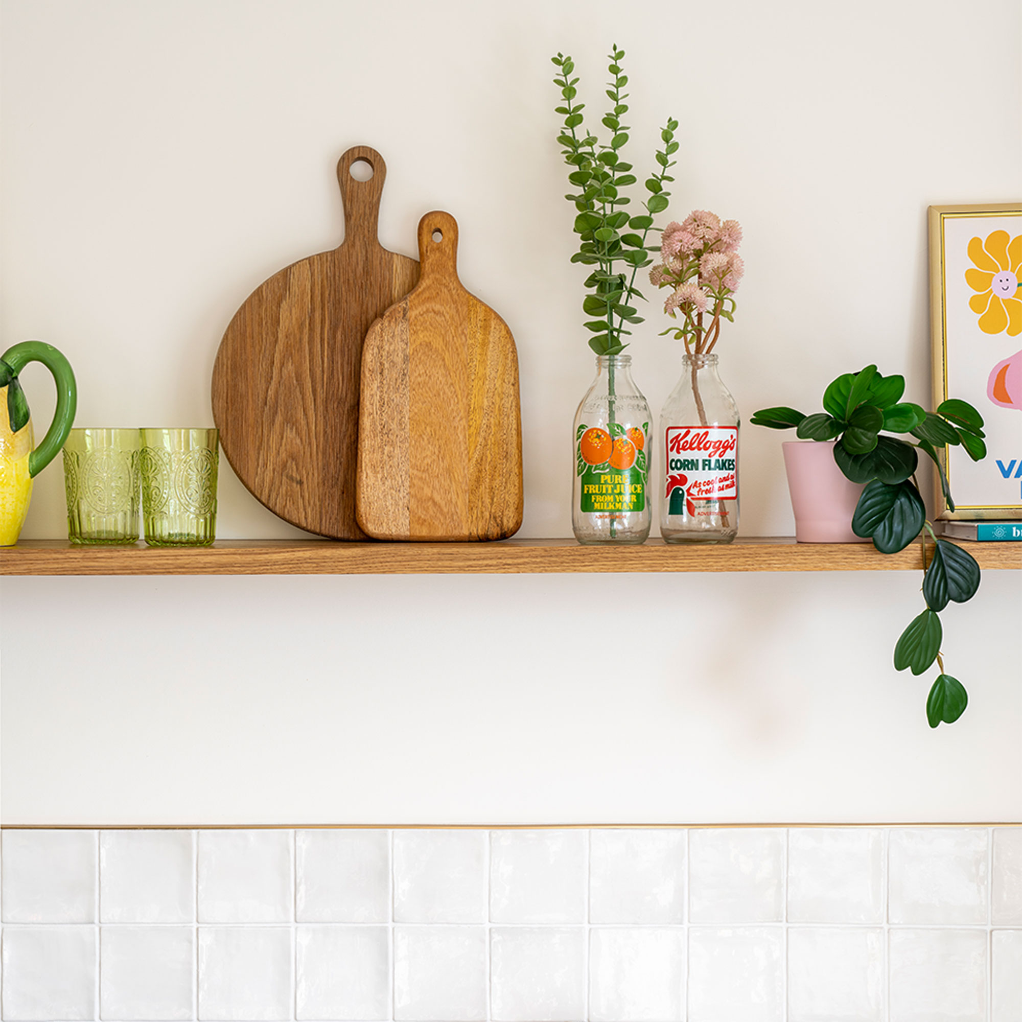
‘Rather than having any overhead cupboards, I wanted one long shelf to display our favourite items – and as it’s oak the kitchen shelving idea adds another element to the room.’
‘I’m really not a fan of spotlights, or most overhead lighting, so as well as the pendants over the island, I’ve added in wall lights on the back wall where it’s darkest.’
Fun neon sign
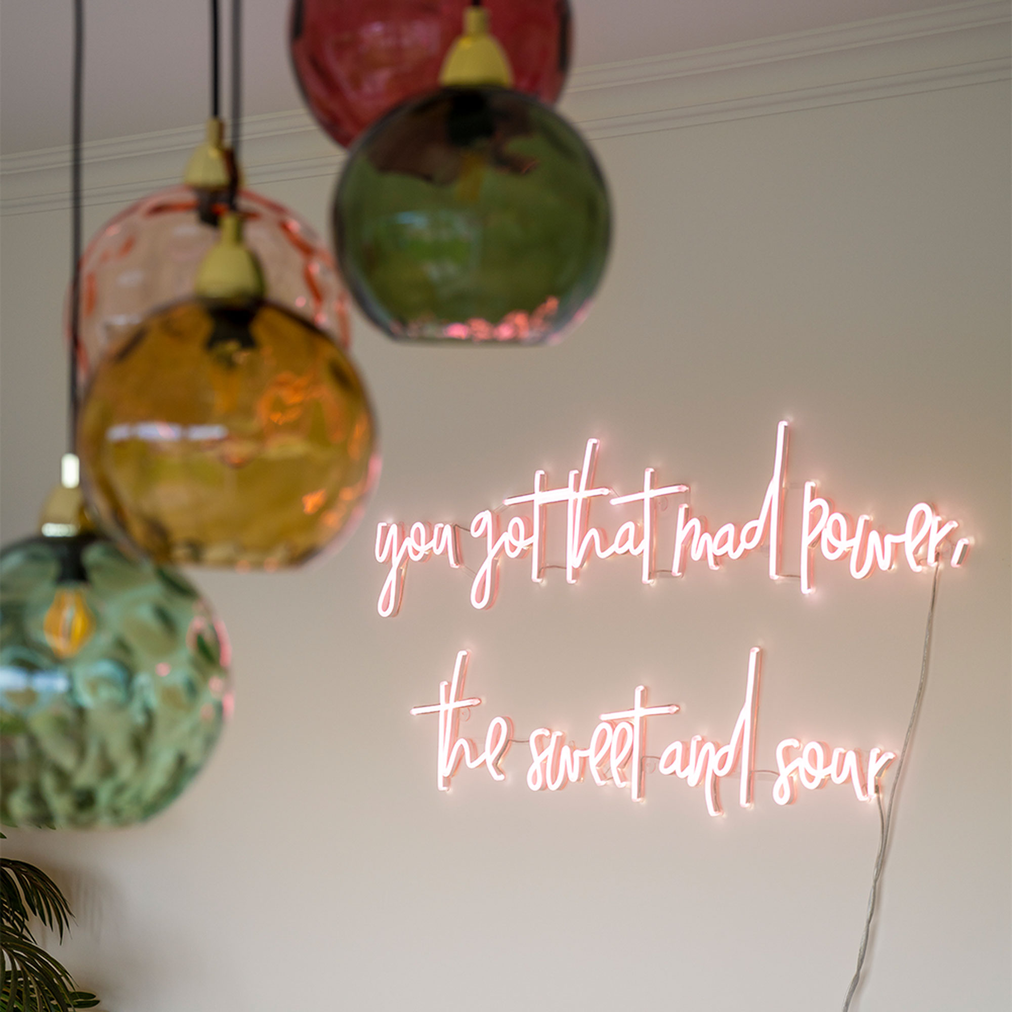
‘Coloured glass lights always add another element. I brought this set with me from the flat, and it has influenced my choice of colours, but they’re colours I love.’
‘Putting up an old neon sign gave the blank wall in the dining area a bit of character and brings in my beloved pink, while a black metal storage unit in one corner gives me somewhere to display things – plus there’s my new oak shelf, which I’ve filled with bits and pieces. We love being in this space and it’s better than we could have hoped for.’


