Get all your news in one place.
100's of premium titles.
One app.
Start reading
Creative Bloq
Creative Bloq
Technology
Daniel John

This beautiful Toyota print ad is pure visual poetry

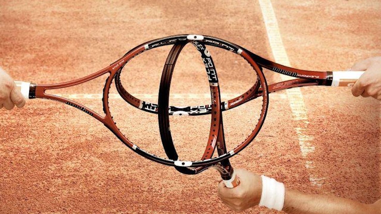
Toyota print ad featuring the Toyota logo made out of tennis rackets.

Sometimes the best print ads are the simplest. Ads that make the viewer double-take with a smart and striking subversion of a familiar image can stick in the memory for a long time – which might explain why the internet is still talking about one particularly brilliant example from 2008.

When Toyota announced itself as the sponsor of the Bulgarian Tennis Federation, it did so with a delightfully simple print ad featuring tennis rackets positioned to look like the Toyota logo. And that's it. No hidden message, no clever tagline. Just a singularly effective piece of visual poetry.

Sign up to read this article
Read news from 100's of titles, curated specifically for you.
Already a member? Sign in here
Related Stories
Top stories on inkl right now
One subscription that gives you access to news from hundreds of sites
Already a member? Sign in here
Our Picks
Fourteen days free
Download the app
One app. One membership.
100+ trusted global sources.