The two most important things we’re all looking for in our homes are more space and more light. With a new home, it’s not always a given, but there are clever ways in which you can create both a sense of space and light with the help of a good design strategy.
Of course, there are less invasive ways such as playing with paint colors, and reflective surfaces, but if you are in a position where you are undergoing redecoration, you might want to consider these tactics that Dubbledam Architecture + Design have employed in this Victorian house in Toronto, Canada, to encourage flow and a sense of discovery. I love how this modern home looks filled with light, and has such a joyful, playful spirit.
Compression and expansion to create a sense of space

This rather narrow home was made to feel much wider through a thoughtful strategy of compression and expansion. There is a wonderful play between narrow areas that enclose the space, creating a feeling of compression, juxtaposed with sudden openings to larger spaces with tall ceilings.
This contrast between narrow and large is an interesting idea that I haven’t stumbled upon before. It’s basically creating an illusion by playing with our visual perception of space. If you have a long narrow hallway for instance that tends to be quite dark, create an effect of openness in the adjacent rooms through lighter colors and a lot of natural light, to enhance that distinction between the spaces and make the rooms appear larger.
Curvilinear forms and fluid contours for a sense of flow

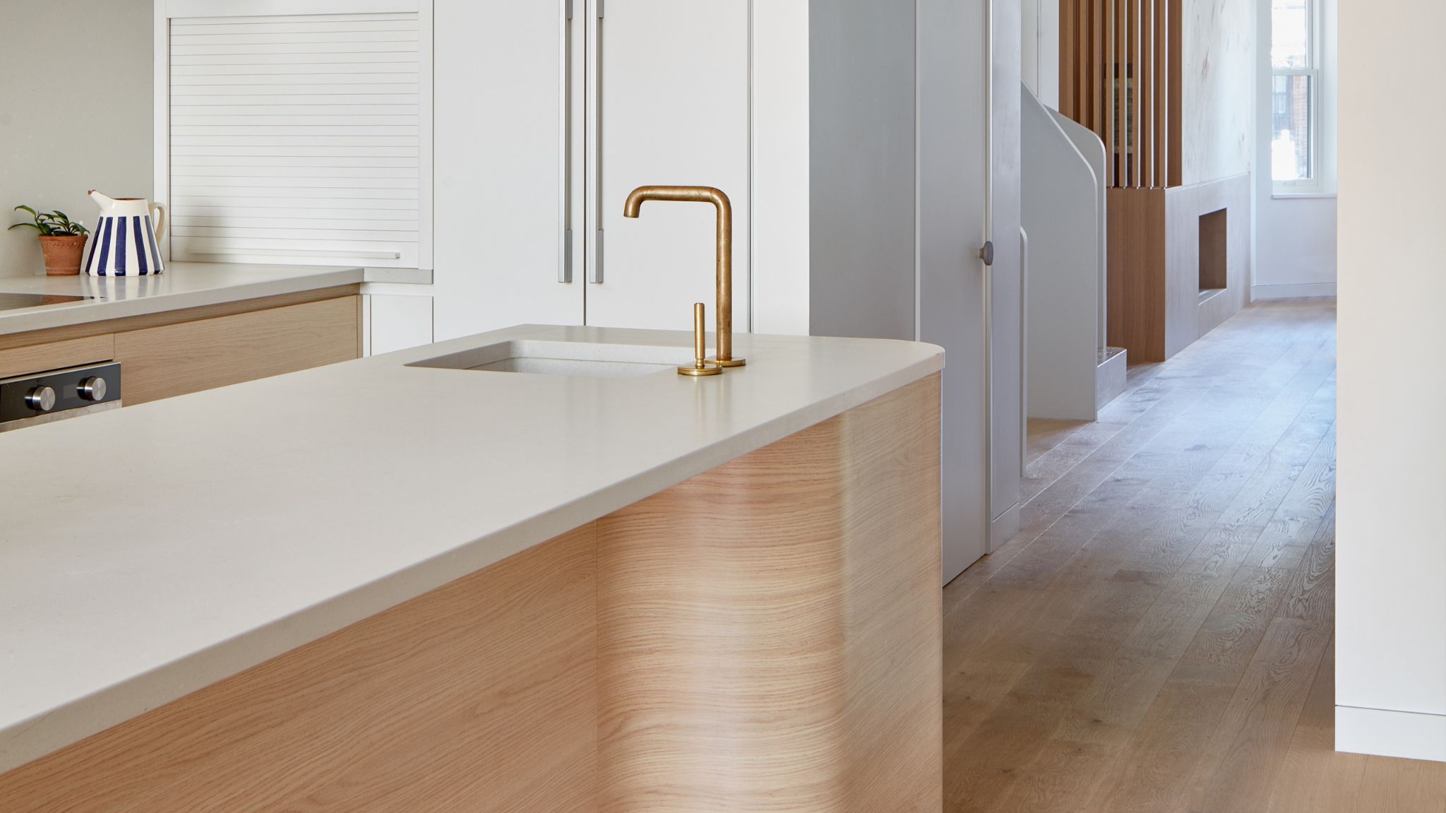
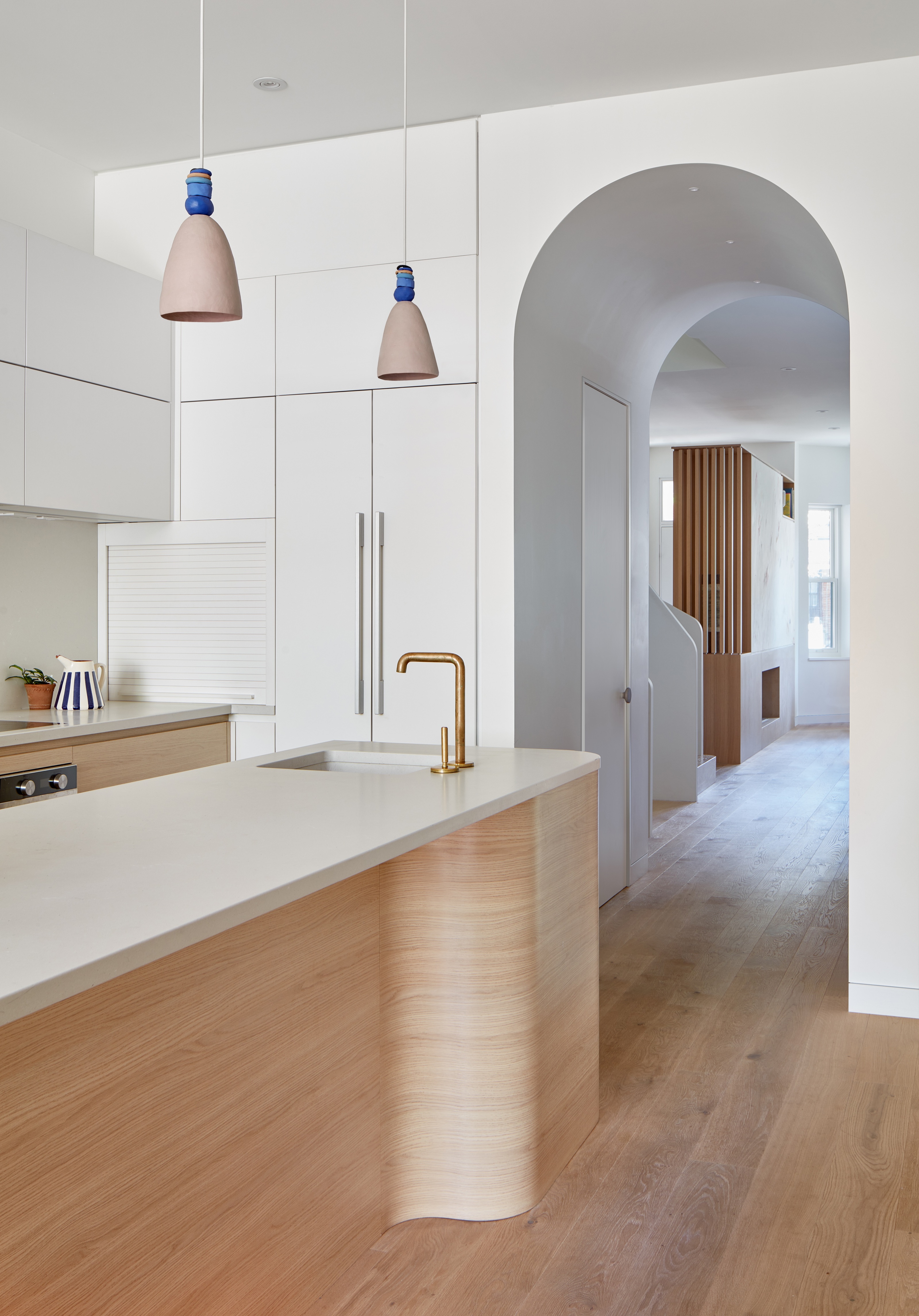
Light is an important element of this design, and it’s introduced wherever possible, in unexpected ways. The reading nook on the second-floor landing gets its own light from a side window. The tall, rounded archways throughout the home allow for more light to flow uninterrupted by doors in each room, from the dining, kitchen to the living room. The rounded shaped detail of the modern kitchen island in light oak bounces light further and allows it to flow through the space into the adjacent rooms.

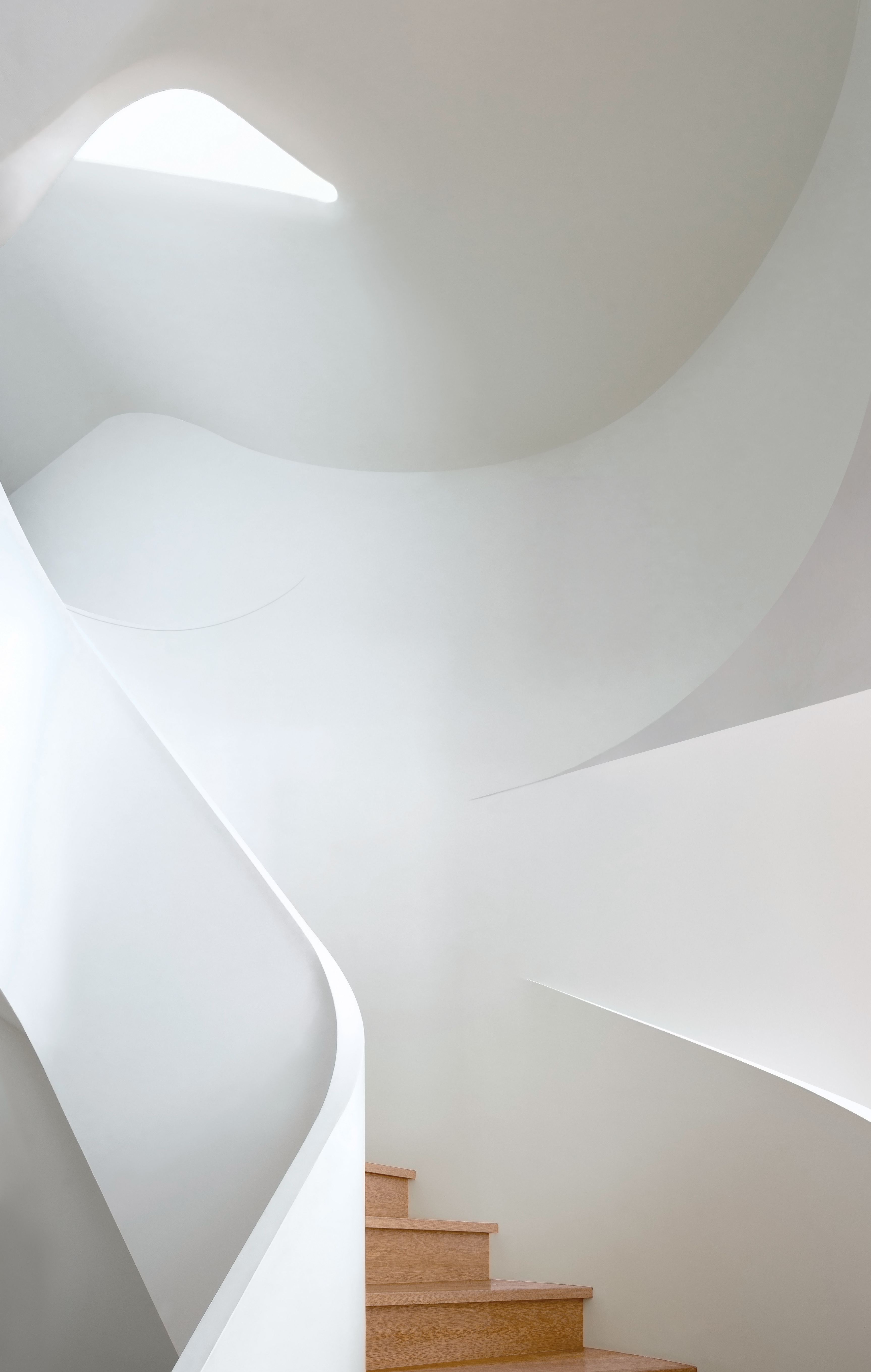
The organic, curved shape of the staircase spirals like a ribbon through the vertical line of the home and is in contrast to the rectilinear floor plan, making the space feel softer, more organic, almost as if sculpted. A focal point of the house, the staircase filled with light from the skylight above enhances the home’s sense of flow and allows light to bounce off the white walls and natural oak steps, while the winding balustrade casts shifting shadows throughout the day.
‘Curvilinear forms are employed throughout,’ says Dubbeldam Architecture + Design principal, Heather Dubbeldam. ‘Arched openings between rooms incite anticipation as they frame views of what lies beyond, resonating with curved walls, display nooks, the kitchen island, and banquette, further enhancing the house’s sculptural sensibility,’ she explains
Get the look of this home's minimalist kitchen with colorful accents
Price: $350
This mini vase in Murano glass will look so joyful on a kitchen worktop, and in a minimalist space it will be a pop of color.


