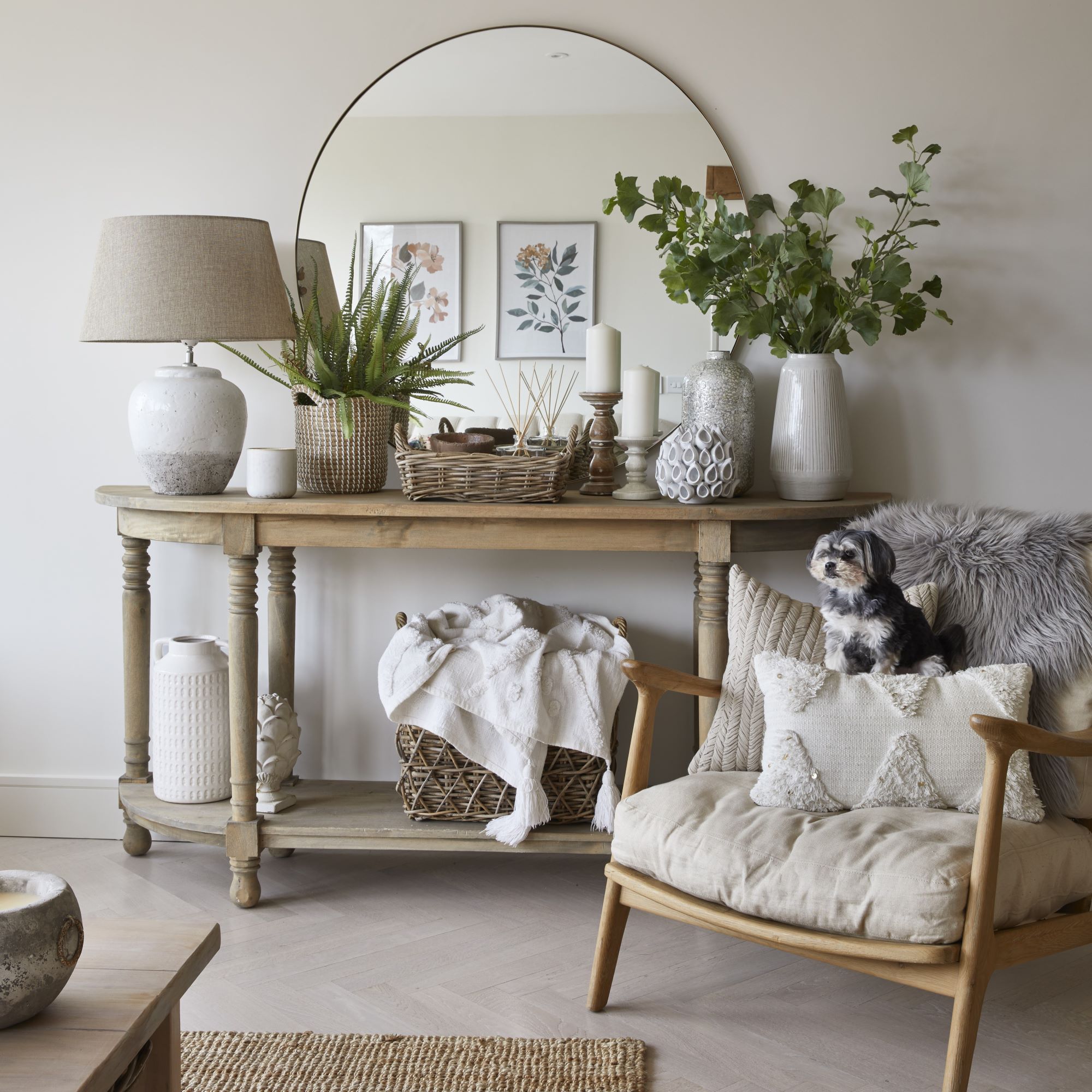
The renovation of this Norfolk farmhouse has been a tale of two halves – both in looks and the homeowner's approach to the project.
Kelly Howlett, an interior designer (@khowlett.interiors), and Rob, a company director, live in the farmhouse that dates to the 1800s with their four children. When they moved here in December 2019, the front half of the house had large Georgian windows and a mellow cast-stone facade, while the back was mostly flint with small windows that failed to fully capture the views across the fields.
Before they tackled the ambitious job of uniting these two disparate styles, they turned the property’s derelict barn into a comfortable place to live while the main house was renovated, starting in September 2021.
‘Work on the house took two years because it was so extensive,’ recalls Kelly. ‘The roof came off and floors came out so we could raise the ceiling height downstairs. We took every internal wall out upstairs and remodelled the layout. And downstairs we blocked up doorways and created new ones.’
Going with the flow
Though it dated back to the 1800s, the building wasn’t listed. ‘It was livable, but needed upgrading,’ Kelly tells us. ‘Living in it before starting the work helped a lot. When we came to redo the layout,it made more sense to us.’

One issue they wanted to address was the flow of the house and the fact there were lots of small rooms that weren’t fit for purpose. ‘There was a walk-through living room at the front of the kitchen that nobody sat in, with another sitting room beyond. We took out a wall to make it part of the kitchen and a more usable space.
‘Upstairs was a tiny landing with a box room too small for a single bed. We took that out to make the landing bigger.’ The front door opened to the stairs with a dining area on the right-hand side and a door to a sitting room on the left.
‘We removed that door,’ says Kelly. ‘Now when you walk in you have the full aspect of the extended kitchen on the left and the dining area to the right.’
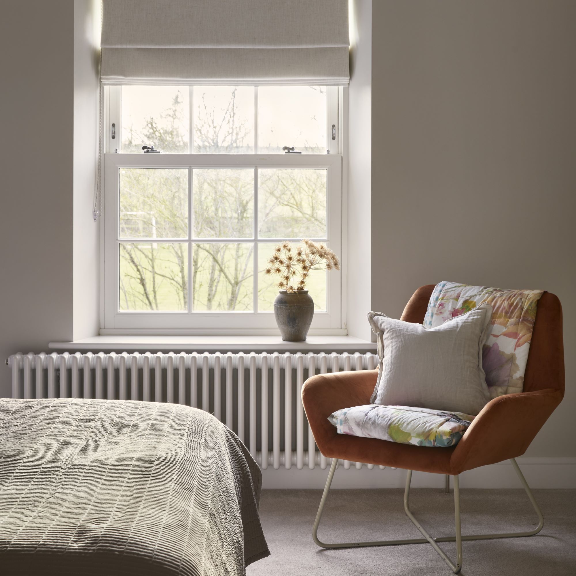
One crucial change Kelly was determined to make was to replace the small rear windows with large Georgian-style sash windows.
‘It has opened up the views. When I woke up the other morning I could hear deer in the garden – there were about seven of them. You wouldn’t have noticed before.’ They used builders who they had worked with on a previous project, helped by Rob, who has a scaffolding company.
A high-end look
Kelly had the vision for the design and sourced materials, furniture and accessories. ‘You can’t beat stores such as The Range, Dunelm and Habitat,’ she says. ‘I mix in pieces like a chandelier from Soho House to make the highstreet buys seem more expensive.’

A double-height extension created space for a long kitchen/living area with bedroom above. The new kitchen and dining area on either side of the stairs is now open plan. At the end of the house, an old coal shed has been turned into separate living quarters.
Dining area
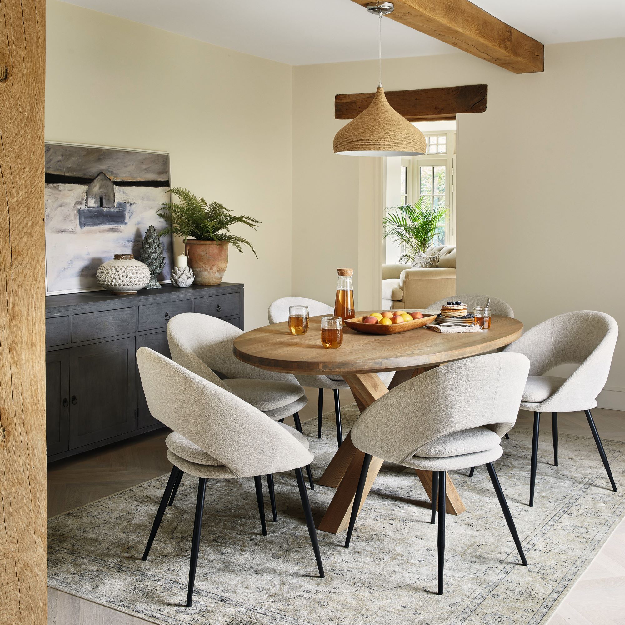
‘The door to the kitchen used to be on the back of the dining room wall and you had to walk through that to get to the utility,' Kelly explains. 'That didn’t work for us, so we blocked up the door and made the old kitchen a utility.’
The exposed beams are a key feature in the dining area, which the couple stripped of old paint to reveal their natural beauty and make them look like new.
Kitchen
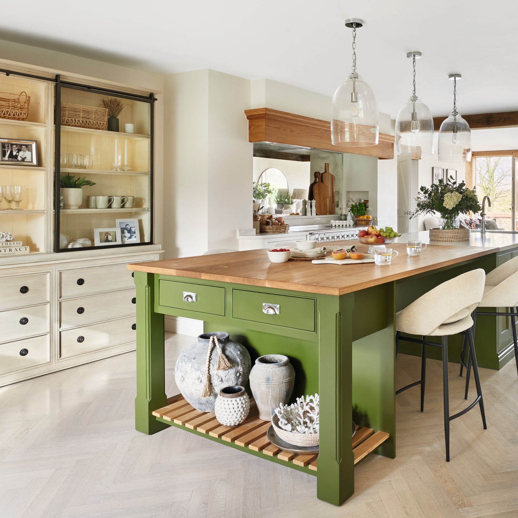
As it’s a farmhouse, I wanted a kitchen table, but the room wasn’t big enough for that and a sitting area,' says Kelly. 'The table at the end of the island means people can sit around it while I cook.’
A dual-zone kitchen island is both functional and stylish. You can use different surfaces to zone an island, with wood for a bar/ table and quartz, marble or granite for the prep area.
'The breakfast bar is my favourite space in the house!' Kelly tells us. ‘The breakfast bar that I managed to sneak in. It’s only 20cm wide, but it’s the perfect spot for a glass of wine while one of us cooks.’
Living room
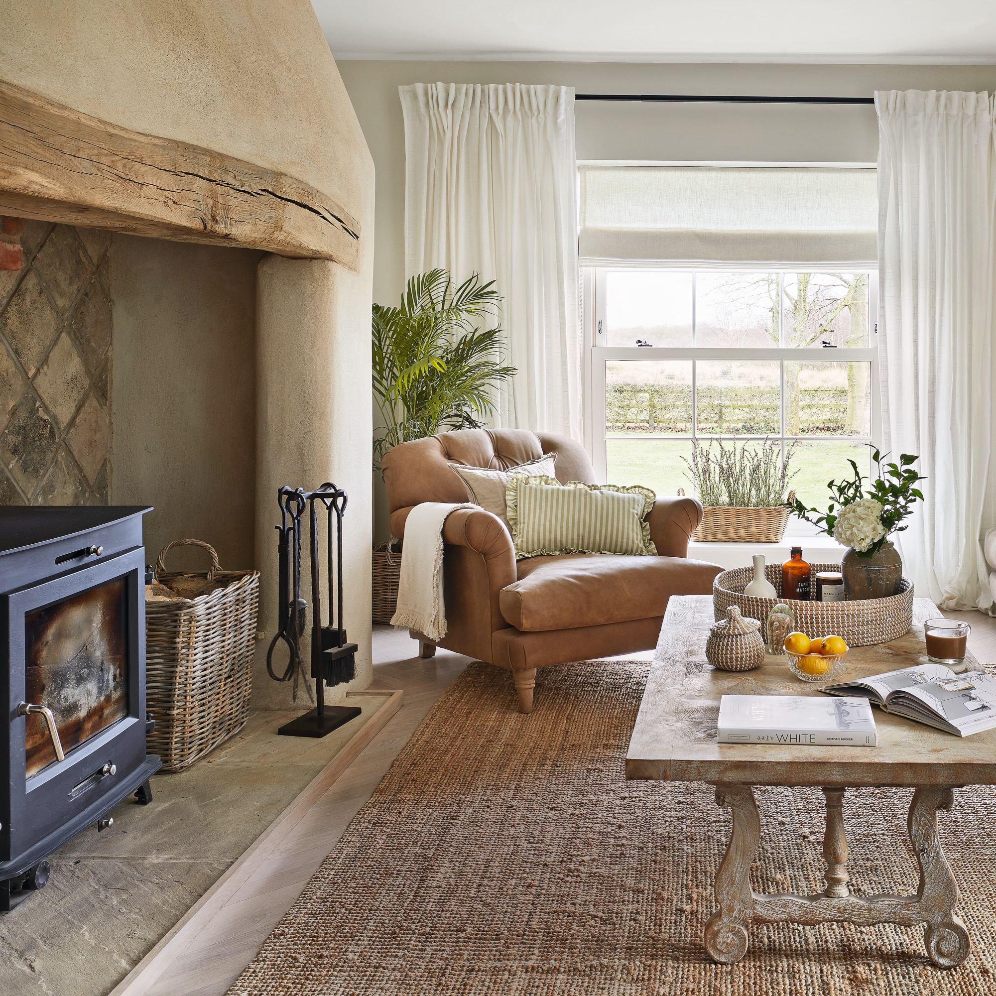
Kelly and Rob were already pleased with the rustic living room charm in here, so the only changes they made were different windows, and a new door. The large rug adds a layer of texture underfoot while creating a focal point for the room.
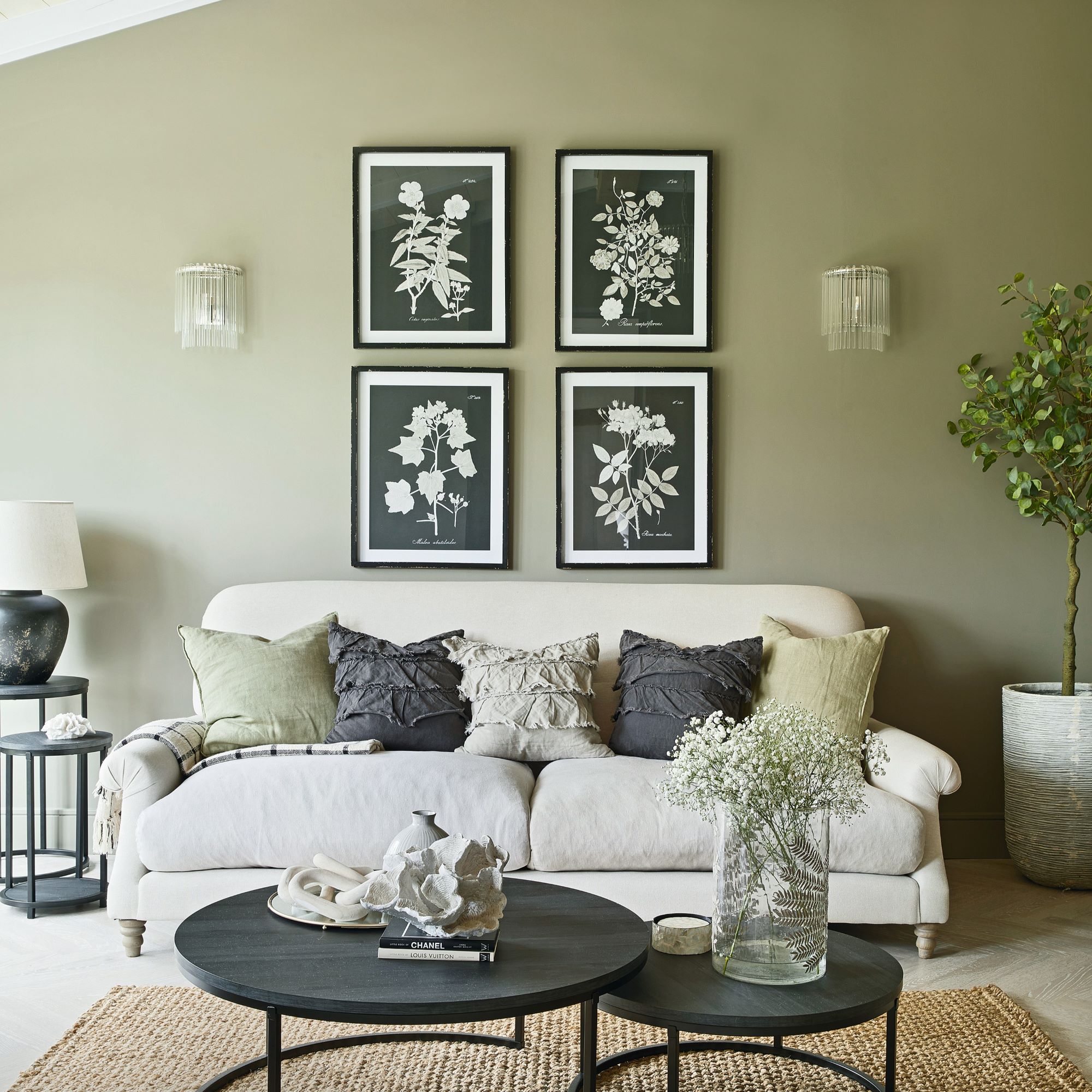
'The snug is quite dark, so I thought I’d go with that and paint it green,' Kelly says. 'It’s nice having a contrast to the rest of the house which is so light.'
En suite
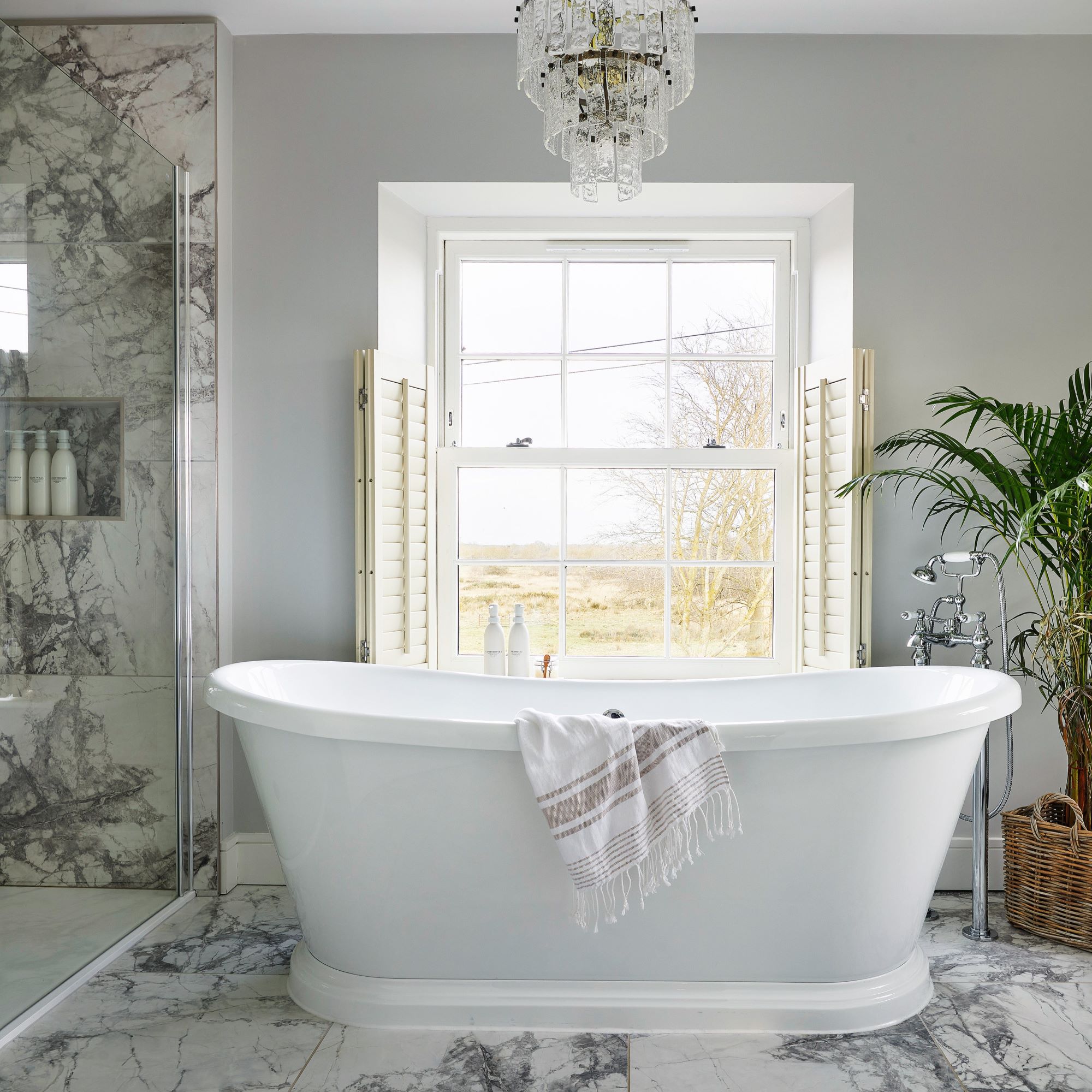
'The bathroom was really big and had a jet bath and a bidet, which we were not going to use, so it had to be remodelled,' Kelly says. 'I often sit in the bath with the blinds open because it is so private. I’ve never seen anyone outside, just sheep.’
Marble-effect tiles and a bathroom-rated chandelier help to create a luxurious sanctuary.
Kid bedroom
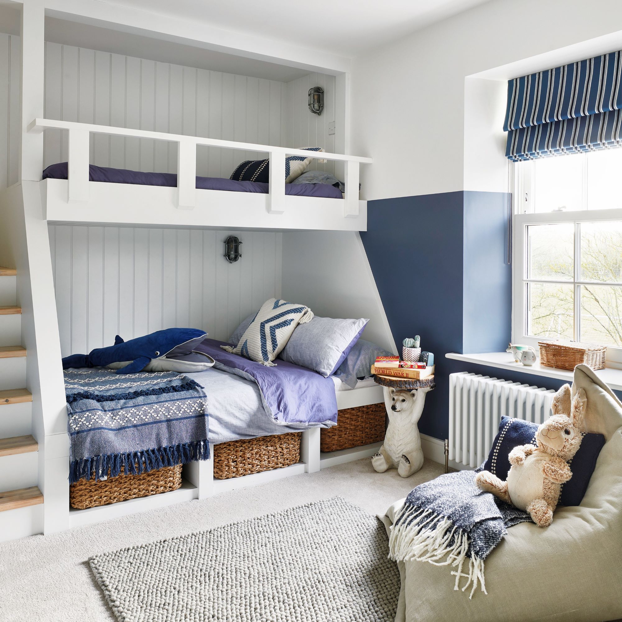
Kelly says that her and Rob bribed their son into having the smallest room by putting in bunk beds. 'I found the design I wanted, Rob drew it up on the computer, and our carpenter made it for us. The top bunk is for when his friends sleep over.’
Main bedroom
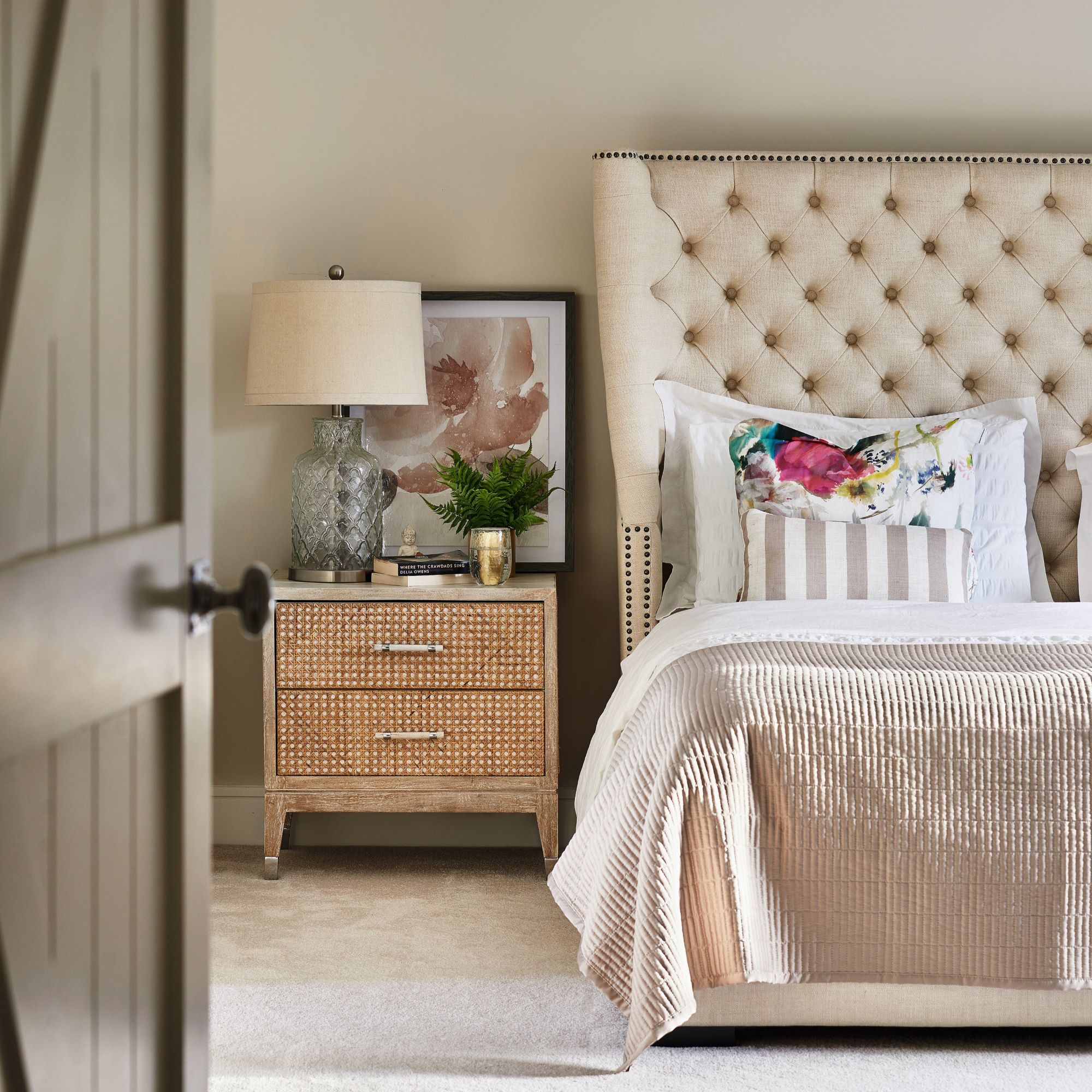
‘I do love a high-street hunt – my house is 90% high street. We also have good independent stores, where you can pick up odd bits.’
Looking back on the project now, Kelly tells us that it was far from straightforward - especially when their builder went into liquidation. 'But the best decision we ever made buying it in the first place, and being brave enough to give it a go.'
As pleased as they are with the transformation of their home, the couple are making plans for their next project – another, more dilapidated farmhouse nearby. ‘Rob and I grew up on ordinary estates and never thought we’d live in houses like this, but life takes you on a journey sometimes. We’re proud of what we have achieved here.’
Get the look
This gorgeous coffee table from Graham & Green is perfect for adding some rustic country charm to your living room. Adorn with a few decorative items and let it become a simple but key feature in the room.
These stylish black and white bar stools are the perfect addition to a kitchen island or breakfast bar. Fixed with a cosy and comfortable seat, this is available in different colourways, so there are plenty of options to suit your style.
For an elegant touch to the bedroom, this table lamp from The Range looks expensive, and will become a natural statement piece in the room. The glass covering around the gold stand is simple, but elegant.
Focus on: a statement staircase
Kelly and Rob have improved the flow of their ground-floor living space, where the impressive staircase takes centre stage. Having the stairs at the centre of open-plan access to the dining area and kitchen makes a good first impression through the smart new porch.
Stylish staircase ideas aside, there are a few things to note if you want to create a statement stairway in your own home.
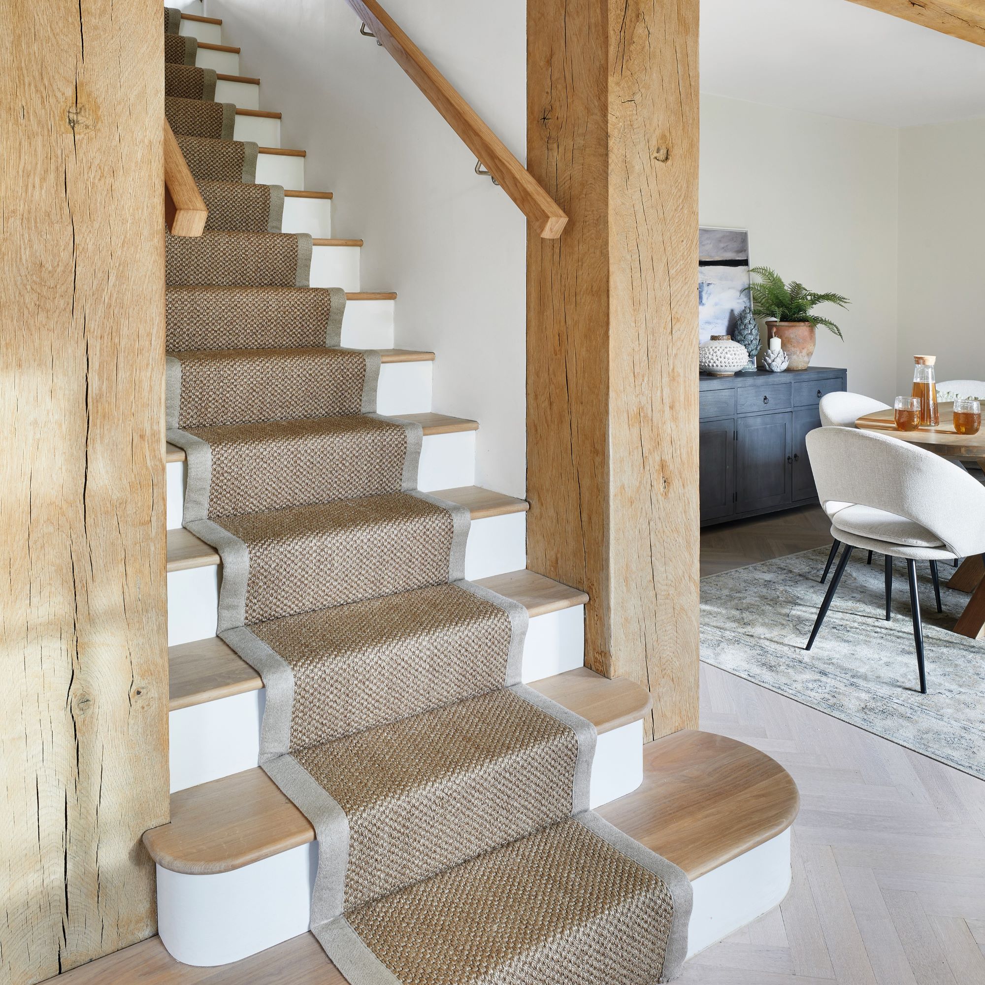
- Take steps to improve: staircases in the entrance hall of your home can set the tone for the interior, so it is worth considering how you can elevate yours. If you want a quick and easy update, rip out worn and dated carpet, give the steps, spindles and bannister rail a fresh coat of paint and add a hard-wearing, stylish runner.
- Put safety first: the depth of your stair tread is known as the going. In a house, it should measure between 220mm and 300mm for safe use, while the vertical riser should be between 150mm and 220mm. There should be a handrail on one side of your staircase if it’s under 1m wide, and on both sides if it’s over 1m.
- Out with the old: if you are replacing a steep or narrow staircase, or even relocating stairs, the average cost to supply and install a standard staircase ranges from £1,500-£4,000, according to Checkatrade.


