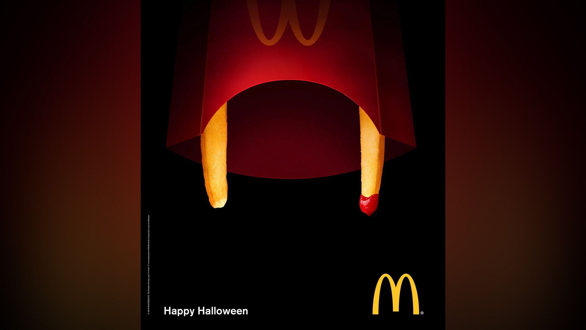
Design fans are praising these crafty McDonald's ads that expertly use subtle imagery to create a series of spooky designs (who knew the humble fry could be so threatening?) While these playful ads seem to resurface every spooky season, we're still lovin' them thanks to their stunning simplicity and retro-inspired aesthetic.
While McDonald's is known for its bright and bold branding, this stripped-back look proves that sometimes taking a less is more approach can have a big impact. If Reddit's rapturous praise is enough to go by, these funky ads certainly deserve a place on our list of the best print ads.
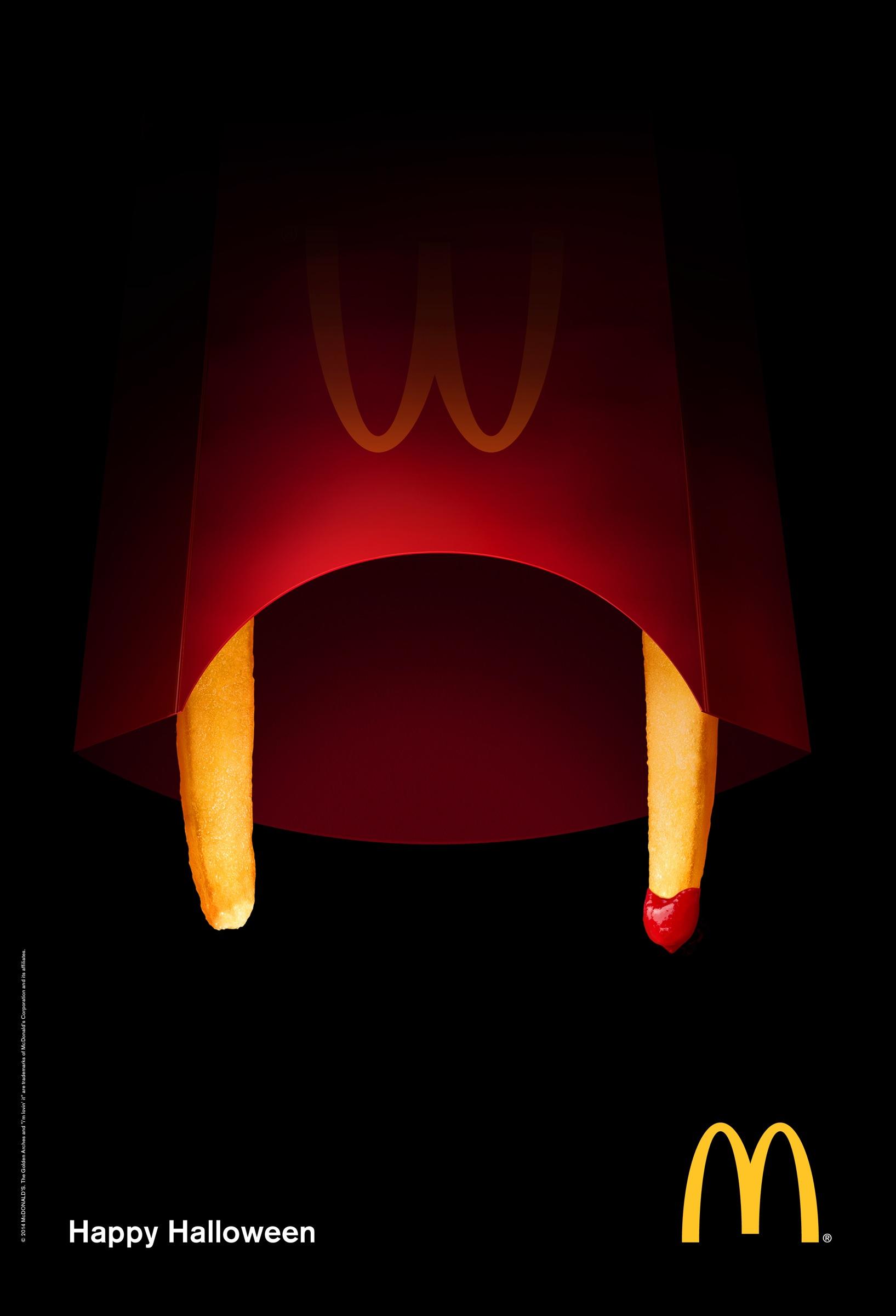
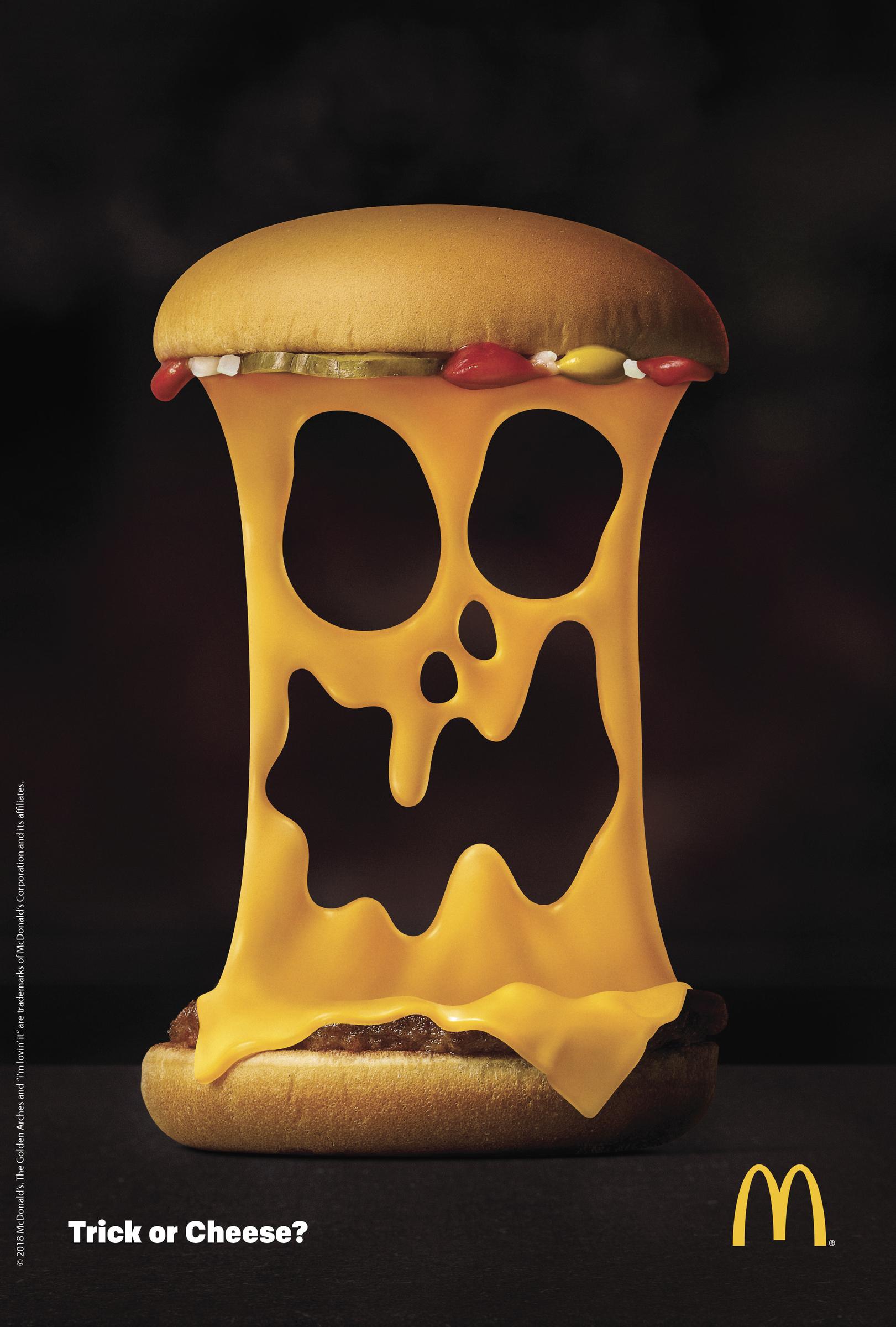
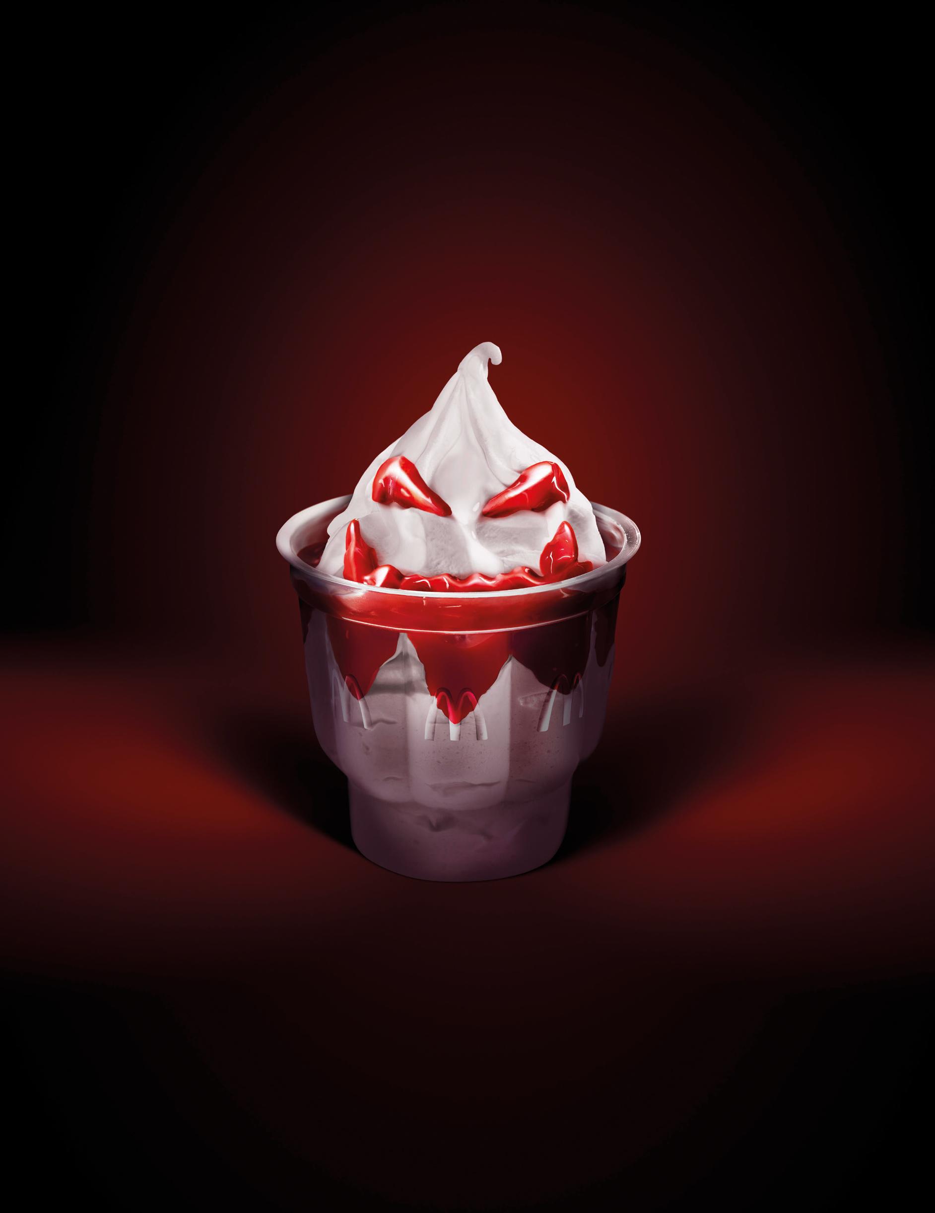
Created by advertising agency DDB, the 2014 'Happy Halloween' campaign is a masterclass in minimalist graphic design that really packs a punch. Giving some of the fast food chain's most iconic menu items a signature spooky twist, each ad has a unique playfulness that still feels quintessentially McDonald's. Over on the r/graphic_design subreddit, many design fans praised the ads, calling them "genius" and "minimal and impactful", proving just how timeless minimalist design can be.
For more creative inspiration, check out the best Halloween fonts to amp up the fear factor in your spooky season projects. If you still need to get into the Halloween spirit, check out the best horror film posters to inspire your next movie night.
