The Wikipedia puzzle globe is arguably one of the most recognisable logos on the internet, but it turns out the iconic design could've looked very different. In honour of its 25th birthday, the online encyclopedia is looking back through the archives, digging up an eclectic series of logos that didn't make the cut.
We may be facing a minimalist design invasion today, but back in the early days of the internet, design was a Wild West of funky illustrations, pixel art and clashing colours. While today's best logos might be designed with simplicity in mind, Wikipedia's rejected logos reveal how community creativity has always been at the heart of its brand.
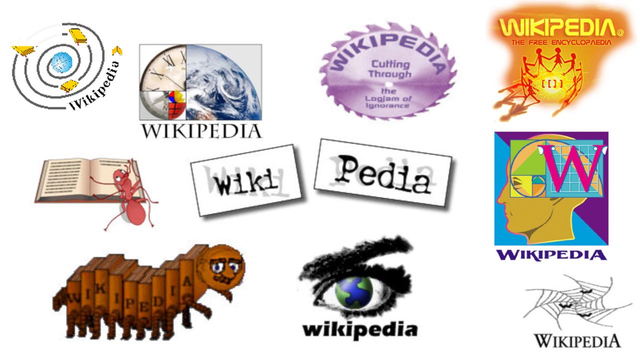
In a recent blog post, Wikipedia shared how "consensus" has shaped its brand, from deciding which topics deserve an official Wikipedia page to the brand's visual and audio identities. Created by its community of creatives, the diverse array of designs was all carefully considered, regardless of the artist's professional credentials.
Among the submissions was a colourful hydra, an ant reading an encyclopedia, and my favourite of the bunch, a centipede made of books referred to as the Wikipede. The Wikipedia puzzle globe was eventually settled on after hot community debate, picked for its simplicity and clever symbolism.

For more design inspiration, check out Wikipedia's adorable new Baby Globe mascot, or check out the best logos of the 2000s