Living in a small rental, but with plans to extend their family, it was time for this couple to start looking for a larger property.
‘We’d been renting locally for about four years, but our flat was tiny with only two bedrooms, and as we were hoping to have more children, we really needed more space,’ says the homeowner. ‘I really wanted a Victorian terrace as I love period properties with high ceilings, large rooms and built-in charm, but I didn’t want a massive project as we didn’t have spare funds to do a big renovation.’
‘So, when we spotted this place it ticked all our boxes; it had been recently decorated but retained some original features; the doors and downstairs floors had been stripped, which was a real bonus, and we felt it had scope to add our own unique touches.’
The living room
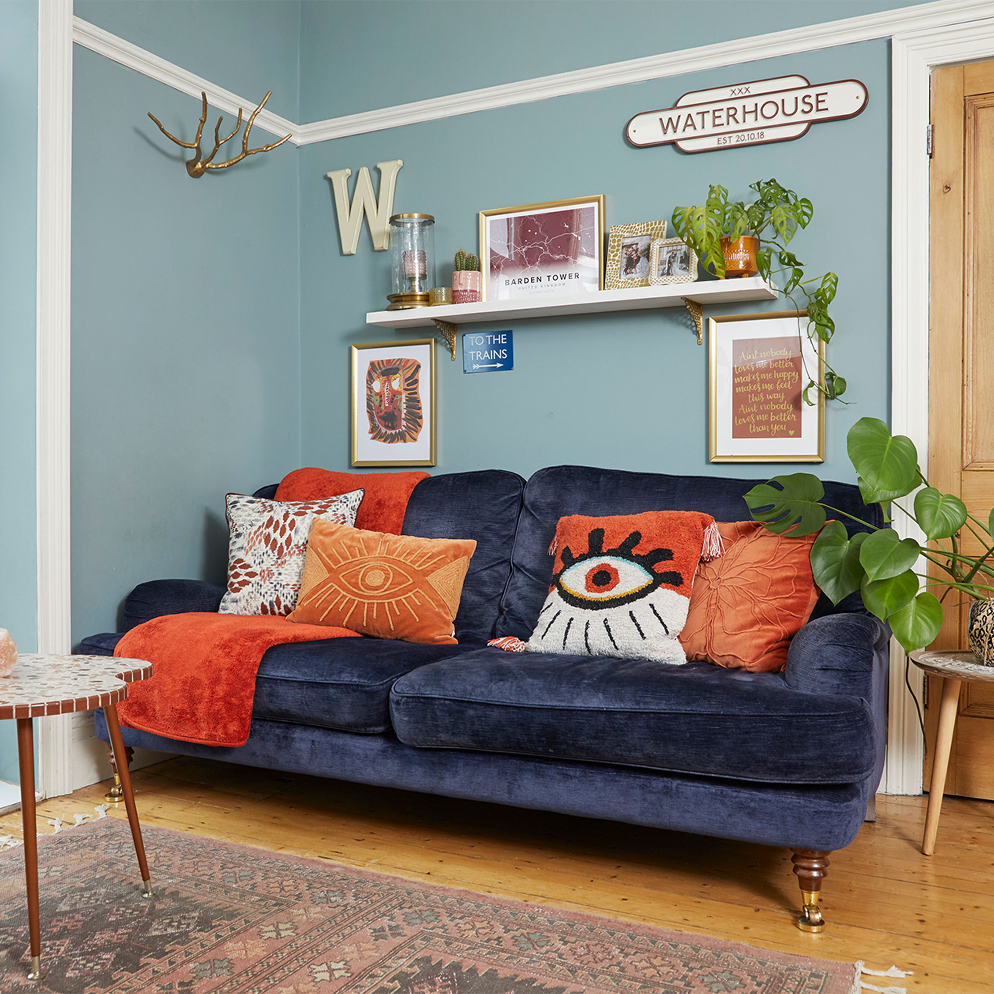
‘Because we were moving from a much smaller place we had to get new furniture to fill the rooms, so I made a mood board to help with the living room ideas. My style errs towards a traditional aesthetic, so I chose Oval Room Blue by Farrow & Ball, and paired it with classic, timeless-looking sofa from Laura Ashley.'
Traditional fireplace
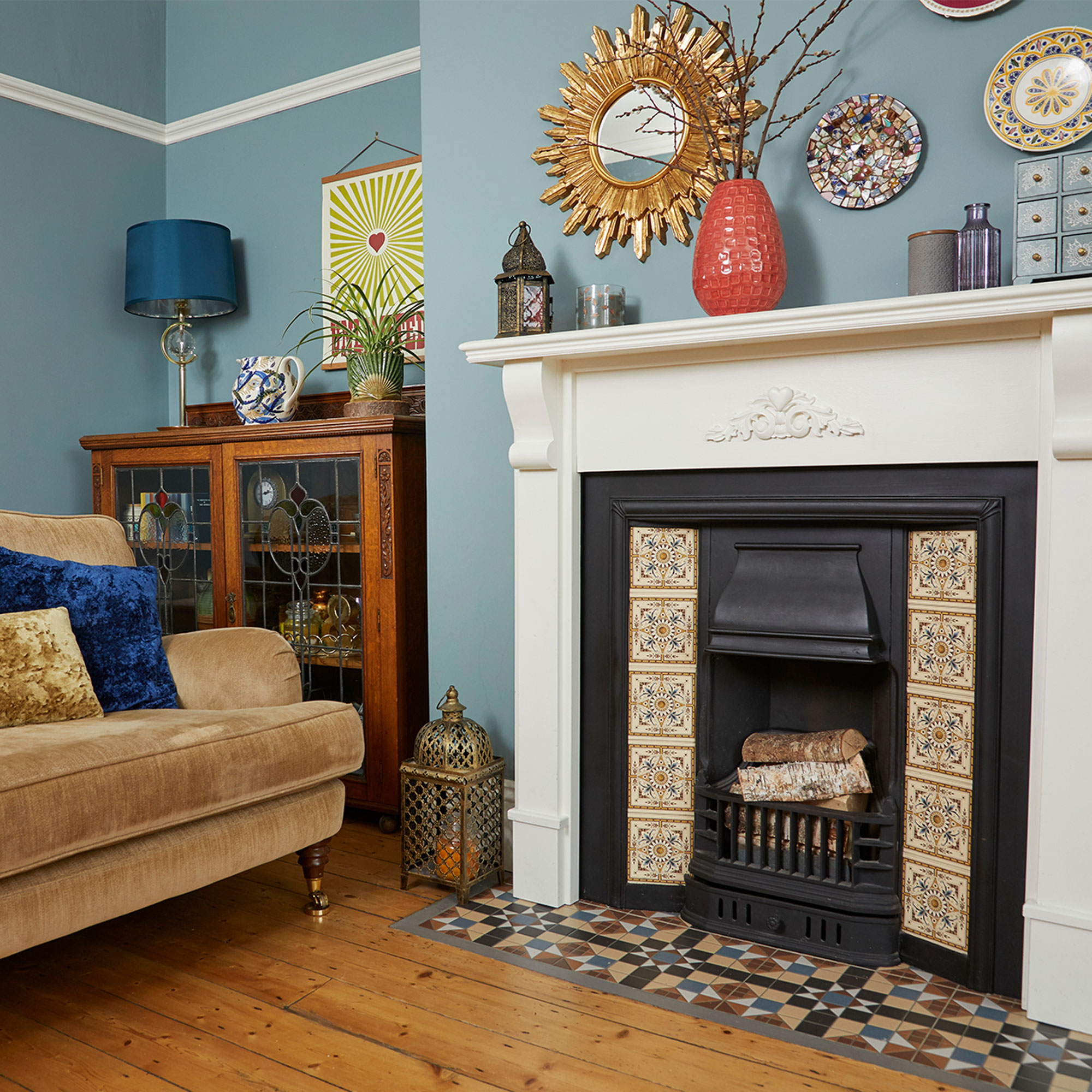
'For the fireplace idea we sourced traditional-looking tiles for the hearth, from Wickes, as a nod to the original Victorian look. Installing them was a bit tricky because we had to dig down to fit the tiles, but it feels amazing to say we did that ourselves.’
‘When we picked up the surround it didn’t have a ledge so my husband made the top and we added the moulding.’
Gallery wall
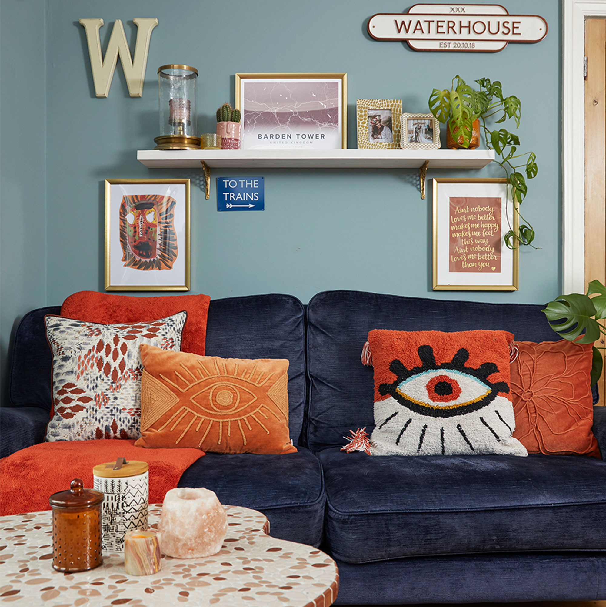
‘I always knew I wanted a traditional look when I owned my own home, and dreamed of having a room this big to fill with beautiful furniture, like this velvet sofa from Laura Ashley.’
‘Everything on this gallery wall behind is personal to us as a family; the numbers on our metal name sign refer to our wedding date and the lyrics were one of our wedding songs.’
The kitchen

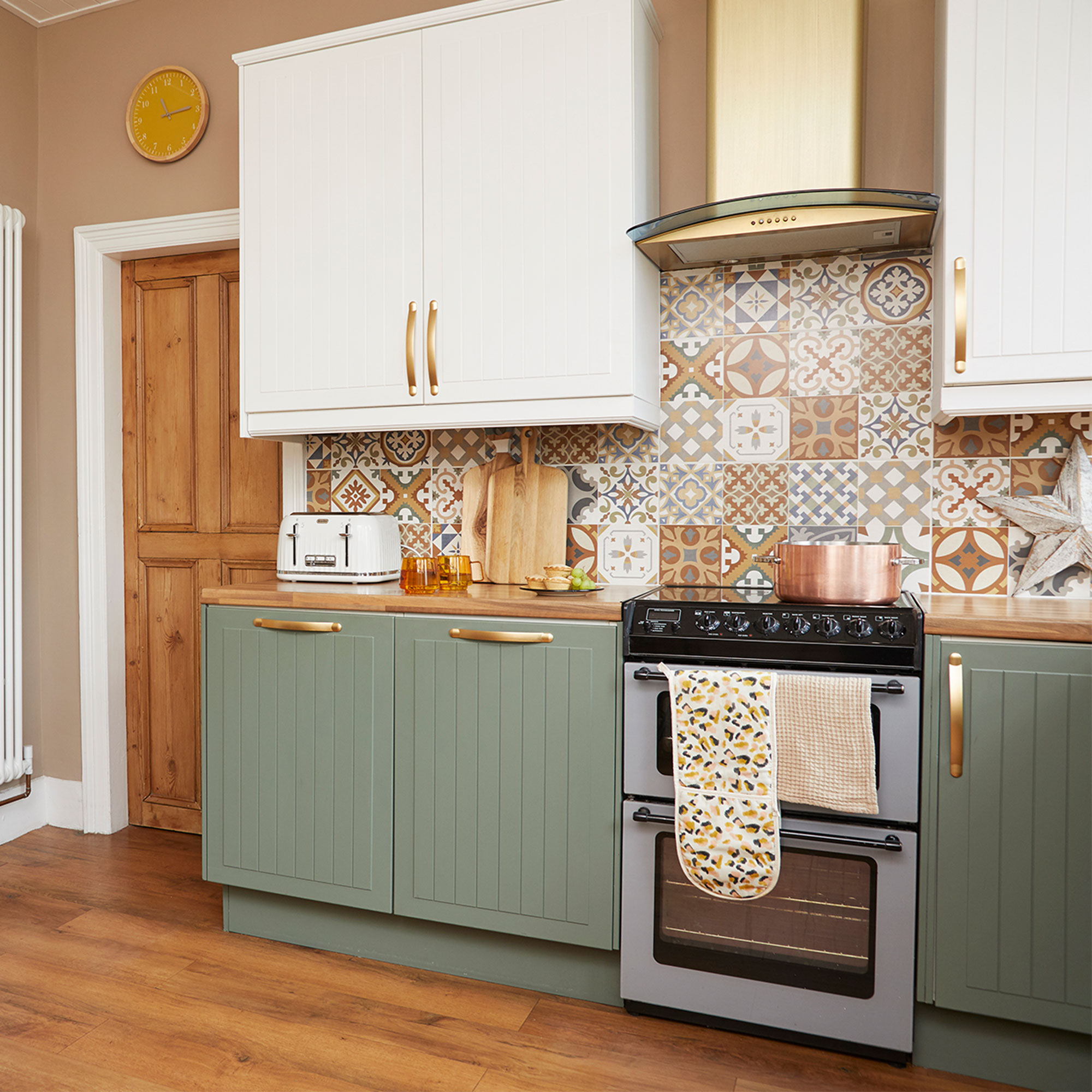
‘When we first moved in we gave the kitchen and living room a quick lick of paint to refresh them but had always planned a more thorough makeover once we’d finished upstairs.’
‘I loved the style and design of the room and didn’t want to spend a fortune on a new kitchen. I’d seen people painting cabinets on Instagram so decided to give it a go myself.’
‘I bought a £200 kit which included de-greaser, primer and brushes and chose a soft green for the base units and painted the top ones in Dulux Brilliant White. I then replaced the old stainless-steel tap with a gold one and finished off the look by spraying the cabinet handles, ceiling lights and shelf brackets gold.’
Kitchen shelving
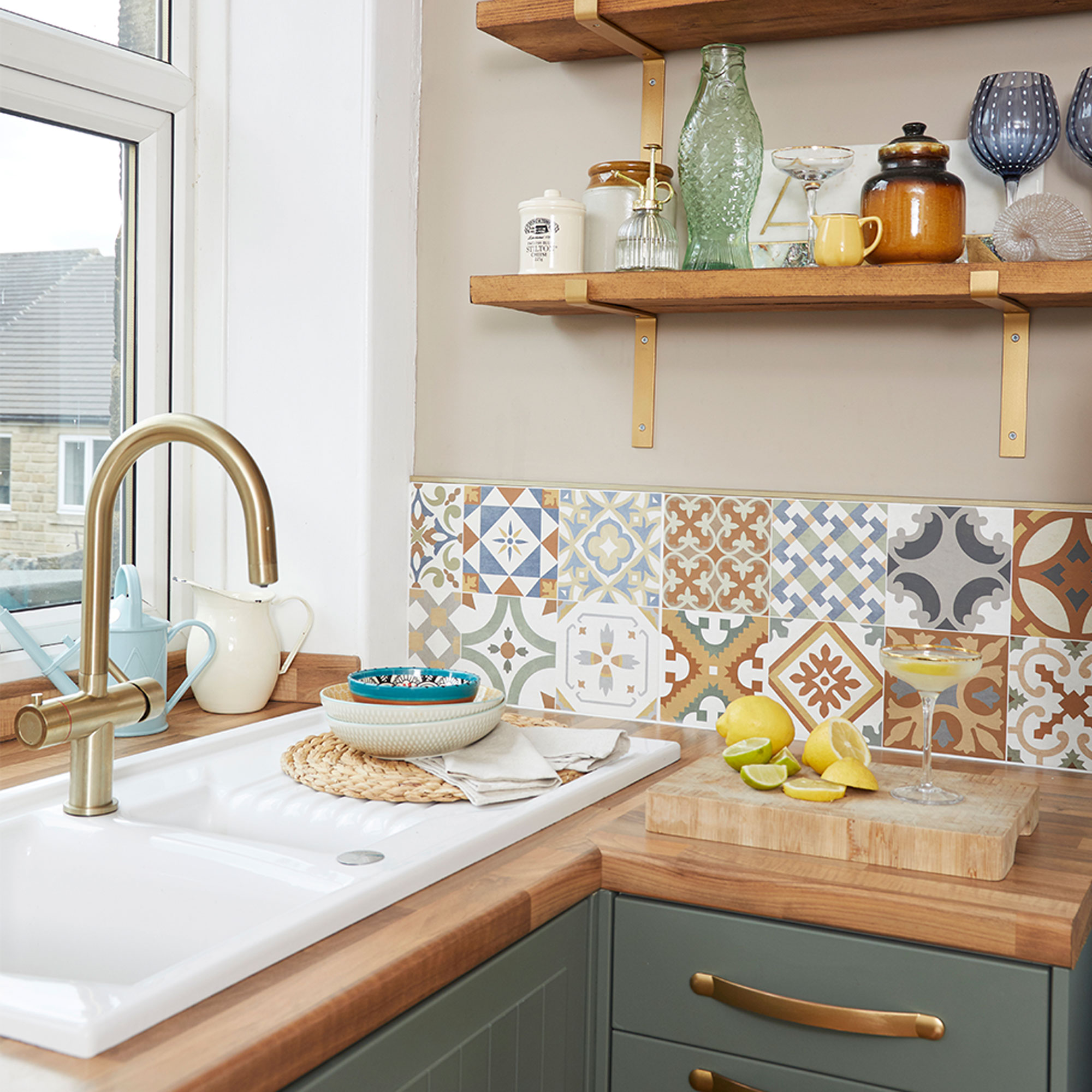
‘I’ve turned this redundant corner into a bar area, though the kitchen shelves are another excuse for a bit of display and styling. The Milla 4-in-1 boiling hot tap, from The Tap Factory, has been a game changer for me as it gives me cold filtered water and boiling water in an instant.’
‘We chose wooden worktops to complement the floor, though we got a professional in to help install them as it was quite a big job and we didn’t feel confident tackling it ourselves. We chose patterned tiles with mustard and blue tones, so went for copper hardware for the handles and shelves to finish the room.’
The dining room
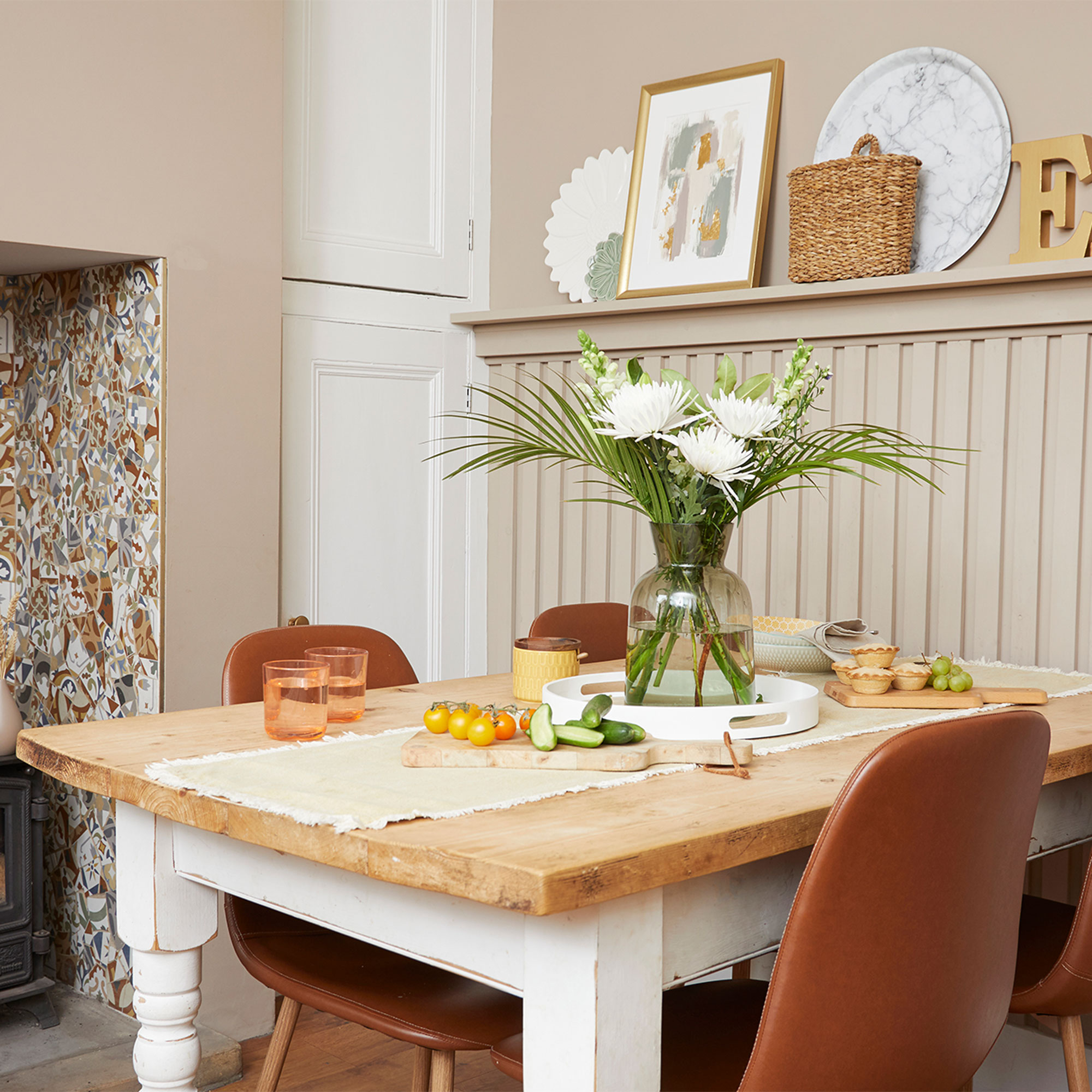
‘We bought the dining room table from a charity shop and replaced the original top with scaffolding boards to extend the table ever so slightly at each end to make it bigger for our growing family.’
Outdoor seating area
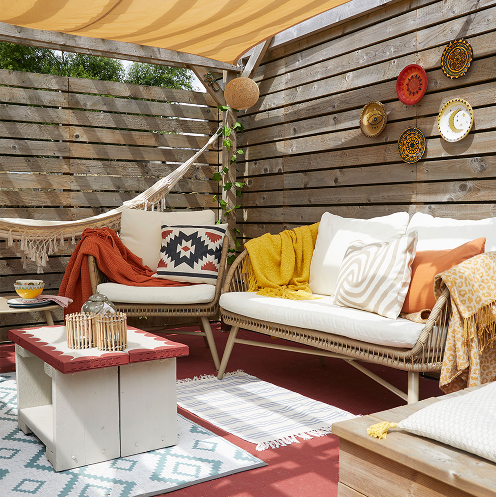
‘The garden was overgrown with mounds of mud and overgrown brambles everywhere, but once we hacked that back we realised we had even more garden than we thought. We concreted the surface under the pergola and added fencing around the edges to create an outside room.’
The bedroom
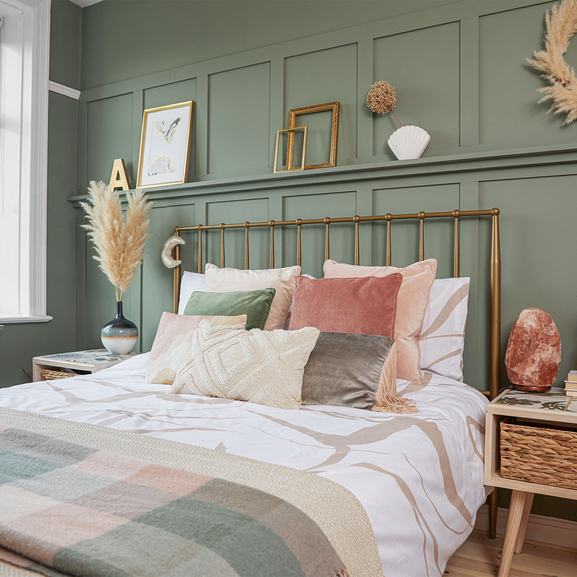
‘I’m good at visualising a look and thought wooden cladding would add character to the bedroom ideas, but we couldn’t afford to get people in to do the work. We both have a “can-do” attitude, though, so we decided to do it ourselves, and as my husband is a real perfectionist, he read up to make sure he got it right.’
‘We went for a palette of muted greens and pinks, which gives us a little bit of calm in a house full of boys. The bed came from Wayfair and the panelling is painted in Promenade by Crown Paints.’
Bedroom fireplace
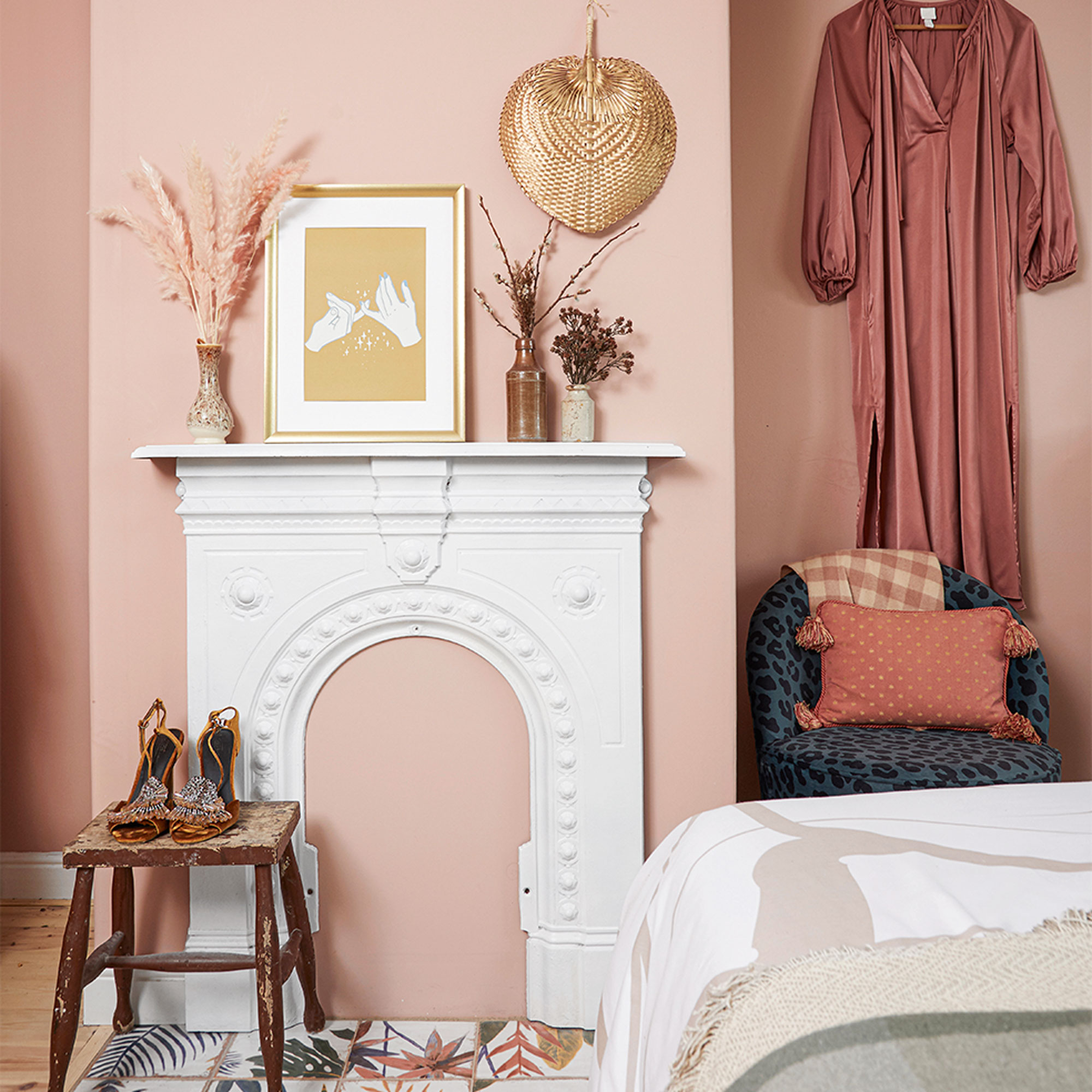
‘The fireplace was only £25 from a salvage yard but it had about 25 layers of paint on it so we stripped it back and painted it white before attaching it to the wall as a focal point. The walls are painted in Powdered Clay by Crown Paints.’
The bathroom
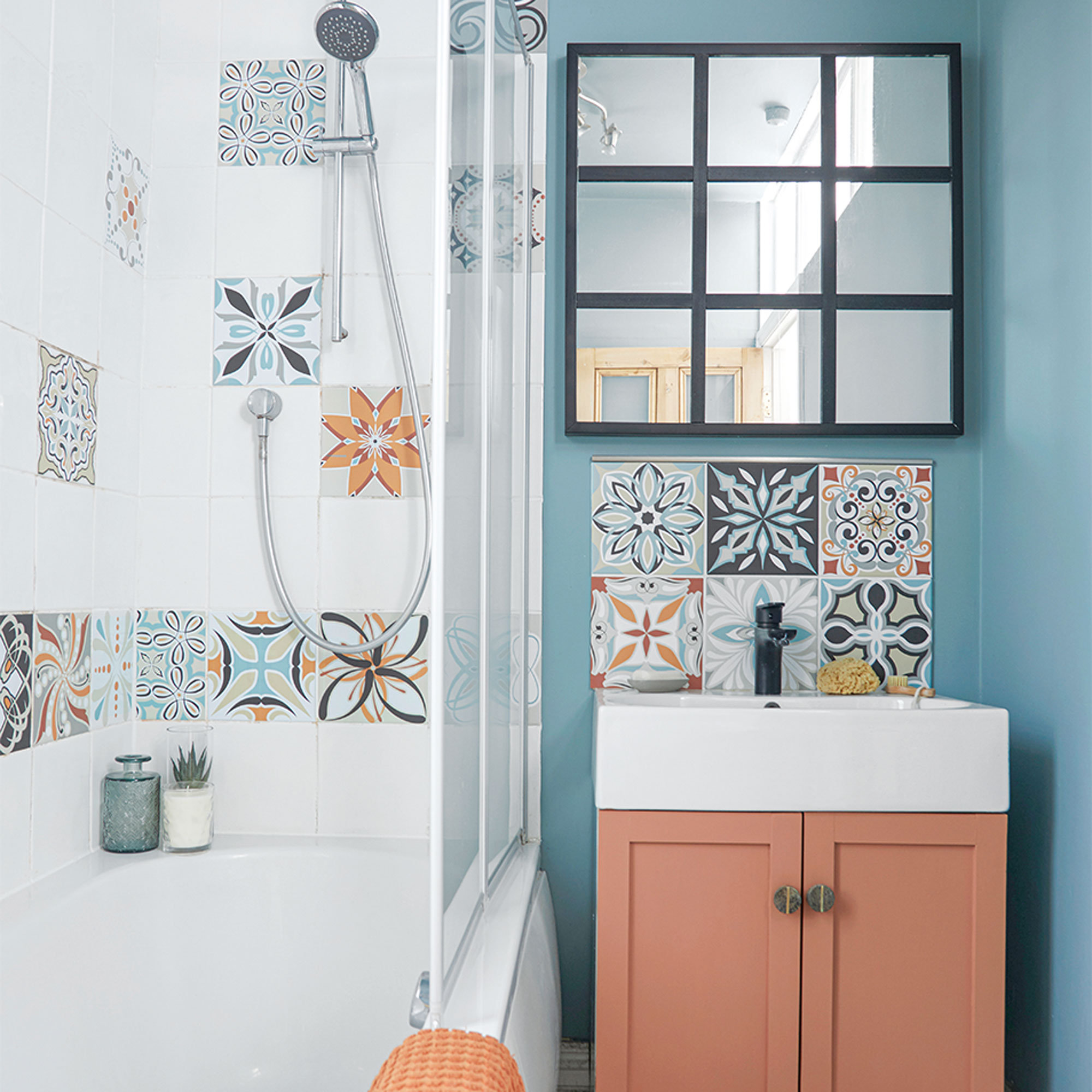
‘The bathroom is tiny so we couldn’t do much, but the walls and tiles were white so I added a splash of colour using tile stickers – a quick and easy budget way to transform a room.’
‘The mirror is a simple Ikea hack; we added the wooden slats to give the mirror a Crittal effect and then I painted it black.'
Children's bedroom
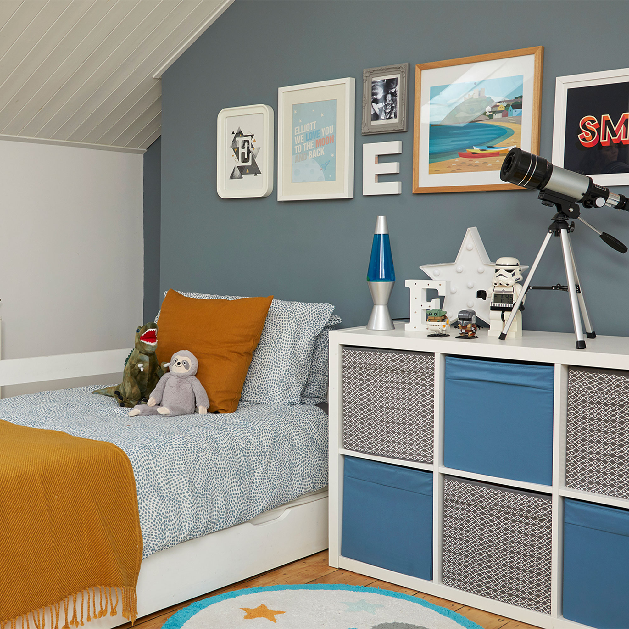
‘When it came to the children’s bedroom ideas, the attic had already been converted so we made it into a shared bedroom for our two sons. The colour scheme is calming blue and white with accents of mustard to liven it up.’
‘The Ikea Kallax storage cubes are a great way to hide away all the little toys and bits of Lego that the boys have collected over the years.'
Boy's bedroom
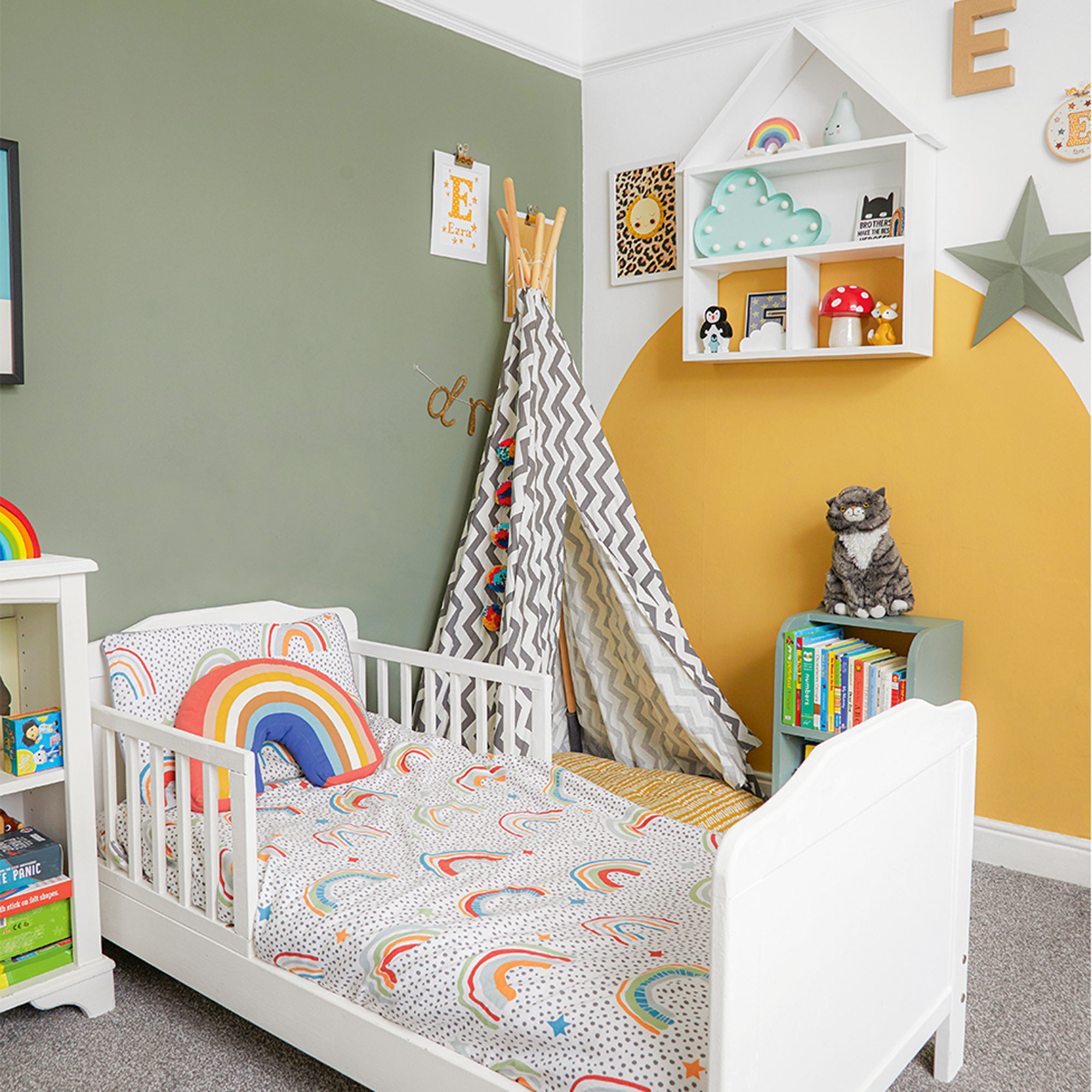
‘We loved the green colour in our bedroom so much that we decided to use it in our youngest son’s room too, though I complimented it with a fun mustard colour-blocked arch.’
Bedroom storage
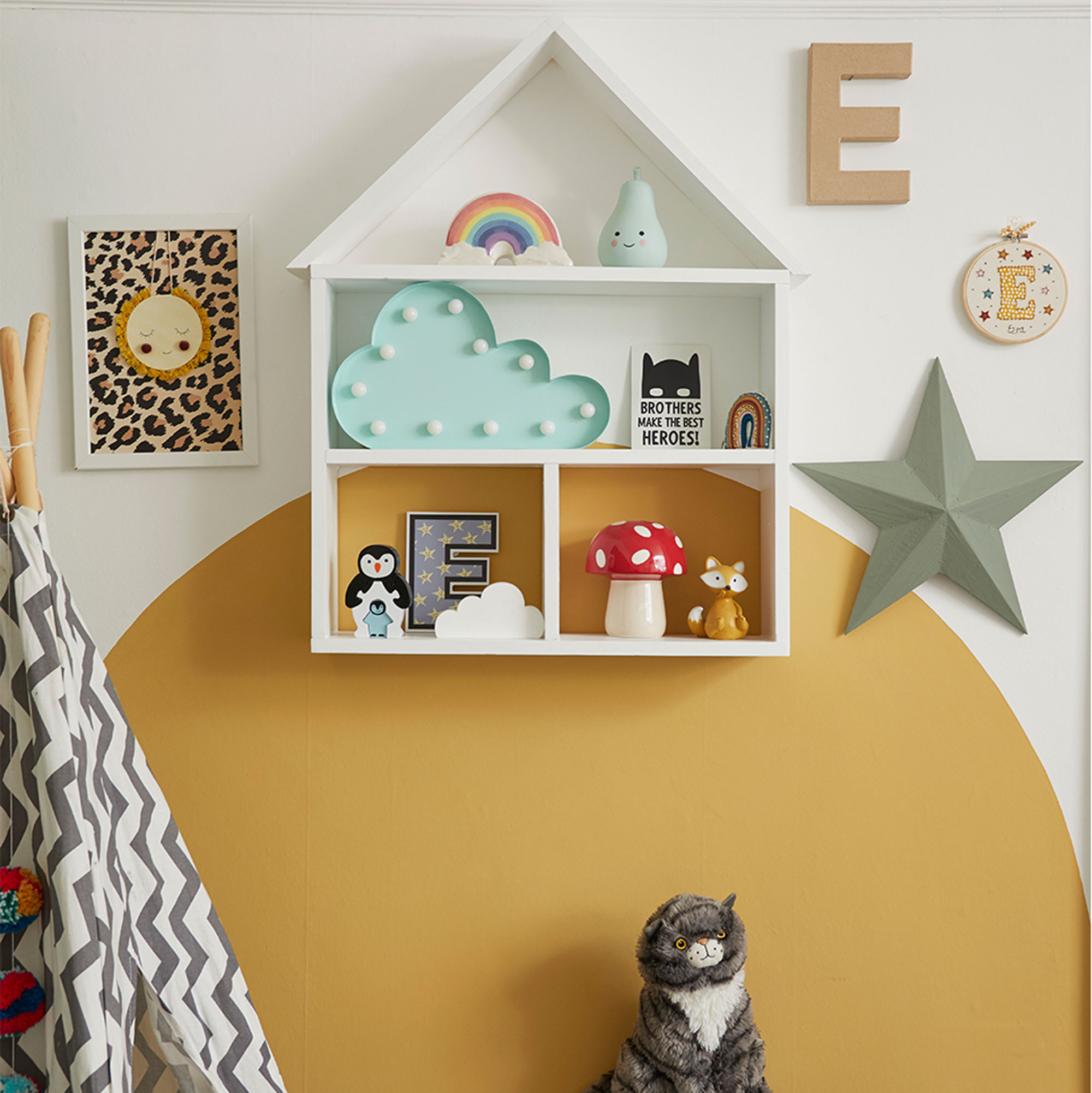
'The house shelf is a playful way to display some of our son’s favourite things.’
‘Although I’ll always love faffing and finding unique accessories in charity shops and secondhand stores to update and personalise the rooms, I love my home and I’m really proud to be able to look around and say we’ve done this ourselves.’
