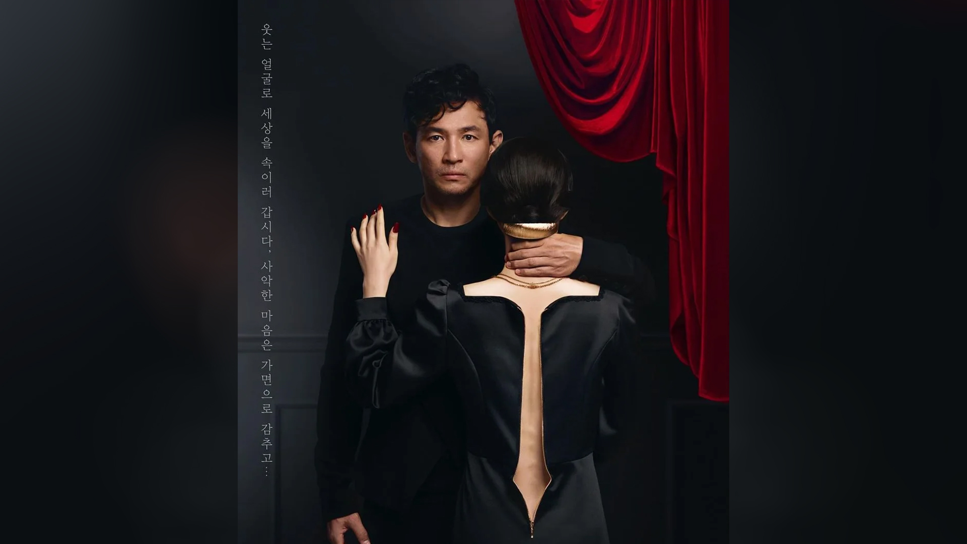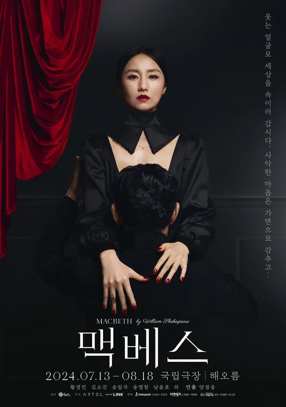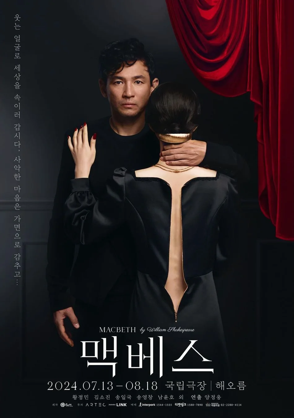
The National Theatre of Korea has unveiled a set of stylish posters for its upcoming production of Shakespeare's classic, Macbeth. With ingenious costuming and composition, the powerful design is a brooding reflection of the Scottish play, bringing a sleek and striking refinement to the poster design.
While we've seen our fair share of stunning film posters, rarely do we see theatre production posters get the same limelight from design fans. The National Theatre of Korea proves that poster design doesn't have to be overcomplicated to be memorable, spotlighting just how captivating minimalist design can be when used effectively.

Created by art director Yuni Yoshida and photographed by Noh Juhan, the two posters ingeniously make use of negative space to create striking visual storytelling. In one design, the queen's unzipped dress cleverly creates a sword silhouette, while the other features a crown motif shaped by the front of her garment. With a simple monochromatic colour palette offset by touches of red, the posters have a macabre edge that compliments the play's dark themes.

If you're after more poster inspiration, check out this clever optical illusion Lion King poster that was a roaring success among design fans. For more ingenious design, take a look at the stunning Italian magazine cover that has an eerie design detail.


