People often expect the most innovative communication to come from big brands in the private sector, but that's not always the case. It might seem an unexpected topic for clever, inventive design, but some of the best road safety ads are masterclasses in visual communication.
When you think about it this actually makes perfect sense. Road safety is something everybody already knows about. We already know it's wrong to drink and drive, we know we should wear a seatbelt and shouldn't use our phones at the wheel. People switch off when they hear these messages, so it takes something very clever to make and get people's attention and, perhaps, actually change their behaviour.
For more examples of great visual design communication, see our picks of the best billboard advertising and the best print adverts. In the meantime, here are three of the boldest and cleverest road safety ads we've seen.
01. This shocking optical illusion road safety ad
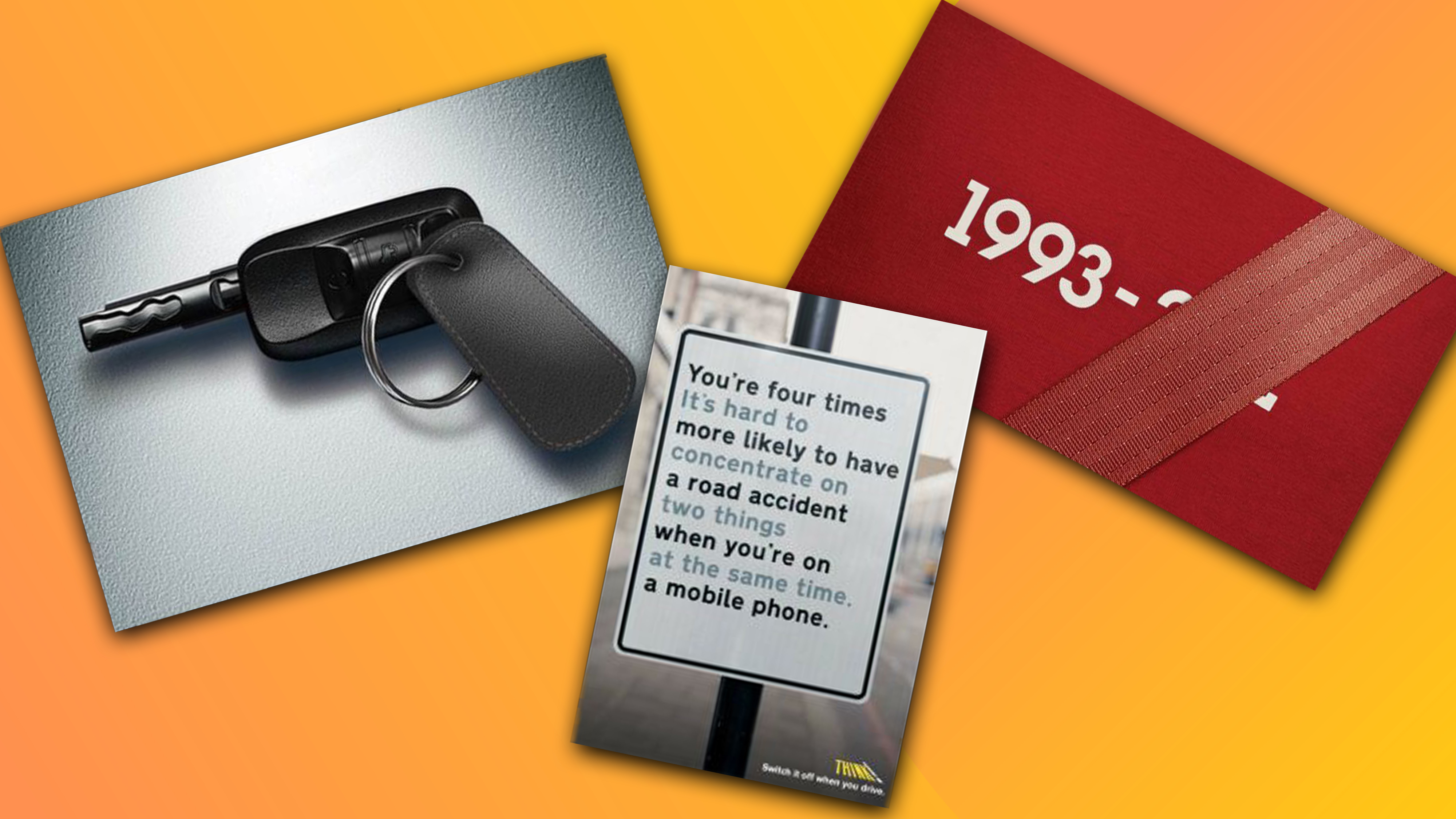
This road safety ad created in 2013 by Pakistan-based English-language newspaper The Frontier Post, is ingeniously simple but very hard-hitting. At first glance, it seems to depict a gun accompanied by the copy "Takes one life every 25 seconds." But look a little closer, and you see the gun is actually a car key. The analogy cleverly conveys how deadly a motor vehicle can be. No, it's not subtle, but when it comes to making an impact with a message that's already become tired, sometimes a blunt approach works best. The minimalist execution makes the message all the more stark.
02. This Think! road sign poster

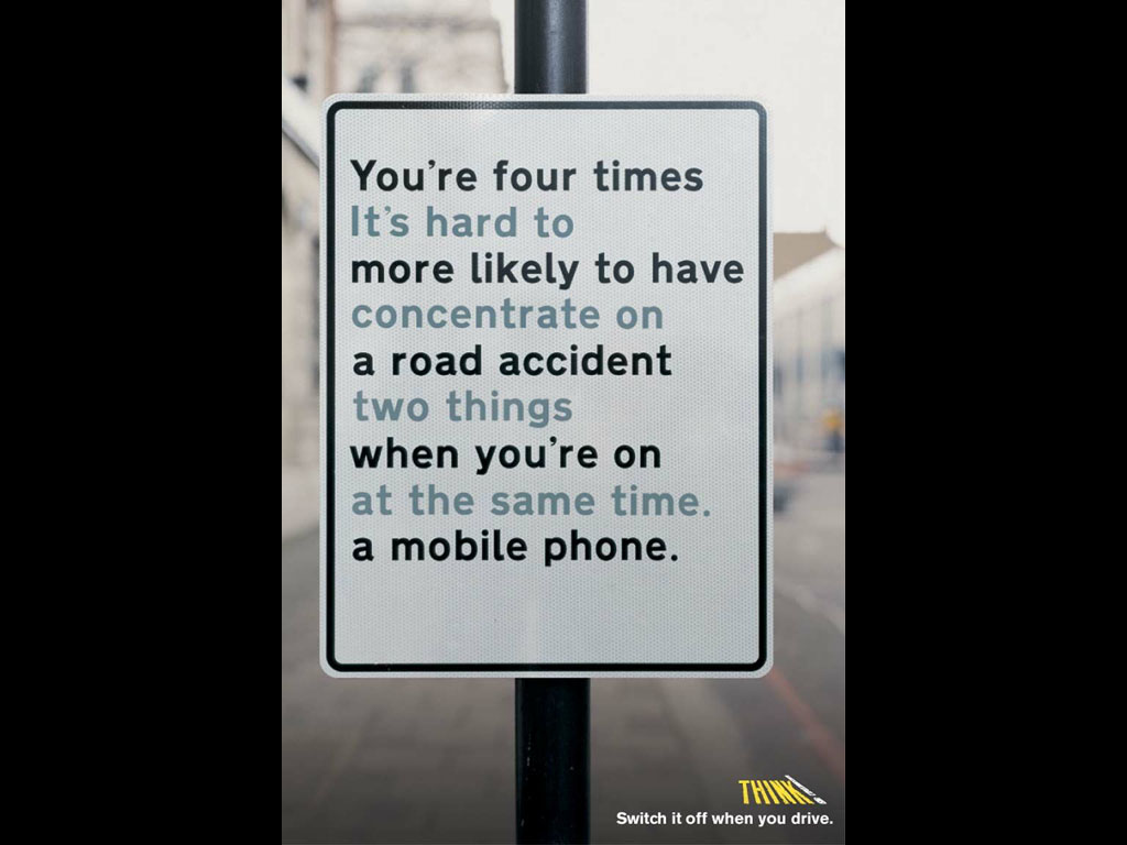
At first glance, this road safety ad appears to make no sense. And that's exactly the point. Designed to discourage drivers from using their mobile phones at the wheel, the ad shows a fictional road sign featuring two sentences interweaved in a way that makes it difficult to focus on either. The poster was the work of Think!, which runs road safety campaigns in the UK, and AMV BBDO, back in 2002, when mobile phones were less 'smart' (and less distracting) than today. It feels even more pertinent today.
The Quebec Automobile Insurance Society seatbelt ad

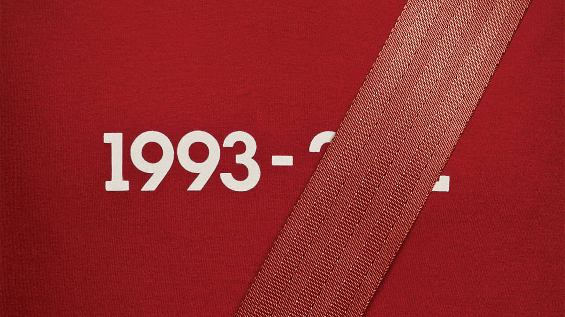
This clever road safety campaign highlights the importance of wearing seatbelts through a series of close-up shots that show a year of birth and, presumably, death. The second year is covered by a seatbelt, since it saved their life. The campaign was created for Quebec Automobile Insurance Society by the creative agency lg2 in 2012. We're not sure who wears a T-shirt with the year of birth and death, but it certainly gets attention.


