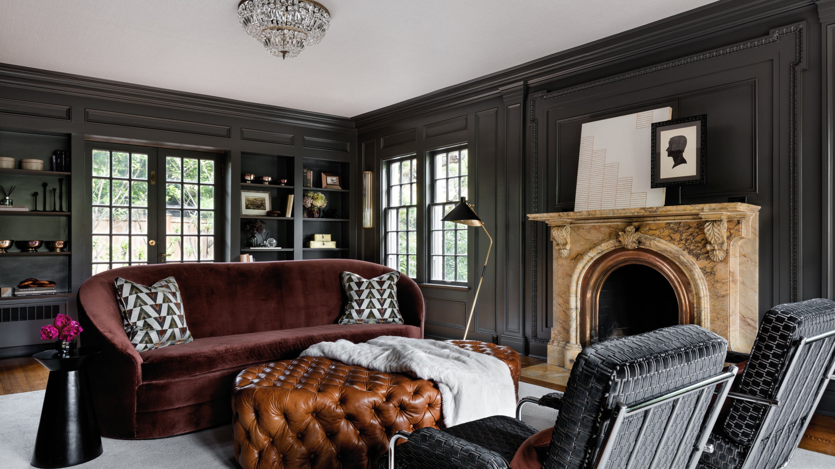
Designed by Shannon Adamson Interior Design, this historic 20th century Jacobethan mock Tudor home in Seattle mixes Art Deco influences with statement 1970s furniture. Adding to the drama is the dark paint walls that characterize each of the rooms and add a depth to the 1970s feel.
'The clients were very particular about the feel they wanted for the house, opting for moody tones over bright spaces to create a cozy feel,' explains Shannon. 'Rooms were painted in a consistent wall color from top to bottom, to avoid creating busy contrast between the walls and trim.'
The choice in dark paint was also in an effort to bring the historic home into the 21st century. Although the clients love and appreciate the historic interior architecture and moldings throughout the 1917 home, their overarching style leans more contemporary,' explains Shannon.
'When the clients expressed concern about achieving balance between the two styles, I suggested that using darker wall colors would subdue the interior architecture into a quieter, more textural role.'
Read on to find out the three grey shades - and one turquoise - the designer opted for to transform this modern home.
The sitting room
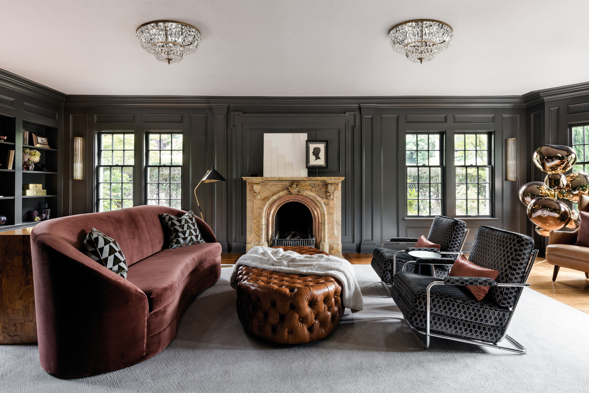
In the living room, the designer settled on Sherwin Williams' Iron Ore. A cool charcoal shade, it adds sophistication and with its sheen really allows the historic crown molding to really shine. 'The paint's satin finish highlights the undulations of the crown molding in a subtle way, showing them off without creating busyness,' explains Shannon Adamson.
The room also has gorgeous original quarter-sawn oak flooring throughout the main floor, 'which just sings next to darker paint colors,' says Shannon.
The furniture and fabrics needed to complement the coloring. Cognac leather, sienna velvet, a bit of pattern and dark metals were chosen to keep the palette from becoming too cold or oppressive.
The low ceilings also helped the decision for a dark colorway on the wall. 'Proportions of the room are a key factor,' says Shannon. 'A space with eight to ten-foot tall ceilings feels cozy when painted a moody color, but the same color in a large space with very tall ceilings could feel heavy and oppressive.'
The sitting room has such a lovely variety of textures and shapes playing off the architecture, it's a really engaging room to be in. The focal piece is the original carved Italian marble fireplace, and it was so fun to select the surrounding pieces to play off those elements - 1950s Italian crystal chandeliers, a custom curved velvet sofa, and the 1930s Gilbert Rohde chairs.
The breakfast room
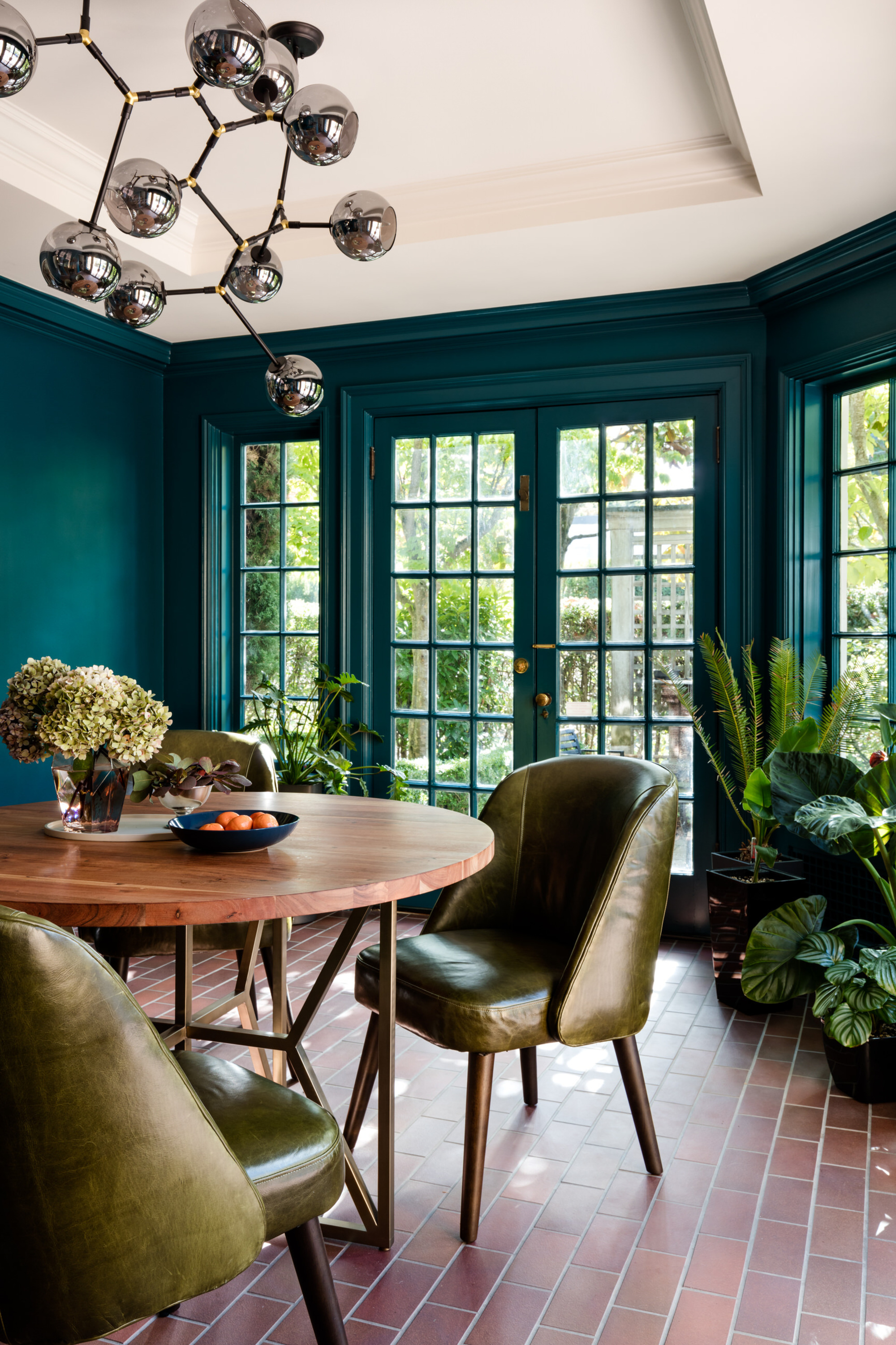
In the breakfast room, the walls are painted in Benjamin Moore's Galapagos Turquoise, a jewel-like deep teal tone that has a lot of depth to it but warmth at the same time. 'There is a geographic component at play as well,' says Shannon. 'Dark color schemes seem to work beautifully in areas with gloomy weather (like Seattle).
'Deeper colors somehow deliciously complement the filtered natural light in an already-grey surrounding. I'm not sure the effect would be the same in Los Angeles or on the south coast of France.'
The main bedroom
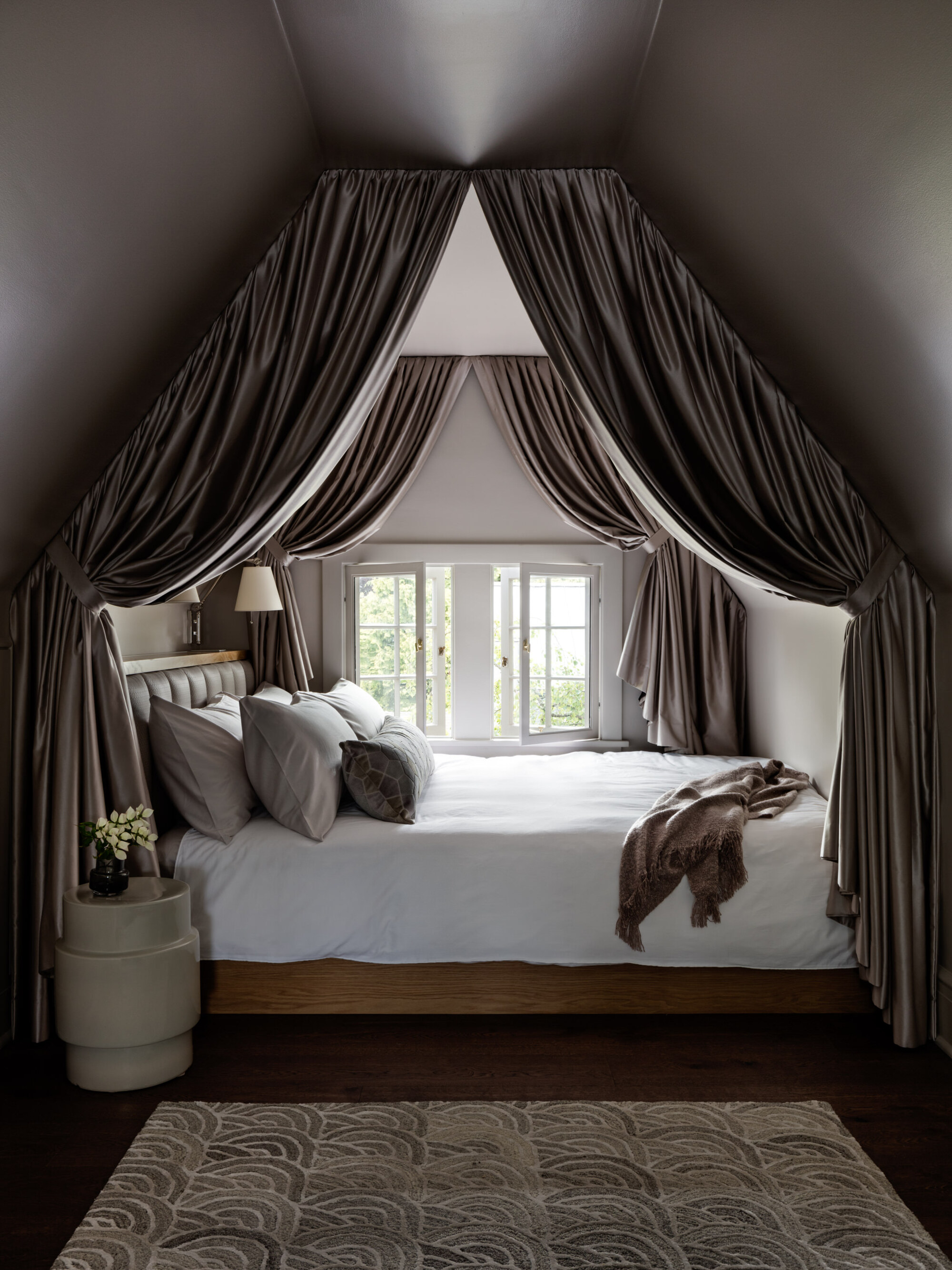
In the main bedroom, Shannon opted for Sherwin Williams's popular paint, Classic French Grey. This tone has a slight warmth to it that stops it from feeling too cold, with the color really coming to life in south-facing light.
In this bedroom, it is perfect for bringing that cozy atmosphere. 'Rooms, where we go to seek an enveloping environment are a natural candidate for a moody scheme,' says Shannon. Cozy bedrooms lend themselves to darker colors, where a bit of drama is warranted.
The bar
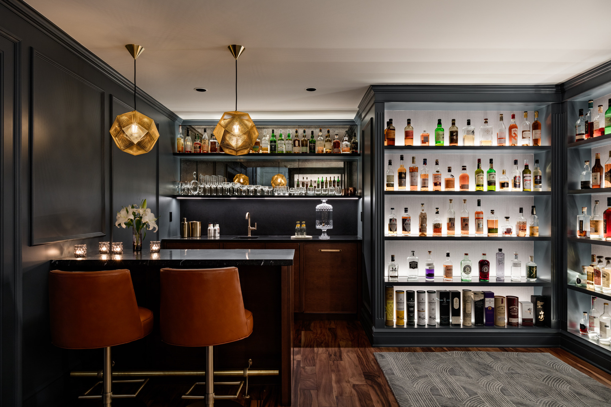
The wet bar area has a sleek and sophisticated look, with thanks to the wall paint, another Sherwin Williams, this time Outerspace - a mysterious blue with grey undertones, giving it a brooding edge.
The speakeasy bar is another favorite space,' says Shannon. 'Expanding off an original wet bar (now the back bar), Shannon used walnut cabinets accentuated with honed Nero Marquina marble countertops. Locally-made antiqued mirror panels sit above the bar, and an aged brass footrail and Tom Dixon pendants add a touch of sparkle.
To show off the clients' impressive liquor collection the existing bookcases were lined in a textural Arte wallcovering, and the team inlaid bespoke linear lighting for a really dramatic feel. 'The entire space was painted an inky blue-black, which plays nicely off the warm acacia wood floor.'
3 perfect moody shades
This deep and sophisticated tone has a dark charcoal tone to it, perfect for creating a cozy scheme.
Classic French Grey by Sherwin Williams has very subtle undertones, making it almost a perfect grey.
The 70s influences
The house has a 70s decorative vibe to it, but this wasn't necessarily a specifically intentional stylistic addition, says Shannon. 'When gathering inspiration for the project, I looked to the work of Jean Michel Frank, a French interior designer in the 1920s and 30s.
'Many of his projects were in historic homes, and he was the master of contrasting traditional ornamentation with streamlined furnishings, much like this home.'
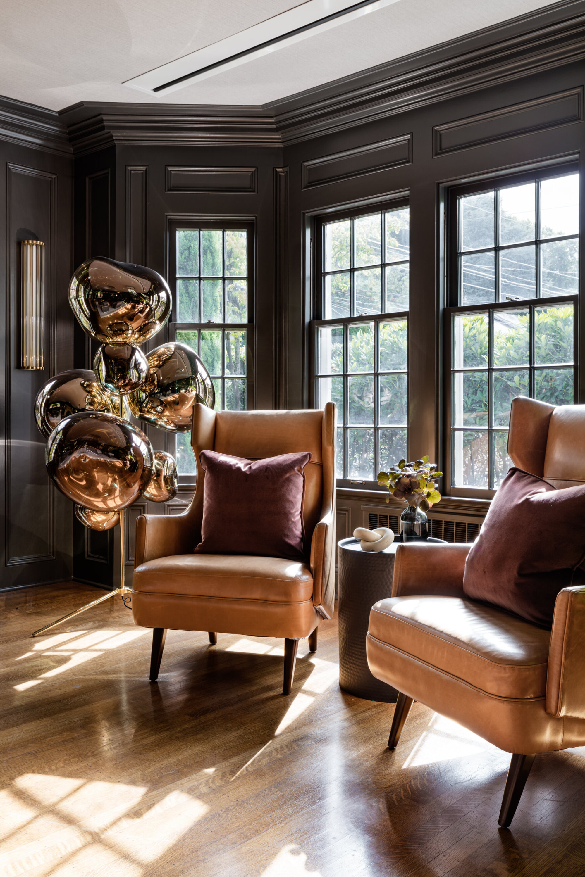
In the search for streamlined pieces there came along a few items that hearken back to the 1970s like the sitting room Arteriors wing back chairs in cognac leather, and a retro geometric O&L wallpaper used in the powder room.
'During the project, we also incorporated a sculptural Tom Dixon floor lamp the clients had purchased. Its sculptural shape added another funky element, which plays off the shiny Flos T2 table lamps on a pair of asymmetrical metal console tables (also by Arteriors).
'It's sort of a cheeky play on the furniture found in more historically accurate homes-- a pair of console tables with mirrors above, two wing chairs huddled together, a tufted leather ottoman - but reimagined in a playful way.'

