With the arrival of a new year, the focus is always on the fresh trends that a new season brings with it – at least here at Ideal Home, it is. But as new looks rise in popularity, others fall out of favour as a result, which includes interior colours – and even though you might not even realise it, these are the colour combinations dating your home in 2026.
As interior colour trends change with time, so do the best colour combinations for your home. And as overall home decor trends for 2026 favour earthy shades, as well as deep and rich colours like burgundy, there is a common theme running through the colour pairings that are no longer up to date – and the theme is high contrasts.
‘Our relationship with our homes has shifted, and people are increasingly drawn to spaces that feel warm, welcoming and nurturing, rather than minimal to the point of feeling impersonal,’ says Marianne Shillingford, creative director and colour expert at Dulux. ‘There’s a definite move towards warmer, more embracing palettes.’
So with that being said, the outdated colour combos are likely not going to take you by surprise…
1. Black and white
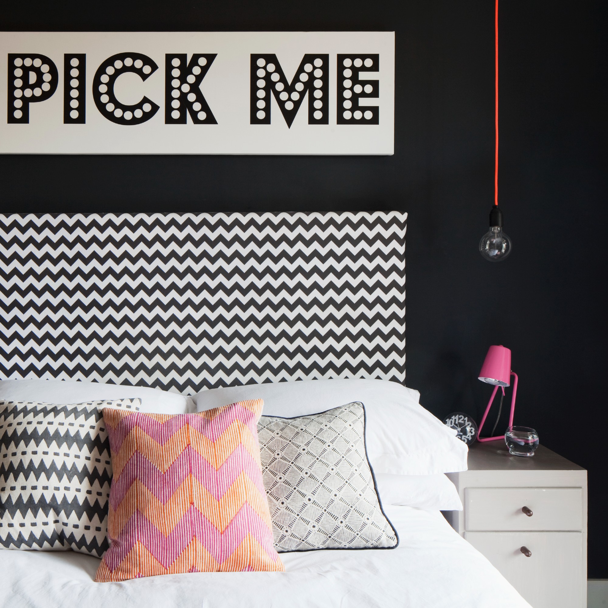
Black and white displays one of the most drastic and stark of colour contrasts. So it’s only natural that the popularity of this colour pairing is decreasing.
‘High-contrast black and white schemes can start to feel a bit harsh if they’re overused, particularly when they’re not softened with any warmth or texture,’ says Rob Abrahams, co-founder of COAT Paints. ‘In general, anything that lacks depth or warmth tends to date more quickly.’
2. Grey and white
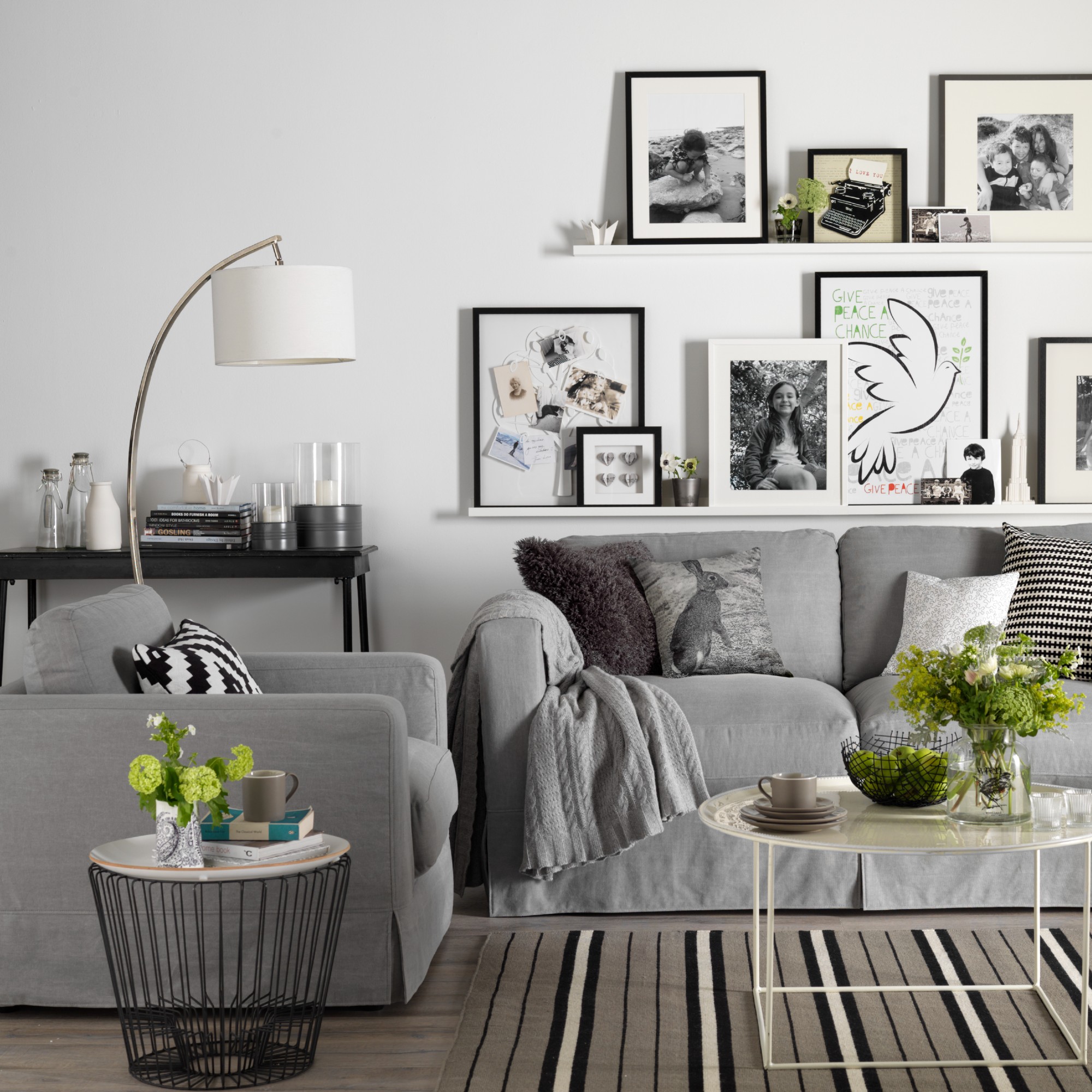
It feels like I’ve been talking about cool, brilliant whites and grey shades falling out of favour for ages now. But some people still feel comfortable with these cold albeit neutral shades. But perhaps 2026 is the year that we eradicate the presence of cold white and millennial grey.
‘Some of the cooler, more clinical combinations are beginning to feel a little past their best, particularly that familiar pairing of “millennial grey” with crisp, blue-toned whites. While it was once seen as effortlessly modern, it can now feel quite stark and lacking in personality,’ Marianne at Dulux says.
What’s replacing them
1. Soft off-whites and earthy shades
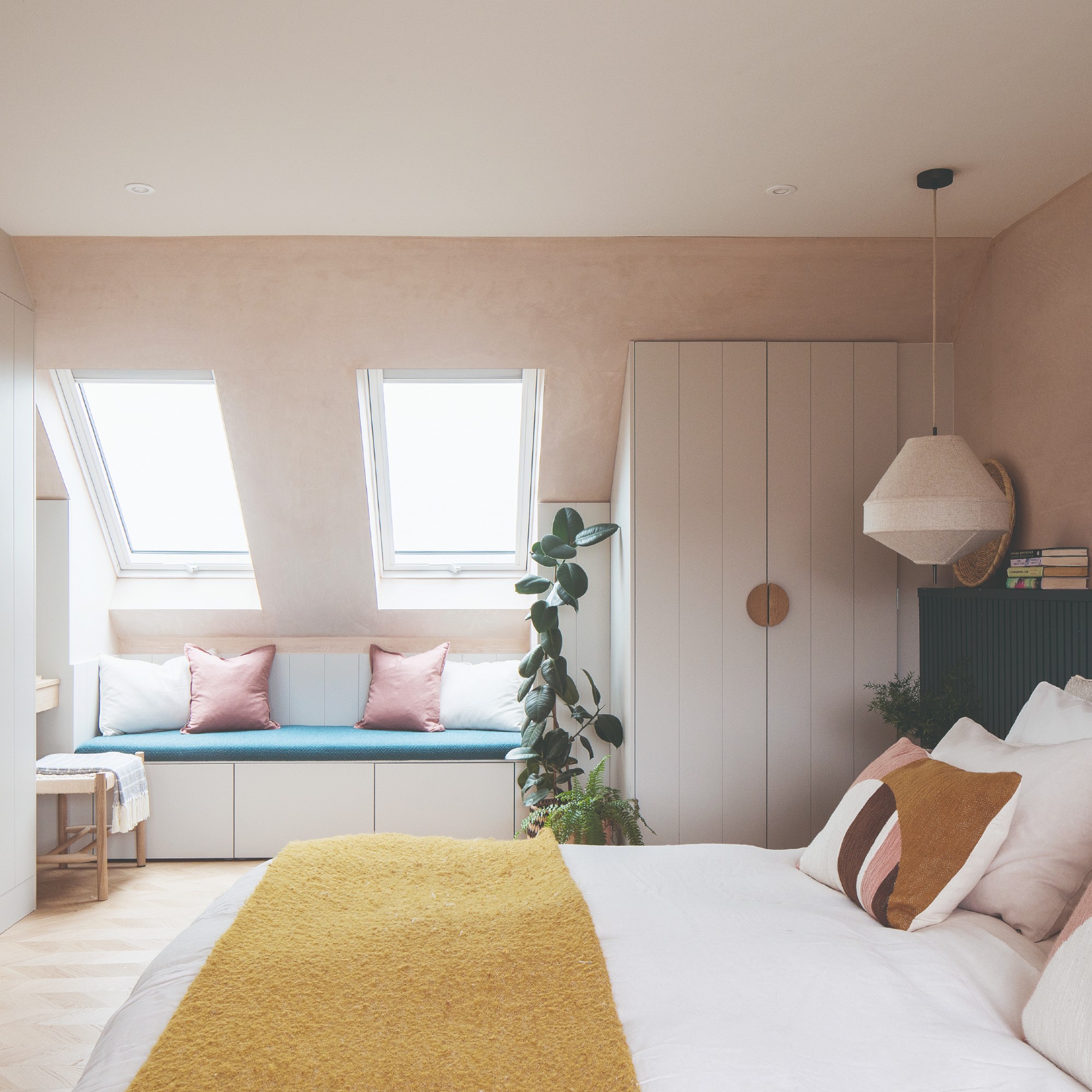
It’s official – warm-toned white and off-white shades are replacing brilliant white in 2026 in general. And as for the overly simplistic and cool greys and black, these colours are being swapped for warm, cosy, earthy shades when creating colour combinations for a home.
‘We’re seeing a clear move towards warmer, more layered palettes,’ Rob at COAT says. ‘Soft whites such as Mindful paired with earthy tones like clay, taupe, muted greens or yellows like Cheap Soufflé are performing really well because they create a space that feels calm and inviting.’
A paint colour inspired by the natural shade of fired clay like this one brings a lot of warmth into a room.
Add some grounded warmth underfoot with a patterned rug in earthy shades like this washable Ruggable design - it's currently one of my favourite Ruggable rugs.
Swap a grey sofa for one in a delicious brown shade like this John Lewis Pleat sofa, one of the best new sofa designs to come out of 2025.
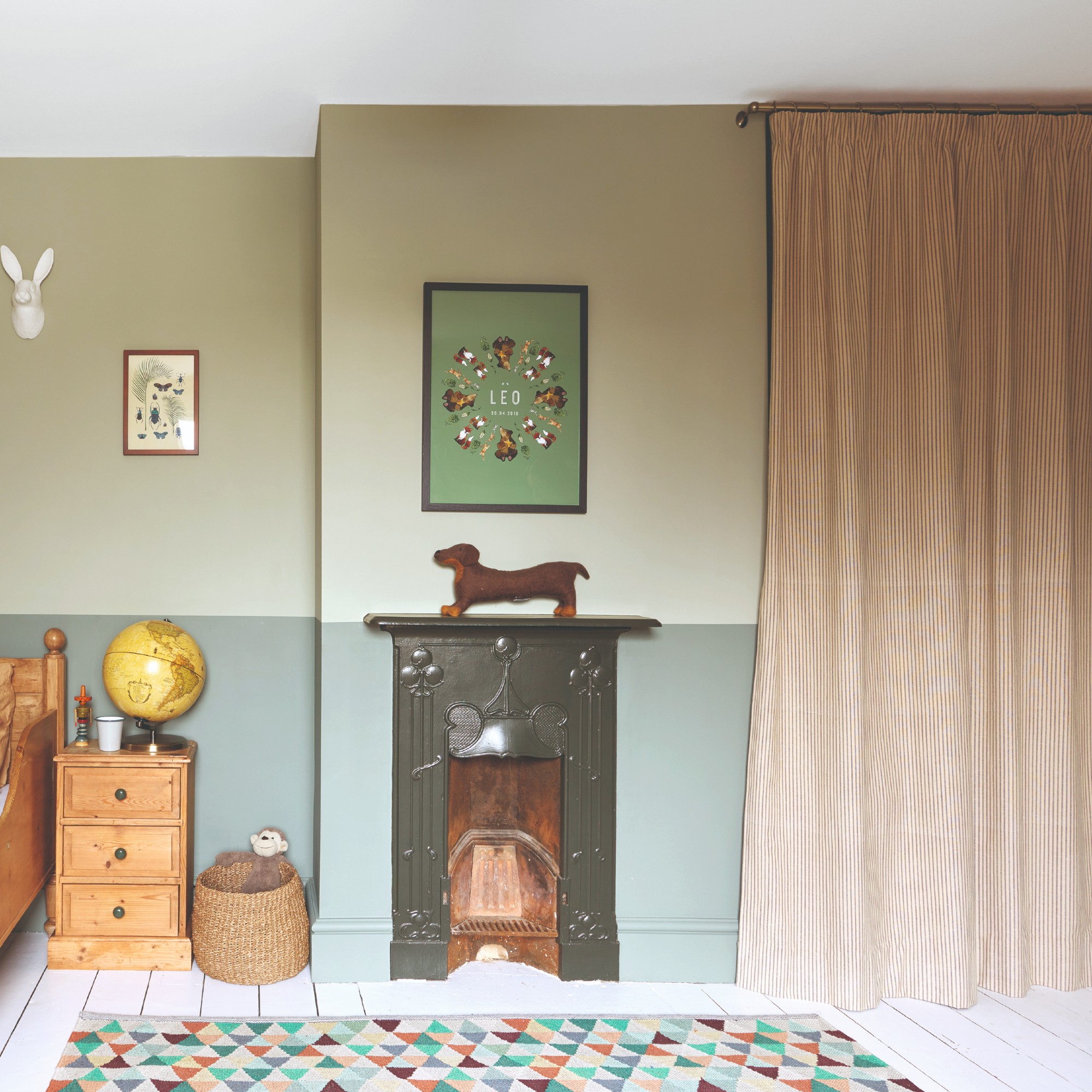
Olive green is not only one of the most sophisticated and grown-up greens, but it's also the most organic-looking. And this Lick paint shade real does the real thing justice.
La Redoute's 100% linen bedding regularly sells out, that's how good it is! It comes in over 20 colourways and my favourites change regularly - but this plaster-like pink is both comforting and earthy.
Going for nature-inspired tones is anything but boring - especially when you incorporate pattern and texture, as perfectly demonstrated by this gingham, pleated table lamp from M&S.
2. Tonal schemes
Colour drenching is not going anywhere anytime soon. In fact, if anything it’s further developing into the likes of double drenching and colour capping paint trends. The versions of the biggest decorating of the last few years incorporate multiple shades and tones of the same colour creating depth in a room and a desired layered effect.
‘There’s a growing interest in tonal schemes, using variations of the same colour across walls, woodwork and ceilings. This can work with bolder shades, for example a dark red such as Smith & The Devil paired with a softer one such as La Torre or even a plaster pink such as Piglet. That approach adds depth without strong contrast, which makes a room feel more cohesive,’ Rob at COAT explains.
Is your home’s colour scheme on the list? And are you thinking of giving it a much needed update?