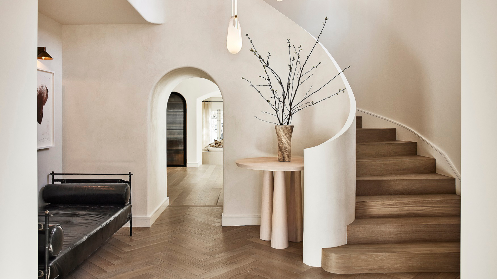
The entryway is an essential part of your home on a conceptual as well as a practical level: it's the first room visitors will see, and it sets the tone for the rest of the home. So it's no surprise that interior designers give a lot of thought to the way they create schemes – and that the entryway trends we see trickling down as a result are geared to help create a soothing, welcoming but still practical space.
Varied though these trending entryway ideas are, they all have one thing in common: they help to define this transitional space as a room in its own right, with careful attention to color, furniture placement, artwork and storage.
5 entryway trends to try now
If your own entryway feels a little lacklustre right now, we'd recommend picking up at least one of these entryway trends – straight from the mouths of designers – to help inject a little oomph into your space.
1. Round tables
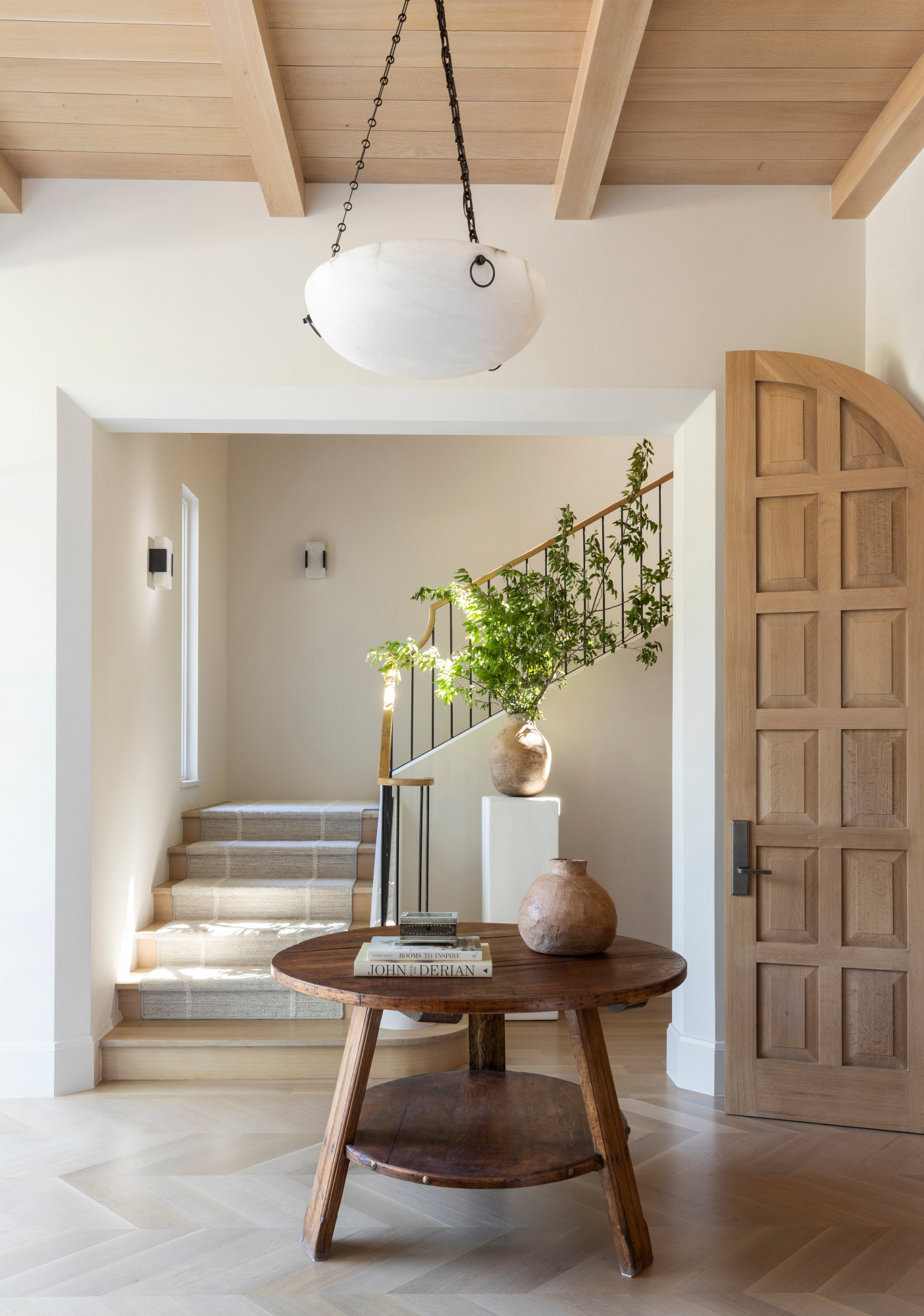
Say goodbye to consoles: we’ve seen a growing number of top designers using a round table as a functional centerpiece in an entryway. ‘A round table in an entryway is a great way to add layers to a larger space and create a landing area for small items as you walk in the door,’ says Jennifer Sissom, lead interior designer at Ryan Street Architects, based in Austin, Texas. The shape creates better circulation within the space, she explains – and is perfect for entryway table decor ideas too: ‘It's the perfect place for fresh flowers that welcome guests into your home.’
Opt for a table that sits at dining height or above, rather than a side or coffee table – these will get swallowed up in the space. For the entryway at the top of this page, KES Studio used a piece at bar height to match the sweeping architecture of the stairs. ‘Placement of the table within the curves of the stairs is not only functional but creates a focal point upon entry,’ says founder Kara Smith.
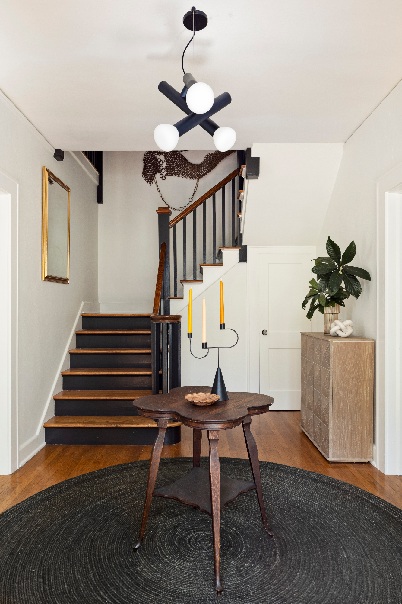
And of course, you needn’t be limited to uniformly round tables: the space above by Chinotti House, based in Gainesville, Florida, uses a clover-shaped design. ‘We consider entry spaces the first taste of what's to come in the rest of the home,’ say owner Chelsey Cox and designer Rachel Rector. ‘This entry is a "traffic circle" of sorts; the front door, the stairs, and openings on the right and left for the living room and dining room. It was important to have a small, rounded table here so as to not impact flow between these spaces.’
2. Gallery-style spaces
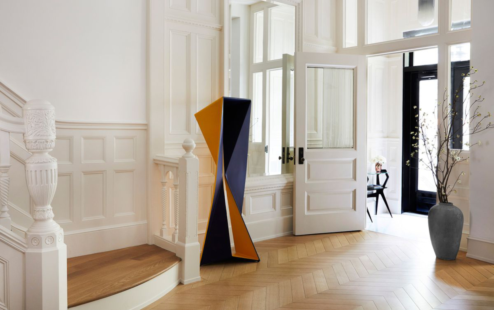
No need to save your best art pieces for the living room: designers are making entryways gallery spaces in their own right with a statement piece of art. After all, this is the first room your guests will walk into – so why not confront them with an incredible piece off the bat?
If you’re approaching the look with on-trend wall art, keep the styling around it minimal: try placing it above a console, under a picture light or next to a complementary wall light, and don’t be afraid to embrace negative space: it’s essential to make the piece the focus of the room.
Alternatively, follow the lead of New York studio GACHOT and turn to sculpture. ‘The design directive was to create a gallery-like space within the living environment to showcase the client’s extensive and ever-growing art collection,’ explains Denise Downing of the entryway above, where a sculpture by Thomas Müller greets visitors through the front door.
3. Color-contrasting sight lines
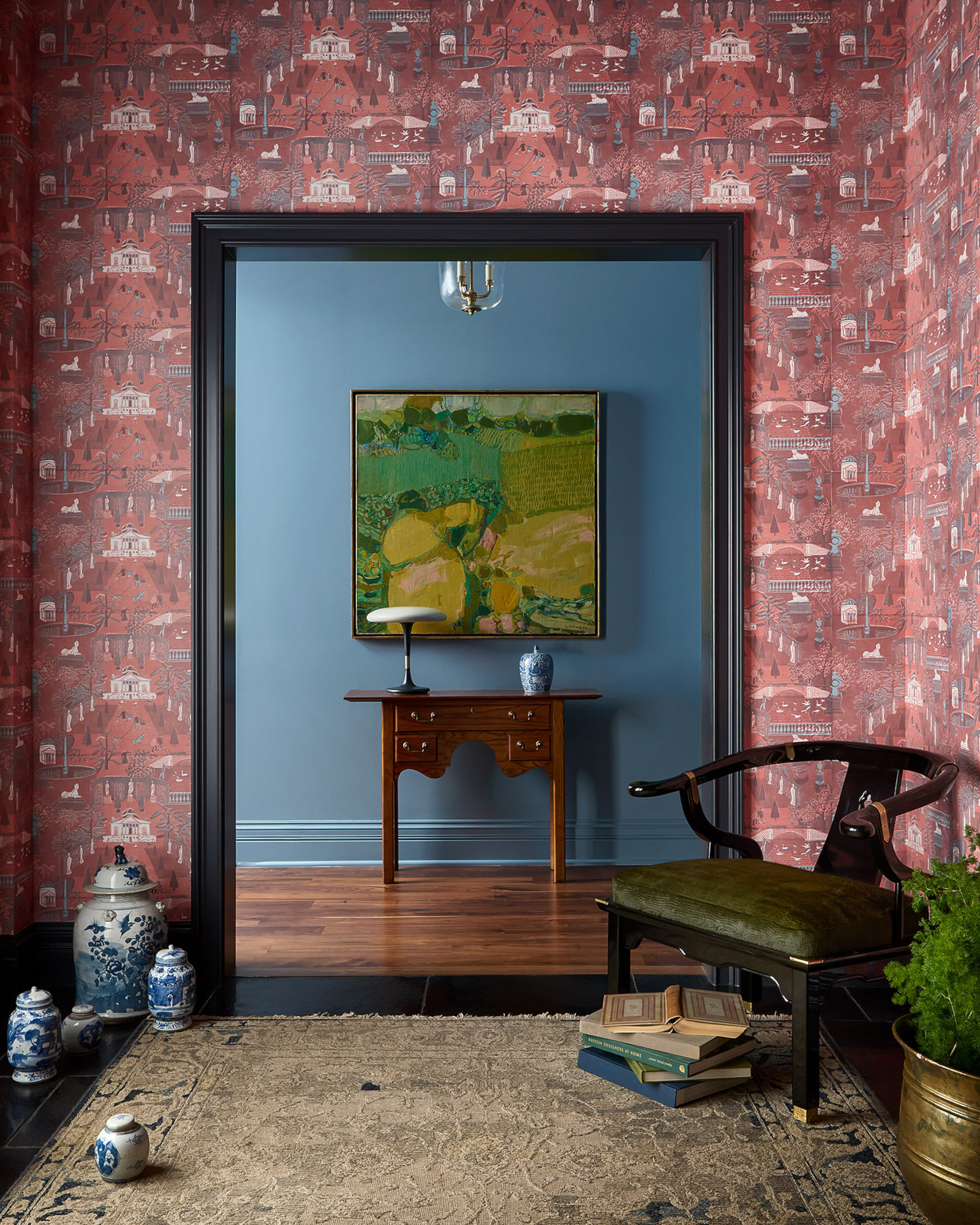
Entryway color ideas are typically tricky to nail, but the trendometer is swinging towards using shades that play off the adjoining rooms in a bold, playful way. For example, you might choose a moody dark blue entryway that leads into a colorful living room with vibrant pops of orange. Whatever color pairing you choose, the key is to work sightlines and make sure there’s a visual connection between the rooms, be that an open archway or a glazed door.
The entryway above by Salt Lake City's Susannah Holmberg is framed by an opening through to a living space; the color is carefully chosen to bring the entryway into the room. ‘We painted the adjacent hallway a corresponding blue because rarely is a room experienced on its own,’ Susannah explains. ‘The relationship to the space beyond will always affect the experience. With that in mind, we chose a color that would enhance this entry, while also bridging the color palette of the art and the wallpaper.’
4. Chairs as objets
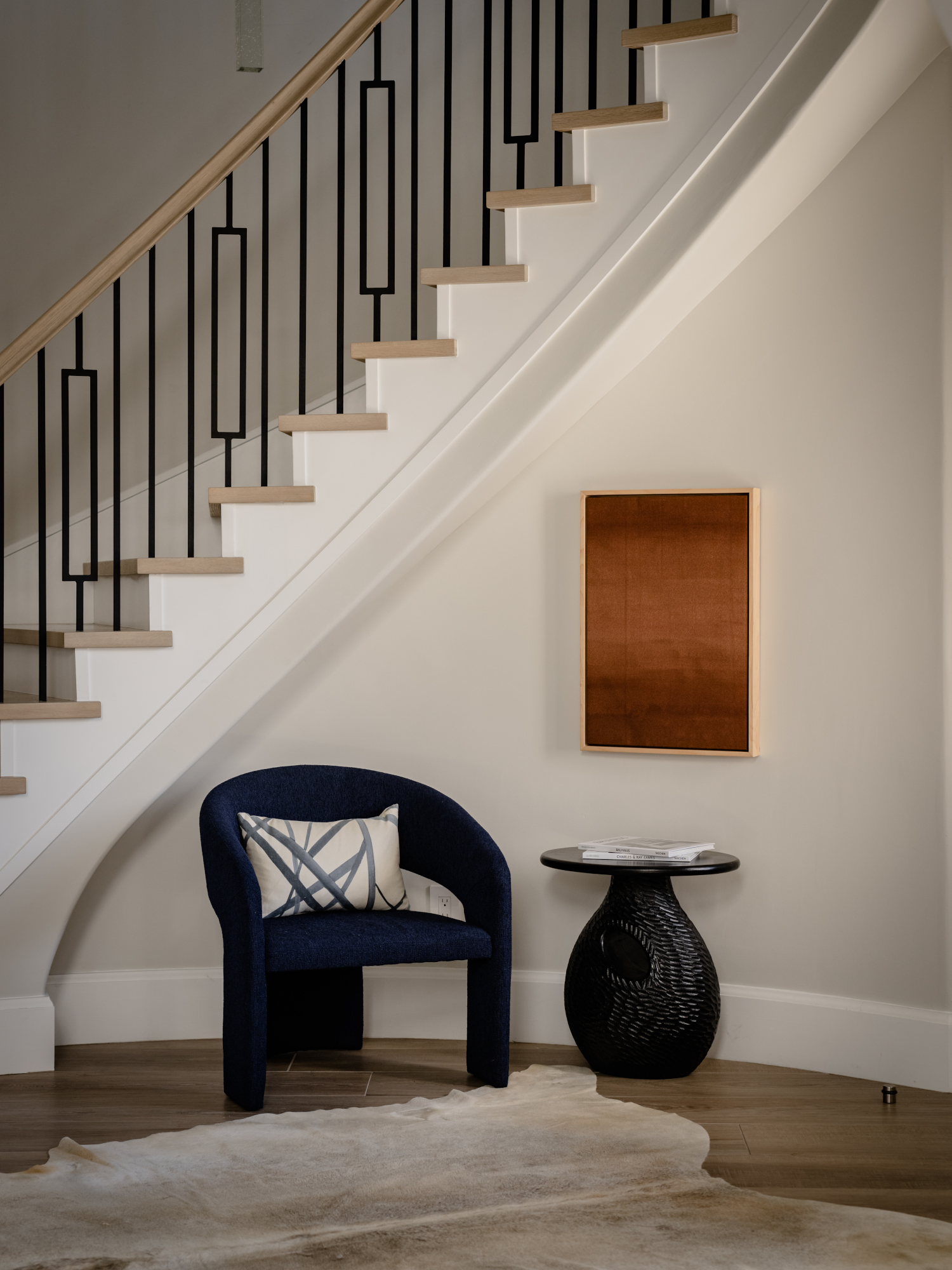
We’ve spotted designers creating artful entryway vignettes using chairs, making these functional furniture pieces works of art in their own right. The key to the trend is to use delicate accent chairs – think slim, sculptural pieces rather than bulky armchairs. While the chair still performs a function – as a place to slip on shoes, for example – it will rarely be used for long periods of time, so form definitely trumps function here.
For Laura Brophy of Brophy Interiors, based in Newport Beach, CA, the aim for the entryway above was to create an experience that seamlessly combines beauty and functionality. ‘The goal was to leave a lasting impression by transforming the area into a breathtaking and functional space that sets the tone for the entire living experience,’ she explains. ‘I wanted to create an unforgettable first impression that immediately captivates and delights, while authentically reflecting my client's personal style and taste. In addition to aesthetics, I wanted it to serve as a place of escape, offering precious moments of solitude and tranquility.’
5. Built-in storage
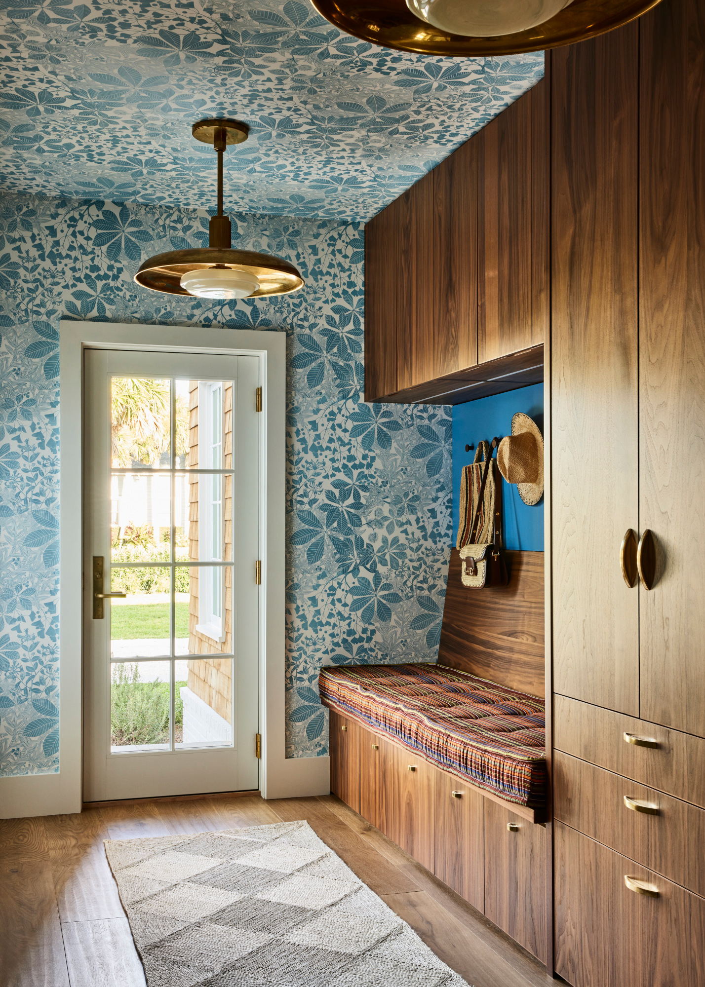
The most practical trend on this list, beautiful, built-in entryway storage that complements rather than imposes on the rest of the space is nevertheless proving popular amongst designers. The best schemes use it as a means to add aesthetic value to the room, as the scheme above by Bunsa Studio shows.
‘This is the primary entrance used by the family of five (and a dog), and there is a separate formal entrance at the front of the house used by guests,’ explains Jennifer Bunsa. ‘We wanted to have a specific place to put everything away so this area would remain uncluttered. We added Marthe Armitage's Chestnut hand blocked patterned wallpaper on the walls and ceiling to bring the outside nature in, furthering this idea of making the transition from the outdoors to the interior of the home.’
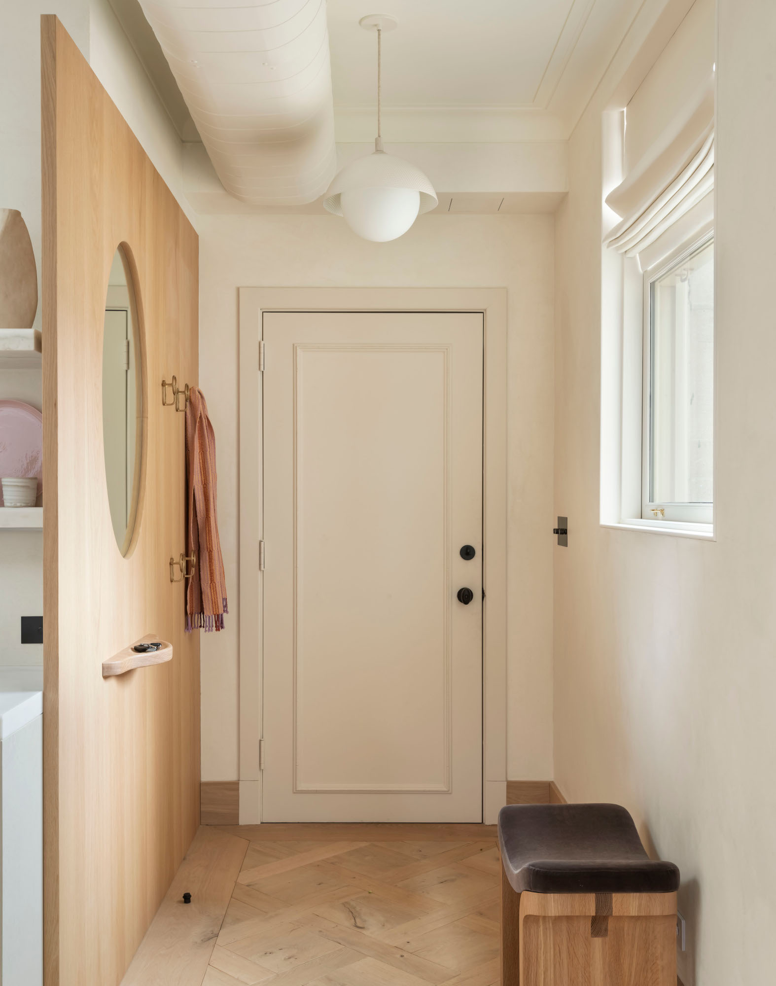
The trend can be incorporated into small apartments, too. This entryway by Brooklyn practice General Assembly uses a wall panel to integrate easy storage solutions. ‘We felt it was important to create a defined entry space in an otherwise open living space,’ says co-founder Sarah Zames. ‘We designed a solid oak millwork wall panel to separate the space physically from the kitchen and visually define the area with a change in wall material.
'The millwork wall includes an integrated mirror, key shelf and hooks. These three elements on the wall come together to provide a space for the homeowner to take a moment or pause prior to entering or leaving. The apartment is meant to be a peaceful place of escape and the ritual of coming and going is integral to the process of slowing down.’


