From the Tube map to the famous roundel logo, the London Underground has generated some iconic design. We've looked before at some of the best London Underground poster designs, which often followed design trends of the day. Some of these romanticised a bucolic life in suburban 'Metro-land'. But one set of designs is provoking astonishment online for a very different approach.
The 'Underground for Climate' campaign of the 1920s aimed to promote London's subterranean transport system as providing a more agreeable temperature compared to option of travelling above ground. Today's audiences are likely to view it through very different eyes amid the global climate crisis. And while one of the taglines might still technically ring true, it's really not something to boast about.
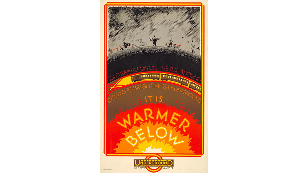
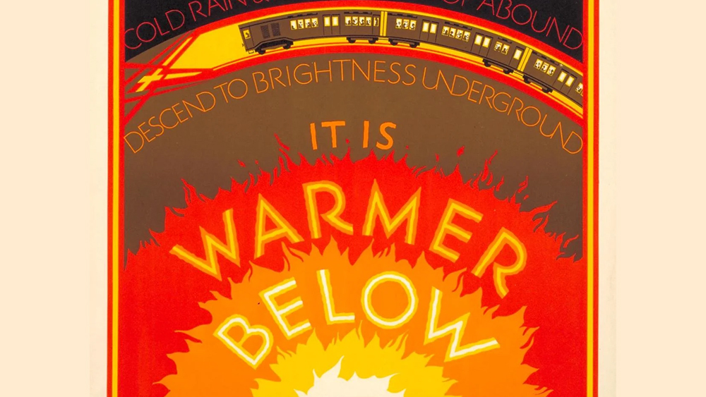
The 'It's warmer below' poster for the London Underground was illustrated by Frederick Charles Herrick in 1927. It shows pedestrians battling against driving rain on the surface while the Tube passes by below, perilously close to the Earth's firey core. The text invites us to "descend to brightness", suggesting that London's so grim, it's brighter underground.
But transport bosses of the day apparently thought the Tube offered the best solution in any extreme. A complementary poster design suggested the Tube was equally appealing as a cooler alternative during the summer. It shows people struggling to stand up during a terrifying-looking heat wave, something that feels darkly relevant today.
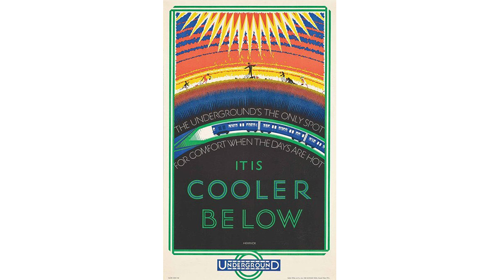
Anyone who travels regularly on the Central Line will know that today only one of these posters is true, and not in a good way. I didn't experience the Tube in the 1920s, so I can't comment on the level of comfort it provided at that time. But today it definitely only ever feels warmer below, and not in a way that's ever desirable.
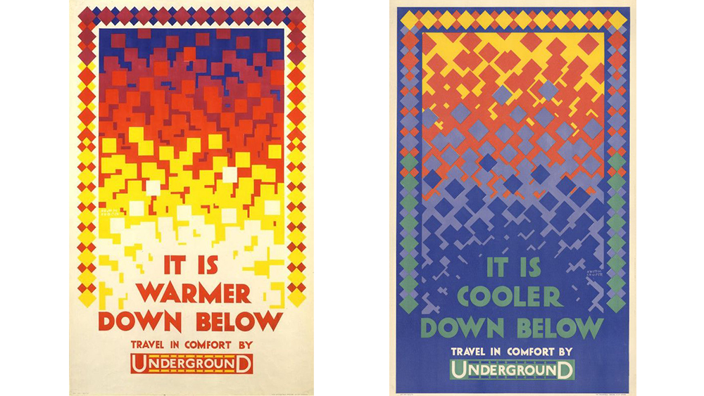
The Underground was promoted for its purportedly pleasant temperature for several years. Earlier designs from 1924 by the Canadian artist Austin Cooper feature a more abstract approach but the same message. 'Travel in comfort' they say.
The mix of apocalyptic imagery and the slightly pedantic and condescending 'Keep Calm and Carry On' voice (with the unabbreviated 'It is', I can just hear the tagline being read by an announcer with a plummy RP accent), the posters would be a perfect piece of retro-futuristic design for a British Fallout. Only they're real.
For more recent poster inspiration, see Netflix's comedy Under Paris posters and the best Star Wars posters.


