
The iPhone 15 Pro design has been leaked, and I’ll be honest, I’m really struggling to see what’s actually new about it. Let me explain.
I mean come on — am I living on another planet? I’ve seen a whole lot of sites big up these new design changes — exposed via exclusive renders on 9to5Mac, and a dummy 15 Pro model shared on the Chinese version of TikTok.
But while everyone else seems to be getting really excited about the reported changes, I’m struggling to answer one question: what actual changes are coming that will make an impact?
Same, but different?
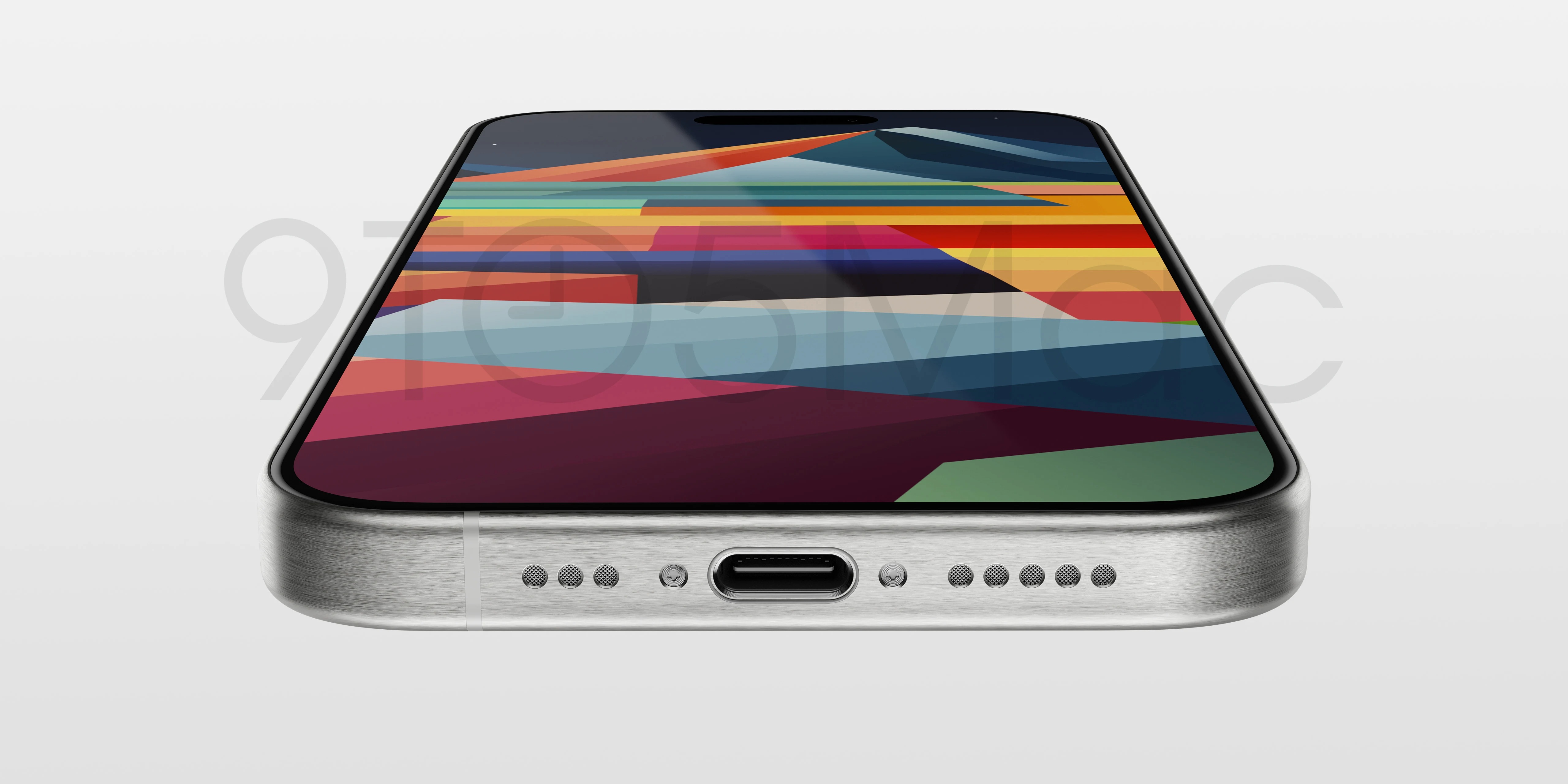
Let’s break down the leaks. According to 9to5Mac, the iPhone 15 Pro looks set to get a new titanium casing — producing a matte finish over the glossy stainless steel of the past few models.
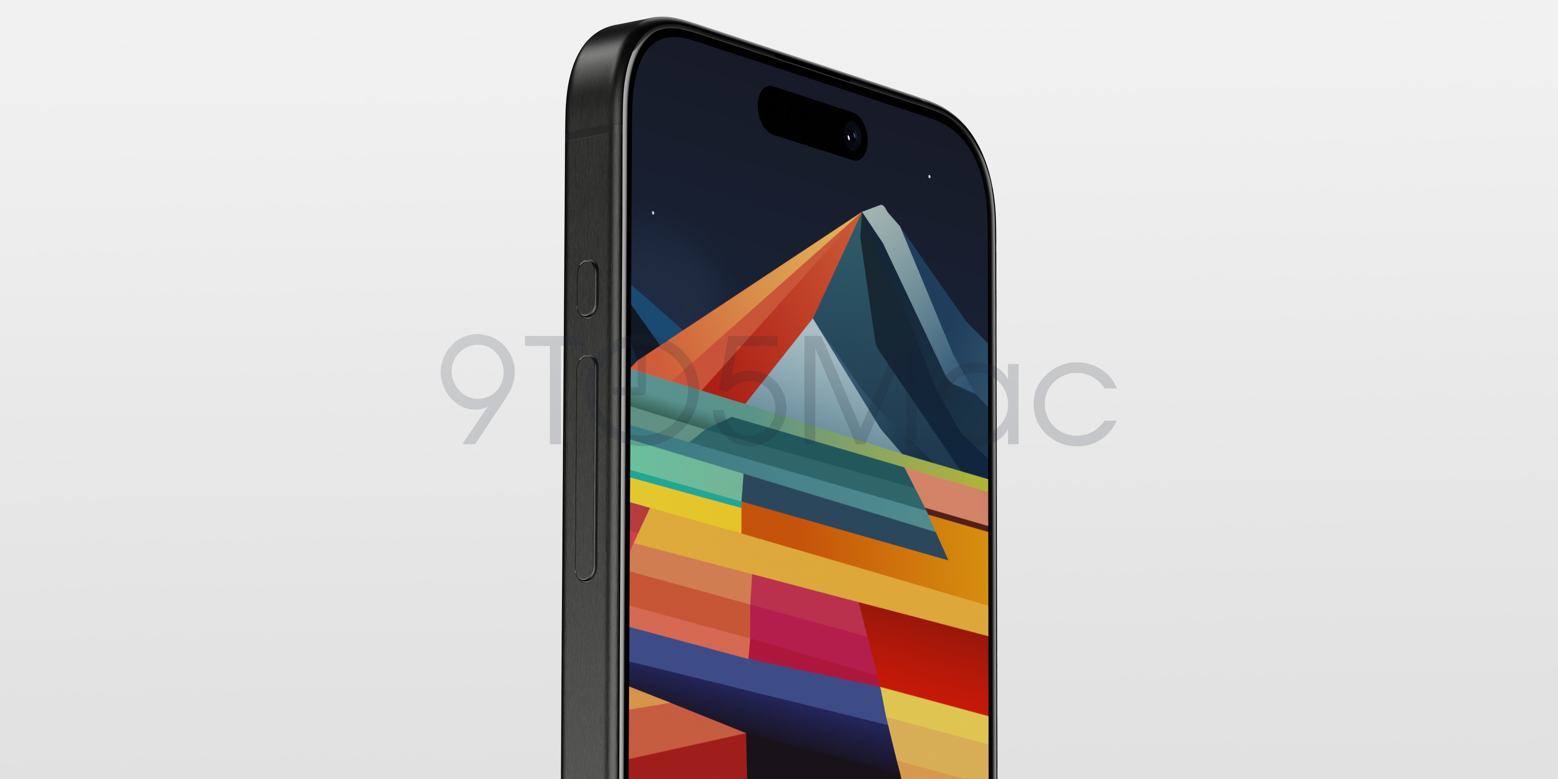
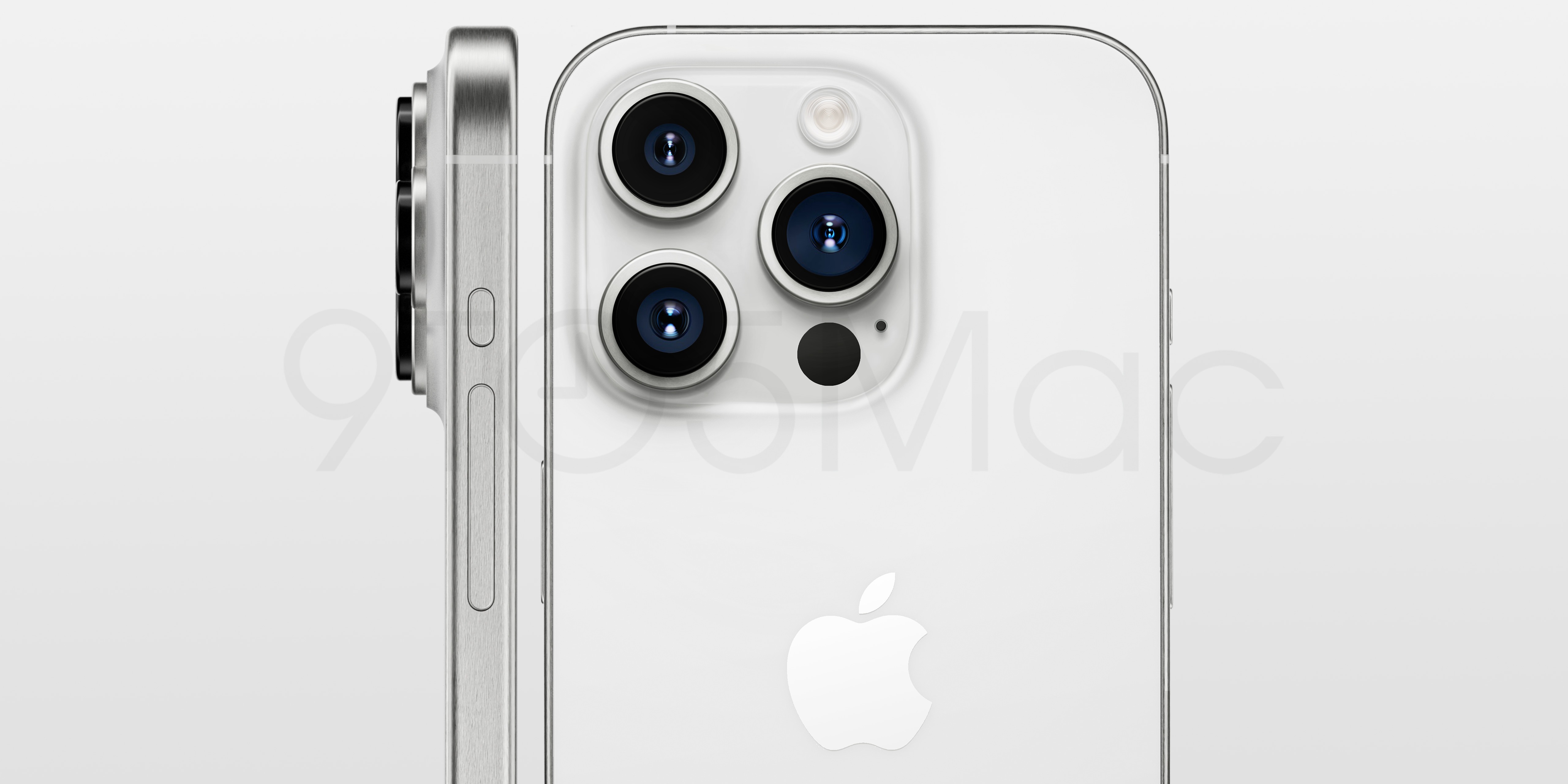
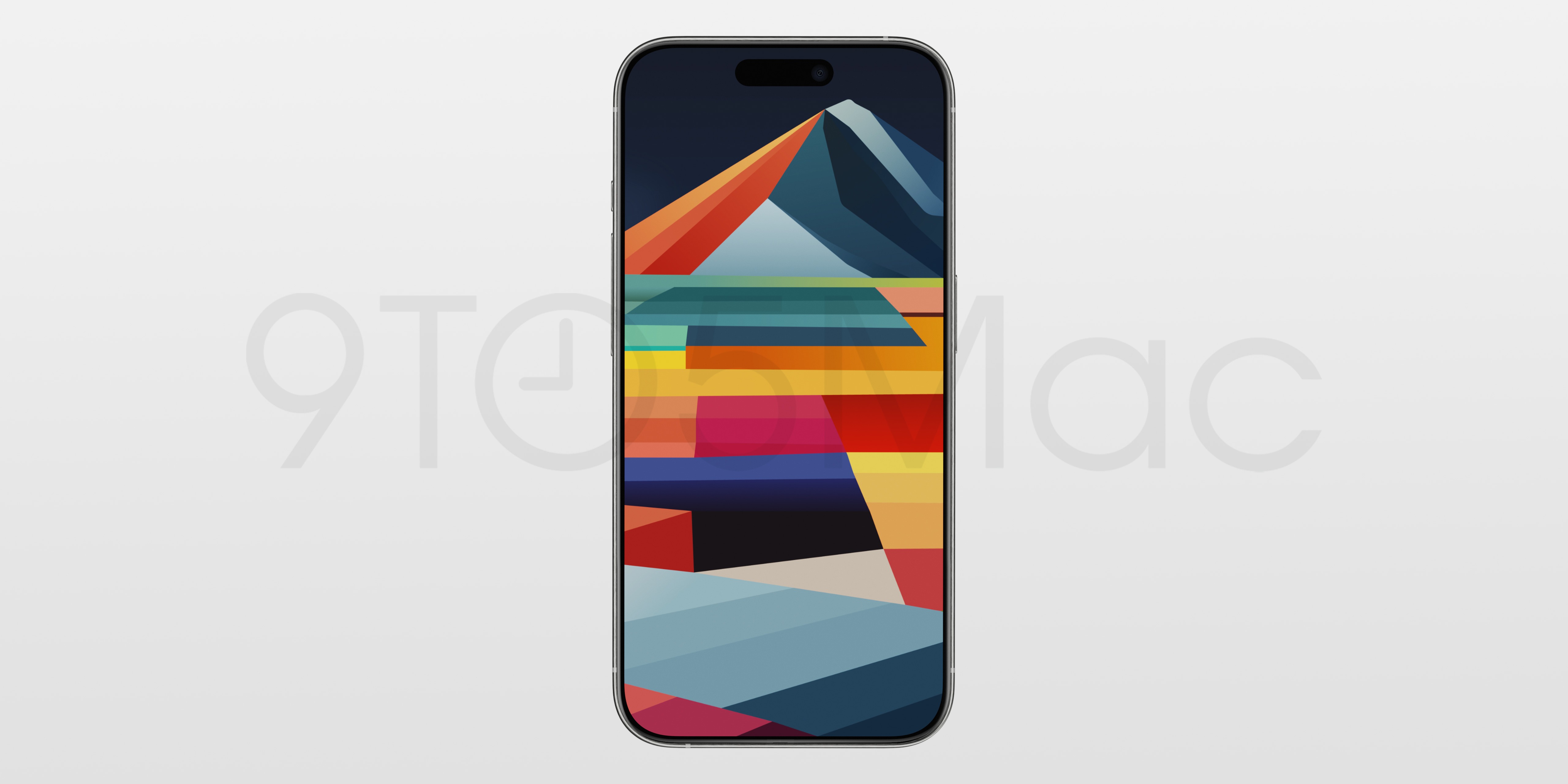
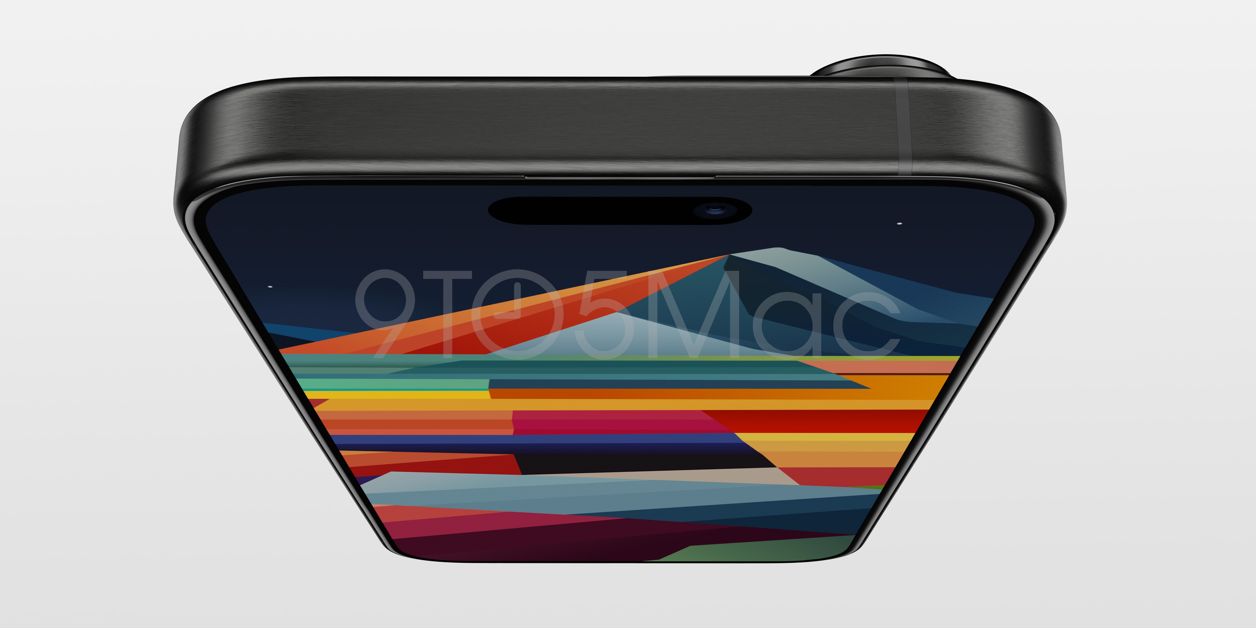
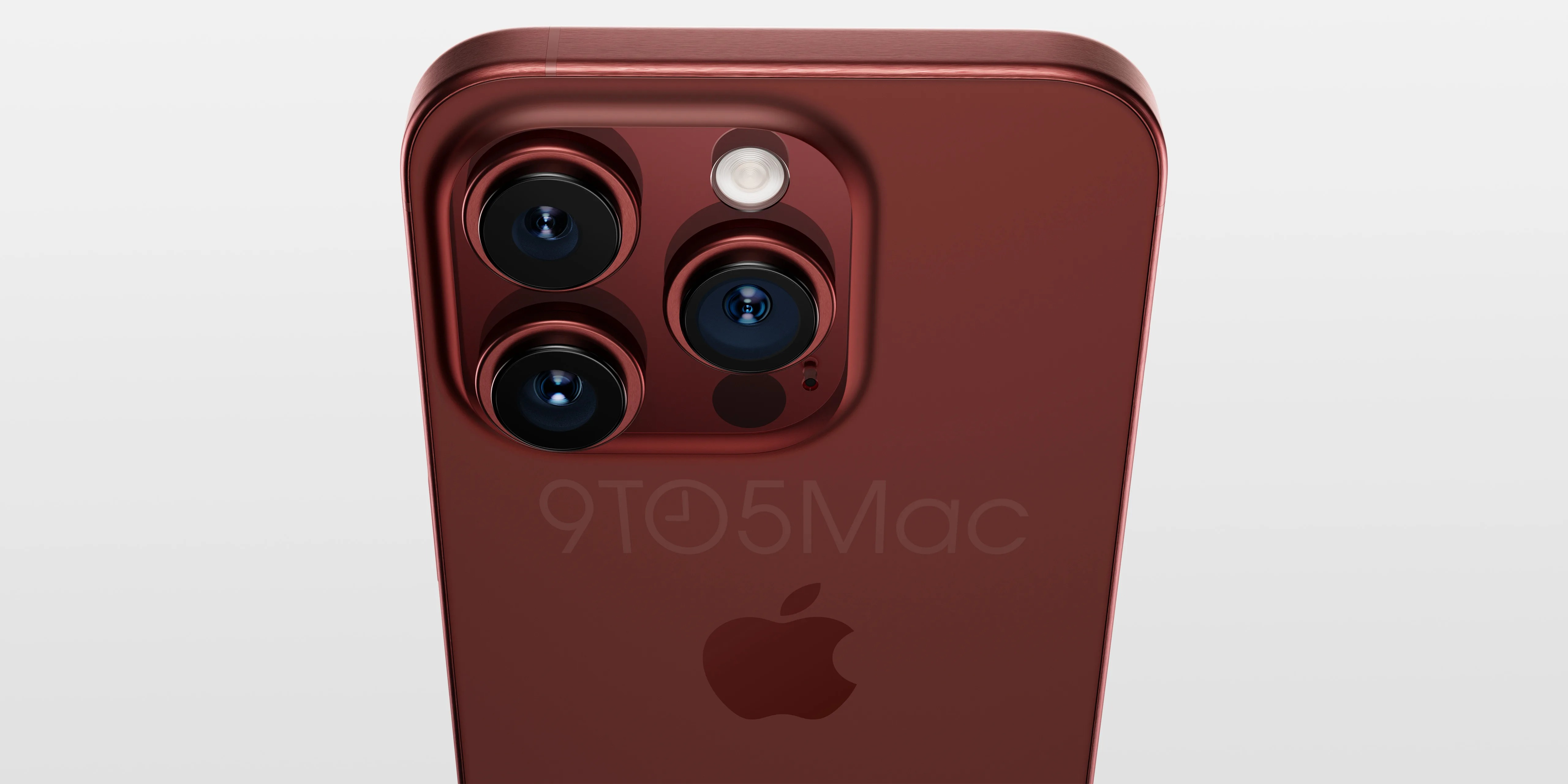
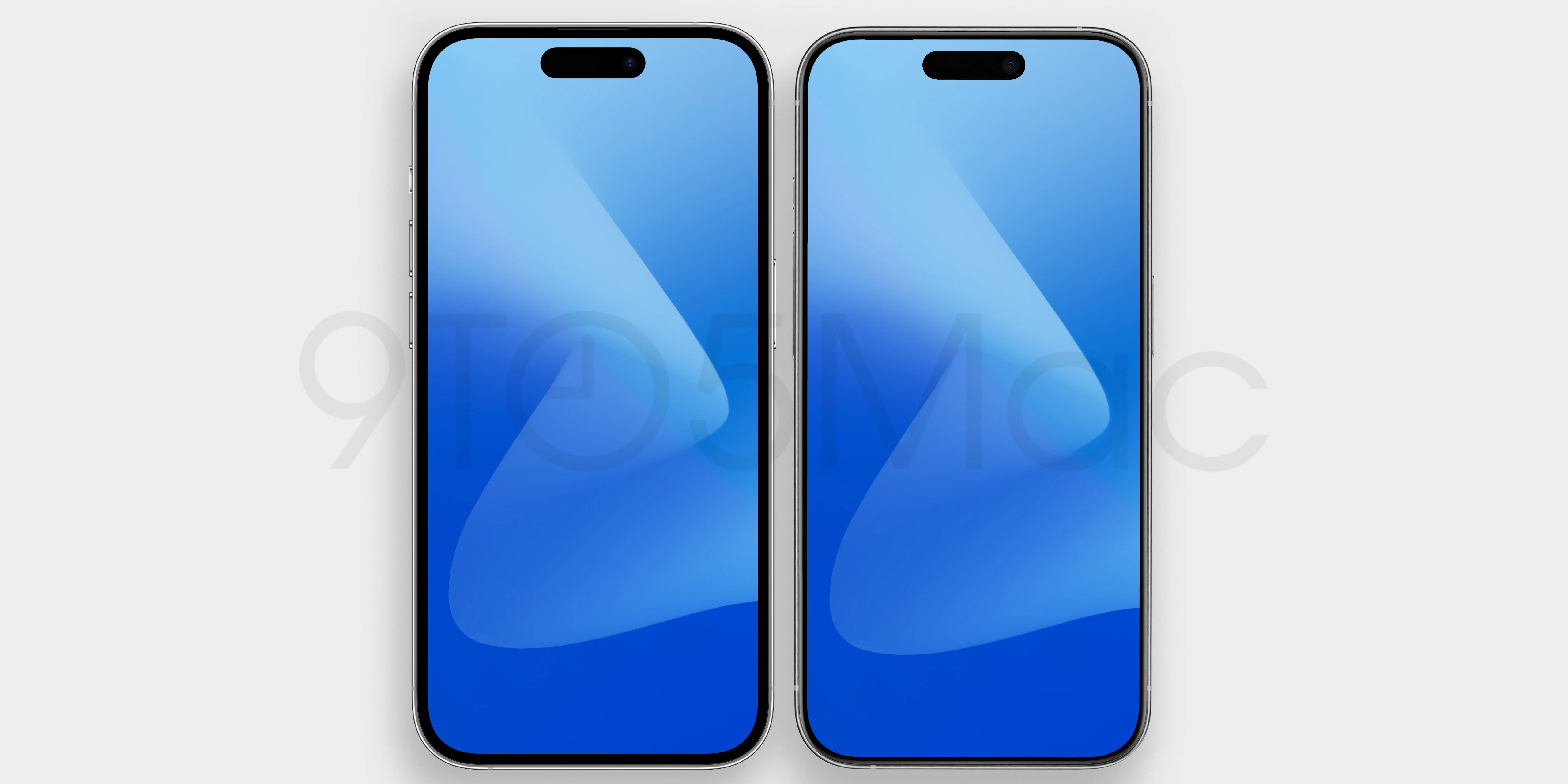
On top of that, the camera bump looks set to be made larger for additional components like the periscope camera, and the display bezel will be reduced to 1.55mm. This last one will result in a (mostly) reduced overall size of the iPhone 15 Pro when compared to the outgoing 14 Pro:
- iPhone 15 Pro: 5.76 x 2.77 x 0.32 inches
- iPhone 14 Pro: 5.80 x 2.81 x 0.31 inches
However, while the render indicates the volume and a new action button (replacing the mute switch) are going to be solid state with haptics, we do have new reports that these new buttons have been axed due to manufacturing issues.
But what does this actually translate into when you look at the aesthetics? Honestly, not that much. The titanium band still looks pretty flat, the rear is still flat (I would’ve loved a subtle curved edge to the rear glass like the Xiaomi 13), and the actual changes seem to be super minimal.
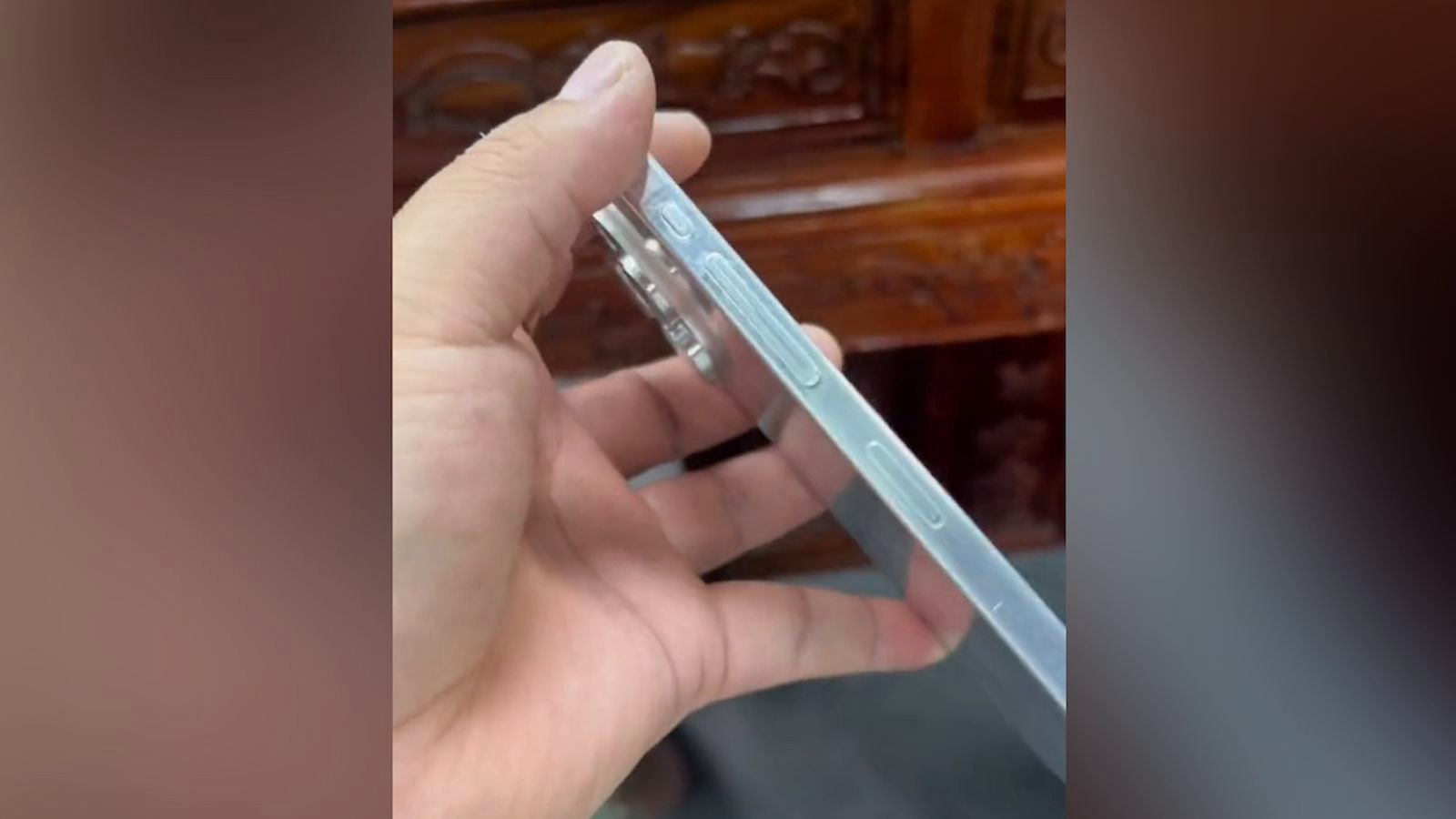
And while I would take any dummy model shared on a TikTok-style service with a pinch of salt, this would also be the smoking gun that confirms my fears. While 9to5Mac’s renders show the subtle changes in more detail (and that, admittedly, gorgeous new red finish — the exact color code is 410D0D), this is just a physical example of what users will be holding in a few months time.
To say I’m underwhelmed would be an understatement. The corners and edges barely have any sort of curvature to them, and even though there may be material changes and something far subtler happening here like the reduced bezels, I can’t help but shrug about this.
Scratch beneath the surface
So while the outer shell’s design could be a bit of a let down (predicting the reviews: it feels super premium, but I would’ve loved to see some bolder risk taking to update the look), the real changes are set to come to the internals.
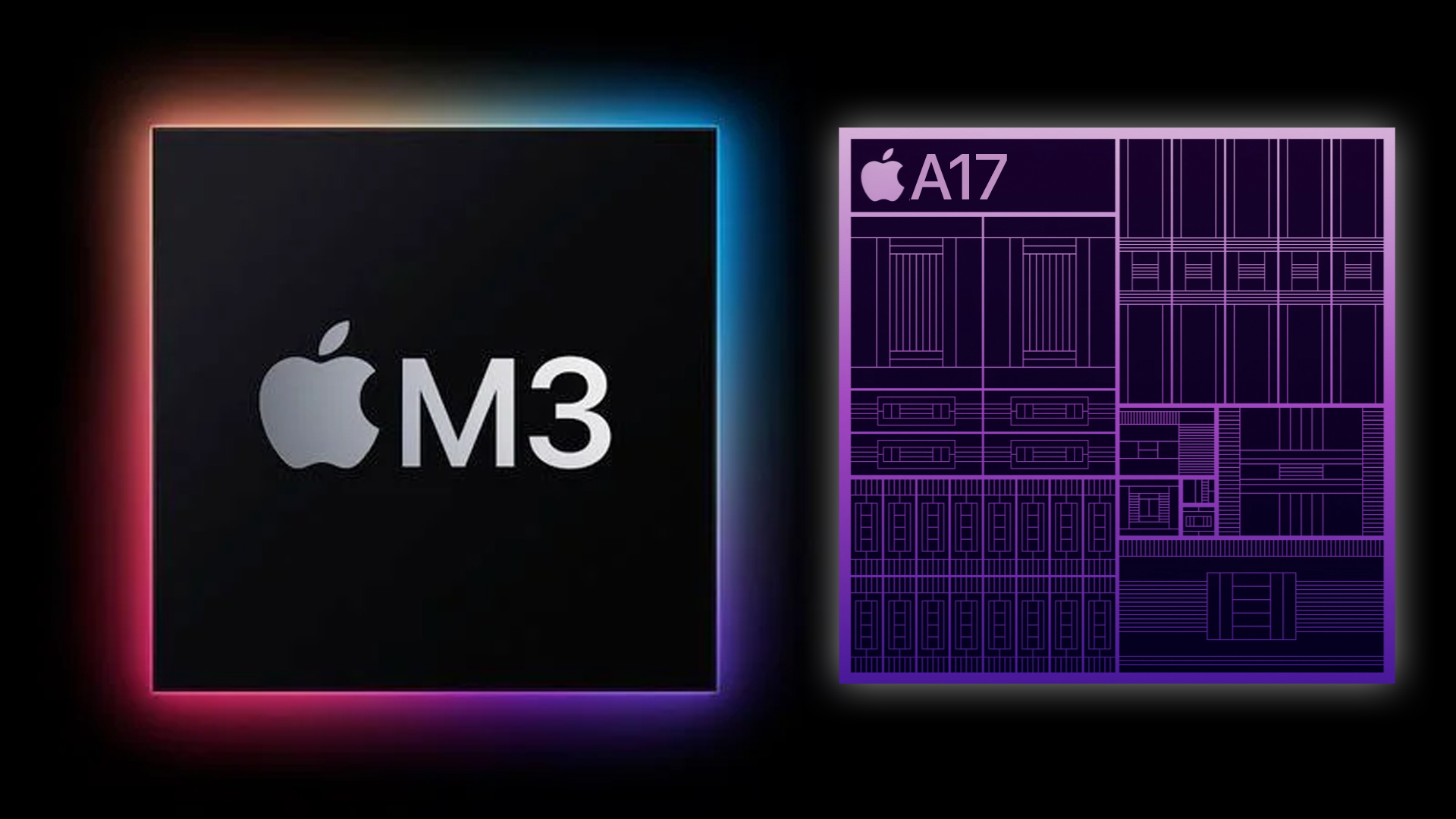
These include the 3nm A17 Bionic chipset, which will provide some mightily impressive speed boosts over the already monstrous A16 Bionic in the iPhone 14 Pro/Pro Max, while reducing the overall size and power dependency of transistors for improved battery stamina.
And of course, we have to talk about the switch to USB-C. If rumors are to be believed, Apple is going to be embracing the open standard in the most Apple way possible — by closing it down with Made For iPhone certification and an authentication chip.
However, I wouldn’t be so sure about that, because the EU ruling Apple is having to abide by to make this work makes any sort of charging speed throttling like this illegal.
Outlook
Sure, there are some hardware functionality alterations and a couple of tiny design tweaks. But I’m looking at this side by side with my iPhone 14 Pro (review coming soon) like Senõr Chang squints at the cheat sheet in Community — struggling to see what’s actually new.
Early rumors got me excited with the possibility of a dramatically updated design that would have brought the seemingly tired three-year-old aesthetic forward into a new generation. But in reality, it’s a lot more iterative.
To me, one thing has become obvious over the years: smartphone design is becoming boring. That slab in your pocket has basically become an appliance, and much like washing machines and the like, companies like Apple are seemingly terrified to take risks, and give us something interesting.


