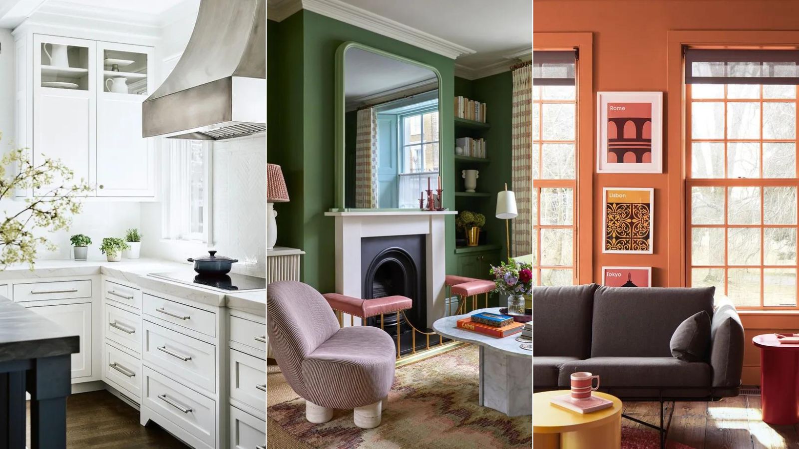
April is a time of new beginnings, abundance, and, hopefully, warmer weather, so finding the perfect paint colors to decorate with in April should be a joyous affair.
Being my birth month, I've been desperately looking forward to writing about the color trends for April. It is my favorite time of year – allergy season hasn't quite kicked in yet, but spring blossoms are in full bloom and the weather is slowly warming up. Unsurprisingly, this month is all about nature with hues of seafoam green, deep purple, and pure white.
April is a good time to give our interiors a spring update by drawing inspiration from the uplifting, seasonal colors of zesty yellows to punchy purples. Here, designers, decorators, and experts reveal how to approach choosing room color ideas for April with confidence.
7 paint colors to decorate with in April – to highlight the joys of spring
If you wish to decorate your home with the latest spring color ideas to mark the arrival of the new season, you've arrived on the right page.
I've rounded up the most beautiful colors set to dominate paint trends in April 2024, along with helpful guidance from the experts in the know on how to use them in your home.
1. White

Evoking purity alongside sophistication and confidence, white is a wonderfully versatile color for interiors in spring.
'White is perfection,' says Karen Haller, color psychology specialist, teacher, and best-selling author of The Little Book of Color, available at Amazon. 'It is pure and unblemished, and gives a feeling of peace, simplicity and clarity.'
Decorating with white offers a blank canvas that illuminates dark spaces and can make even small rooms feel spacious, light, and bright. However, Brilliant White, the best-selling white paint is a man-made color that was developed after the end of the Second World War. It is the only color that doesn't appear in the natural world, so you may wish to introduce warmed-hued white, largely inspired by colors emanating from nature to help you feel grounded.
‘An off-white palette comprising off-white base notes and a scattering of additional tones including beige, eggshell and ivory will provide enough warmth to see you through spring and summer,’ says Charu Gandhi, founder and director of Elicyon.
2. Deep purple

The spring garden is abundant with deep purple flowers, and our interiors should exude the same burst of color. Purple room ideas, once the color of many teenage bedrooms, are having a moment. Vivid violets and royal purples are bold, daring, and fun – much like spring.
‘Deep purple has an inviting, friendly energy and is great for creating a relaxed feel within a home,’ says Francesca Wezel, founder of Francesca’s Paints. ‘Associated with sociability and open-mindedness, it helps make people feel at ease – perfect for communal areas. This color is often used in yoga and meditation studios for this purpose. Purple also has a slight feminine edge, which reinforces the feeling of comfortability.’
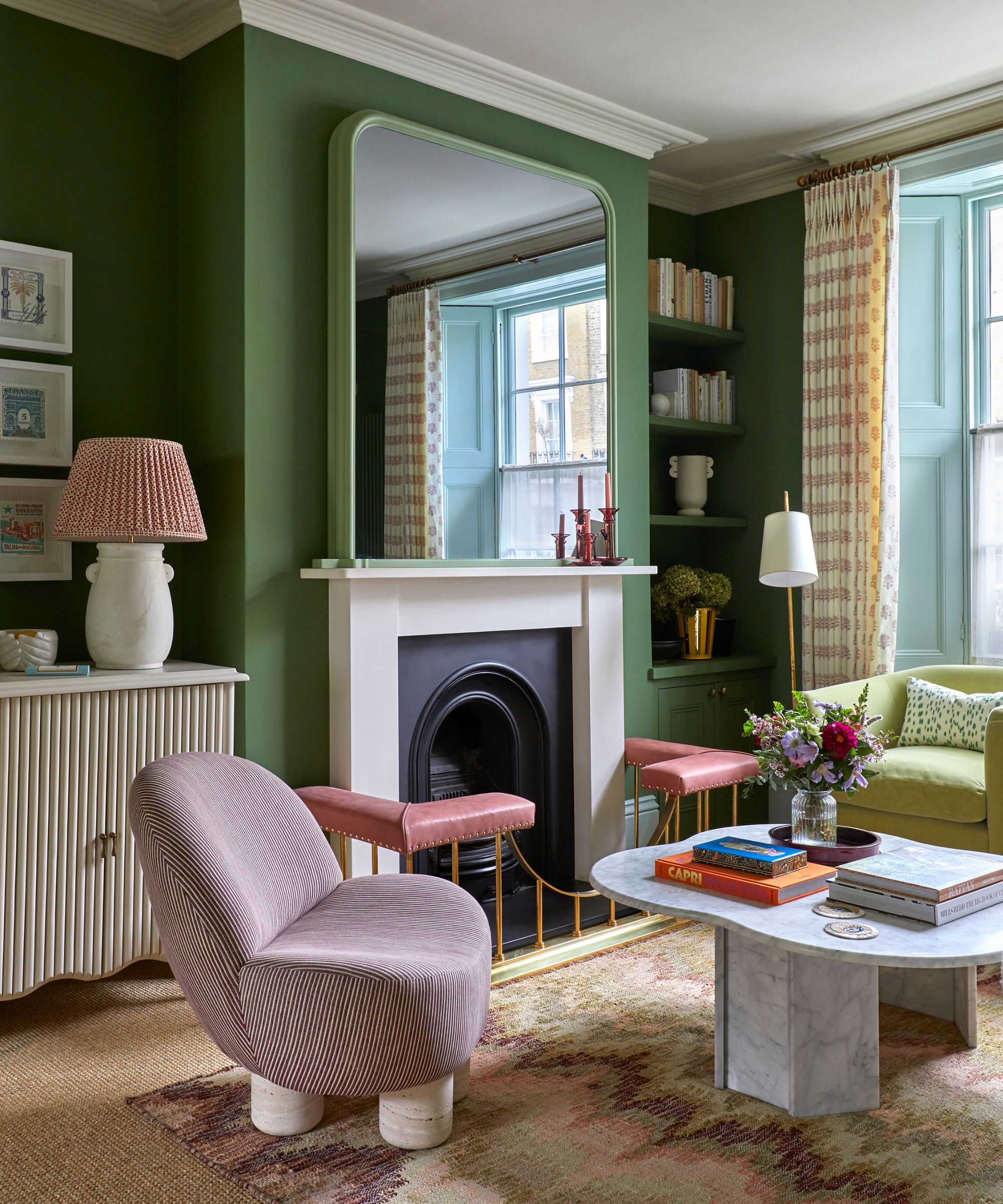
3. Grass green

Symbolizing nature, freshness and vitality, the color green is an enduring favorite when it comes to room color ideas. As nature begins to spring into life, be inspired to decorate with the season's fresh botanical shade of green to create refreshing and restorative spaces.
With its roots in the natural world, grass and spring green are grounding and comforting shades that connect us with the landscape, which is something we crave in changing times.
‘Often used to bring the outdoors in, decorating with green aids our emotional well-being,’ says Francesca Wezel, founder of Francesca’s Paints. ‘It has a soothing, non-threatening energy, making us feel safe and at peace.’
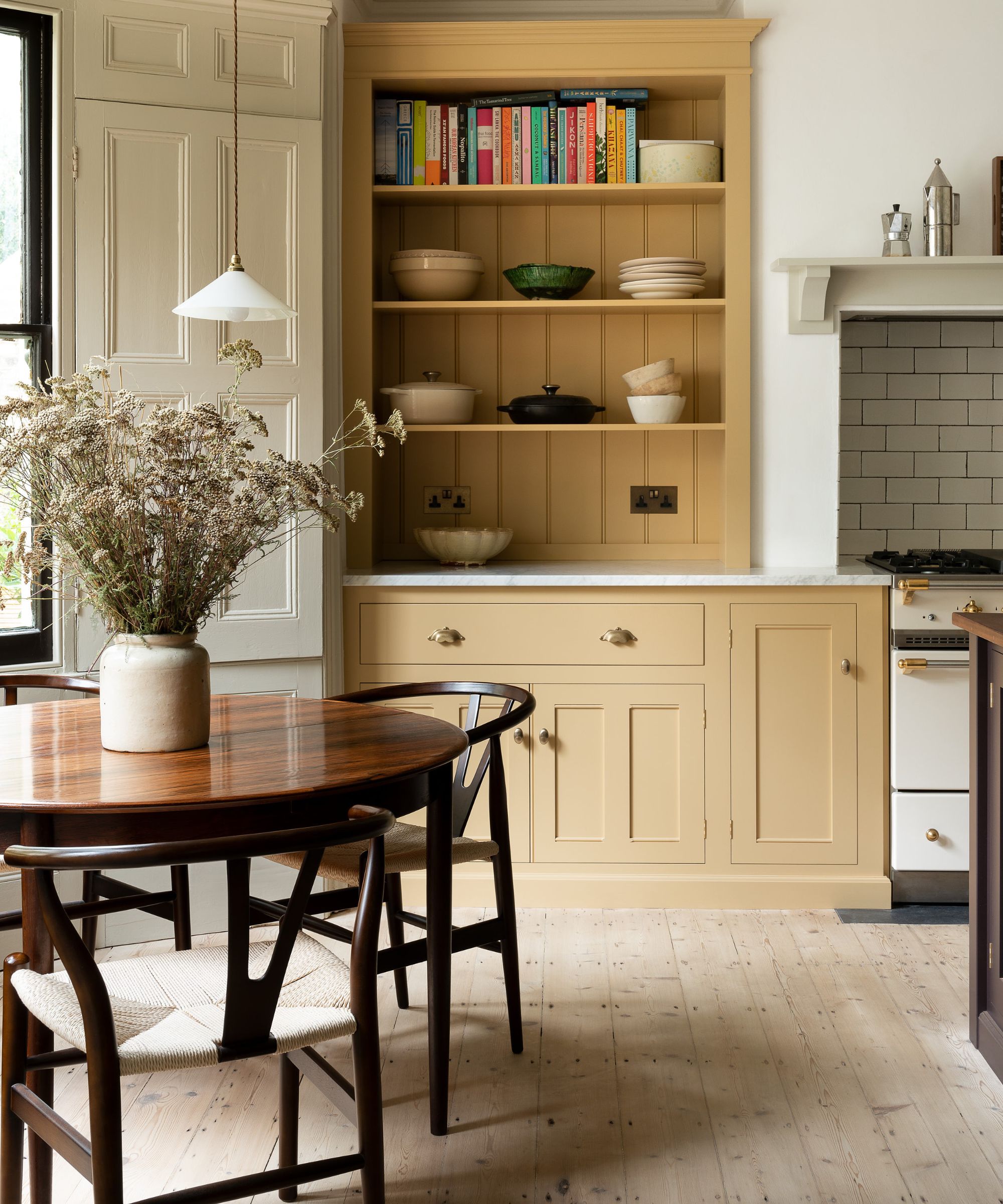
4. Pastel yellow

Pastel yellow will continue to shine a spotlight on our homes this month. As one of the most uplifting and mood-boosting colors it is not surprising that it is having a spring renaissance.
‘This cheery, pale color imbues the room with optimism and is perfect for bringing a sense of positivity into the home,’ says Justyna Korczynska, senior designer at Crown. ‘Pastel yellow, like most pastel colors, is also very soothing, particularly when paired with cool, calming tones such as grays and pale, muted blues. The color creates a sense of calm with a feeling of well-being and restfulness.’
Yellow is a color that people are often scared to use, but it’s a fantastic color to really lift a space and create interest.
5. Sky blue

Spring may have officially started in March, but for me, April is true spring. So with a new season comes the opportunity to look to a bright future, and where better to start than by injecting your home with mood-enhancing color? Fresh, airy and imbued with the restorative power of nature, light sky blues have this year been tipped by interiors experts as the perfect backdrop to modern living.
‘Whether we are working or relaxing, creating or exercising, it is essential to have a space that reflects the optimism and desire for a fresh, new start that is top of the agenda for the year ahead,’ says Marianne Shillingford, creative director of Dulux.
Naturally soothing, but equally energizing and hopeful, decorating with blue promises to bring the outside in to enhance well-being. Pair it with neutrals such as white and cream for classic calm, or with stronger tones of mustard, red, sienna, and navy for a unique, head-turning scheme.
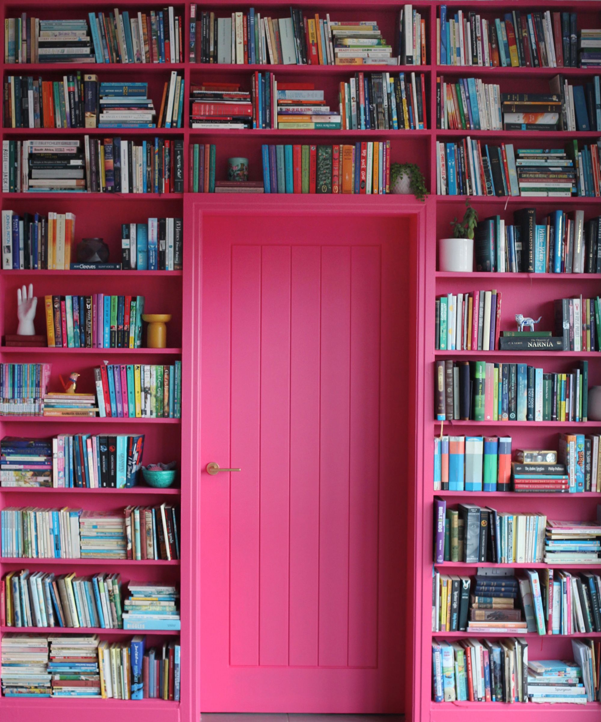
6. Barbie pink

Bold, bubblegum pink shades, also known as Barbie pink, are blossoming in the home this April, both for their versatility and mood-boosting design qualities. It's inviting, uplifting and effortless to decorate with, so it's no surprise that pink is now seen as a designer favorite.
Decorating with pink was supremely popular in the '80s but has since fallen out of favor until the Barbie movie reignited my love for this sugary shade. Perhaps it reminds me of my teenage years or the fact it makes me smile every time I see it, but what I like to call 'power pink' has found a place back in my heart and home.
Too often, Barbie pink is limited to girls' bedrooms. This is a waste of a wonderful color that needn't be solely thought of as feminine. Pink room ideas can be elegant, and sultry, and work as both an accent or an enveloping whole-room shade. My advice – if you love it, be brave.
‘Pink is a truly wonderful shade to use as an accent color in a room. There is such an incredible range of shades to choose from and dark pink can add depth and personality to a design scheme,' says Natalia Miyar, founder, of Natalia Miyar Atelier. 'It’s bold and vibrant and works so well when used for upholstery on a headboard or bed base in a bedroom. I also like to use it for piping on a cushion to add a subtle pop of color to a sofa or chair.’
7. Burnt orange

Unashamedly bold, burnt orange is also surprisingly sophisticated and versatile. It is an energizing color that will get you ready for spring.
In the 1970s, decorating with orange was particularly popular for both flamboyant fashion as well as interiors. It was used in floor-to-ceiling schemes in bold geometrics and floral patterned designs and textures. While today burnt orange offers a more collaborative and perhaps less dominating presence, it does still share many of the same styling elements that were part of the 1970s look – but today's look aims to energize rather than shock.
‘Burnt orange is a wonderfully optimistic color but it is not one for the cautious,’ says Helen Sanderson, creative director of fabric company Ian Sanderson. ‘It is a serious, grown-up color that makes fabulous partnerships with teal and with surprise elements of subdued blush pinks – perfect for spring.'
Dropping burnt orange into an otherwise neutral scheme by way of soft furnishings or as an accent wall offers a more measured approach to its use than painting a whole room


