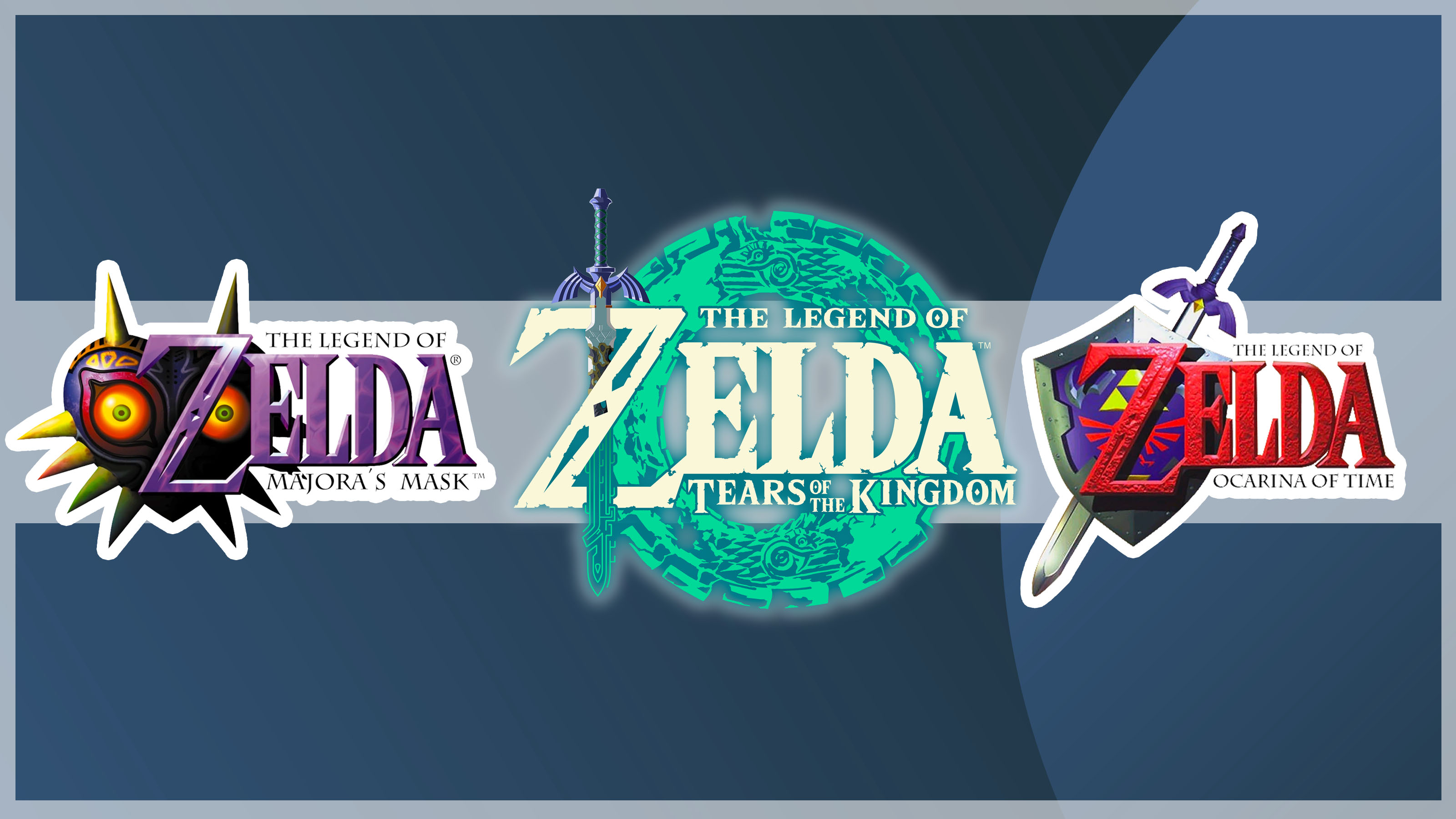
In the run up to the release of The Legend of Zelda: Tears of the Kingdom, Nintendo's latest instalment in the Zelda franchise, we're taking a look back at the ever-changing logo design. With consistent typography and a plethora of different illustrations, each logo perfectly represents the game style – but which one is the best?
Fans have historically had a lot to say on which Zelda logo is the most successful – as proved by a Reddit post from last year, which sparked a fierce debate. Here, we take a look at some of the standout logos, and share some of the debate surrounding the controversial issue. Want more logo inspo? See our favourite places to get logo design inspiration.