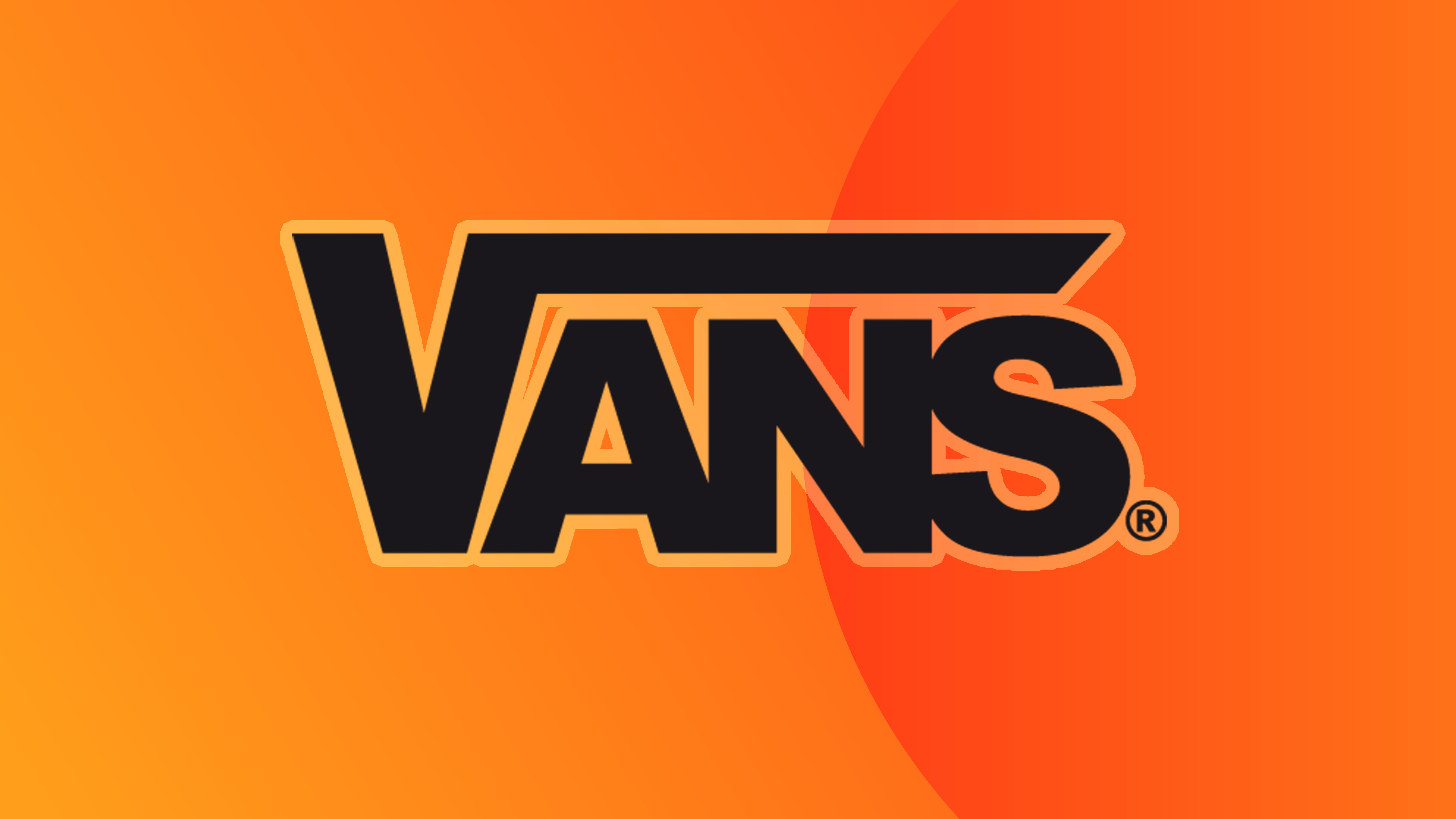
The internet is experiencing a collective mind-blown moment after a resurfaced discovery suggested that the Vans logo might have a hidden meaning. Since 1966 the skate apparel brand has kept its distinct logo the same, with bold black lettering featuring an extended 'V' motif – but it seems there might be more to the design than meets the eye.
Astute onlookers might notice that the extended 'V' isn't too dissimilar to the square root sign, but if like me, you're not much of a mathematician, you'd be excused to miss this little detail. Even if the design isn't the best logo of all time, it certainly deserves a spot as one of the most debated designs we've seen.