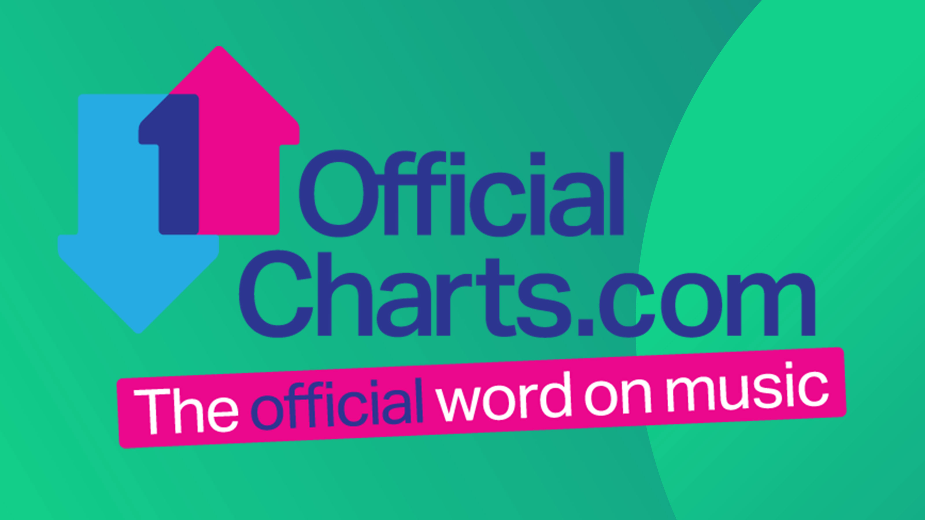
If you're a fan of brilliant logo design you'll want to join the crowds of people just noticing the clever element hiding in the middle of the UK music chart logo. Now, you may immediately spot the two arrows pointing up and down that symbolise the songs moving up and down the chart. But there's a sneaky addition of another key part of the charts – and it's cleverly made up of those arrows.
See it? Yup, there's a cheeky little number one (1) created from the blue and pink arrows overlapping. Because, y'know, songs sometimes get to number one in the chart. Get it? Great. It's a smart bit of logo design inspiration and, according to Reddit, very few people ever knew it was there.