Rockstar's transformation from DMA Design—the Scottish developer behind the Lemming series as well as Grand Theft Auto—into an international publishing behemoth is a tale that's been told several times before. For starters, there's David Kushner's book Jacked: The Outlaw Story of Grand Theft Auto, and BBC docudrama The Game Changers starring Daniel Radcliffe. There's even our own feature on how Rockstar made millions selling Scotland's natural export: dark comedy.
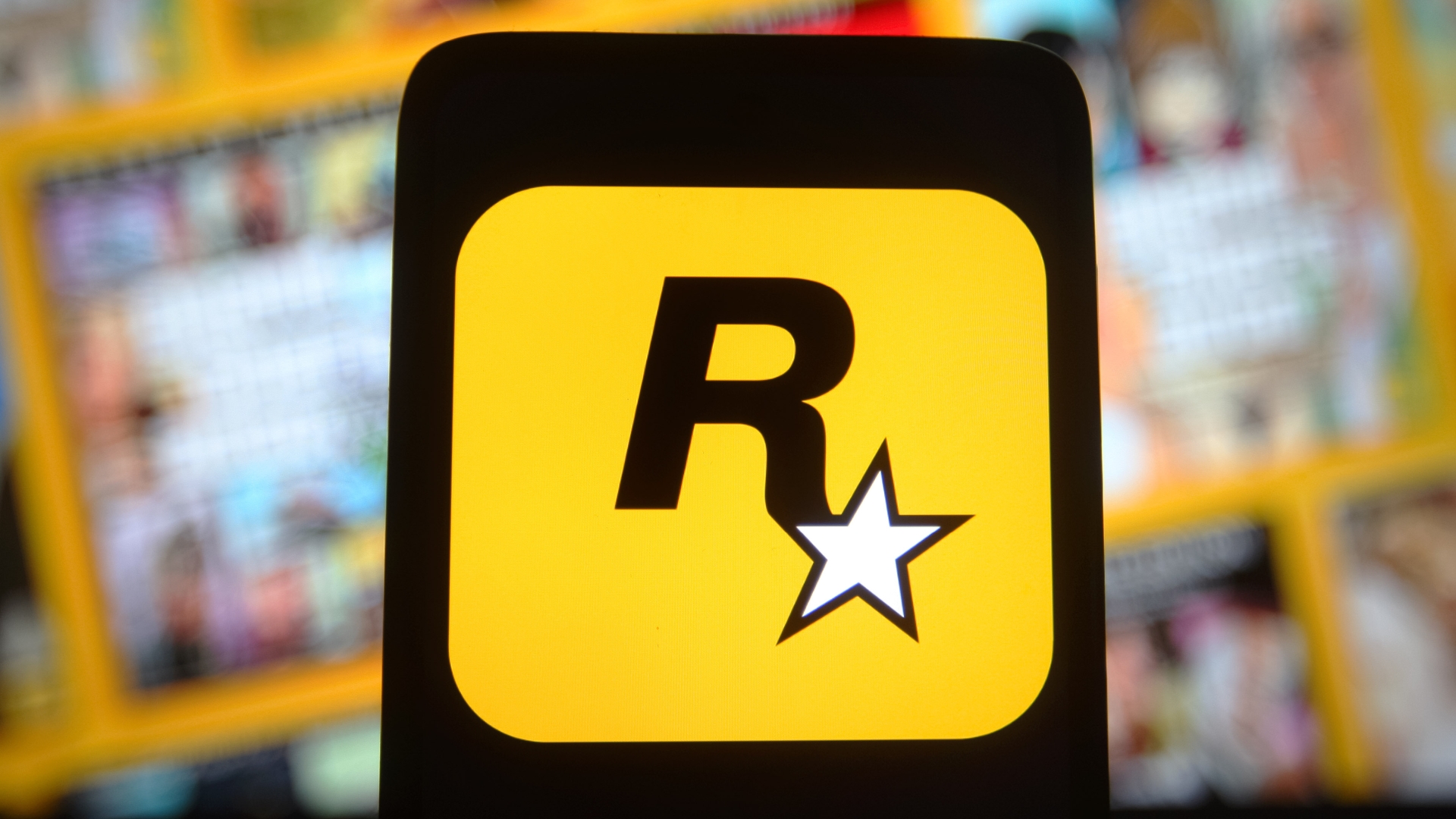
One story that hadn't been told in full is how the company's immediately recognizable logo with the R and star against a yellow background came to be. Until now, as Time Extension has tracked down former Rockstar designer Karen Scott (then Karen Mui), who explained how she and artist Jeremy Blake created the image that's become inseparable from the company.
At the time, Rockstar had a marketing plan that involved printing the logo on stickers and spreading them across New York, where it had just opened the new office Scott and Blake had been hired by. "It has to be a sticker and it has to have the glue you can't unpeel at all. Even if you tried," were her instructions. "The kind that when you're a kid in the '70s once you put it on your bedframe, it never comes off." That's why it has rounded edges—they made it harder to get a grip on if someone tried to peel it off.
The 1970s were an inspiration for the color as well, Scott said, explaining that "the gold or yellowish gold is actually something that kind of nods to the '70s almost like early Kodak logos and things that had that same kind of vibe that was very much part of early Rockabilly rock music."
Though when she and Blake joined the company hadn't settled on its new name, the small, mostly British team seemed determined to act like rockstars. "We'd go to restaurants as a group, and we'd get kicked out of every single restaurant we'd go to," she said. "It was bad, and I had to convince them, 'You know, in the United States, they have guns here, you can't be trying to randomly start something with someone. You don't know what you're going to deal with.' We also made class rings. It became almost like a cult for us. We were small enough to take risks."
In these early days the New York office only had seven or so staff, and money was tight. "We were so low-budget," Scott said, "which is funny to think about now because it’s kind of blown up quite a bit. When we got there, it was like 'Oh my god', we were working in literally the most closet-sized office you can imagine. I remember at one point, there wasn't even a desk. There was like a cardboard box and I had to work on top of it."
Scott also worked on the packaging design for GTA 2, fliers for a series of events at Club Vinyl called Rockstar Loft, and was part of the production team for Earthworm Jim 3D and Thrasher Presents Skate and Destroy. Two years later she moved on from Rockstar, and has spent the last 15 years at Microsoft where she's now a principal design manager.
Rockstar, of course, would eventually become one of the biggest companies in videogames, with Grand Theft Auto 5 the second-best-selling game of all time. Right now it's working on Grand Theft Auto 6, which we've seen some of earlier than expected thanks to leaks that apparently 'won't have any influence on development'.