Recently, I've been feeling pretty fed up with the design and layout of my bedroom. Instead of a space that felt bright, spacious and relaxing, it felt small, dark and claustrophobic. So in a moment of spontaneity, I decided to totally rearrange it, and in doing so opened up two alcoves either side of my bed. It took little over half an hour, and quite a lot of manual labor (slowly inching a wardrobe that didn't want to budge across the floor wasn't easy work), but I was left with a room that felt almost unrecognisable. The space had a totally new lease of life, and even felt bigger and brighter.
It turns out the answer to my bedroom woes was staring at me in the face this whole time, so my golden rule is to now ask myself before buying something or dramatically altering anything - will rearranging the furniture fix the problem? Sometimes and often the answer is no, but if the answer is yes, then you find yourself saving time and money.
To inspire you to rearrange your bedroom furniture, here are five fabulous layouts that have caught my eye recently.
1. This bedroom with a strong focal point
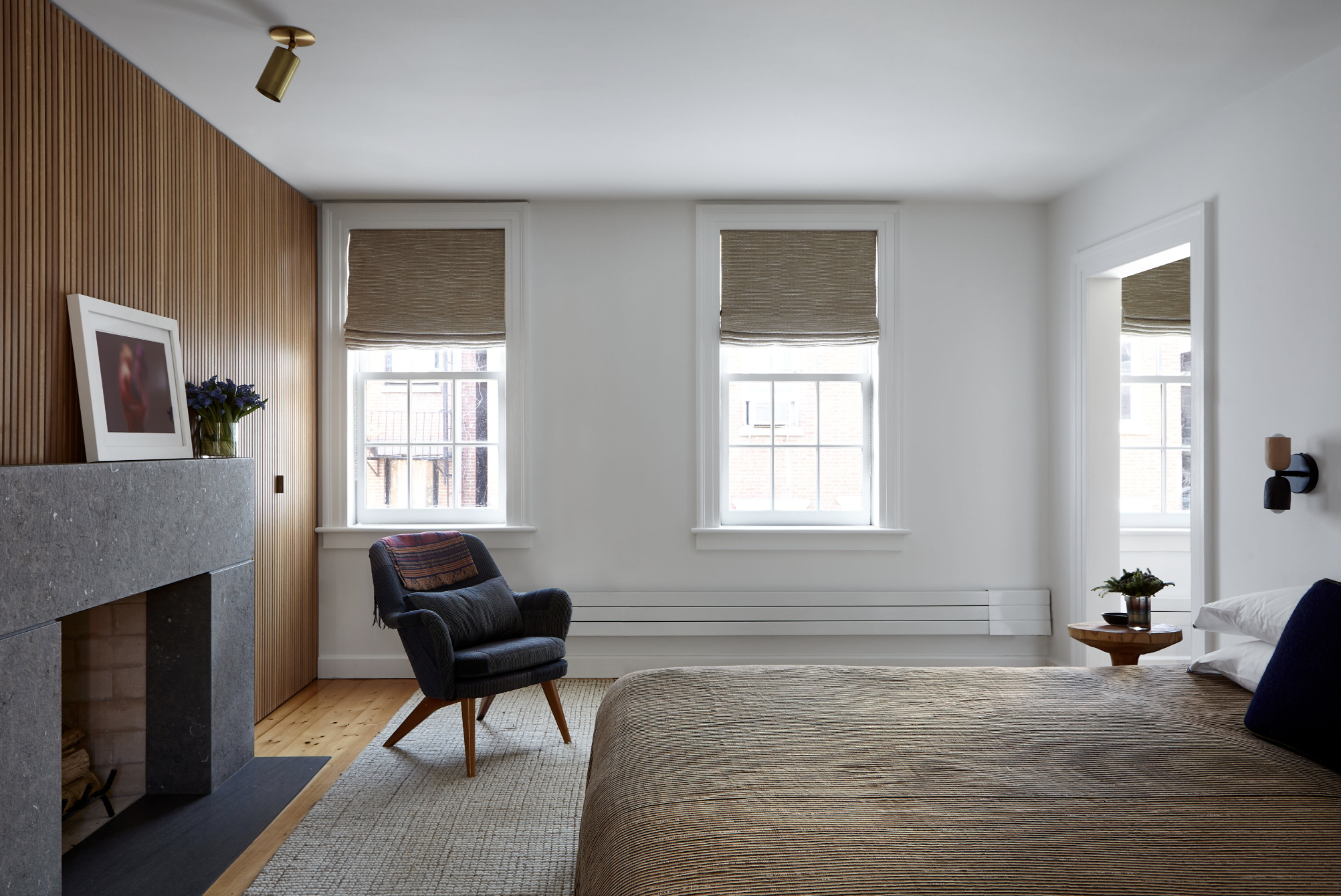
Designer Matt McKay opted for a super simple bedroom layout in this Greenwich Village home, but there are lessons to be learned from this straightforward bedroom format.
Firstly, the way Matt has placed the bed shows great consideration for what the bed faces. Instead of the bed being the first thing you see as you walk into the room, the focal point is the fireplace and oak millwork feature wall that conceals primary bedroom closets.
'It's an obvious place for the bed and fits a king size perfectly,' explains Matt. 'The fireplace is the first thing you see as you enter the room and it's incredibly romantic in the evening,' says Matt McKay. 'The existing fireplace was traditional and in disrepair so we chose to revise it, flanked by contemporary millwork housing the primary closets.' The millwork uses the same oak finish throughout the house, creating a common thread in every room and linking the spaces together.
Light floods the space from the side and an accent chair in the corner adds a cozy touch and the feel of a reading corner. 'The accent chair works here as it is near a window so it gets daylight,' says Matt. 'It also serves as a cozy spot to curl up by the fire.' Finally, the furniture is all placed with all feet on the bedroom rug, tying it all together in a harmonious way.
2. This bedroom's seating area at the end of the bed
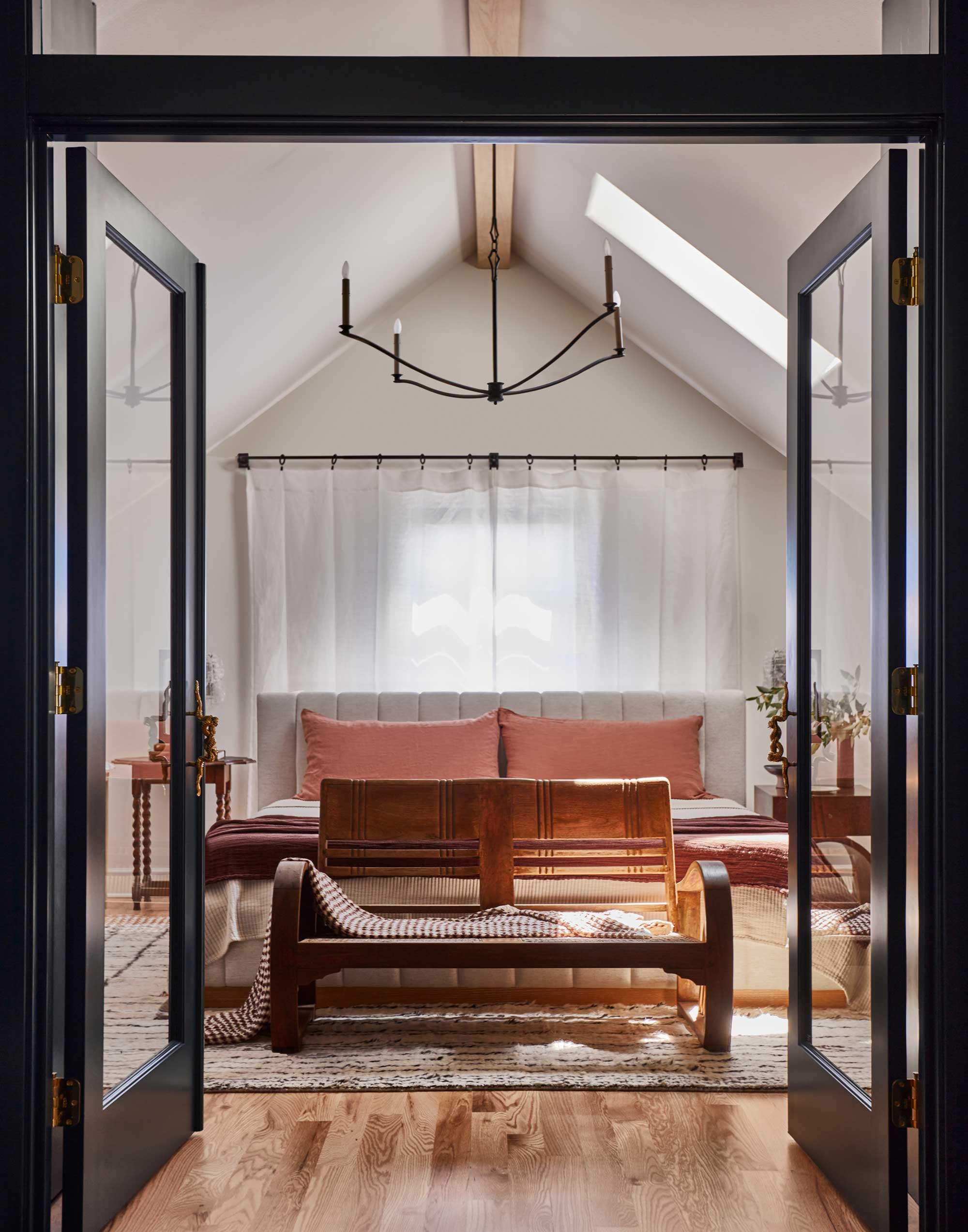
Designed by Lisa Staton, this 1930s Tudor home in the heart of Seattle devotes the entire top floor to the master bedroom, giving a hotel standard feel to the bedroom. The layout is more traditional in format, featuring a centered bed that protrudes away from the wall and welcomes you as you enter. To top it off, designer Lisa added a seating area at the end of the bed, welcoming you into the space and emphasizing that this room is a space for relaxation.
Don't be reluctant to play with the idea of a seating area at the foot of your bed, or even a suggestion of a seating area with a skinnier bench or upholstered ottoman that you can perch on.
'This is an option for rooms that have the extra length,' explains Lisa. 'A sofa at the end of the bed can create and inviting seating area, without becoming an awkward barrier to walk around.'
It's also an aesthetic tool to make the space feel cozy. 'It helps fill the space with extra comfort and visual interest, and also can act as a spot to lay things as you get dressed and organized.' Just try and resist the urge to dump disgarded clothes and always keep it free from clutter. Here, Lisa has draped a simple throw over the sofa for extra texture.
Material: Cotton and polyester blend
Colors: Surrey Camel, Thames Cream
Price: $999
3. This space that makes the most of the alcoves
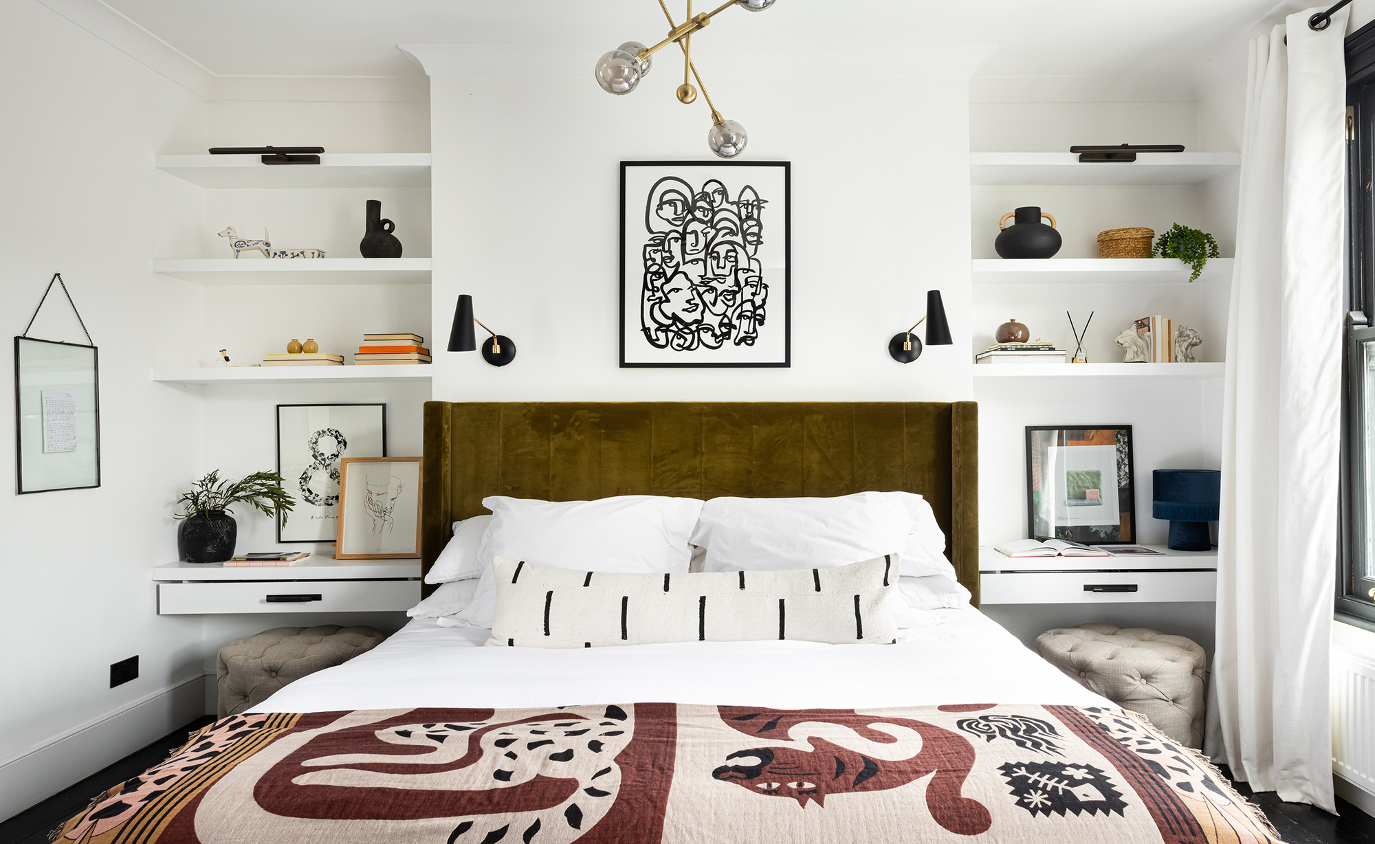
This is the bedroom that inspired my own bedroom layout. So often we see the alcove space in a bedroom filled with storage. While this can look neat, I love this look from Interior Fox that embraces open shelving.
The firm replicated what we so often see in living rooms, using shelving to provide a decorative moment either side of a chimney breast. In this example, it highlights the bed as the focal point of the space. Instead of the classic bedside table either side, there are two dressing tables or desks with handy drawers where you can stow your bedtime essentials.
'We had to make the best use of the space on the chimney wall,' explains Jenna Choate-James of Interior Fox. 'The wall to the right is full of two large windows, and the wall to the left has an opening to the walk-in closet and ensuite bathroom.
'We extended the chimney breast to be wider so that a super king-sized bed would sit flush against it. This created smaller alcoves which we designed to be built-in bedside table-meet-desk units.
'The alcove shelving offer my husband and I a place to display art, stacked books, trinkets, and candles, but when the alcoves are literal mirrors of each other, symmetry is important,' points out Jenna. Avoid a visually jarring look by striving for symmetry and simplicity. Use minimal colors and mirror style of decor and shapes on both shelves.
4. This floating bed in a small bedroom
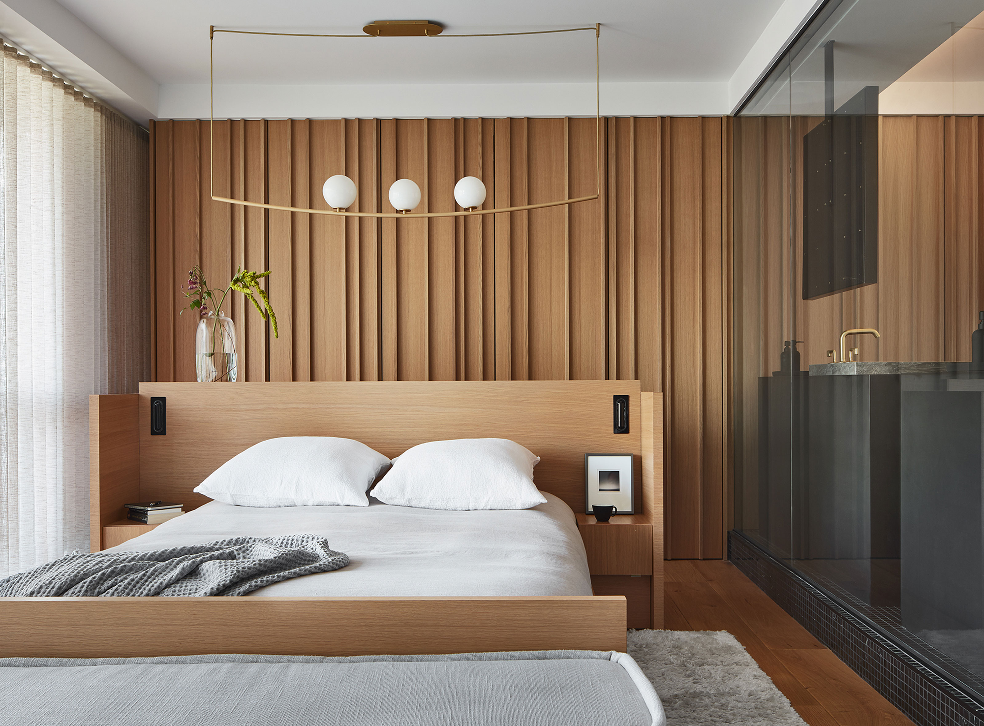
Floating a bed in the center of the room might seem an unlikely layout for your bedroom, but by doing so, you can create a modern broken plan scheme. Just like how you would use a sofa in an open plan space to divide and forge zones, you can use your bed's edges to to create mini areas within one room.
It's not just an idea for large bedrooms either. Chicago-based architects, Searl Lamaster Howe proves that you can create this clever look even in small bedrooms, with a bed centered in the middle of the space, giving easy access to the surrounding doors and closets.
'Working around the things in a high rise that cannot move like pipes and mechanical chases was tricky with this project,' explains Greg Howe, founding partner of Searl Lamaster Howe. 'The constraints prompted inventive solutions such as floating the primary suite's bed in the center of the unusually long and skinny space.'
5. This super symmetrical scheme

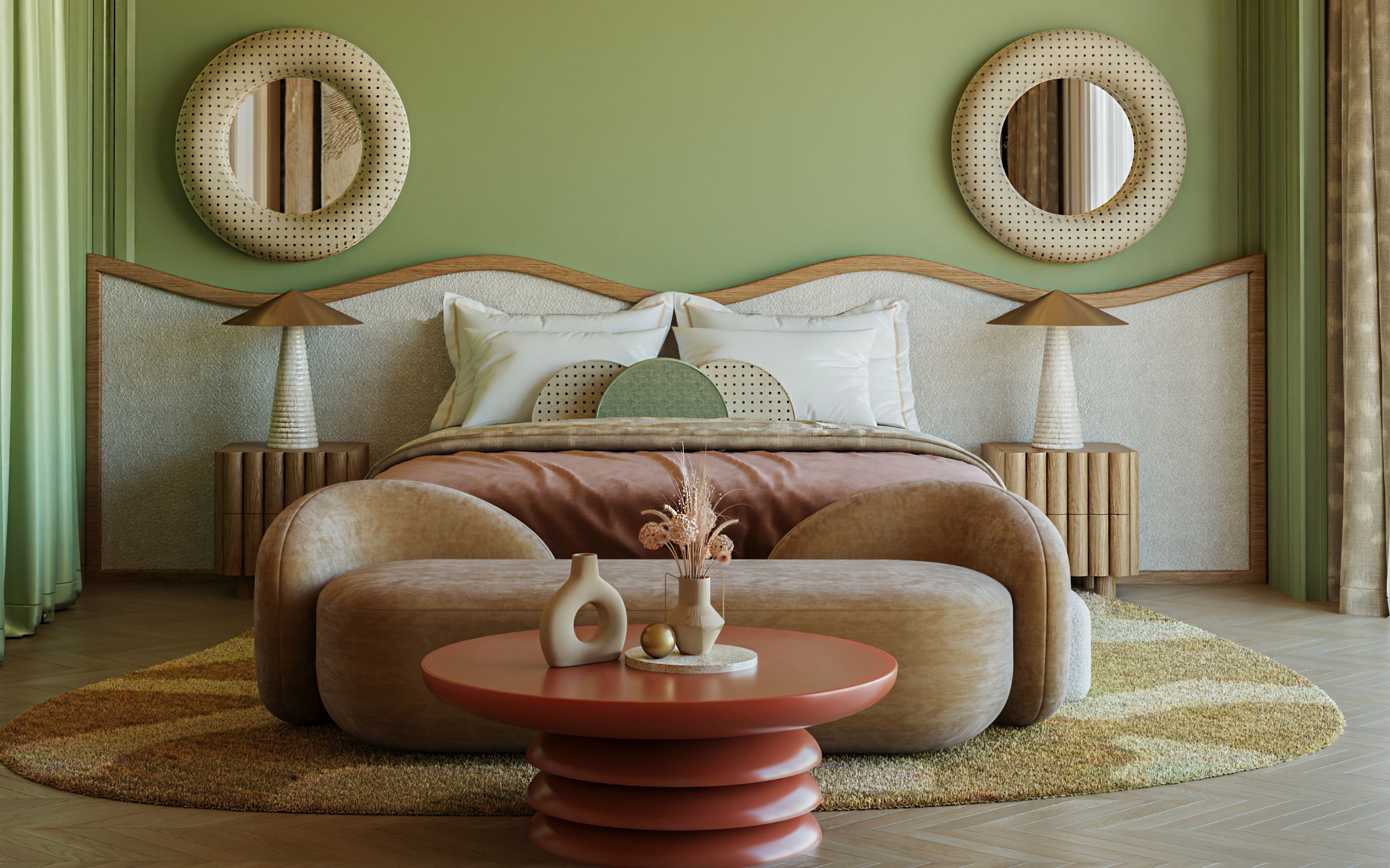
Finally, if you're unsure about your bedroom layout, focus on symmetry and the design is bound to follow. Use the bare bones and structure of the room and build the space with furniture and decor balanced on either side to make it easy on the eye.
This example from İrem Erekinci Design is the perfect example of well-executed symmetry. From the matching bedside tables to the way the pillows have been arranged, the symmetry helps the space flow naturally, which helps foster a relaxing bedroom atmosphere.
'While creating the space, I wanted to design a cheerful bedroom by using assertive colors and wavy forms, but needed it to be balanced,' explains İrem. 'I used symmetry with furniture and decor to balance it out.' The only thing disrupting the symmetry in the space is the decor on the coffee table at the end of the bed. 'I think the coffee table and bench right in front of the bed are the savior solution for 'little rest' moments,' says İrem.


