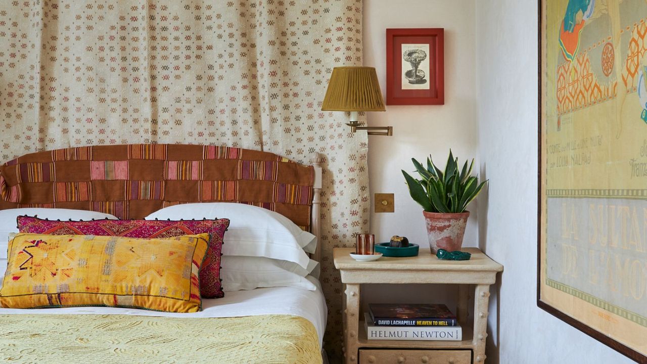
Pattern clashing is nothing new, but it has never felt more exhilarating. Interiors are embracing audacious combinations, and the result is lively, unexpected, and entirely personal.
Though mixing florals with stripes, checks with botanicals, or geometrics with animal prints may in theory sound bizarre, the visual tension it creates is precisely what gives a space vitality and character. In fact, the growing appetite for richly layered interiors has sparked a new wave of homewares designed for pattern on pattern. From patchworked textiles to mixed-motif cushions and boldly contrasted ceramics, designers are embracing pieces that do the creative work for you.
In fact, the growing appetite for richly layered interiors has sparked a new wave of homewares that arrive with pattern clashing built in. From patchworked textiles to mixed motif cushions and boldly contrasted ceramics, designers are embracing pieces that do the creative work for you. Here are my picks for bringing this spirited, artful look home.
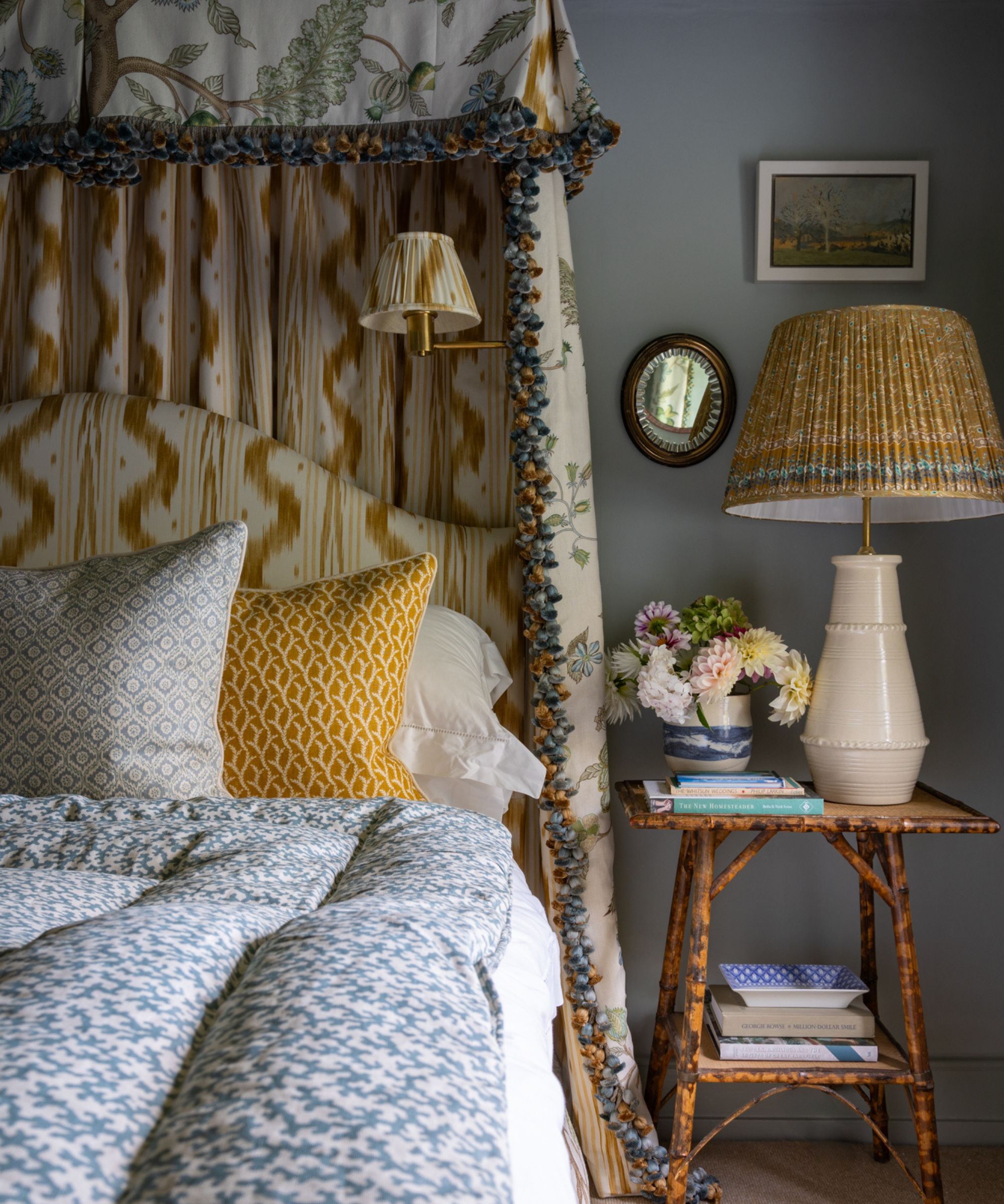
‘I often find it helpful to start with a single ‘hero’ print,’ says Kent-based interior designer Charlotte Luxford. ‘This could be a wallpaper you’ve fallen in love with or a bold fabric print that really catches your eye. From there, you can build the rest of your scheme, pulling out accent colours from the design to keep everything cohesive.
For example, if you have a large-scale floral print, pair it with one small-scale botanical, a classic check or stripe, a geometric pattern such as Ikat, and some plain fabrics in soft velvet or linen to balance the look. This way, your room feels layered and interesting without ever looking chaotic.’
This ottoman pairs a bold floral print with a crisp pinstripe, two very different patterns that work together precisely because they don’t compete. The pinstripe’s simplicity balances the floral’s complexity, letting each pattern shine without overwhelming the other.
Sometimes, all it takes is a subtle accent, just a whisper of a second pattern, to transform an entire space. To achieve a layered, lived-in, and well-traveled aesthetic, embrace pieces that clash in unexpected ways, like this beautiful Oka lampshade. The more eclectic and thoughtfully juxtaposed your elements, the richer and more dynamic the overall look becomes.
Animal prints and florals together on the same duvet? It may sound chaotic, but it works. The bedding by Yves Delmore is certainly quite pricey, but everything the French textile brand produces is achingly luxurious.
I love everything Coco & Wolf create, but particularly love this chintzy floral-patterned scatter cushion. That dainty and ditsy Liberty print looks beautiful with the contrasting fuchsia floral print on the trim.
Colourful napkins seem to be everywhere at the moment, but these are a great example of pattern on pattern that works beautifully. The same hero colour, in this case putting green, is used to keep it cohesive. The result is oh-so-pretty.
‘Everyone is talking about the recent Ruggable x RIXO collaboration, and this is my favourite piece. I’m naturally drawn to leopard print, but paired with the vintage-inspired florals, it creates a beautiful balance of old and new.
This Sanderson cushion is a great example of pattern clashing that shouldn't work in theory, but works beautifully in practice. Two of these on a bed or sofa would look truly beautiful.
I’ve had my eye on these for a while. They’re a subtle way to embrace the trend, allowing you to introduce touches of clashing patterns without committing to a full-scale clash – just a few accent pieces here and there can make a stylish impact.
When it comes to monitoring pattern trends, it's clear that it's all about nostalgic designs. If you're looking for more ways to incorporate pattern in a bombastic way, consider embracing the pattern-drenching trend for a maximalist look.