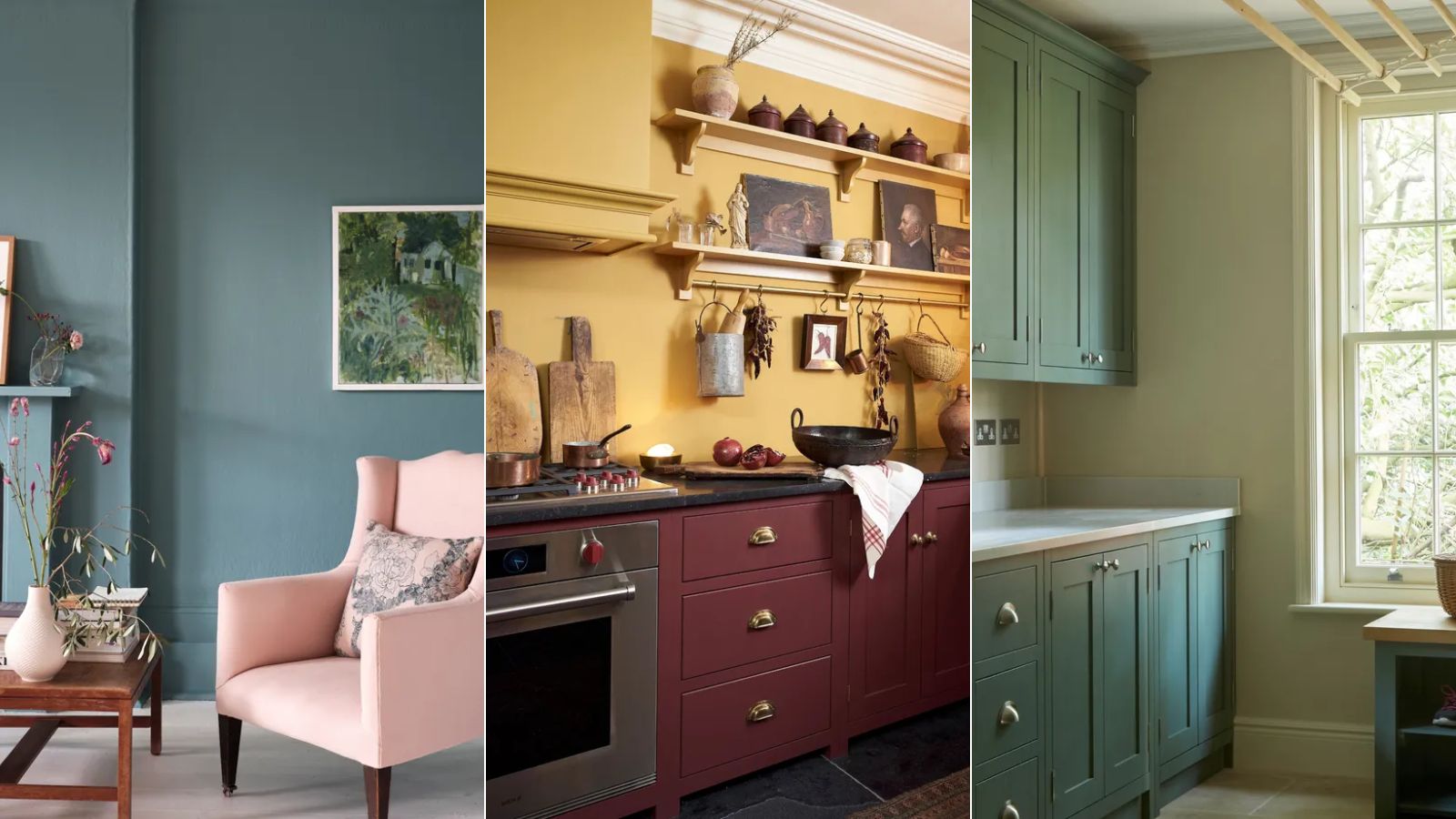
Color psychology is a fascinating subject and an important one to consider when deciding on your home's color schemes. Relating to how colors influence our mood, color psychology plays a significant role in determining how each room in our home feels, as well as how they look.
While it may sound like a complex subject, understanding some of the basics of color psychology can set you on your way to choosing the right shade for your room color ideas.
We spoke with paint color specialists and a color psychologist to break this topic down, sharing below four different moods and the best colors to help achieve them – from relaxed to energized.
Colors to decorate with depending on the mood you want to create
'Paint color surrounds you in a space, and it plays a big role in the overall design and feeling of a room,' explains Arianna Barone, Color Marketing Manager at Benjamin Moore. 'Everywhere you look in the room, you are interacting with the paint color. That interaction is what can affect your mood.'
'Certain colors are believed to convey a certain feeling but at the end of the day, it is subjective and important to take into consideration how that particular color makes you feel. Color is personal and people can respond to colors differently.
'If you look at the color wheel in its simplest form, it breaks down into warm and cool colors. Warm colors – reds, oranges, and yellows – are known to have more comforting, optimistic, and energetic qualities, while cooler colors – greens, blues, and violets – often exude tranquility, relaxation, and calmness,' says Arianna.
Calm and focused
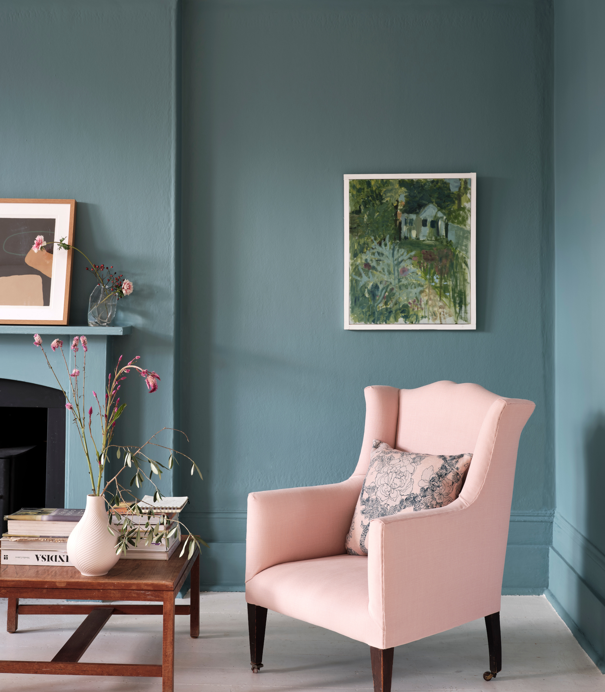
Creating a calm and focused feel can be useful in many spaces, but home offices are more than often the most important room to benefit from this mood. In these spaces, you'll likely want to avoid highly saturated, stimulating colors and stick to more gentle hues. Among these, decorating with blue is highly recommended by color experts.
'Blue is the color of the mind,' says Tash Bradley, color psychologist and Director of Interior Design at Lick. 'The lighter the shade of blue the more mentally soothing it is; and the darker the blue the more mentally stimulating. This is a great color for a home office.'
'I like to go for a mid to dark tone for a home office – it has those more mentally stimulating properties to it and it can be very good to clear your mind, get you focused,' adds Tash. 'Blue 07 is one of my go-to colors. That's our darkest blue with a green undertone. But anything that has a warmth to it – you don’t want a cool blue.'
Helen Shaw, Director of Marketing (International) at Benjamin Moore also recommends blue as a calming home office paint color: 'Blue is a safe choice as it promotes focus and concentration. Just look at the natural world and you’ll see serene skylines and tranquil seascapes in gentle blues.'
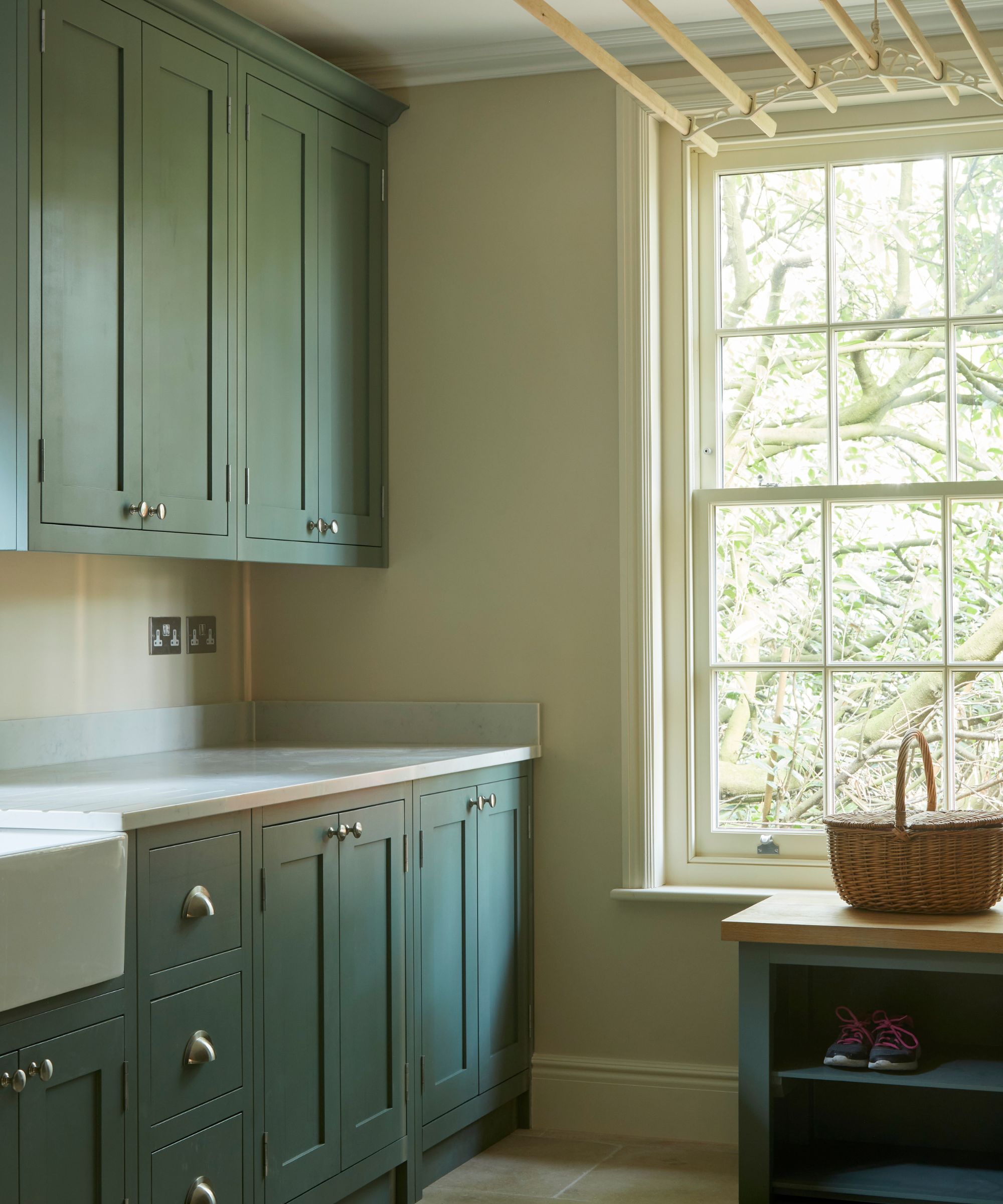
Another calming color is green. 'Your eye doesn't have to adjust to the color green so it makes it a very relaxing color to be around,' explains Tash, who recommends Lick's Green 04 which has a blue undertone.
If you want to keep things lighter, many paler paint colors promote a calming feel, according to Arianna: 'Colors like Hollingsworth Green HC-141, Yarmouth Blue HC-150, and Porcelain 2113-60 have a soft hint of gray to them, which reduces the saturation and brings in the easygoing qualities of neutrals and grays. These colors can also bring a calming focus to spaces like home offices.'
Lively and social
In rooms such as dining rooms and kitchens, you may find yourself wanting to create a more lively atmosphere, since these are the spaces we host and entertain guests. If so, there is a range of vibrant colors that feel energetic and stimulating.
'Warmer colors like reds, oranges, and yellows are known to create energy in a space,' explains Arianna. 'If you are looking for a lively color to spark excitement and conversation, look at dynamic hues like Caliente AF-290 and Hawthorne Yellow HC-4.'
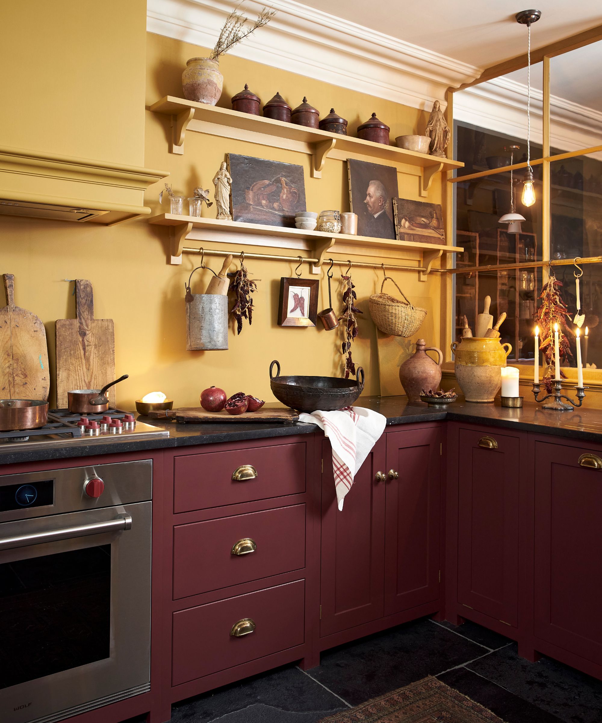
'Yellows will add positivity, or look to a zingy orange to radiate warmth and happiness,' adds Helen. 'With many homes embracing open plan living, using these tones to zone the spaces can be a handy tool in your design manual.'
However, if you want to create a lively atmosphere but don't want to go overboard with color, you can pair softer hues with saturated tones to have a less intense but still energizing effect.
'I tend to lean towards softer walls – so going for a lovely warm neutral on the walls and the ceiling – whether that’s a light or a mid-tone neutral and then I tend to pack the kitchen cabinets with a bit of a punch and a bit of a color,' says Tash.
'The color that affects you physically is the color red,' continues Tash. 'It increases your heart rate, it gets your blood flowing.' If lively is the feeling you want to create, there's all the more reason to embrace decorating with red since it's a leading color trend right now, especially rich, wine reds that feel sophisticated and dramatic.
Relaxed and restful
We all want our homes to feel relaxed and restful, especially in bedrooms and bathrooms. To create a restful feel through color, it's all about nature-inspired, soft hues that aren't too saturated.
'When you are thinking of relaxed and restful colors, these are your shoulder-dropping colors that when you walk into a room they’re not loud, they’re not shouty, they instantly make your shoulders drop and you relax around them,' explains Tash.
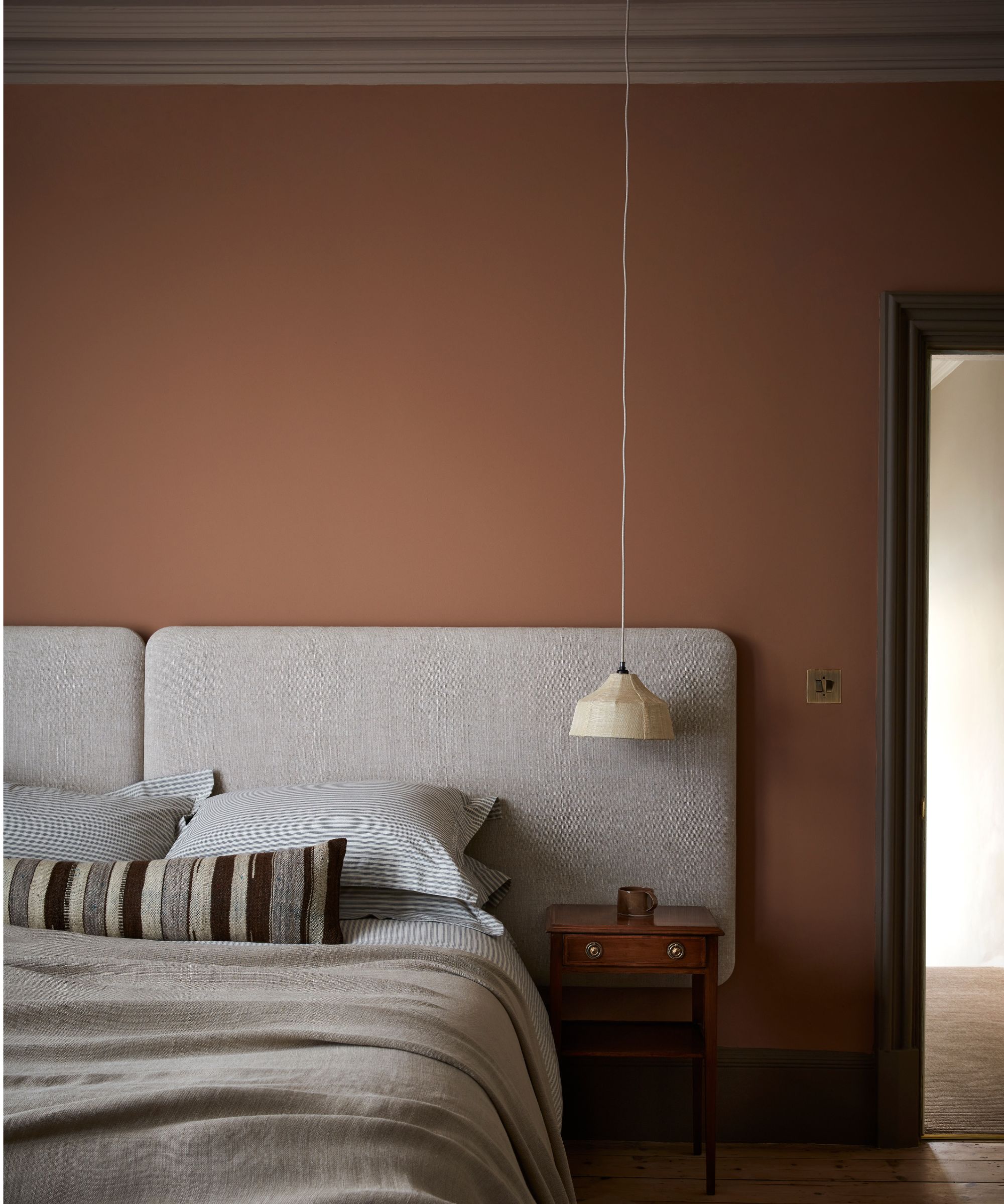
'Pink 01, Pink 07, Taupe 03 – these dusky, plaster earthy pinks are shoulder-dropping colors that instantly make you feel very relaxed, and they're the perfect colors for a bedroom. They really encourage your mind to switch off, they’re just a really lovely color.'
Decorating with green also comes into play here, says Tash: 'The more yellow pigment that you add to green, the more energizing it becomes, so with a toned-down sage green or a soft, delicate green, that’s a very restful color, again great for a bedroom.'
Or, if you prefer decorating with neutrals, these are go-to colors for creating restful spaces: 'Anything that has a connection to nature, you’re very comfortable around,' adds Tash. 'So any sort of beige, taupe color is a really good color for a bedroom and a bathroom.'
'Soothing colors like New Hope Gray 2130-50, Paris Rain 1501, and New Age 1444, are a beautiful blend of the versatility found in neutral hues and the calming qualities of cooler colors,' explains Arianna, making them great choices for restful rooms.
Cozy and safe
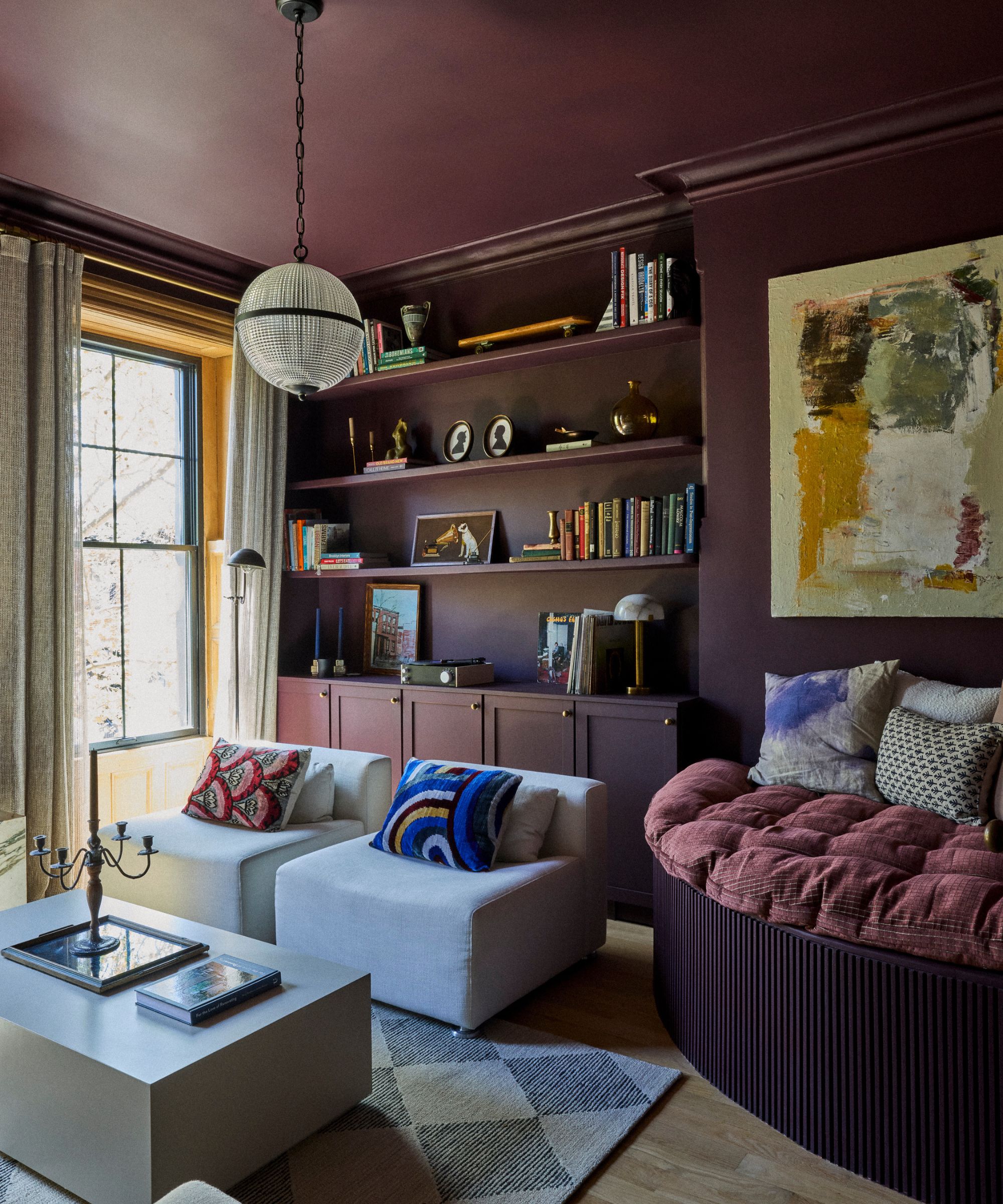
In rooms such as living rooms and snugs, you may be inclined to decorate with colors that help to create a cozy and safe feeling. While the choice of color is important here, it's equally important to consider how you use the paint color, with experts recommending color-drenching ideas in these spaces.
'Less contrasts make a room less busy and so by wrapping one color onto everything you are creating that very cozy, warm feeling, cocooning you in a space,' Tash explains.
'So cozy colors – again you’re looking at those earthy pigments so anything with a brown-pink tone to it,' adds Tash. 'Pink 08 is one of our best-selling colors for a living room. It’s just incredible.'
Cozy rooms also allow you to lean into trending dark paints for a moodier look. 'Midtones and deeper hues can bring an enveloping and comforting feeling to spaces like living rooms,' says Arianna. 'Look to colors with a hint of warmth for an added layer of coziness like Cinnamon Slate 2113-40, Weimaraner AF-155, and Silhouette AF-655.'
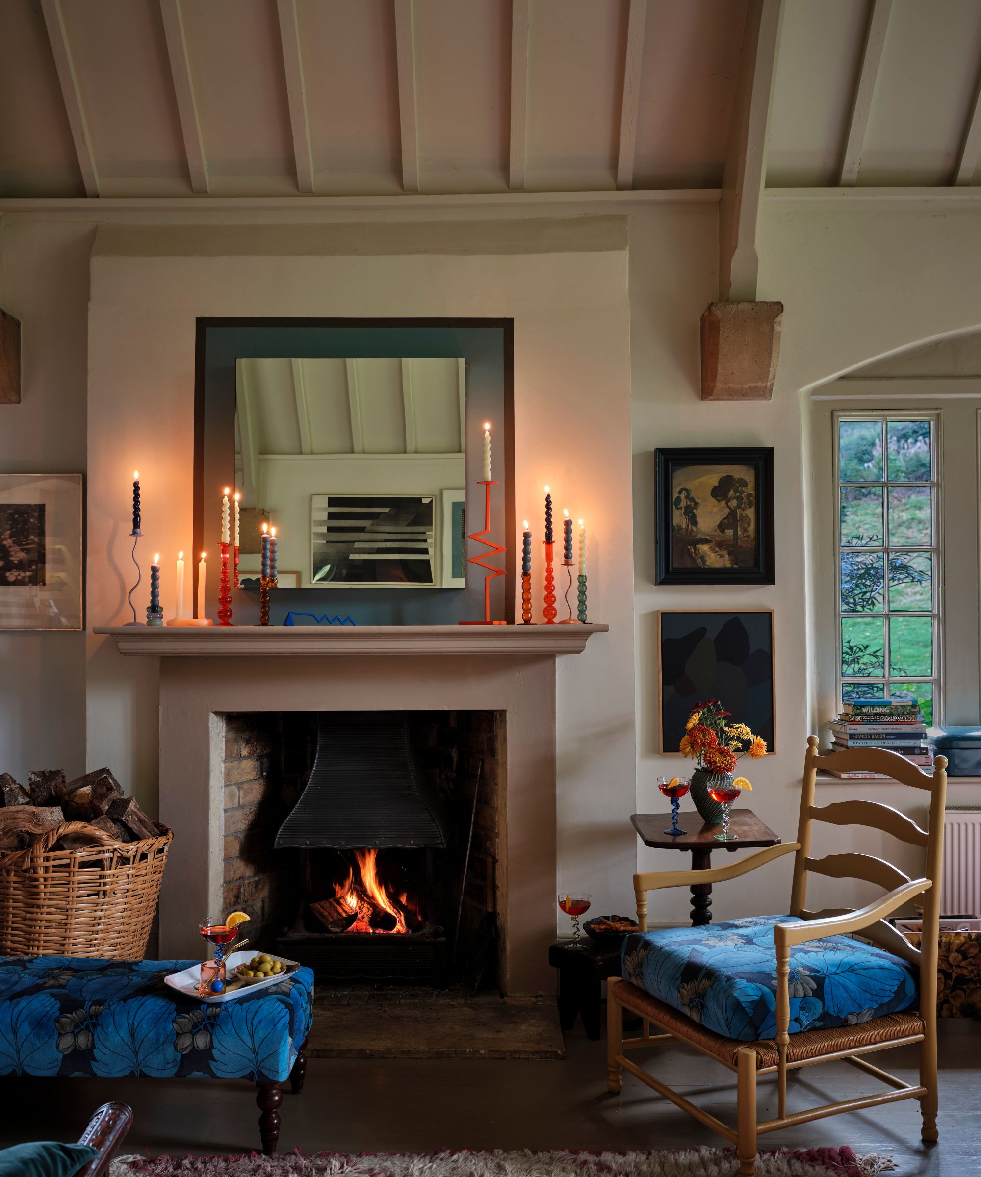
Alternatively, lighter tones can work well, so long as they have a warmth to them to create a cozy feel. 'Earthtones take us back to nature and feel safe and restorative,' Helen explains. 'Use a monochromatic palette and layer tactile fabrics, natural wood, and organic ceramics to deliver a cosseting look and feel.'
'Bieges are such lovely colors for a living room,' adds Tash. 'Our White 05 – that oaty white with its gray and yellow pigment – is a really nice color if you want a light neutral color that’s lovely under candlelight.'
Whether you want to use color to aid in creating a relaxing sleep space or want to enliven a social space with bolder shades, it's certain that color is one of the most effective ways to transform how a space feels.


