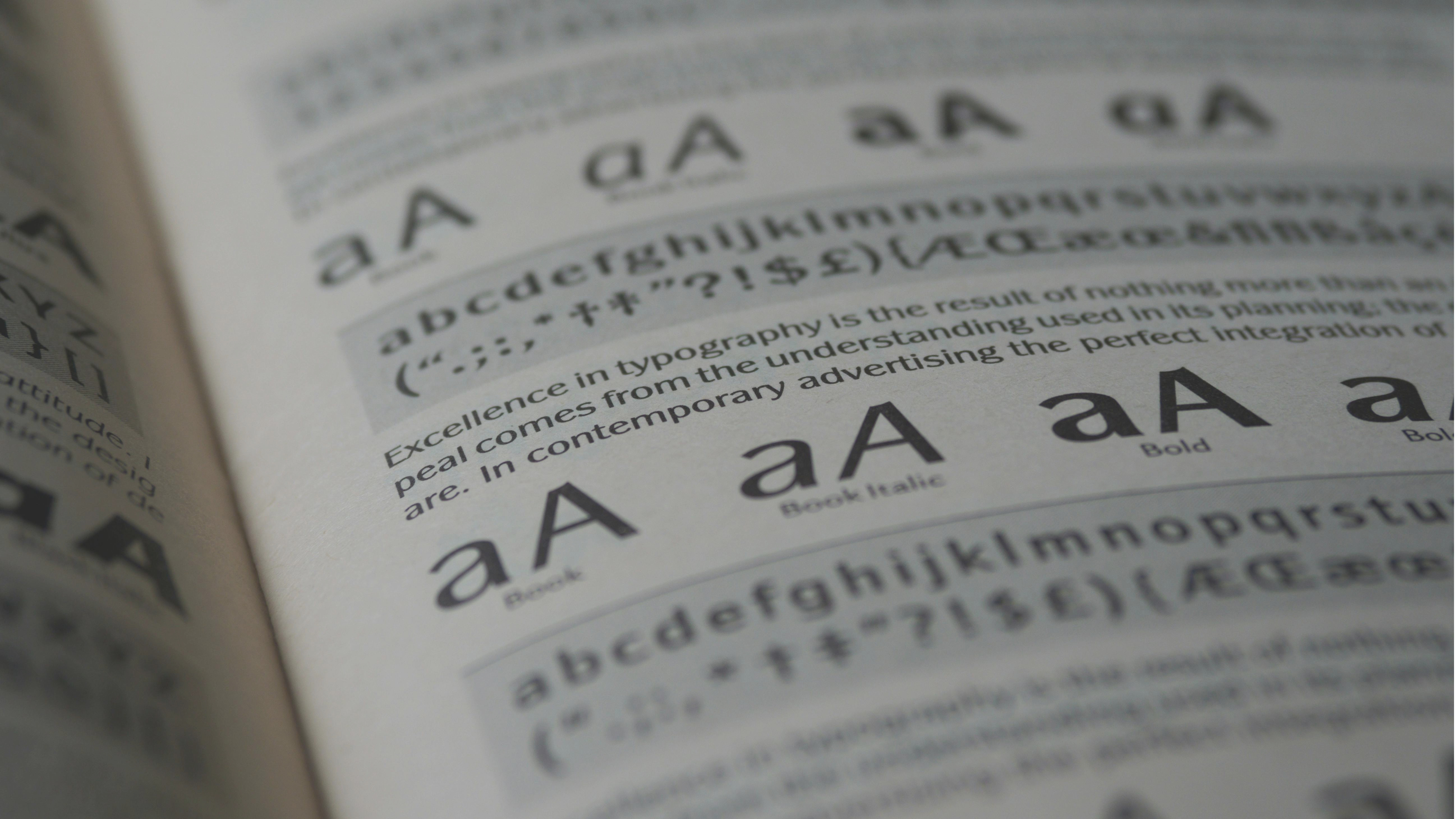
We all know words have power – but the fonts those words are written in can have just as much. Font psychology is the study of how fonts and typefaces make us feel, and while it may not be something you’ve thought too much about before, it is a huge aspect of design and branding.
Someone might have some understandable scepticism regarding how much choosing the best fonts can really matter. After all, the meanings of words don’t change because of what the letters look like, do they? It’s not like a globally recognised brand could instantly and devastatingly alter how people perceive it, simply by changing the font of a single word, is it?
Okay, you probably can see where I’m going with this, you design-savvy audience you…
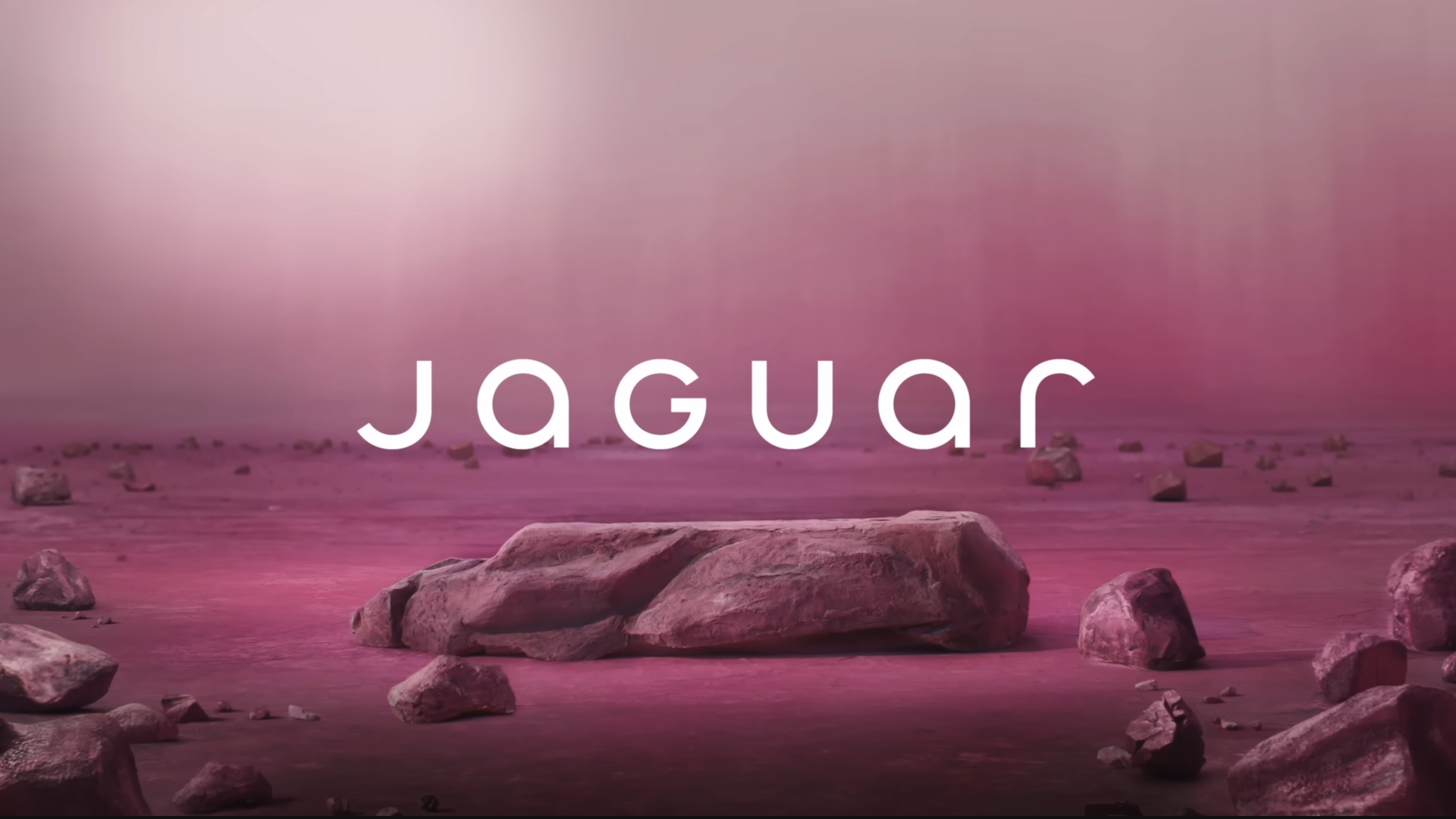
The font wasn’t the only problem with the infamous Jaguar rebrand – but it was a big one. When people criticised the rebrand for looking like it belonged to a vegan smoothie maker or a yoga studio, they were largely talking about those letters. Those rounded curves, that smooth uniformity of shape and size, that oh-so-millennial insistence on using all lower case. None of these things are inherently bad – but none of them make you think of a high-end, prestigious car company, either.
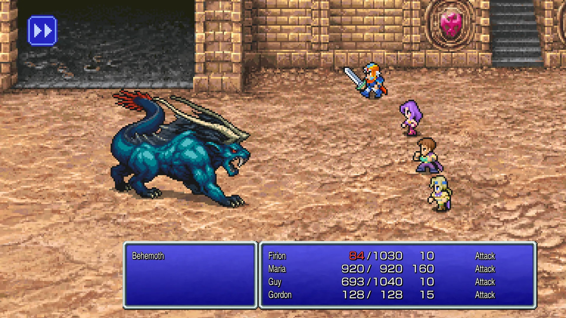
And let’s not just pick on Jaguar – a few years ago, Square Enix released a Pixel Remaster series of the first few Final Fantasy games, making them playable on modern consoles – and was met with outcry. Why? The font was wrong. The charmingly pixelated (but perfectly legible) font of the retro titles had been replaced with grim, charmless, appstore-looking-ass letters that felt tonally completely out of step with the games, and had modders and gamers everywhere scrambling to fix it.
Those are just a couple of examples of the perils of ignoring font psychology – as professional type designers know all too well. ‘Typography never exists in a vacuum,’ says Marie Boulanger, Type Design Lead at Monotype. ‘Type is a cultural medium, influenced by trends and the worlds around us.’
‘Of course you always have to be mindful of it, but in the same way you have the be mindful of all cultural norms and content shifting. Being a designer is also about observing and capturing the world around us.’
What is font psychology?
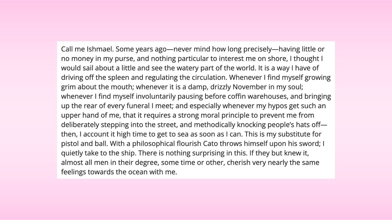
Take a look at the below paragraph. Interrogate how you feel as you read it:
Now look at this one:
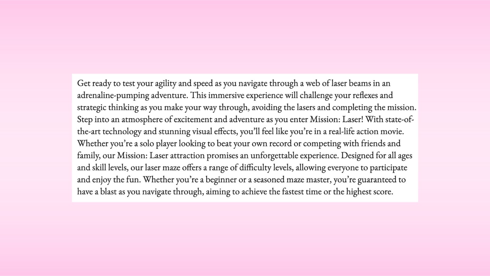
It’s not the most egregious thing in the world, but in both cases it feels… off, right? It’s weird to read the opening paragraph of Moby-Dick in the kind of clean sans serif font you’re used to seeing used for social media posts and Google search results. And similarly, the Laser Quest marketing copy in the serif font just doesn’t look right at all – a complete mismatch of content and style, as though somebody accidentally sent the wrong text to a printer.
That is font psychology. It’s the study of how people react to typographical choices – the thoughts, emotions and behaviours that are elicited by certain font choices. As any designer knows, a huge amount of the communication you will do with your audience is completely non-verbal, and fonts are no exception.
Font choice is so powerful that people can read the exact same text in different fonts and come away with different impressions of it. In a study by Samuel Juni and Julie S. Gross, a group of students were shown one of two versions of a satirical text from the New York Times, one in Arial, the other in Times New Roman.
Once they’d read the text, they were asked to rank it using a series of adjective descriptors. The group who’d read it in Times New Roman consistently rated the text as being both funnier and angrier than the group who’d read it in Arial. The exact same text, perceived two different ways.
Your reader starts to form their perception of your brand from the second they clap eyes on your text, and first impressions are everything. If for instance you are marketing a phone whose main selling point is its slimness, then it makes much more sense to use a slim, elegant font than a thick one, and bring those associations of slimness and elegance into your reader’s mind right away.
A good case study from the team at Monotype came with being entrusted to design a new typeface for Boehringer, a pharmaceutical brand.
‘Through our findings with research partner Neurons, we know that certain fonts elicit specific emotional responses with certain markets, which can be amplified by context,’ says Marie Boulanger. ‘In the pharmaceutical world, one of the main values you must communicate to customers is trust (much like financial institutions). We found that humanistic sans serif typefaces performed well for trust, so you can really see that come through in this project.’
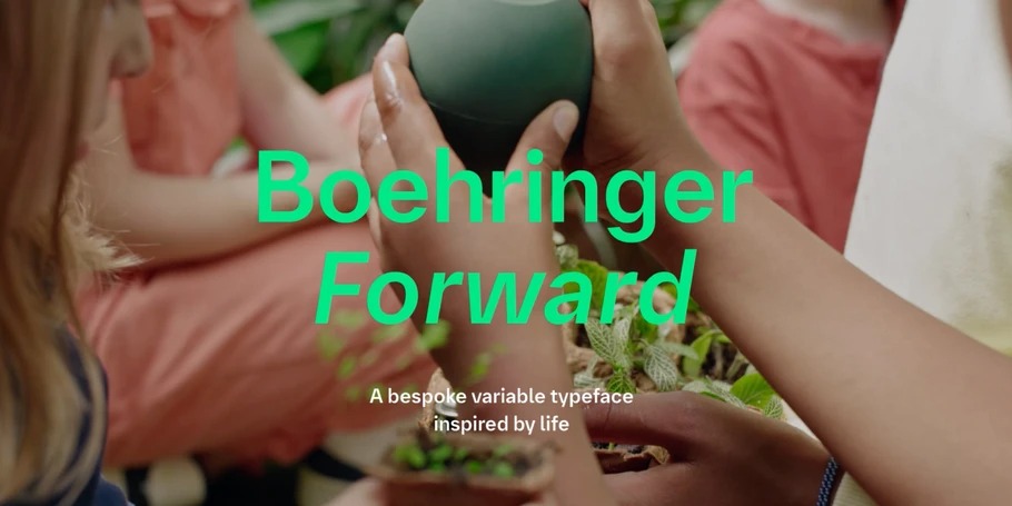
‘However it’s important to be flexible, and this specific project also has really lovely typographic details that add warmth and personality, like the joints and the counters.’
The psychology of different font types
When choosing a font, you’re going to be looking across a few key categories, each of which will have different psychological associations for your reader. While there’s a lot of individual variance within font types, here is a broad-strokes look at how they can be used.
Serif
- Examples: Times New Roman, Georgia, Garamond
- Associations: tradition, authority, formality, respectability, reliability, trust
Serif fonts are the oldest of the bunch, having been used in printed books and newspapers for centuries – some of the oldest known typefaces are serifs. Garamond, still one of the best-known today, dates back to the 16th century. As such, a serif font tends to evoke feelings of tradition, heritage and stability in the mind of a reader.
Serifs are a good choice for a brand that wants to appear respectable and dependable, or add a degree of formality to its branding and communications. Law firms, accountancy firms, universities and banks are some of the types of institution that will generally prefer a serif font, as will broadsheet newspapers and literary magazines. Serifs are also commonly used among premium and luxury brands, as a signifier that the brand in question takes itself and its product seriously.
Sans serif
- Examples: Arial, Helvetica, Century Gothic
- Associations: modernity, informality, progressivism, straightforwardness, clarity, efficiency
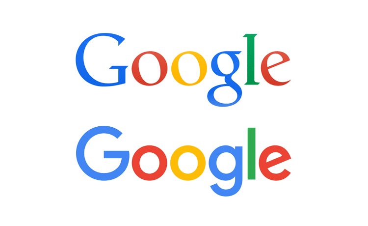
So named because they lack serifs – the small lines or strokes attached to the ends of larger strokes – sans serif fonts are a more recent invention, relatively speaking. As such, they tend to evoke a sense of modernity for a reader. Brands will often opt for a sans serif font when they want to convey that they are contemporary, cutting-edge and up-to-date. When a brand wants to refresh its identity, often the first thing to change is that it will switch from a staid serif logo to a jaunty sans serif one; Google quite famously did just that in 2015.
Sans serif fonts are popular with tech companies and startups. Fashion brands like them too, particularly those who are at pains not to appear too stuffy or out of touch. Smaller, independent brands that are going up against big chains or conglomerates will also often opt for a sans serif to make themselves feel different, like they’re going against the grain. You’ll also almost certainly read sans serif fonts very frequently in your day-to-day life, as they are overwhelmingly the font style of choice for social media posts – not to mention the text you're reading right now.
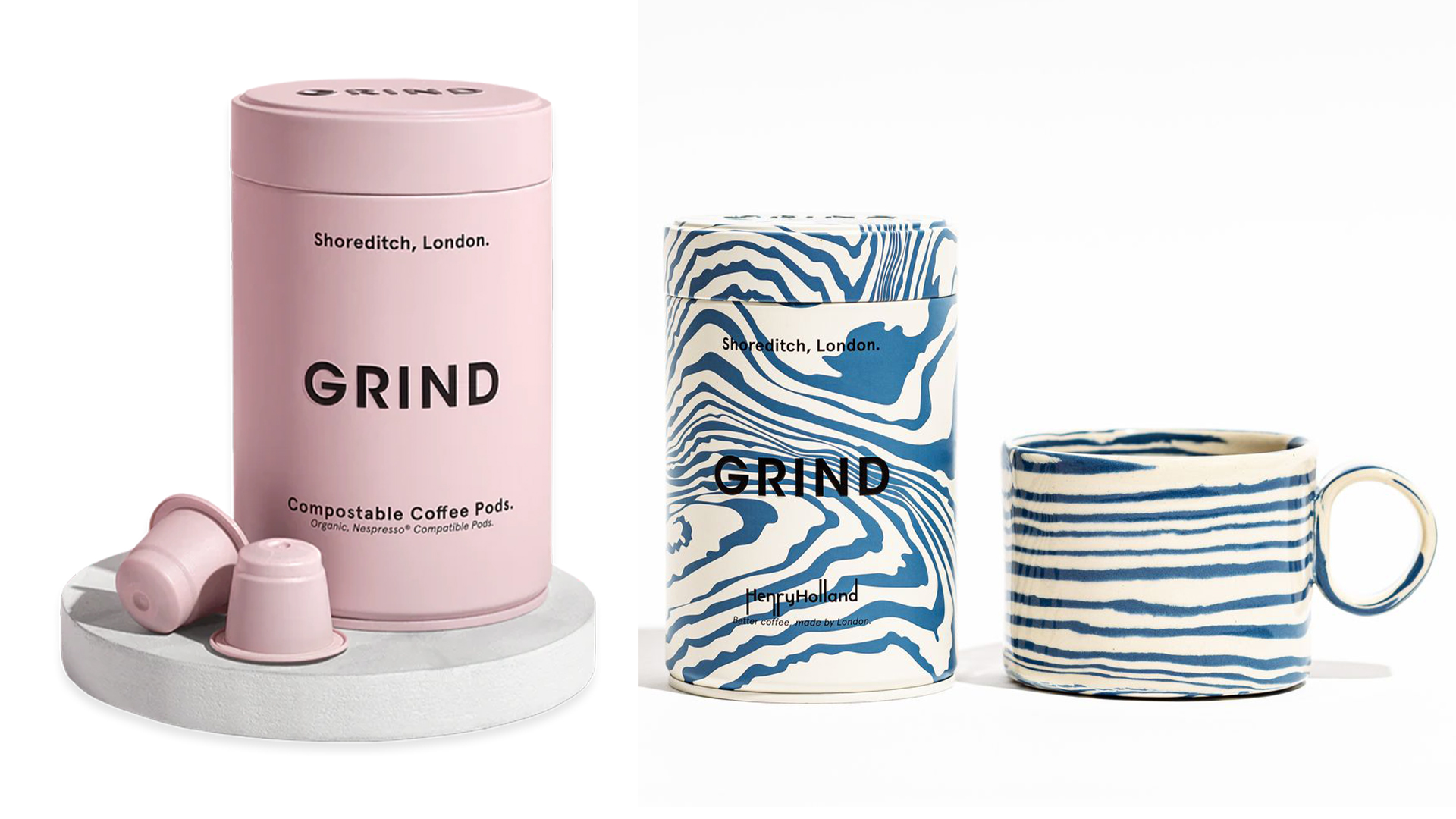
Of course, nothing exists in a vacuum, and the popularity of sans serifs has led to a change in their perception as some people have come to regard them as overdone and passé.
‘Trends, particularly the more extreme or noticeable ones also influence brand perception,’ says Marie Boulanger. ‘How many times did we see the “blanding” graphic about luxury brands all going for Sans Serif typefaces in the 2010?’
‘If everyone in your brand category starts doing one thing, you may need to differentiate yourself through branding.’
Script
- Examples: Lobster, Thirsty Rough, Lucida Script
- Associations: creativity, emotion, femininity, playfulness, whimsy, adventure
Script fonts are designed to look like handwriting. They’re not the best for legibility, but are ideal for injecting a little homespun charm into your branding. While your first thought when you visualise a script font might be one that apes a beautiful cursive handwriting style, the actual net is quite broad – which makes sense when you think about how varied people’s handwriting can be.
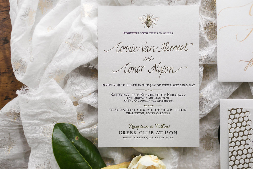
The infamous Comic Sans, for instance, is actually a script font, designed to look like a child’s handwriting. Depending on the nature of the script, a script font can have all sorts of uses. The more fluid and cursive styles tend to be used for wedding invites, luxury brands, posh restaurants and that sort of thing – they communicate sophistication without feeling austere.
The childish styles, meanwhile, are great for anything to do with kids, from toy branding to sweets. They evoke a sense of childlike simplicity, a straightforward and playful way of looking at the world.
Modern
- Examples: Ambroise, Bodoni, Walbaum
- Associations: style, sophistication, functionality, calm, elegance, poise
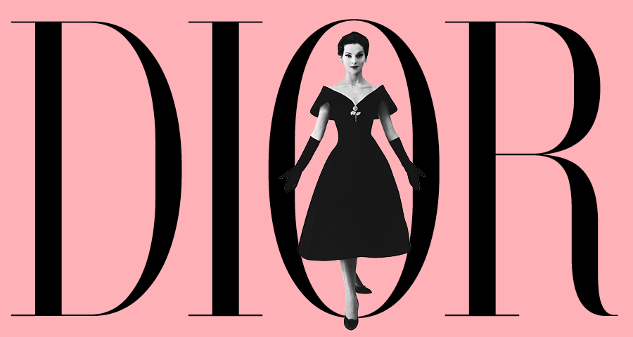
Despite the name, modern typefaces have been around for centuries, with their invention credited to French author Firmin Didot in 1784. This is why you’ll also hear them referred to as ‘didones’, though that term was coined much later. Modern typefaces are characterised by pronounced contrast between thick and thin strokes, as well as slim, unbracketed serifs.
A modern typeface isn’t the best for long running copy, but for headers and logos it can be just the thing, conveying the kind of elegance and sophistication that high-fashion brands are always chasing. Open a fashion magazine and you won’t have to flip through many pages before you find an example of a modern typeface.
Slab-serif
- Examples: Clarendon, Rockwell, Memphis
- Associations: strength, boldness, confidence, assertiveness, impact, energy
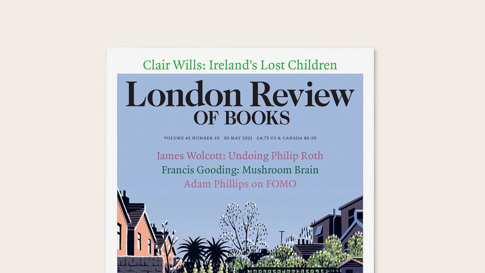
Slab-serifs, as the name implies, are essentially a spin-off of serifs, though they also owe a great debt to didones. They still retain those distinctive little serif tails, but give them a blocky thickness that is immediately striking and distinctive. Slab-serifs are strong fonts, often used to give something impact or punch, rather than for longform text. A 4,000-word London Review of Books article in a slab-serif would be quite wearing to read, but in smaller doses it’s a font style that’s attention-getting without being tacky or gimmicky.
Automotive brands gravitate towards slab-serifs and the associations of boldness, independence and confidence that come with them. The famous Marlboro cigarettes wordmark is also a slab-serif, and some tech companies use the style too — most notably Sony.

Looking forward
Something that's important to stress about font psychology is that it's an ongoing, evolving discipline. People in 2025 won't necessarily respond the same way to a font as they would have in 2015, or 2005. The point is not to trend-chase, but to maintain an awareness of how different styles of font are currently being perceived.
‘I think trying to keep up is futile. Type is culture and changes all the time,’ says Marie Boulanger. ‘Ultimately a custom typeface project is something which has to fulfil a brief for the client. That can mean a lot of things to different people, depending on needs, but also lived experiences and references. There’s no magic recipe!’


