What you need to know
- Google is preparing to roll out a redesign for the Play Store's dialog box UI, which brings it more in line with its Material You theme.
- The revamp gives the dialog boxes for app updates and information a more card-style appearance.
- The update is also bringing a new "Featured Stories" editorial card to certain apps' details page.
Google is preparing to roll out a redesign for its dialog box's UI that appears at the bottom of the Play Store when scrolling.
As detailed by AssembleDebug on Telegram, the updated design is rolling in via Play Store version 39.8 (via Android Police). The patch contains a "redesigned dialog UI" and "new editorial cards" in the details page when tapping on an app.
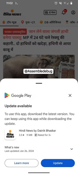
The new dialog UI box fits Google's Material You design theme that's present across its ecosystem. The box now features rounded corners and a gray bar, which lets users resize it as they see fit. Moreover, this UI change will appear whenever an app prompts users to update it. The update prompt is the larger dialog UI variation, offering information about what's new in the update alongside a message highlighting that the update is required for use.
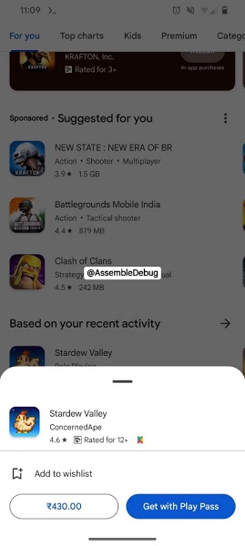
There is a smaller version, which will only appear if a user long-presses an app in the Play Store. It doesn't offer much information, only detailing its price (if applicable), app name, developer studio, and other items.
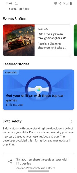
The flip side of this update brings a new editorial card to the details section of an app called "Featured Stories." Not every app will have this, but tapping it for those that do will produce a page of "recommended" similar apps.


As the publication notes, users may need to update the Play Store manually before seeing the changes. However, version 39.7 appears to be the latest, meaning it may take some time before the redesign (v39.8) is available to install. Users can manually check by tapping their Profile icon > Settings > About > Play Store version.
Aside from redesigns, Google started testing AI-generated FAQs within an app's details page. It appears as though the company is planning for AI to answer user's most common questions. After enabling it in the store's code, it looks like users would find answers to what others like about the app, what its features are, and more.
Another feature that was spotted in testing involves AI-based "app highlights." These would provide users with quick pieces of information, essentially condensing what can likely be read in an app's full description box. App highlights would draw attention to an application's most notable features and the various activities one could do inside it.


