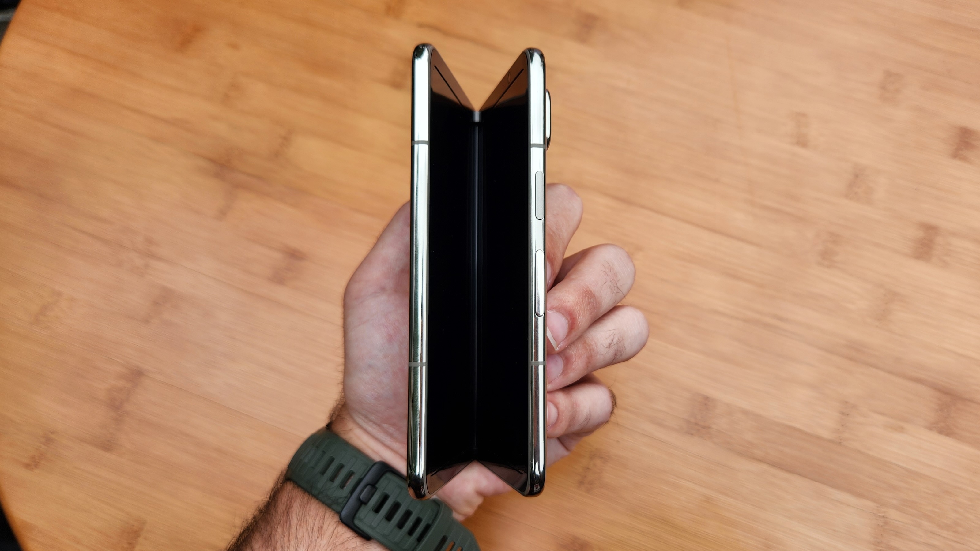
Ever since Android 9 Pie's release back in 2018, I've been livid about the changes Google made to Android's recent apps UI. Commonly known as Overview, the stock Android UI that displays recently-opened apps is one of the most useless, worst-designed pieces of UI that Google has ever created.
But the Pixel Fold looks to be changing this for the better, taking cues from Samsung's Good Lock — one of the reasons I've preferred using Samsung phones for years — allowing users to choose between multiple apps with a single tap when multitasking. No scrolling required!
But does this represent a larger shift to Android, or is it just Pixel Fold-specific? We've seen teams at Google tweaking and redesigning UIs a lot lately — the new Google Home app is an excellent example of this — so I'm certainly hoping it means more than just one product gets improved.
What makes overview so bad?
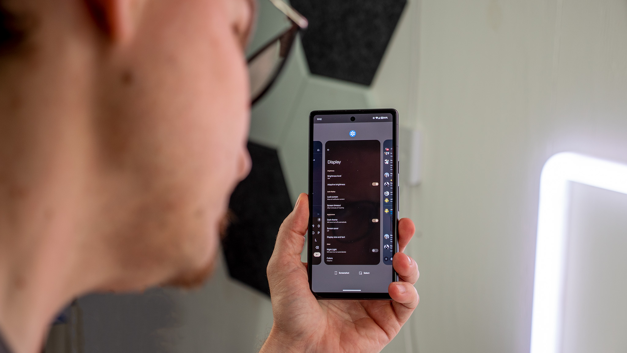
All the best Android phones support Google's excellent gestural navigation bar introduced in Android 10. It was a monumental upgrade from the "pill" introduced in, surprise, surprise, Android 9 Pie. Most of the time when I'm multitasking on a phone like the Pixel 7a I'll just swipe left or right on the bottom bar until I find what I want.
But, sometimes, I want to go back further than the last 3-4 apps. That's what Overview was created for or, at least, what it once was created for.
As a user, I would expect to open up Overview — done by swiping up on the bar and holding for a moment — in order to navigate back to an app that I recently opened. The entire purpose of this UI is to keep me from going back to my home screen and finding the app I want again.
Except, all I see when I open Overview is the app I currently have open.
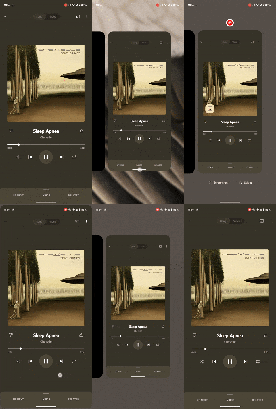
Really? You're seriously telling me that someone at Google's AOSP team thought a UI built for multitasking should show the current running app first?
Not only that, but it's the only app you can see on the screen thanks to some ridiculously oversized thumbnails. You have to scroll to the left to see the next app and, even then, you can't see further back than one app at a time.
This is an entirely useless and ridiculous UI for multitasking. It accomplishes none of the goals it's supposed to be created for and completely fails its sole purpose.
To make matters worse, the folks at Android UI design have only doubled down on this awful design over the years, taking away the AI-powered suggested apps icons at the bottom and replacing them with buttons to take screenshots or copy text.
Newsflash: when I'm multitasking, I'm not looking to take a screenshot. I'm looking to switch between apps as quickly as possible.
Plus, to open up more than one app at a time, you have to click on the little icon at the top of each app's thumbnail view and tap the split screen button. Why can't I just drag the thumbnail of the app to the top or bottom of the screen?
This entire UI is awful.
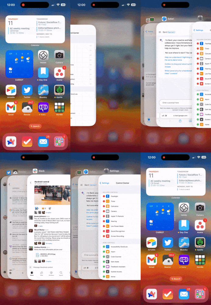
If I perform the same gesture on an iPhone, I'm presented with a somewhat similar-looking screen that differentiates itself in one very, very important way: I can see more than one app at a time.
Yes, it still utilizes a horizontal-scrolling carousel on a very vertical display — once again, a colossal waste of space — but I can at least predict how far I have to swipe to get to where I want in the multitasking carousel. Good luck doing that on most Android phones.
Samsung fixed this a long time ago thanks to Good Lock and I haven't ceased applauding their efforts ever since. I just wish it were accessible without having to download another app.
How the Pixel Fold is fixing it
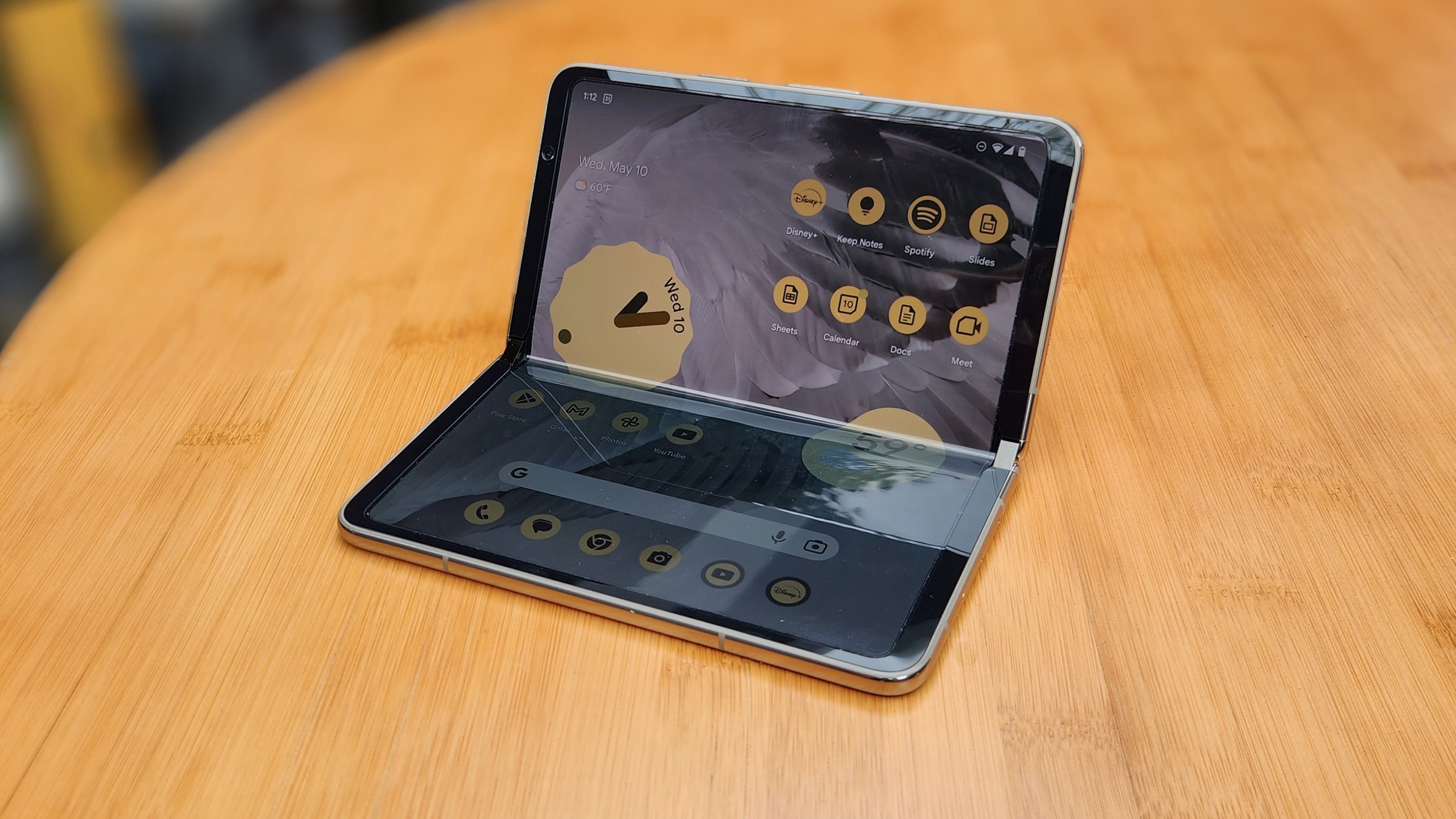
The Pixel Fold is finally fixing Android multitasking for good, and it's not just doing it by addressing most of my main complaints with Overview over the past five years. It's going one step beyond that, as well.
Let's begin by visiting the Overview screen using the exact same gestures I just used on a Pixel 7a and an iPhone 14.
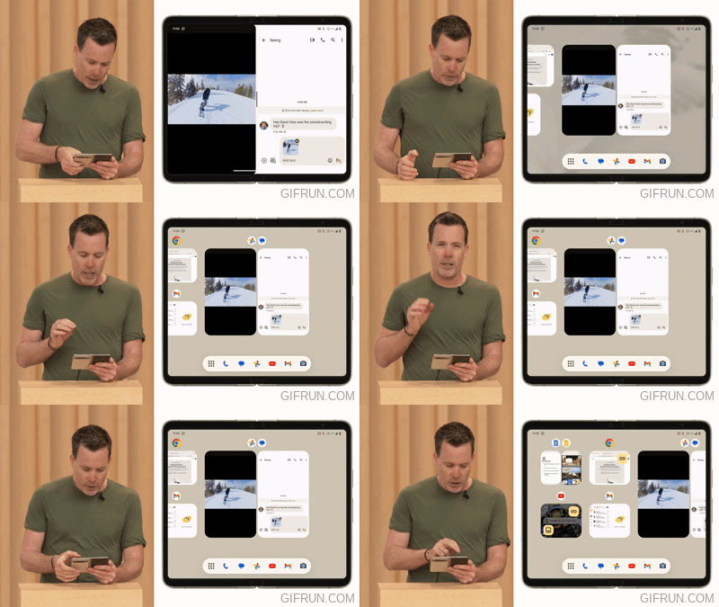
Do you see what just happened there? Not only does the multitasking carousel show more than one app at a time, but a brand-new taskbar appears at the bottom of the screen — more on that in a bit. Let's focus on Overview, first.
While the active app still shows most prominently in the middle of the screen — I'm still asking Google why it thinks this makes any sense at all — a quick swipe to the left lets you switch between as many as six different apps at a time. This is extremely similar to how I configure Good Lock to run on Samsung phones and it makes multitasking so much quicker and easier, no matter the screen size or aspect ratio.
As a bonus, the task switcher now shows the app pairs you've made, so you can easily swipe between multiple apps at a time when running apps in split screen.
But, wait! There's more!
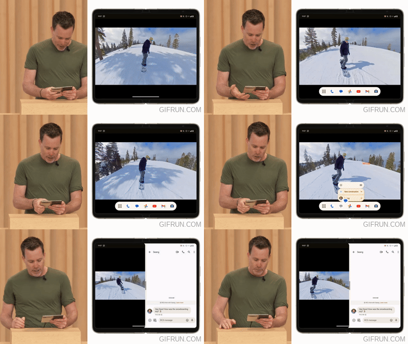
Thanks to the work Google and Samsung put into Android 12L, there's a new taskbar that appears at the bottom of the display when swiping up — or when opening Overview, as you previously saw.
The taskbar acts as a way to quickly use split-screen mode and run more than one app at a time. Samsung first introduced this with the Galaxy Z Fold 4 last Fall and I couldn't believe how much easier it was to split-screen apps because of it.
This works exactly as it should and exactly as I expect it to.
Not only that but dragging content from one app to another now appears to work as expected, as well. These aren't necessarily new concepts for Android phones from manufacturers like Samsung but they are things that are new to Android as a base operating system.
All I can say is finally. Thank you for listening, Google, and I hope you decide that these kinds of excellent multitasking features make sense for the rest of the Android ecosystem as a whole, too.
Phone deals: Best Buy | Walmart | Samsung | Amazon | Verizon | AT&T


