It's hard to believe that at one point in time, warm beiges, chalky whites, and moody taupes were the go-to choice when it came to the most on-trend colors. In 2026, the colors du jour couldn't be more different; in fact, designers seem to be welcoming all shades other than neutrals into their schemes. And the announcement of Pinterest's 2026 Palette only confirms the reign of beige is over.
According to searches and saves across Pinterest, these six striking color trends have gained momentum across the globe. Curated by their in-house trends team, Pinterest has revealed that Cool blue, Jade, Plum Noir, Wasabi, and Persimmon are the colors to watch out for in 2026.
Interior designer Katie Kiser shared her thoughts on this year's roundup of hues. 'While I think the Pinterest 2026 color palette is literally and figuratively bold, I believe it underscores what we designers feel deeply right now: a craving for tension in our designs. I believe there are shades within the shades of these selections that feel very on trend and incredibly applicable.'
1. Cool Blue
This year's Pinterest palette relfects our current craving for vibrant hues that pack a punch. First out of the round-up is 'Cool Blue'. Described by Katie as 'practically a neutral at this point. While this particular shade feels extra icy, this is our sophisticated, trendless option for the Pinterest 2026 color palette.'
Cheerful without being overly glaring, cool blue is a refreshingly easy shade to transition into the home. An icier take on the powder blue trend, Pinterest's first pick is cooler than a traditional pastel. A shade that works in spaces of all descriptions, it's not hard to picture the icy blue adorning the walls of an entryway or a feature wall framing a headboard.
2. Jade
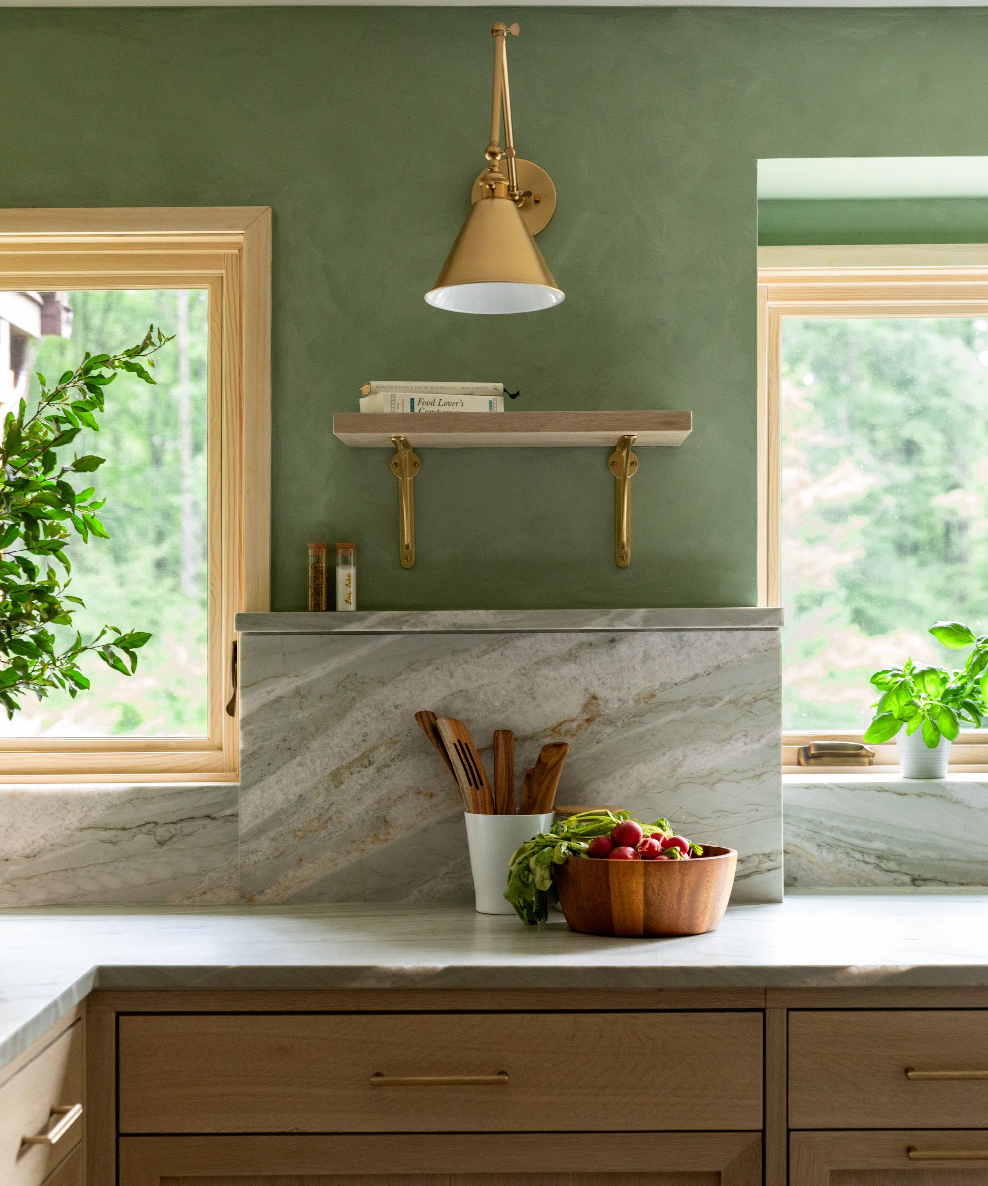
An even more soothing version of the once-loved sage green, Pinterest's second pick is 'Jade'. A subdued shade that feels like an elevated neutral, it's not hard to imagine this familiar hue in homes everywhere. Katie says, 'Jade is incredibly soothing and works well for a fully saturated palette. From floor to ceiling, you can make this work. The workhorse of the 2026 Pinterest Color selections, if you will.'
Decorating with green might sound bold, but Mary Beth Sullivan of MB Sullivan Design says, 'Pinterest's 2026 color palette feels very of the moment. Cool blue and Jade green are familiar but fresh and act as the base neutrals in this palette.'
Interior designer Darlene Molnar comments, 'While only five colors this Palette is saying a lot and I love it. I like that the Palette has what I would consider to be out-of-the-box neutrals to anchor the collection. The plum and jade are the neutrals, muted and sophisticated. They aren’t a departure from what we’ve see in the home industry the last few years. It’s the pops that are the stars here, energizing the palette and bringing a fresh slant to the more muted tones.'
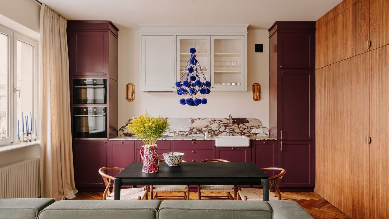
3. Plum Noir

'Plum Noir' is a dark, moody, and deeply sophisticated hue that's refreshingly different to the muted blues and greens we've seen so far.
Mary comments, 'The plum feels historically relevant (speaking from an interior perspective) and at the same time very contemporary.' She adds, 'I would use Cool blue, Jade and Plum Noir as the base neutrals in more dominant elements such as large furniture, paint, and rugs.'
Katie suggests, 'Plum Noir seems to be making its way into all the florals right now, and I am excited to see it get the recognition it deserves as a color of the year.'
Best in a dining room or study, Jennifer Baxter of Baxter Hill Interiors, suggests to 'Elevate it with a bit of black lacquer and glass details or soften it with lighter hues like lilac or dusty pink textures. You could even 'Deco it' with some peacock accents.'
4. Wasabi
Similar to the familiar (yet controversial) chartreuse color trend, Pinterest's fourth color, 'Wasabi', is unexpected and striking. It might not be the easiest shade to decorate with, but that doesn't mean it's not worth trying.
Katie says, 'Wasabi (a synonym for chartreuse?) is an incredible accent color. I absolutely love an alpaca throw in this shade, a gathered silk lamp shade, or even a playful lacquered piece of furniture.'
Darlene says, 'For the bold, these colors work best together. There is so much mix-and-match-ability in the collection. The tamer will find they work best in limited amounts in more neutral or patinaed spaces. Take the Wasabi, for example – it’s the most vibrant of the batch and perhaps the most intimidating. Imagine a wasabi chair paired with a vintage wooden desk though, that combo would be so striking!'
5. Persimmon
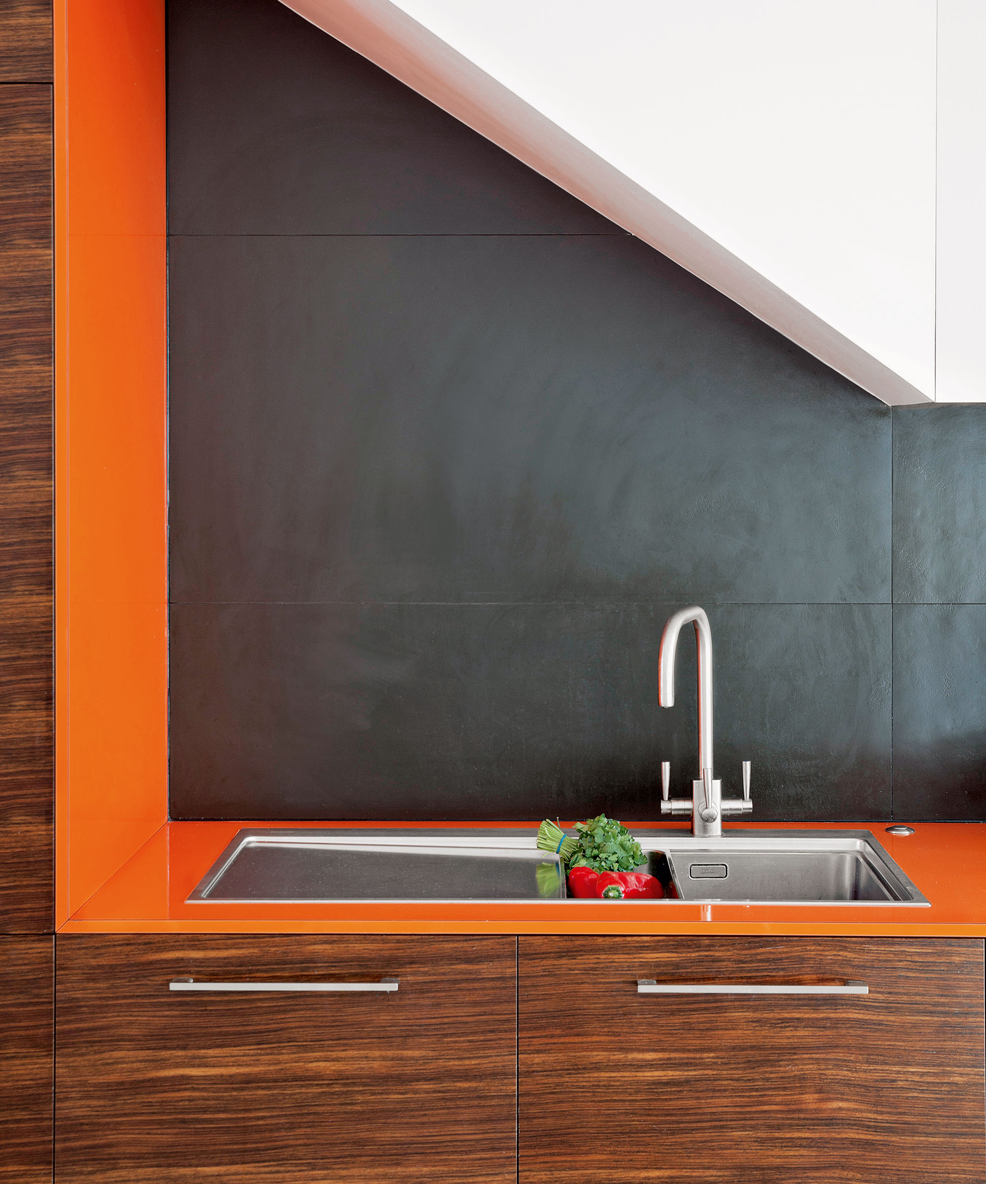
Decorating with orange is often approached with caution, but Pinterest's 'Persimmon' might make you consider embracing more fierce shades. A vibrant red-toned orange, it couldn't be more perfect for homeowners looking to introduce some saturation into their spaces.
Katie says, 'Persimmon is slap-happy and buzzy. Whatever you are doing with this is going to make your clients smile. I would love to see this paired with something ultra traditional, such as a crystal sconce, for the ultimate conversation piece.'
Jennifer suggests, 'This vibrant-but-so-classy hue can work well in an entryway, stairway or hall. Keep it in the family with an analogous palette pairing with a rich, luscious red and a deep, citrusy orange. Or, give it a classic feel with saturated yellows and oranges paired with walnut wood tones.'
Shopping Picks Inspired By Pinterest's Palette
From Wasabi green to the more subdued icy blue, these six picks are perfect for embracing this year's color trends, no matter your scheme.
Delicately fluted, this charming vase is finished in a cool blue glaze, perfect for jumping on this year's color trends.
Finished in a jade green glaze, the Hera dinner plates are a lasting choice for any dining table, guaranteed to uplift your evening meal.
Introduce a dose of richness with the Kathleeen Throw pillow, designed by Chris Loves Julia. Featuring a plum trim, it's whimsical yet enduringly sophisticated.
Perfect for more neutral schemes, the Simryn rug features a chartreuse zebra print, striking yet sophisticated for those looking to create a statement.
Perfect for elevating your bookshelves or coffee table, this orange bobbin frame is cheerful and fun. Finished in a persimmon-like lacquer, it'll catch your attention from afar.
Featuring a pleated surface, the Tory lamp is charmingly elegant. Subdued in tone yet still vibrant, it'll bring lasting impact in a book nook or even a kitchen countertop.
Pinterest's color palette might be on the bolder side, but it's reflective of the continued shift away from the once-loved neutrals and very 'safe' color schemes, to bolder, more personality-filled interiors. Use these playful hues as inspiration for a more color-forward 2026.