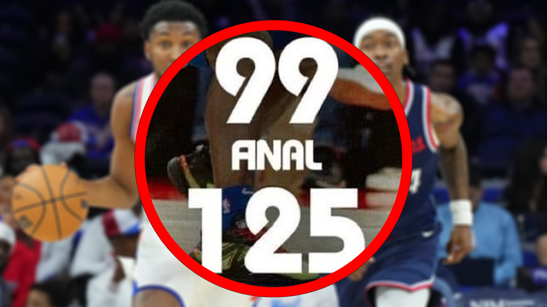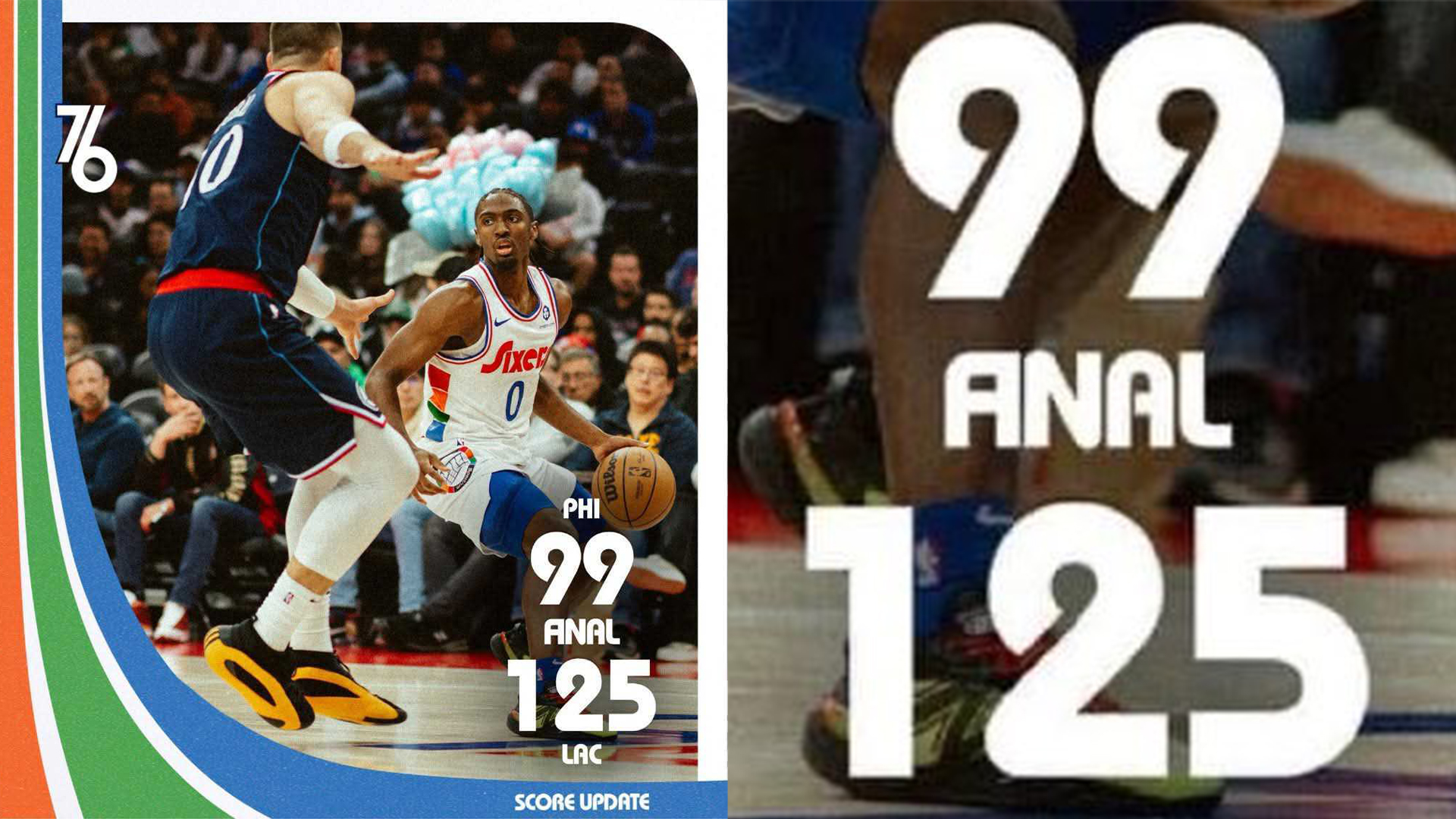
NBA team the Philadelphia 76ers found themselves in a spot of bother during last Sunday's game when fans noticed an unfortunate graphic design error in one of their tweets. A bold typographical choice and some misjudged kerning led to a serious typo, turning the word 'final' into something far more cheeky.
As our ultimate guide to kerning suggests, it's best to watch out for problematic letter pairings and always take a step back from your work to get the bigger picture. Whoever's in charge of the 76ers social media certainly got a cold hard lesson in why graphic design is so important, but that hasn't stopped fans from seeing the funny side.
A tough lesson in typography and kerning was learned tonight by the 76ers 💀 pic.twitter.com/J3so53ZLRyNovember 25, 2024
The design fail in question appeared in a social post displaying the team's 'final' score. Due to the retro style of the font, unfortunately, the 'f' and 'i' appeared to merge into an 'a', resulting in a much ruder-looking word (I'll let you work that one out for yourself).
"Shoulda went with Times New Roman" one fan tweeted in response. "They knew exactly what they were doing and it's shameless," another claimed. While I hold my reservations as to whether it was purposeful (the swift deletion of the post suggests otherwise) it's a harrowing and hilarious reminder that correct kerning is key.

For more typographical news, check out the Typography design concepts every designer needs to know. If you're after more design fails, take a look at Jaguar's new logo, which has been causing a recent uproar online.


