Thinking about what colour to paint your kitchen starts as a fun and exciting prospect, but soon takes an overwhelming turn – like choosing an outfit for an important event. Do you go back to the first colour you tried on or choose something more out of your comfort zone?
It's your kitchen, your rules, and we're here to tell you not to worry about getting it 'wrong'. But if you want something that will stand the test of time and work with other colours, a warm neutral is the best choice. One of the best white paint colours, with a warm undertone, is the foolproof, regret-proof colour we recommend.
Having the 'envelope' of your room painted warm white will leave room for you to refresh it with some other colours in your accessories from time to time. So you can still try out kitchen trends while having a base that's timeless, but also warm and welcoming.
One colour you’ll never regret painting your kitchen
Designers like Jonathan Adler and Kate Watson-Smyth are advocates of the warm white base with more colourful splashes layered on top, so you'll be in good company when choosing it as a kitchen colour idea.
Below, kitchen and interior design professionals have recommended some warm neutral shades for you to browse, with some product suggestions from our favourite paint brands.
1. Joa's White by Farrow & Ball

For a feeling of natural warmth and luxury, wrap your kitchen in soft, creamy cashmere tones. Joa's White by Farrow & Ball, at B&Q, is a great option.
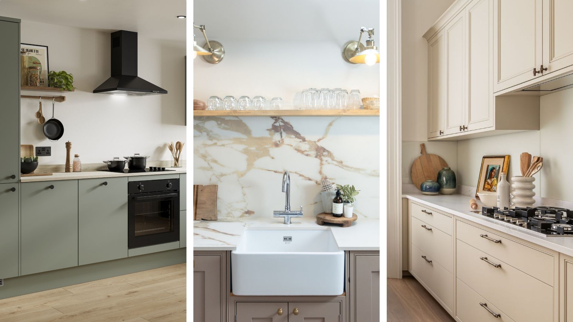
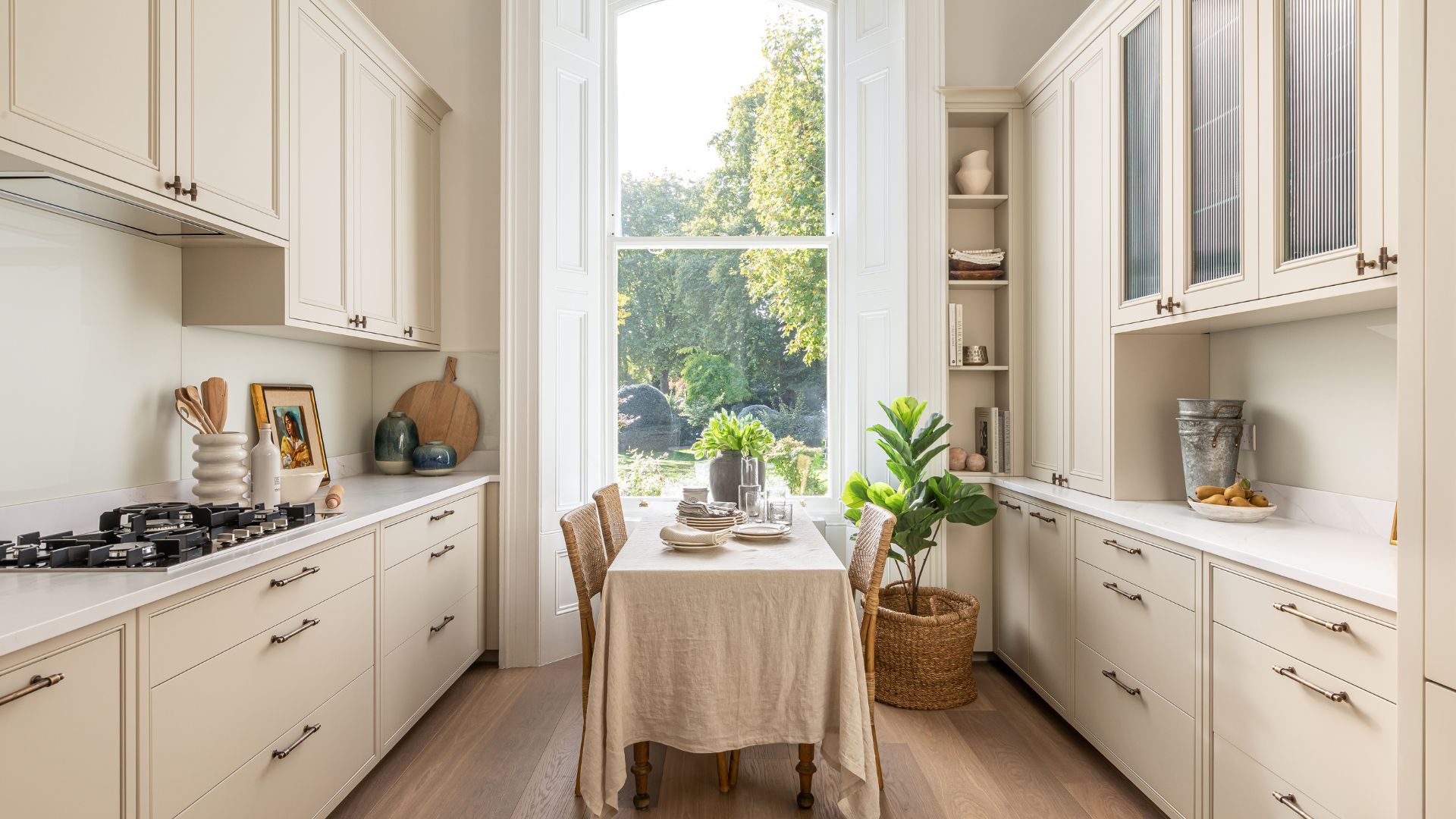
Richard Davonport, managing director and founder of bespoke kitchen company Davonport is a big fan of cashmere paint in the kitchen, as seen in the picture above. "It's not overpowering or too striking, plus it offers a sense of comfort and familiarity that will make a room feel like home," he shares.
It's versatile, too, lending itself to a variety of styles and designs – Richard says a cashmere paint will work regardless of whether you're more modern or traditional, or prefer gloss or shaker cabinets.
Cashmere is a good alternative if you don't want harsh white or dull brown to dominate your kitchen, as these tones are at either end of the colour scale in which cashmere sits.

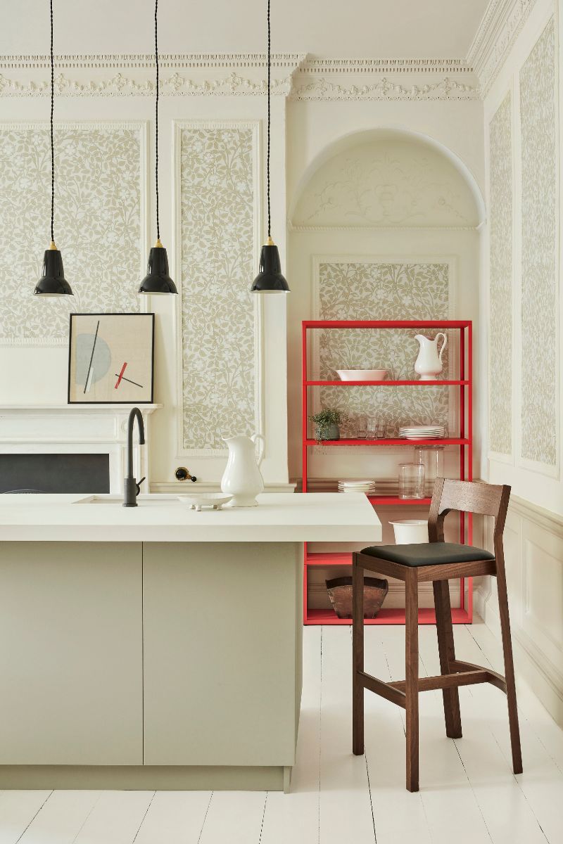
RRP: £5.50 for a tester pot | Joa's White is a warm neutral named after Farrow & Ball's original colour consultant. It has a red undertone so will pair well with some unexpected red decor. It also goes well with Dimity, another white by Farrow & Ball.

RRP: £5.50 for a tester pot | We also love Clay by Little Greene, which is warm and inviting, contrasting beautifully with coral, rust or dark green accents.
2. Slaked Lime Mid by Little Greene

Slaked Lime Mid by Little Greene, at Designer Paint, is a little deeper than the original Slaked Lime shade and is one of the paint company's most popular neutral white paints. It works well on woodwork, too, so you could paint it on kitchen walls and then continue it on skirting boards and door frames in adjoining rooms, creating a subtle sense of cohesion between the kitchen and living areas.
Slaked Lime Mid also complements green and blue if you want to introduce these natural tones in your blinds, dining chair seat cushions and tablecloths, for example. Plus, this paint shade happens to be one of The Living House interior designer Sophie Clemson's absolute favourites. "It's a beautiful neutral white paint colour that has a warmth to it," she says.
"This colour works great for a kitchen if you want to go down the neutral route. To add interest, pair it with brass handles, as this will create a timeless feel. Pair with earthy colours, such as greens and terracotta shades, which contrast well with neutral tones. You could introduce these colours with artwork and soft furnishings."
RRP: £10.99 for two | Follow Sophie's advice and give your kitchen cabinets a classic look with antique brass handles, such as these elegant options from B&Q. These are suitable for cabinets and drawers, and come with screws for easy installation.
£5.50 for a tester pot | Try Sophie Clemson's recommendation on your walls at home with a tester pot from Designer Paint. You can also order free colour cards on the Designer Paint website to compare their different warm neutrals.
RRP: £20 - £30 | Add some earthy green to your kitchen with this tablecloth from Dunelm. As a blend of cotton and linen, it's machine washable, and also comes in blue and neutral colourways.
3. Soft linen

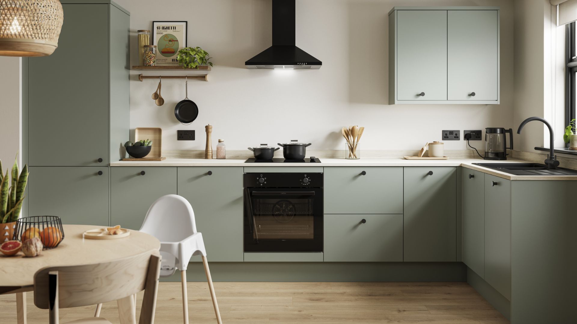
Amanda Lucas, designer at Howdens says warm neutrals are a standout choice when looking at kitchen colours because they are timeless and allow you to change the look and feel of the space, without having to change the kitchen. "I would suggest Howden's Porcelain or Linen kitchen colours as they will never date, and you could add another colour to these if you wanted to be a bit braver.
"The beauty of a warmer neutral allows a variety of other colours that pair so well with it. You can go for a darker palette or a lighter palette, but colours like our Navy, Olive, or Marine Blue look great with the neutrals," Amanda shares.
"Another firm favourite for me is Farrow & Ball Strong White. It’s not a clinical white but still white! It just softens a room and lets the furniture stand out." A fresh lick of warm white will enhance the sense of space, as will a good decluttering session. For inspiration, you can head to our feature on things to remove from your kitchen to double its size.
RRP: £5.50 | Strong White is in fact cool-toned, with a subtle urban feel thanks to its light grey undertones. However, it combines beautifully with these warm whites: Skimming Stone, Elephant’s Breath and All White.
FAQs
How do I prevent my neutral kitchen from feeling too one-note?
You can enliven your neutral kitchen with plants, art, and decor, which will prevent things from feeling too neutral. "Beige cashmere paint works with muted yellow and brown tones, though you can also use shades of pink with it," kitchen expert Richard Davenport says. "Darker cashmere sits alongside olive and deep purples or can be contrasted with off-white shades."
Display cookbooks on cookbook stands to make your kitchen look more expensive on a budget and decorate with some candles and flowers to add colour and make your kitchen smell great.
How do I choose the right paint for my kitchen?
"When choosing a kitchen colour, start with colours you are naturally drawn to, and other colours you have in your house, and then get samples of your wall colour and flooring," says Amanda Lucas, interior and display designer at Howdens. "Take the samples to the room so you can see how they work against the lighting in that space and how they look visually all together."
You can also take inspiration from Mad About The House founder Kate Watson-Smyth's kitchen, recently painted a warm neutral with a hint of pink, which turns into a richer shade at golden hour. This is a beautiful way to create a romantic and characterful kitchen with heart.
In terms of finish, opt for semi-gloss and satin so that it's hardwearing. "The last thing you want is to have chipped cupboards that look tired," says interior designer Sophie Clemson. "You want the paint finish to be wipeable and scuff-resistant to stand the test of time in a busy kitchen."


