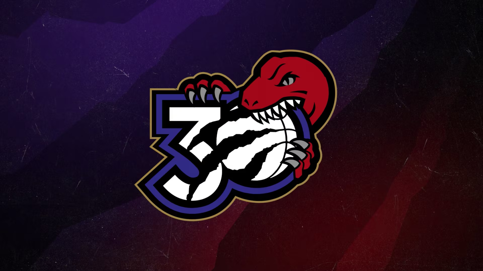
NBA team Toronto Raptors is celebrating its 30th anniversary, and to mark the occasion it has unveiled a delightful new logo design. Like all the best logos, this one has bite – although in this case we mean it quite literally. Featuring a cartoon dinosaur taking a bite out of the number '30', the new design is a lot of fun.
The Raptors’ 30th anniversary logo includes a basketball (of course), with the raptor claw mark that first appeared when the team rebranded in 2015. But while that design did away with the dino entirely, the raptor is very much back in action here – much to the delight of fans. It's definitely one of the best NBA logos we've seen.
Northside Since '95Celebrating 30 years of Raptors Basketball 💜❤️https://t.co/NPGJhnI2sa pic.twitter.com/t7rZ6QiQkJJuly 30, 2024
“We’re always looking forward, working for our next championship, but years like this are a good time to reflect on our team’s history and the amazing things we’ve achieved together, with the support of our fans, our organisation, and our ownership,” Raptors President and Vice Chairman Masai Ujiri announced on a blog post via the NBA website. “Rookies of the Year. Our many All-Stars - and an incredible All-Star weekend here in 2016. And of course, our Championship, which brought fans all across the country and the world together. Let’s celebrate these moments, as we look to add new ones to the list in the decades to come.”

This makes my heart so happy. https://t.co/qNHv4LGbNpJuly 30, 2024
The design has proved a hit online. "This may be one of the best anniversary logos ever," one X user comments, while another adds, "This is lowkey a banger." But the dino design has close competition when it comes to the best 30th anniversary logo we've ever seen. Mickey Mouse ears, anyone?


