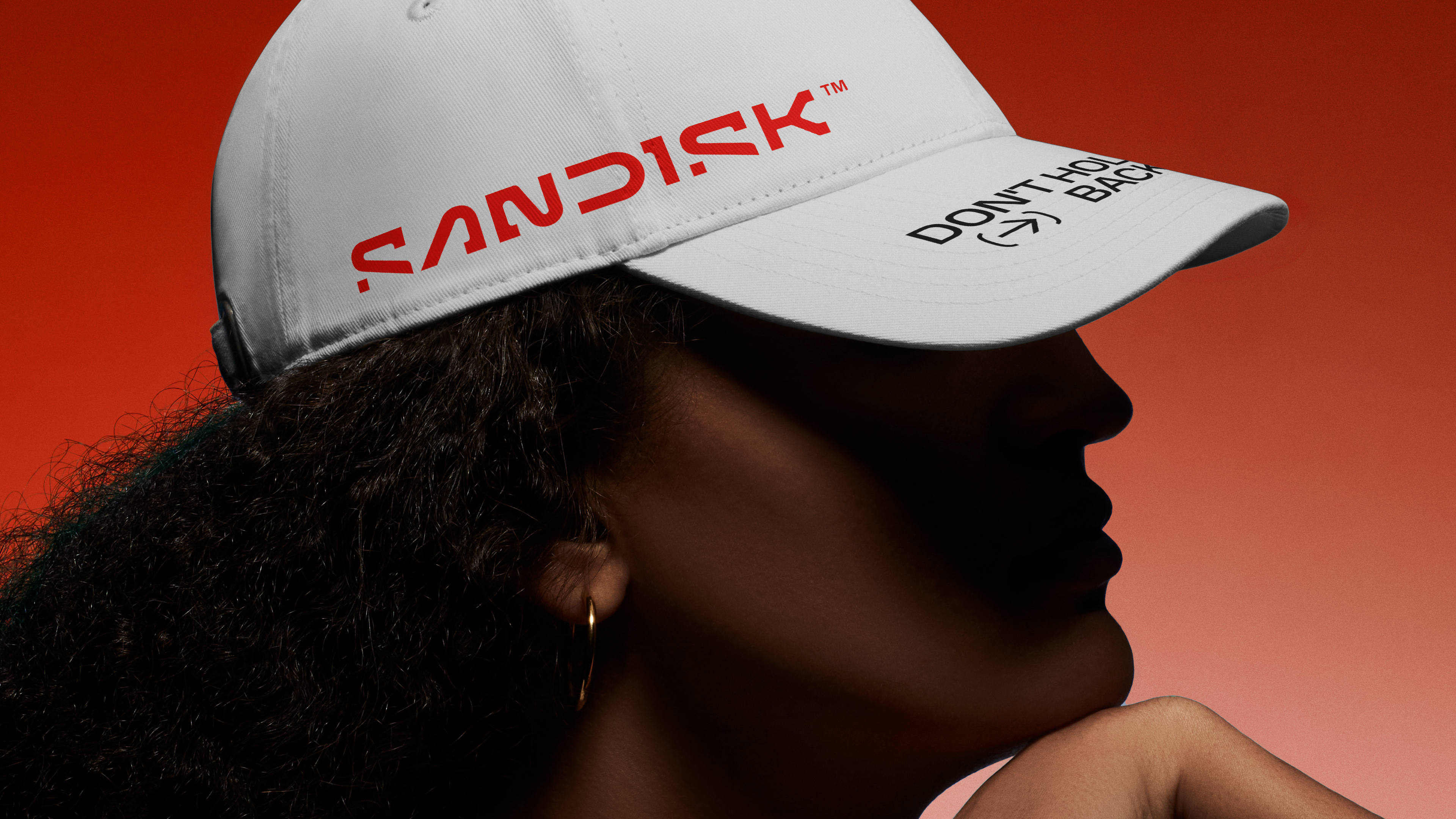
One logo design trend that's caused a bit of controversy in recent years has been taking minimalism to extremes with the omission of parts of letter forms. We wrote (a lot) about how the KIA logo, which continued to be pilloried, and then the Nokia logo after it.
I have a feeling comparisons with these designs will crop up today following the reveal of the new logo for Sandisk, the maker of some of the best external hard drives. But in Sandisk's case, the more minimalist rebranding has a clever inspiration and makes for a dynamic animated logo.