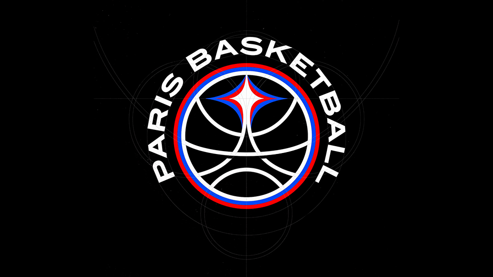
Sports logos tend to be among the most divisive, and the new Paris Basketball logo is following that trend. Some are dunking on the design, suggesting that using the Eiffel Tower is a little too obvious (the opposite of the controversial Paris 2024 Olympic logo, then).
But the new logo has personality. And it's a lot more obviously connected to the team's city.
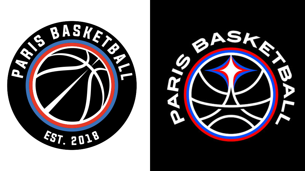
The new Paris Basketball logo is the work of Parisian graphic design studio Tyrsa, and it was coordinated by the YARD agency, which has worked on the club's visual identity since its inception in 2018. It replaces what was a fairly generic roundel with basketball in the centre. Now the lines on the basketball for the shape of one of the French capital's most famous landmarks, the Eiffel Tower.
Some have suggested that resorting to the Eiffel Tower was lazy and obvious, but there's a strong argument for obvious in logo design. Since when has a brand identity been an enigma that has to be cracked? Most of the best logos have a simple and easily recognisable message (there are always exceptions that the new unreadable logo for fashion designer Katarzyna Konieczka).
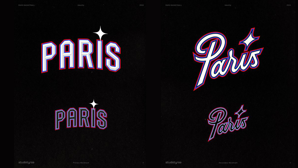
Tyrsa said they didn't want to use the Eiffel Tower at first, but did want to include the concept of light, both as a reference to Paris's moniker the 'City of Light', but also the light of new sporting talent dazzling their opponents. And Tyrsa realised that the "most beautiful source of light in Paris" is at the top of the Tower. The rebrand also includes a bespoke typeface inspired by classic basketball fonts and Parisian Specimen.
The reaction on social media has been mixed. "It's good, the minimalist mindset has been killing a lot of brands , it's cool to see a brand make their logo have an identity instead of being just bland like every other big brand have been doing," one person wrote on Instagram.
Meanwhile, some people seem to think it looks like the LA Clippers logo, which I'm not seeing myself. And some seem to think the designer put the colours of the French flag in the wrong order, making it look like a design for a Serbian or Russian team (they're actually the team's own colours as well as those of the flag of Paris).
For more recent logo design controversies in sports, check out the amusing reaction to the retro Atlanta Falcons logo. And in a very different sector, designers have some scathing opinions on the new Aeroméxico logo.
