OpenAI has been responsible for some of the most impressive (or is that terrifying?) advancements in the world of artificial intelligence over the past few years. From ChatGPT to DALL-E, the company's generative and large language models have spearheaded the rise of AI discourse – but its most controversial offering yet might just be a logo.
OpenAI is reported to have shared a new logo design at a recent company-wide meeting – and apparently it didn't go down well, with employees describing the stark new look as "uninspiring" and "ominous". Not words one would usually associate with any of the best logos of all time.

According to Fortune, the new design is a simple circle, which could represent an 'O' or a zero. Some employees reportedly expressed their displeasure during the meeting itself.
New Open AI logo? pic.twitter.com/6C68vmjlLSSeptember 21, 2024
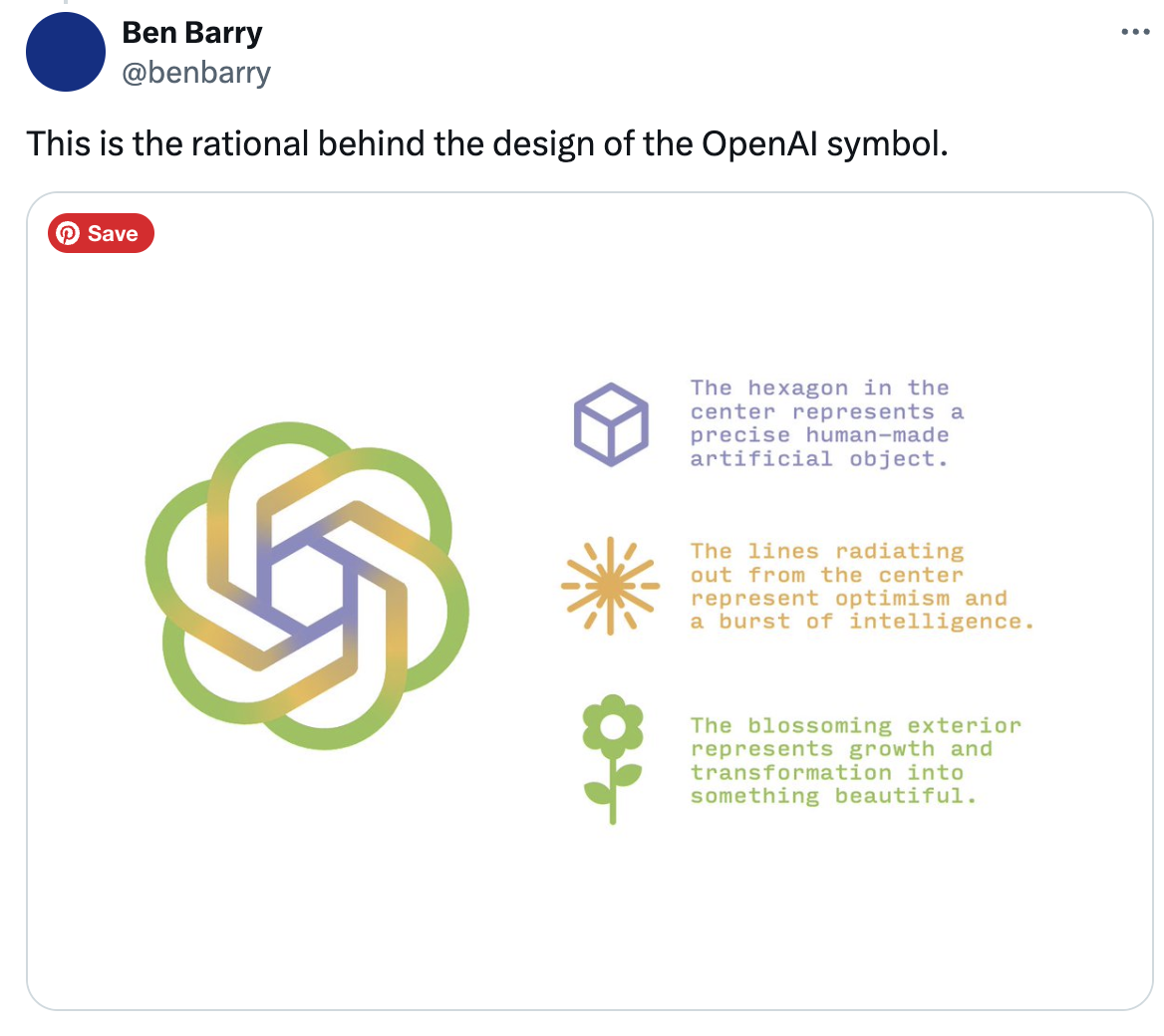
Part of the reason for the backlash could be the affection the AI community holds for the current design. In a tweet last year, designer Ben Barry explained how the blossoming design represents "precision, potential and optimism." This logo is currently emblazoned across the OpenAI website and company swag, and has come to represent AI itself for many.

Time will tell whether OpenAI will take stock of the internal response before debuting the new look publicly. Indeed, if the rebrand goes ahead, it could well end up becoming one of the most controversial rebrands in years.


