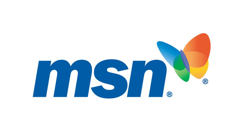
Wait, what year is it in again? All things Y2K have been having a bit of a moment, but the revival seems to have just reached a new peak. Microsoft's web portal MSN is back almost thirty years after its launch, and it has a nostalgic logo to mark the occasion.
First launched with Windows 95, MSN is being revived to provide Microsoft's shopping and gaming services along with the Bing search engine and news and sports aggregation. The last major MSN logo redesign was ten years ago back in 2014, so it makes sense for Microsoft to signal MSN's resurrection with a design refresh, but some are surprised about how familiar it looks (see the history of the MSN logo below, and see our pick of the best logos of the 2000s for more Y2K magic)
MSN never went away completely. The name, which stands for Microsoft Network if you're wondering, was gradually dropped from services like MSN Messenger, Hotmail, and Search (now Skype, Outlook and Bing, respectively). However, the news portal remained online, although most content redirected to Microsoft's Start.
But now the Start webpage is showing MSN branding, while opening a new tab in Edge, Microsoft's browser, now brings up MSN. We're not sure if the Microsoft Start mobile apps will also transition to MSN, but it seems it would make most sense to transition all news and content aggregation back to the MSN brand.
The last MSN logo redesign in 2014 ditched the colourful gradient wings on the iconic butterfly motif and went all minimal on us with an entirely black design. Ten years later, the new logo reflects Microsoft's contemporary design language, but it's hard not to also connect Microsoft's revival of the brand with the general Y2K fever that we're seeing.
It's an interesting decision from Microsoft since MSN is more connected with the past than the present. But, like AOL, it's a brand that still holds a lot of recognition among users, which isn't something that can be said of Start. And people love nostalgia – just check out the new Mountain Dew logo and The Wombles rebrand (and the fierce backlash against Coca-Cola's AI Christmas Ad).
