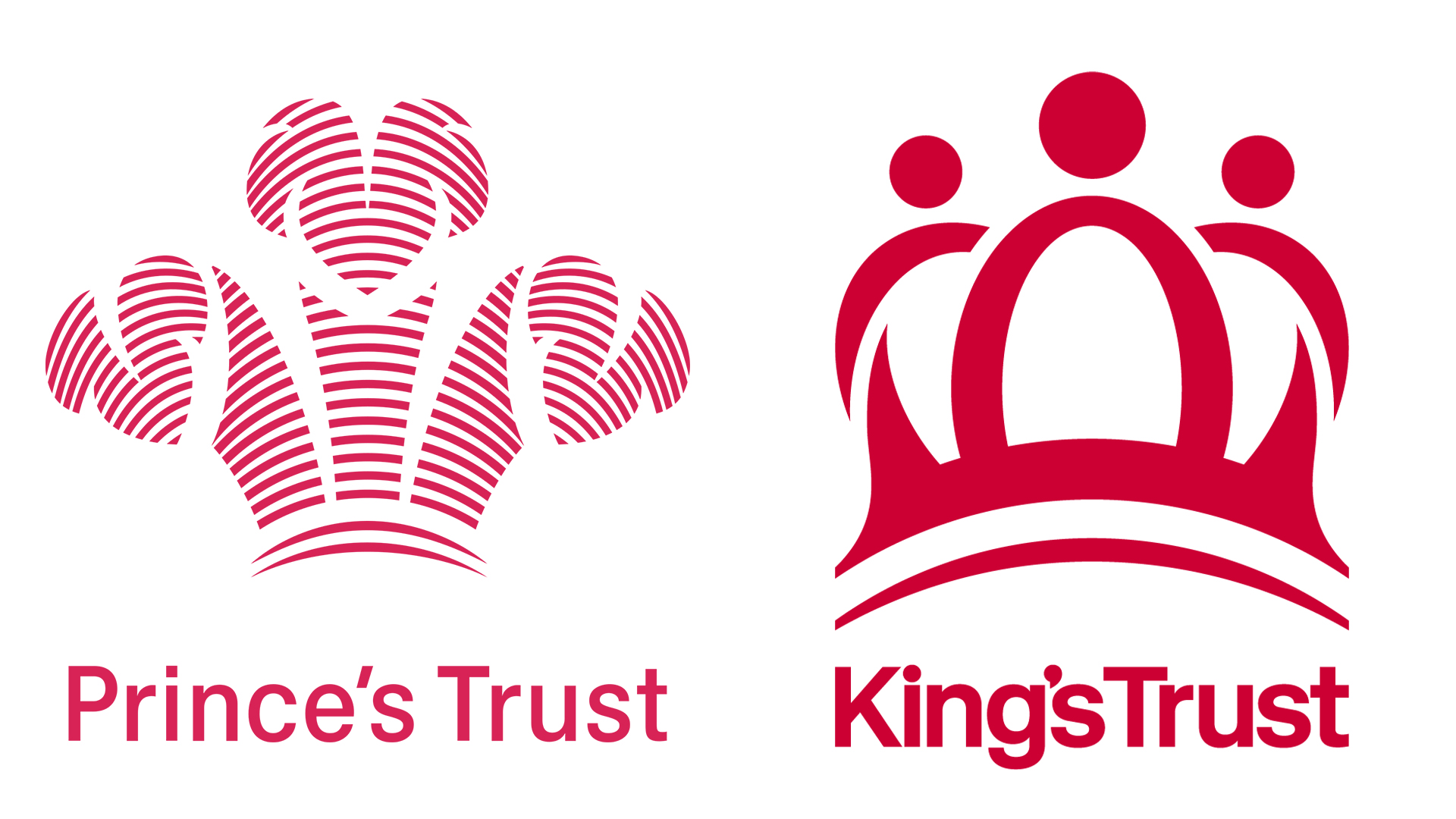
The King's Trust has received a fresh rebrand to appeal to the TikTok generation. Formerly known as the Prince's Trust, the charity offers support to young people facing adversity, equipping them with the tools to build a brighter future.
With a new name and a revitalised logo, the King's Trust has a refreshed appeal, but whether it will resonate with its target audience remains to be seen. The best logos of all time communicate their brand with simple and refined design, and with young people at the centre of its new look, the King's Trust logo is a powerful representation of its ethos – but to the new generation, actions speak louder than aesthetics.
The new logo was created by designer James Sommerville OBE – one of many alumni whose career was supported by the Trust's charitable work. The iconic three-feather logo originally concepted by the King himself has been replaced by a more fitting crown symbol, but there's more than meets the eye to this regal redesign.
The central piece of the crown represents the young people at the core of the Trust's work, while two smaller pieces on either side represent the mentoring support provided by the charity. Subtle details like the arched line at the bottom of the logo represent the young person's progression arc with the Trust's support – a powerful symbol of personal growth.
The bolder, more graphic design is no coincidence, as James Sommerville claims "It needs to show up not just on a business card as in the old days, but also on TikTok." According to The Telegraph, chief executive of the King’s Trust Johnathan Townsend adds "Our work and our purpose doesn’t change at all. But hopefully this moment helps us to remain very present and very much there for the young people we hope to support."
It's clear that the new King's Trust logo has been thoughtfully redesigned, and its refined focus on the young people central to the charity is a refreshing reimagining, reinforcing its new tagline "working for young people." While I hold my reservations as to whether the new logo will enamour TikTok, its symbolic nature gives the Trust a more accessible and accommodating appeal compared to the intricate and stately past design. Capturing young audiences (especially in the chaotic sphere of TikTok) requires more than a name change and a new logo, but the new identity is a noble start that feels far more in tune with the Trust's interpersonal mission.

There are a surprising number of logos with crowns that you may not have even noticed – from Corona to Alfa Romeo – although not many can boast the royal seal of approval like the King's Trust. For more regal design inspiration, check out Meghan Markle’s stunning handwritten logo that shows off the duchess' intricate calligraphy skills.


