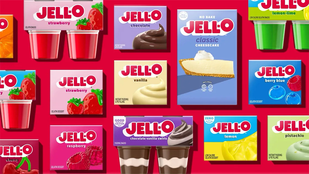
Jelly-O is a brand that feels like it's been around forever but that desperately needed CPR if it were to continue much longer. It's been with us pretty much since the dawn of the modern age (well, at least since 1897 in name, and its product dates back even to 1845), but it's fast been losing its place as the USA's most famous dessert.
Its first rebrand in a decade could be its one chance to recapture some of that shine. The new Jell-O logo is clean and chunky, and the 'O' is enormous. It feels like it's taken lessons from all those soft drink rebrands we've been seeing.