As someone with a limited sense of direction, Google Maps is my best friend, so you can imagine my shock when I opened my phone to find the day of reckoning was upon us. Google Maps had finally changed its icon.
While I'm partial to a tasteful redesign, I was appalled to gaze upon Google Maps new icon, with its crass, gaping design. I'll admit the Google Maps logo has never been one of the best logos of all time, but this salacious new design has caused quite the stir in my soul.
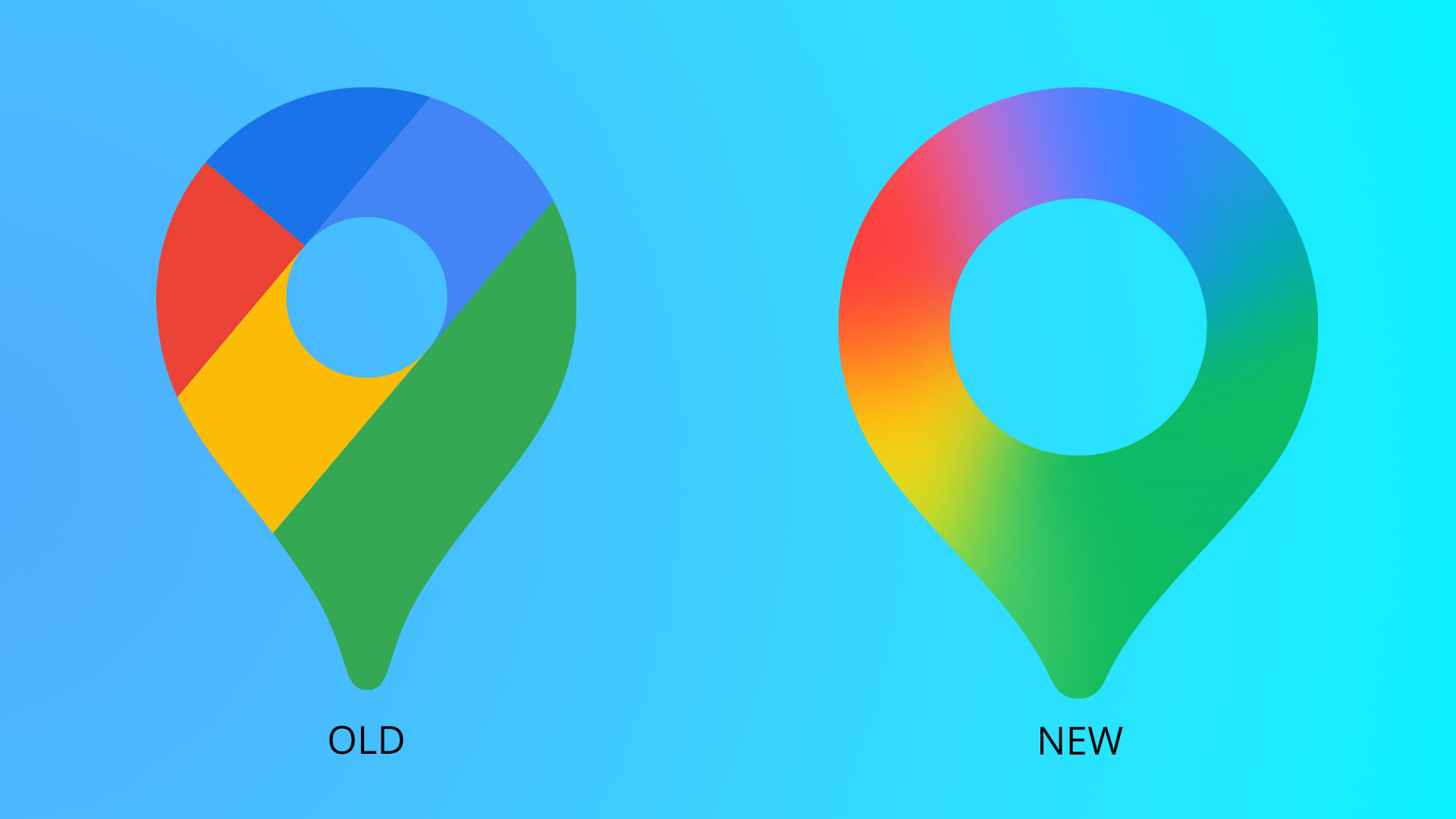
The redesign in question features the same circular pinpoint motif of the old icon, now sporting a watercolour gradient. It all sounds rather dreamy until you take in the cavernous, gaping hole that the designers have carved into my dear friend. What was once warm, affable and trustworthy now feels menacing and vacant, smug in its expansive white space.
I was not alone in my horror – other Google Maps users were suitably shaken by the ordeal. One horrified X user wrote, "New Google Maps logo looks so bad oh no," while another added, "Do they have to make everything like a doodoo mush gradient?" Indeed, have they no decorum?
For more design news check out why Google Maps is riddled with major flaws or take a look at the best Google Doodles.