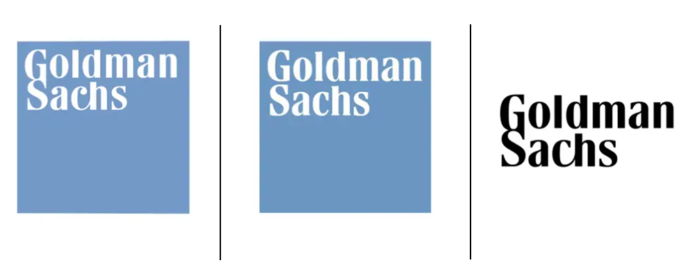
There seems to be a trend in logo design at the moment to want to turn the clock back. From the New York Jets logo to the new DC Comics logo, brands are realising that they had it right before. And Goldman Sachs has joined the club.
Four years ago, the investment bank quietly ditched the most distinct feature of its logotype: the ligatures connecting some of the letters. Now, just as quietly, it's brought them back with a new logo and overall brand refresh.

We would surely all like to be able to wipe some events of the last four years from history. It seems that for Goldman Sachs that extends to its 2020 rebrand. The exercise saw the investment bank split the ligatures that connected the 'G' and 'S' and the 'c' and 'h' in its logo and replace the soft, round typeface with a straighter choice. The purpose, we were told at the time, was because the previous Boldini-based logo was "insufficiently legible at small sizes".
But things have advanced so much in four years that today it turns out that those ligatures can work at small sizes after all. The new logo is a hybrid, bringing them back but also retaining the sharper serifs on the 'A' and the 'C' in place of the ball terminals of the previous design.
But it's not a complete return to the past. For decades, the Goldman Sachs logo has usually appeared in a blue box, designed by in 1970 by Lippincott. The new design escapes that constraint and is being used on a plain white or blue background for a more premium look. It comes with a new classier shade of blue, and it's accompanied by a new monogram variation on the GS ligature for social media avatars.

Business Insider reports that it's seen a "180-page document explaining the changes". This tome reportedly notes that the new logo represents the bank's "heritage" and "culture of partnership" and takes inspiration from various past designs, including black-and-white crest from the 1970s. Personally, I think it's a good move, bringing back the flair that made the old old design distinctive at a time when the bank wants to put the focus back on the traditional corporate side of its business. But it does make the last rebranding look like a bit of a waste of time and money.
For more logo design news, see the new Mazda logo and the controversial new London Museum logo. We also have a round up of the best new logos of 2024 so far.


