Color inspiration is everywhere, so why do we keep coming back to the same old paint colors for walls, hues for couches and curtains and everything in between?
There are many color trends that are the peak of their popularity — but that often also means that they're used extensively in interior design. What happens if you want something a little more unusual and less played out?
We put this challenge to a number of interior designers who are experts at using colors that feel different and unexpected for homes that stand apart from the crowd. These are the colors they suggested capture the mood of 2024, and they're shades that will put you ahead of the curve when it comes to your home's style.
1. Muted Yellow

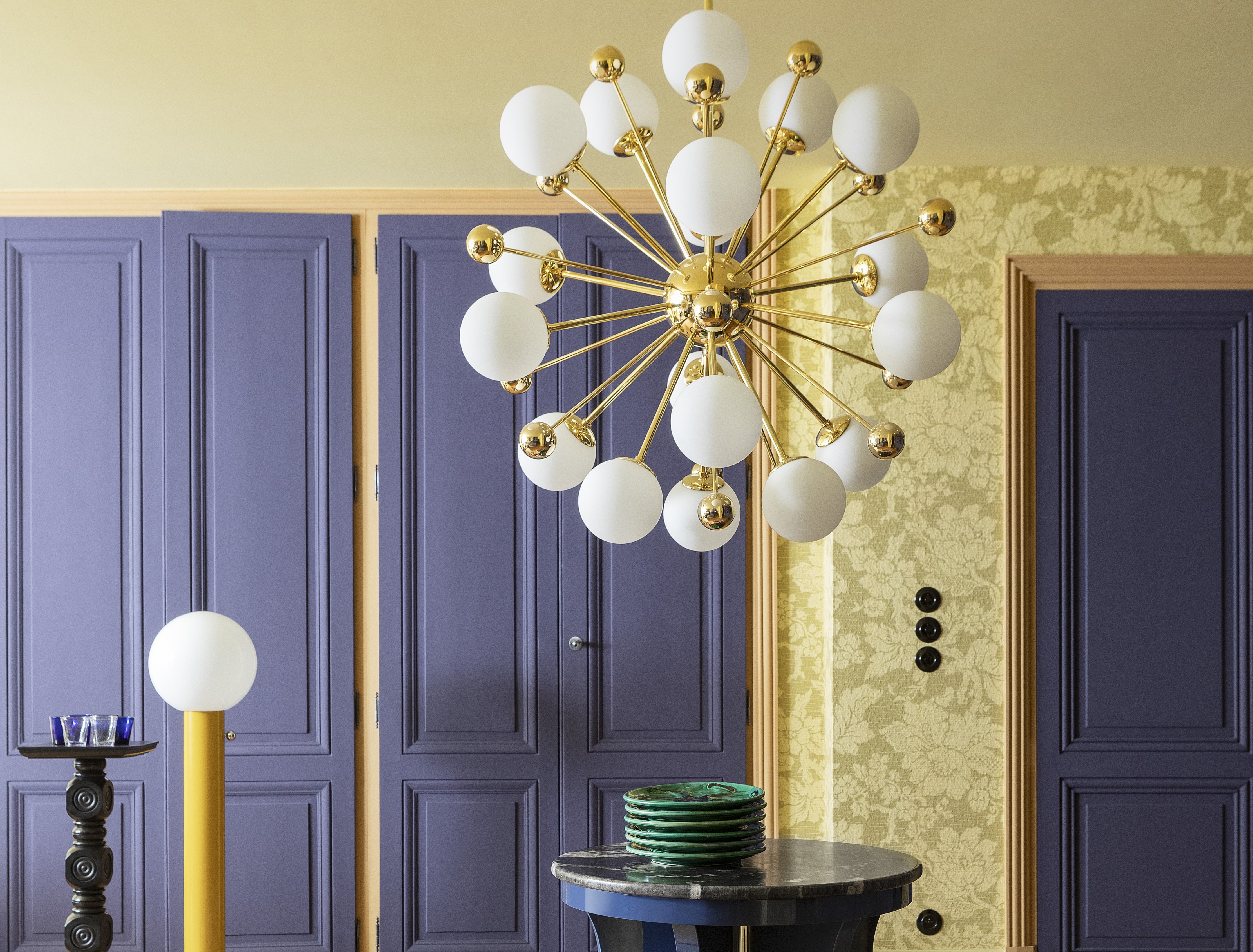
There's something about a muted, mid-tone yellow. It's not too jarring, yet has a lively, fun quality to it. The tone can instantly uplift the mood and also give a space — big or small — a personality. We're seeing beige-y yellow as an interior trend to look out for this year. Plus, many colors go with yellow, making it a versatile hue to play with.
'In this space, we drew inspiration from the colors of the stained glass,' says Elina Mussakulova, founder of sdelaemremont design. 'While the shades were quite limited, I like how we combined the chosen ones into one complete picture. The color Sorbet F306 from Tikkurila, stands out yet has a calming feel to it, perfect for an entrance.'
2. Blue-black
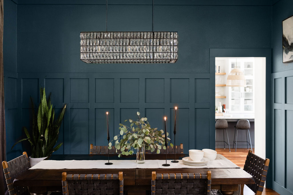
Another trend identified by Livingetc's trend experts for the coming year is a deep, midnight blue — that in some lights almost reads as black. It's a super saturated shade with undertones of warm gray to evoke calmness in a space. The mood at the moment is awakening the senses, and elevating the feel of a space—and a room with a dark blue tone checks the box on all of those things. Plus, when paired with other colors that go with blue, the combination can add depth and moodiness.
'Sherwin Williams Waterloo is an extremely transformative color,' says Laura Williams of ATX Interior Design. 'Some moments it feels very muted and subtle, other times it feels on the dramatic side. Then there are days when it feels like a neutral. It is also perfect for all seasons. I can’t imagine a better paint color for this dining space.'
3. Silvery blue
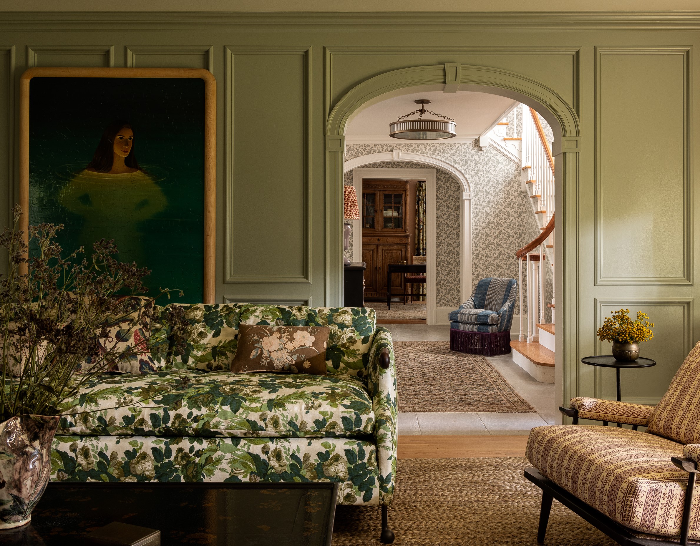
These chameleon tones, which change color throughout the day, are a common thread in the colors designers are being inspired by right now, and silver-toned blue, reading somewhere between light blue, gray and even green, is one of them.
This is a transitioning color, as is evident in the image. The tone seems to change with light, and at times looks like a subtle green but in its essence is a true blue.
To copy the look, we know the paint color. 'For this living room, we chose Farrow & Ball's Light Blue, which is a light silvery blue tone,' says Heidi Caillier, founder of Heidi Caillier Design.
4. Purple-blue

Blue is probably the color of the year for 2024, but it's not just one tone that's taking the lead. this purple-blue, mid-tone that has all the qualities of purple - richness, elegance - but it isn't so intense as a standard purple. . Pair it with other complementary colors that go with purple for a lively space.
'For the door paint color, we chose Farrow & Ball's Drawing room blue which has a warm yet regal touch to it,' says Marie-Lise Féry, founder of Magic Circus. 'And then we paired it with Farrow & Ball's Dayroom Yellow on the walls. This combination of color creates a universe that is both theatrical and contemporary.'
5. Pink
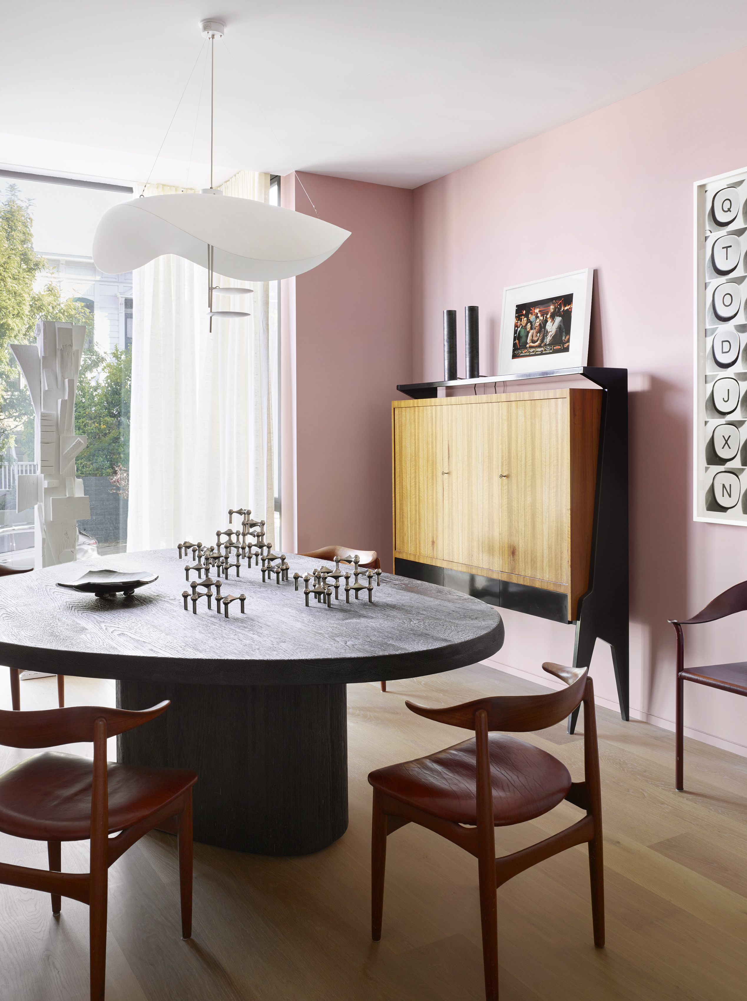
Pink is a timeless hue and several colors go with pink, making it a friendly, easy-to-use tone. In modern interior design, however, it had started to take a backseat after an oversaturation of Millennial Pink made it feel overplayed.
It's returning as a contrast for a modern scheme, as in the dining room above, where it If it's a soft, where it feels almost unexpected against the seriousness of the furniture.
'The home was designed for a bachelor with a balance of rough furnishings and moments of saturated color throughout,' says Jamie Bush, founder of Jamie Bush + Co. 'In the dining room we found these incredible vintage Danish dining chairs with oxblood red leather seats. With that as a starting point, we built a palette of dark red and layered it with pink walls (Cinder Rose by Farrow & Ball) for the perfect contrast. The blond woods add freshness, and the graphic black and white elements imbue depth and drama, creating an overall design balance.'
If a relaxing feel you want to give, choose a delicate pink with cream undertones, as the hue will act as a neutral. Against this, you are free to layer in other colors such as blue, tan, or red.


