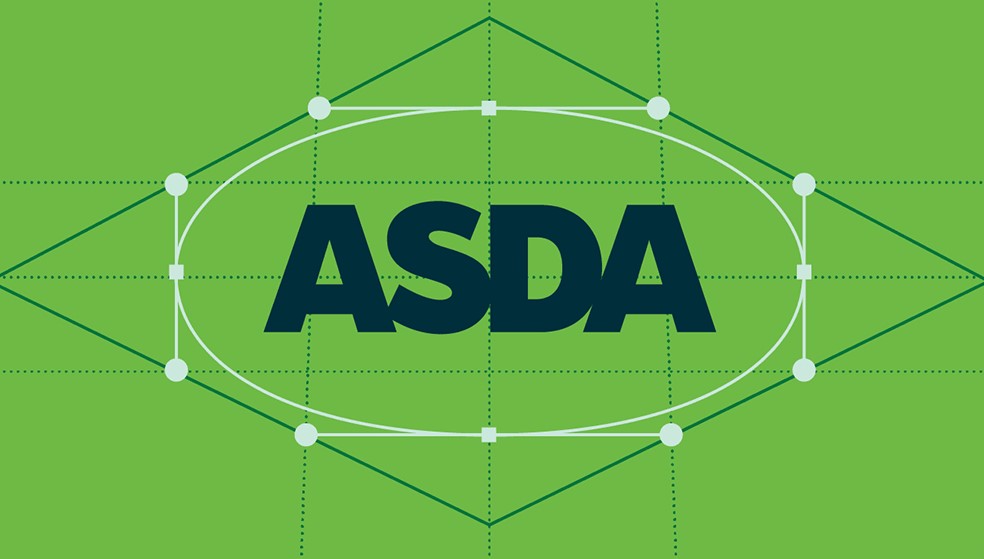
The British supermarket giant Asda has revealed a new logo and overall rebrand. And while it's traditionally positioned itself more at the economical end of the supermarket space, the new identity looks surprisingly sophisticated.
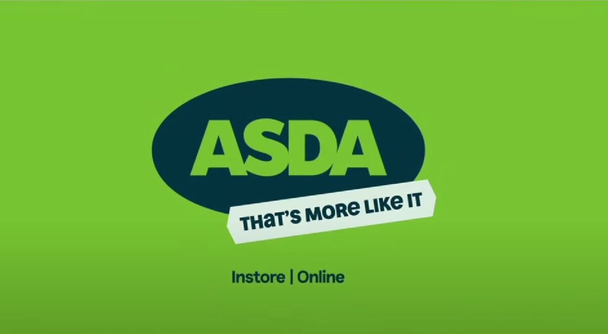
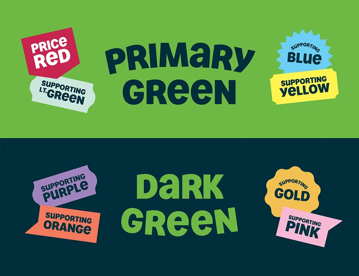
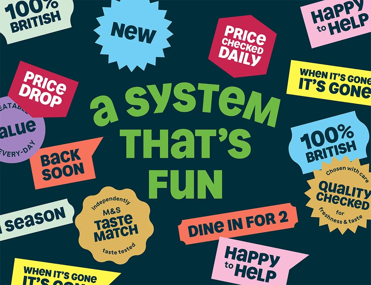
Demonstrating the power of colour, the logo retains the same general design but now appears against a very deep, almost black, shade of green within a sticker-inspired oval surround, which makes it look very different. It's accompanied by a new typeface and colour palette for other pieces and a whole bunch of other stickers. It could even be one of the best rebrands of the 2020s.
Developed by Havas London, the rebranding includes a chunky, rounded all-caps font design created with the type foundry Colophon. This includes unicase glyphs for a friendly, chatty tone, which is reinforced by the stickers and a whole lot of puns and other word play in brand copy. This, says Asda, shows its “light-hearted northern humour and warmth."
It's a look that's very much in vogue for mass consumer branding. It reminds us of the rebrands of Deliveroo and Pets at Home. The sticker motif in Asda's identity clearly links to supermarket stickers in this case, although flagging up the use of plastic stickers does seems to clash a little with the sustainability claims being made in some of the copy.

Lorenzo Fruzza, chief design officer at Havas London, said: “When developing identities for brands like Asda, it’s important to remember that the channels they live in have evolved so much in recent years – they no longer just show up in traditional media channels. We have worked with Asda to create a new brand identity which stands out in the market and can flex across multiple channels – ensuring it’s relevant and meaningful to its customers.”
It's taken 1.5years, but today @havaslondon gets to launch the @ASDA rebrand. New line, logo, colour palette, graphic devices, icons, type face, photography approach, & tone of voice - all laddering up to a more personal brand that puts people, quality & value above all else. pic.twitter.com/1TIEKbHZ0xMay 16, 2024
The new identity is being launched in the brand's 'Serious About Summer’ campaign. This involves ads directed by Freddie Waters of Pulse dealing with summer experiences and featuring the ‘Asda, that’s more like it’ strapline.
Asda chief customer officer David Hills said: “The launch of our new brand identity is a milestone moment in the evolution of our strategy. Our brand has tremendous heritage and is much loved by the great British public.
“We hope this new look and feel will help us stand out in the grocery market – bringing to life our personality and reigniting the strong emotional connection customers have for the Asda brand.”
For more recent rebrands, see the new Puig logo and the controversial Visalia logo.