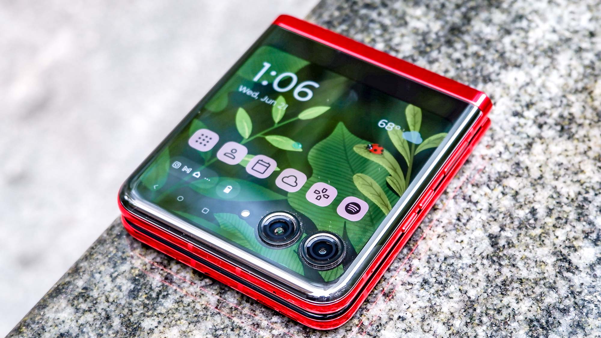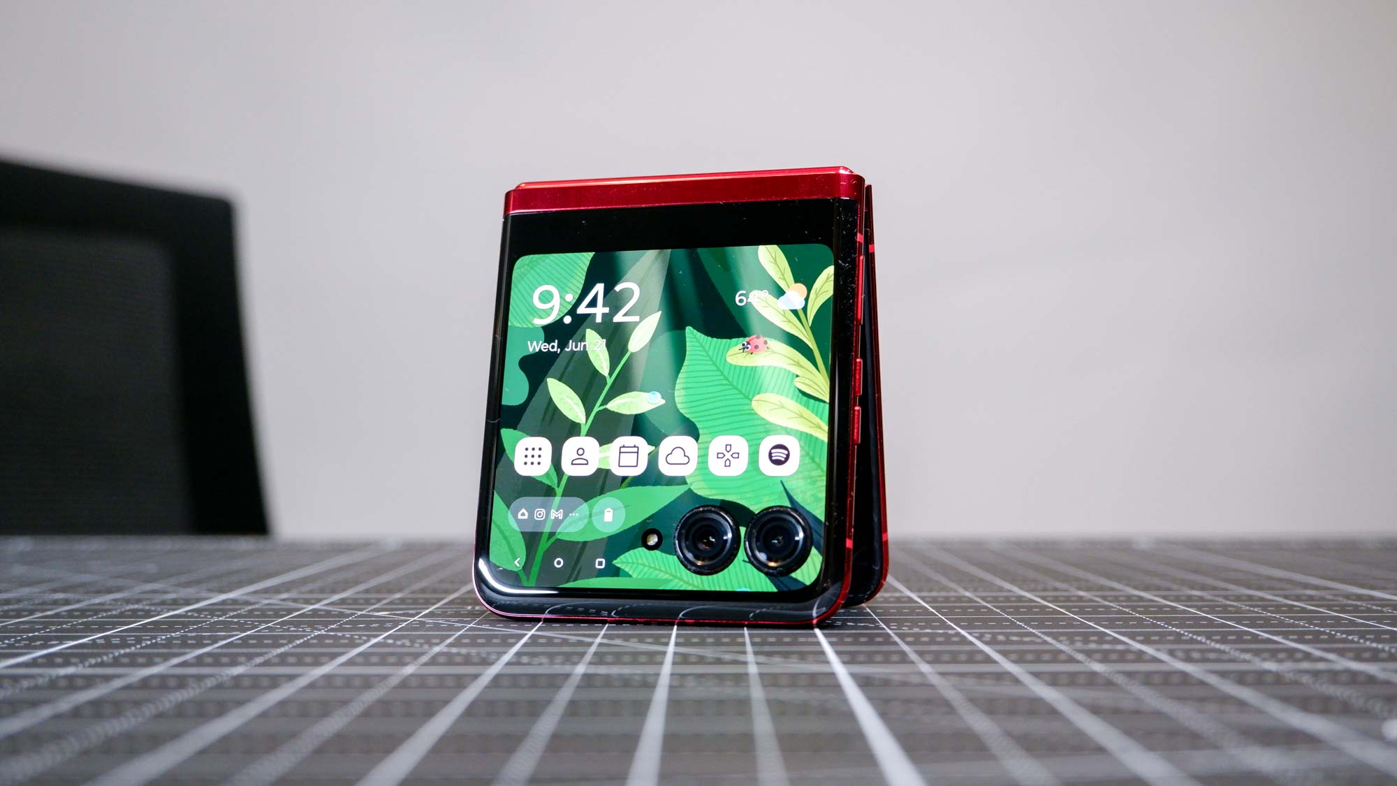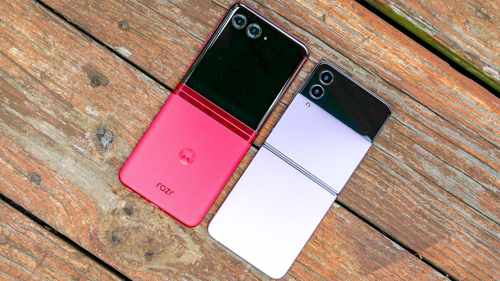
The Motorola Razr+ is a very nice phone, one of the best foldable phones, in fact, all thanks to a slew of impressive and useful upgrades compared to previous Razr models. One of the more impressive (and useful) features is the enlarged 3.6-inch cover display — the largest of any foldable flip phone so far.
But in addition to increasing its size, Motorola clearly put a lot of effort into the cover display. It feels as though the Razr+ design team didn’t want the cover display to feel like an afterthought, or something you’ll only ever use to glance at notifications or the time. And the result is a display that is incredibly nice, and far better than it has any right to be — which might not be a good thing.
Motorola didn’t scrimp on the outer display

The most important thing about the Motorola Razr+’s cover display is that it’s not just about size. That plays a big part in the appeal of the phone, but the display itself has hardware that would put some flagships to shame.
It may not be able to match the specs of the foldable main display, but that’s only because the larger screen takes things to even bigger extremes.
The main draw would be the 144Hz refresh rate, something you’ll typically only find on gaming phones. While I don’t want to use the phrase “silky smooth” which has been overused since the arrival of the first 90Hz phones, The Razr+’s display is a delight to use.
The screen also offers near Full HD resolution (1056 x 1066) with the same 413 ppi pixel; density as the main screen. For that reason, despite its small size, the imagery on the screen is crisp and detailed. Whether you’re browsing Reddit, gaming, or watching videos, you’re not missing out on any on-screen details — even scaled down for the smaller screen. Then, of course, there’s HDR10+ support, for any of the times you watch compatible content on the cover display.
To top it all off, the screen itself is made from Gorilla Glass Victus — some of the toughest display glass on the market. While the main screen has to use a softer flexible glass, Victus means the outer display should be able to withstand plenty of abuse. And being as clumsy as I am, I have partaken in a couple of accidental drop tests. Needless to say there’s no visible damage on the Razor's cover display.
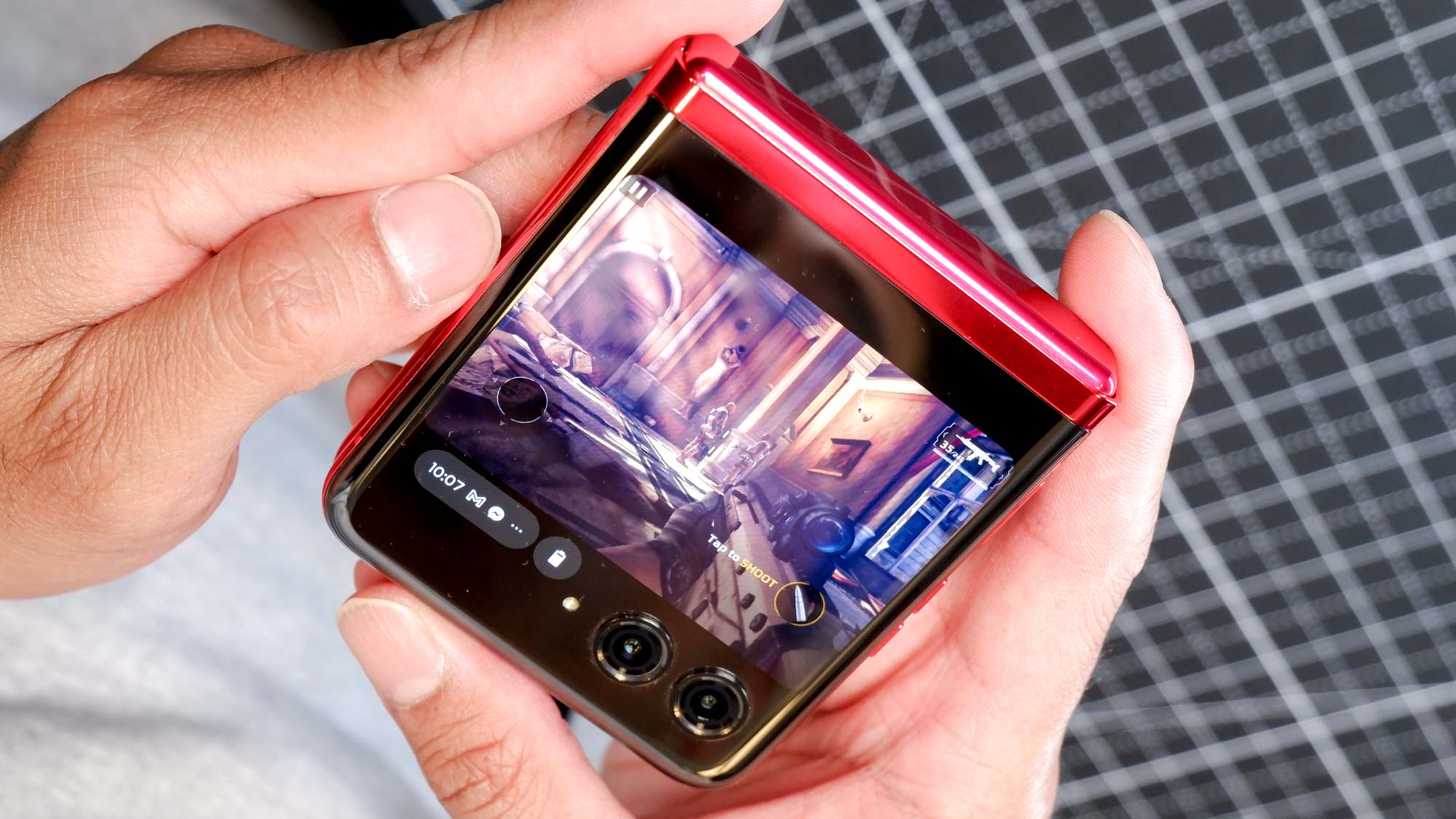
To top it all off, the display isn’t just a simple at-a-glance display that we’ve seen on flip phones of the past — Razrs included. It can’t replace the main display for everything, but the fact you can load and use full-versions of Android apps means it’s a heck of a lot more useful and versatile.
The cover display might be too good for what it is

Granted the Motorola Raz+r’s cover display does come with some limitations, and that means the fancy hardware can feel a little wasteful at times. The fact that it can’t completely replace the main display is one issue, because there are a bunch of things you straight up can not do — like mess with the settings or use a third-party keyboard.
The relatively small size of the display compared to modern Android smartphones also doesn’t help matters. There’s only so much you can do on the cover display as a result. Texting, checking emails or even browsing social media is fine, but those are the kinds of activities that don’t necessarily benefit from using a larger display.
Watching Disney Plus on the cover display is more or less a futile endeavour, since the video window is so much smaller than a full-size screen. Any video service that relies on vertical video, be it TikTok or YouTube, has to contend with the fact most of the content is cropped down to fit the smaller display.
In instances like that, it makes you wonder why Motorola bothered to have features like HDR10+ or the super-high refresh rate. They may sound rather impressive on paper, and you can appreciate having them, but in practice they probably don’t matter quite so much. To be perfectly honest I might have been happy with a 90Hz cover display, and there are points where 144Hz seems like overkill.
To be perfectly honest I might have been happy with a 90Hz cover display, and there are points where 144Hz seems like overkill.
You also need to contend with the fact apps don’t open in full screen mode by default, meaning you lose a chunk of screen space. Plus, while it’s possible to force them to take full advantage of the display, the system doesn’t account for the fact the camera lenses are in the way — meaning some crucial information can get blocked as a result.
So as impressive as the screen is, the various limitations make you wonder why Motorola put so much time and effort into it. Because, let’s face it, letting the outer display take a hit and keeping everything else exactly the same, wouldn’t be the worst thing in the world.
Bottom line

I’m a little torn about the Motorola Razr+ cover display. While I like having all the premium features on the outside display, they do seem pretty frivolous in the grand scheme of things. The fact the screen is so small doesn’t help, and while apps do load there are limitations that mean you’re far better using the larger interior display.
If you can’t take full advantage of the hardware in that display, the question is why would you bother including it? Particularly if it meant Motorola could have lowered the price a bit more. $999 for a foldable like this is astonishingly good value compared to the competition, but that doesn’t mean we wouldn’t want to pay a little less if given the opportunity.
But hey it does help the Razr+ stand out, which is especially important given the impending launch of the Samsung Galaxy Z Flip 5.


