Adobe has completed a study into which fonts are universally loved and loathed by creative professionals. While every creative has their own font and types of typography preferences for any given application, we also know that there are some font families used more than others, and definitely plenty that are widely avoided.
With data gathered from 415 discussions from over 100 sources used by professionals to discuss their font feelings, the study includes detail on what exactly the creatives like and dislike about each font. Below you can see the top – and bottom – 10 fonts in order, complete with the emotional sentiments behind the rankings.
Most loved typefaces
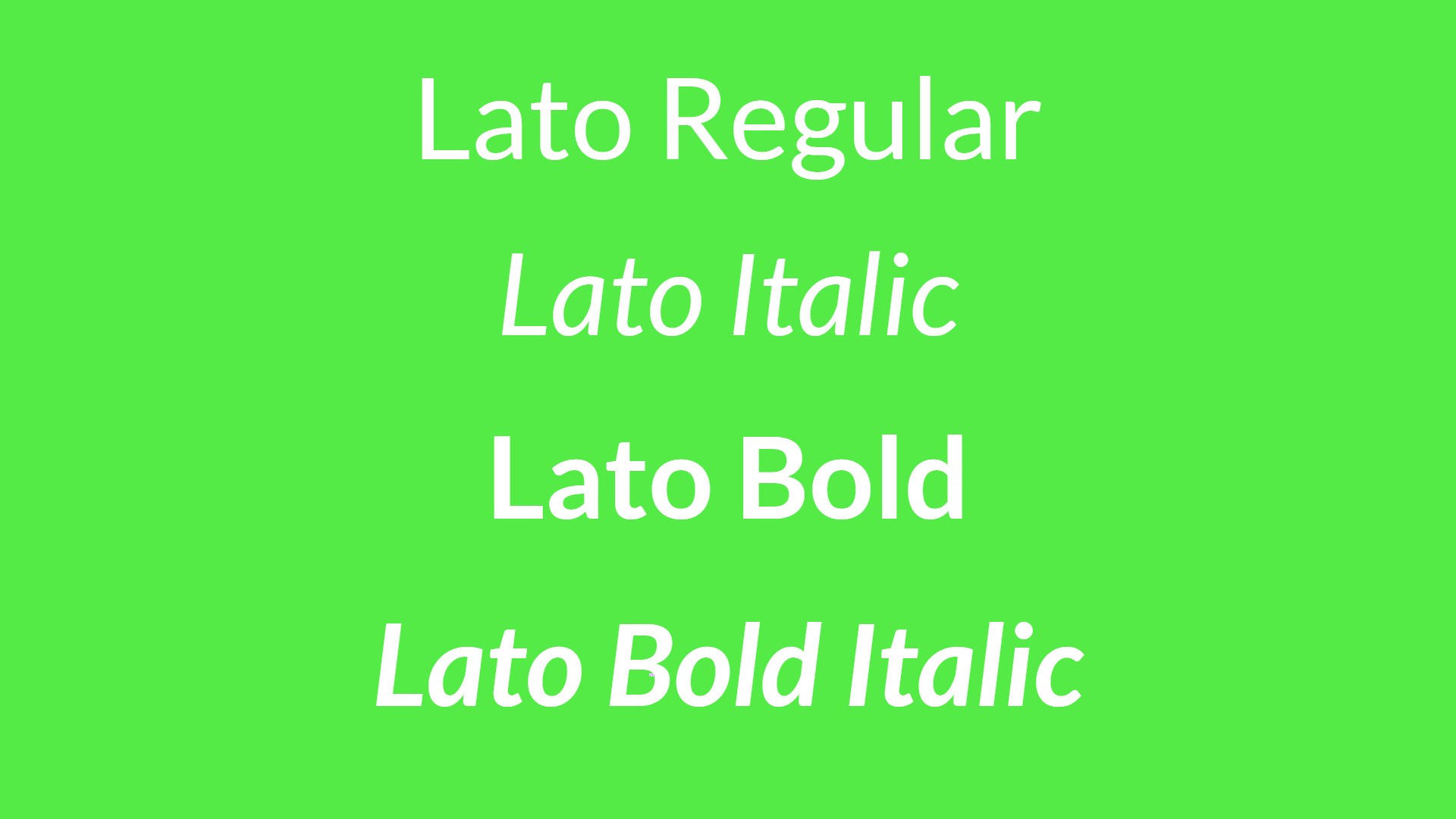
1. Lato: Clean, versatile, and highly readable.
2. Garamond: Timeless elegance with unbeatable readability.
3. Impact: While most known for memes, Impact was viewed favourablyfor bold UI and intentional design.
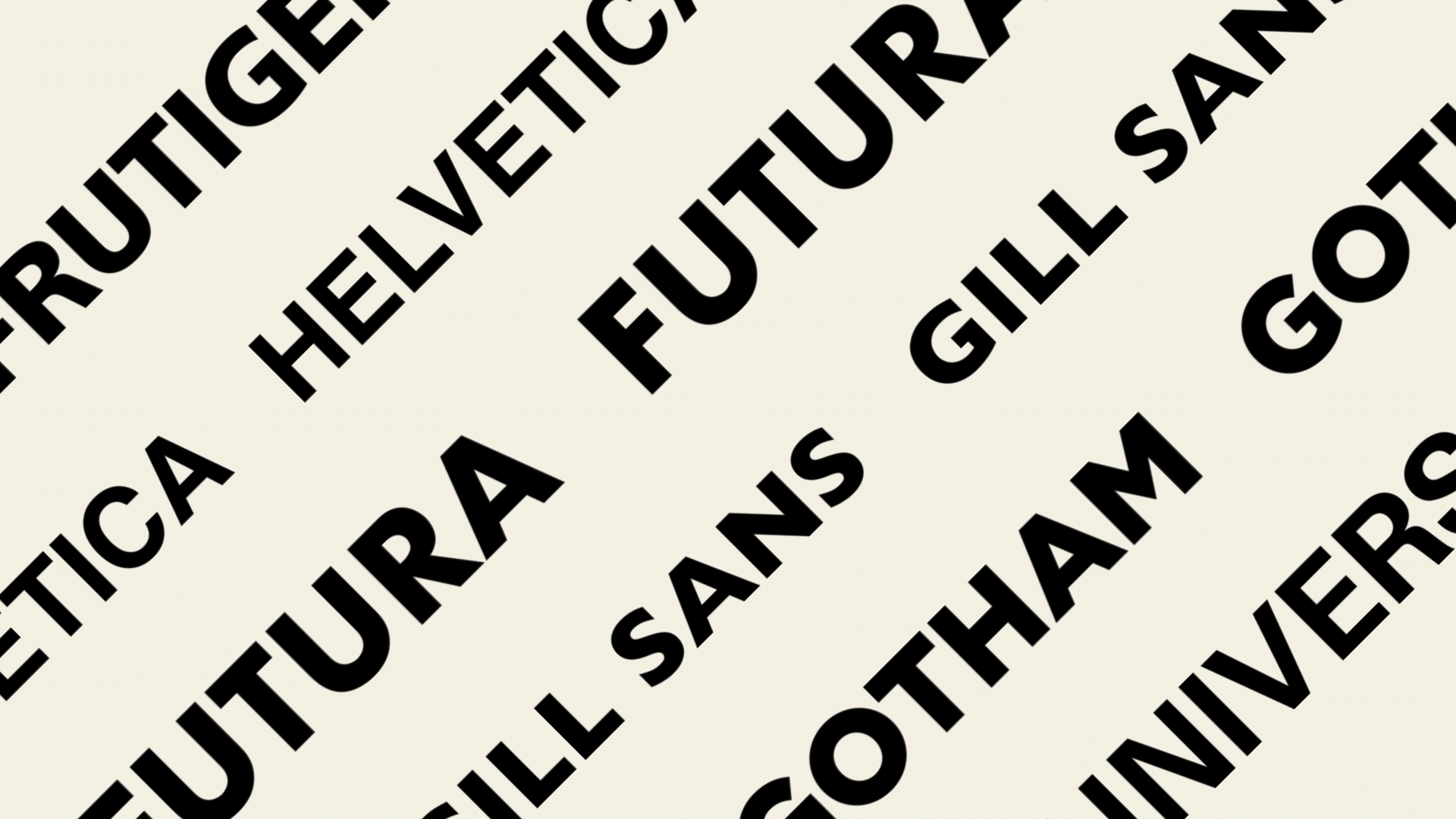
4. Helvetica: Trusted, versatile, and respected across decades.
5. Inter: Clean, readable, and perfect for digital interfaces.
6. Playfair Display: Loved for elegant headings and editorial pairings.
7. Merriweather: A web-optimized serif that balances tradition and screen clarity.
8. SF Pro: Admired for clarity and seamless integration in UI design.
9. Baskerville: Classic sophistication that still feels fresh.
10. Futura: Favoured for its clean, forward-looking geometric style.
Most loathed typefaces
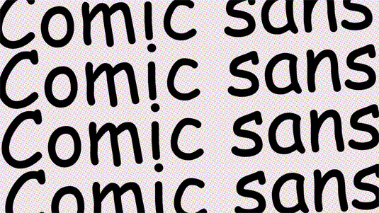
1. Comic Sans: Universally mocked for childish informality.
2. Papyrus: Overused in amateur and “mystical” branding.
3. Arial: Seen as a bland, uninspired Helvetica clone.
4. Times New Roman: Viewed as archaic, elitist, and creatively limiting.
5. Bodoni: Beautiful but frustrating – hard to use effectively.
6. Didot: High-fashion but poor readability and fussy execution.
7. Courier New: Limited to coding and retro aesthetics.
8. Montserrat: Suffers from trend fatigue – once fresh, now generic.
9. Raleway: Trendy in the 2010s, now seen as overexposed.
10. Brush Script: Viewed as dated, unprofessional, and 90s-cliché.
The study, which was taken from unique sources including design communities, industry blogs, social media, and professional forums, reveals some key takeaways. While no-one is surprised that Comic Sans tops the list of the most loathed fonts, it is perhaps surprising that a classic choice such as Arial could appear so high on the same list. It's clear from the analysis that 'safe' fonts are almost more offensive to creatives than 'bad' fonts.
We can also see that trend fatigue has set in, with a couple of fonts that were once trendy are now undesirable (looking at you Monteserrat and Raleway).
And while some might think of Helvetica as corporate and overused, it remains high in universal esteem as a trusted font with mostly very positive discussion centred around its decades of use.
So, which do you agree and disagree with? Let us know in the comments! Then head to our free fonts roundup if you want to play with some new ideas, and our typography glossary if you need to swat up on your lingo.