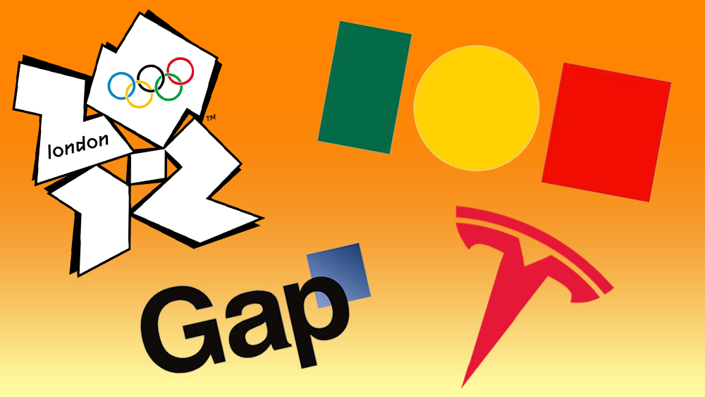
From brave and different, to misguided modernisations, embarking on a new logo design can mean facing a deluge of both admiration and abuse. While some brands may admit defeat and backtrack, others have held onto new designs, which often proves more memorable in time. Although sales have taken a hit in some cases, controversial logo choices clearly get a brand noticed – whether it’s curiosity and enthusiasm from fans or criticism from the sceptics. Or even sparking a slew of parodies or anti-logos.
There are plenty of lessons to be learnt – don’t jump on a trend, don’t make it bland, don’t throw away your heritage, do break new ground and do try something daring. But, crucially, the best logo choices should be authentic, strategic, culturally sensitive and innovative – and never employed as a means to paper over a brand’s deeper issues.